Data Analyst Projects for Beginners: 20 Guided Projects to Build Your Portfolio (2026)
Here are 20 beginner data analyst projects to build a portfolio that gets you hired. They cover Python, SQL, Excel, Tableau, and Power BI, with step-by-step instructions for each.
Breaking into data analytics can be frustrating if you’re a complete beginner. Job postings want experience, and you can’t get experience without a job.
A well-built portfolio of data analyst projects however can help you close that gap. Many analysts land their first role without a single line of professional experience on their resume as their projects did the talking instead.
What you’ll find in this guide:
- 20 guided data analyst projects for beginners, can be completed in a browse, no setup required
- Projects covering six tools: Python, SQL, R, Excel, Tableau, and Power BI
- A recommended starting order, with the three best first projects clearly marked
- A framework for turning completed projects into a portfolio that gets noticed
- Free dataset sources for building your own independent projects
The entry-level market is competitive, and candidates who get interviews typically have 3–5 polished, well-documented projects which is a common sweet spot: enough range to signal breadth, not so many that quality slips. At Dataquest, we’ve helped thousands of learners build exactly that through our Data Analyst in Python career path.
Before You Start: Tool Setup
Most projects in this list run inside Jupyter Notebook (for Python) or RStudio (for R). Neither requires a paid subscription, but both need a one-time local install before you can get started.
For Jupyter, the fastest route is installing Anaconda. It bundles Python and Jupyter together and takes about ten minutes. If you'd rather skip the install entirely, the Dataquest platform lets you run Python code directly in your browser for all hosted guided projects. For RStudio, download R from CRAN first, then install RStudio Desktop from Posit. Our guides on getting started with Jupyter and getting started with R and RStudio walk you through both installs step by step.
Table of Contents
- What makes a good data analyst portfolio project?
- Your quick start: The best first projects to build
- 20 Data Analyst Projects for Beginners
- How to make your projects portfolio-ready
- How to choose the right projects
- Free datasets for your own projects
- Your next steps
- Frequently Asked Questions
What makes a good data analyst portfolio project?
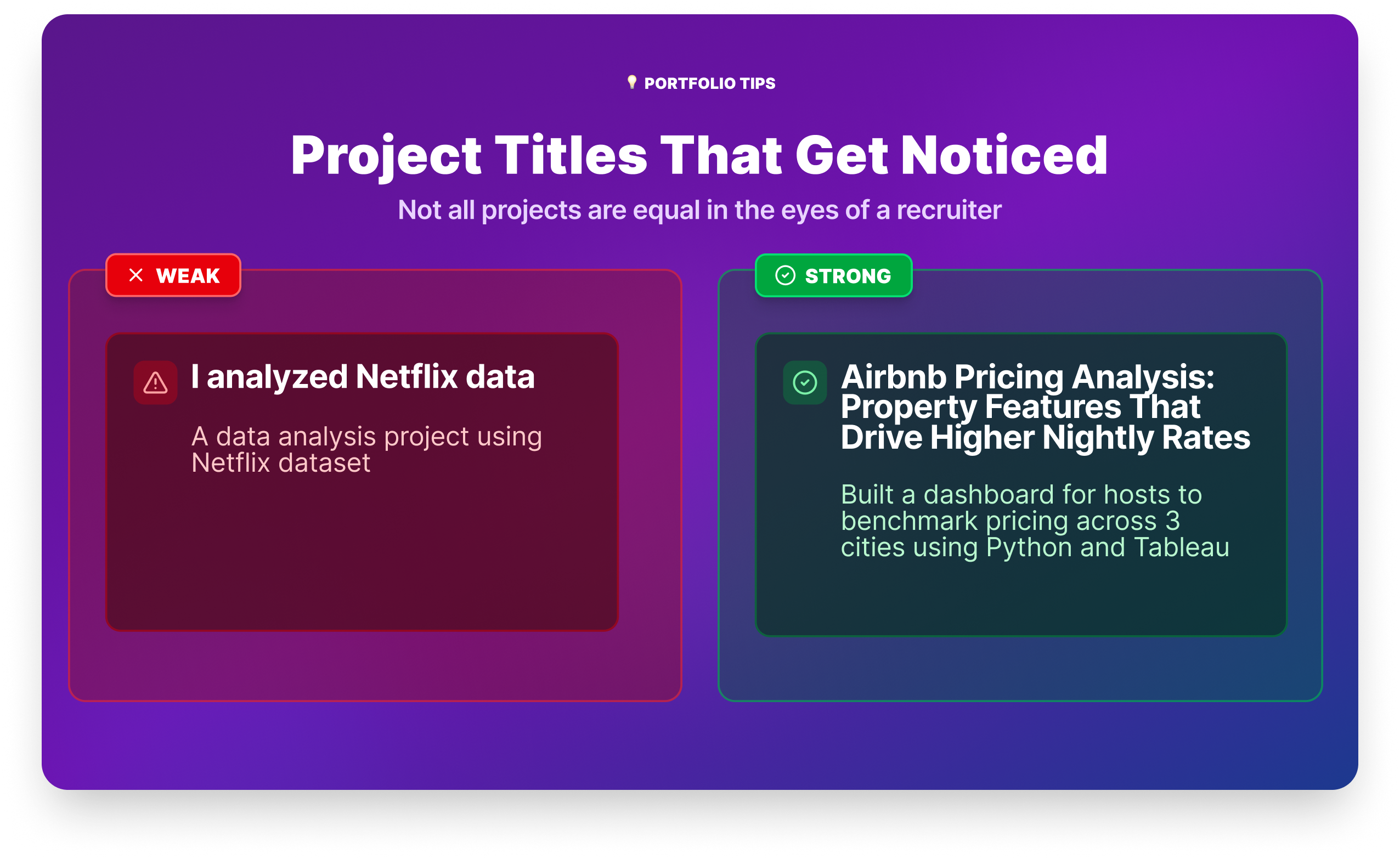
Not all projects are equal in the eyes of a recruiter. The ones that get attention share four qualities:
- They answer a real question. "I analyzed Airbnb data" is weak. "I analyzed Airbnb listings in three cities to find which property features predict higher nightly rates, then built a dashboard for hosts to benchmark their pricing" is strong. A project title that sounds like a question a manager would ask *signals business thinking, not just technical execution: What drives customer churn at a telecom provider?*
- They show the full workflow. Recruiters want to see that you can move from messy raw data to a clean, interpretable result. A project that only shows a finished dashboard, with no evidence of the cleaning and analysis behind it, leaves too many questions unanswered.
- They’re documented. At minimum, your project needs a clear README on GitHub that explains what you did, what data you used, and what you found. Many hiring managers check GitHub before an interview. A repository with no documentation is almost as bad as no repository at all.
- They demonstrate the tools employers actually use. SQL and Python appear in the vast majority of data analyst job postings. Excel and a BI tool (Power BI or Tableau) round out the core toolkit. A balanced portfolio covers all of these.
The best first data analyst projects to build
If you’re new to data analytics and not sure where to begin, start with these three projects. Together they cover the core workflow across two different tools, and they’re all completable in a browser without any local setup.
Exploratory Data Analysis
Profitable App Profiles: You're working with real app store data, asking a genuine business question, and practicing the fundamentals of exploratory data analysis. It produces a clear, explainable result you can talk through in an interview.
Data Cleaning (Python/pandas)
Clean and Analyze Employee Exit Surveys: Data cleaning is often a big chunkof a real analyst's day-to-day work, and this project gives you an honest introduction to it. You'll combine messy datasets from two sources and surface insights about why employees resign — the kind of HR analysis that appears in real businesses constantly.
SQL
Analyzing Kickstarter Projects: SQL is the most universally required skill in data analyst job postings, and this project gives you a focused, beginner-friendly context to practice it on real data.
Complete these three first. Then use the full list below to add depth and tool variety to your portfolio.
20 Data Analyst Projects for Beginners
Each project below includes a difficulty level, estimated completion time, and a note on its portfolio value, ,so you can plan which ones to tackle and in what order.
The projects cover six tools: Python, R, Excel, Tableau, Power BI, and SQL. You don’t need to complete all 20. A strong portfolio typically has 3–5 well-documented projects that together demonstrate range. Use the tool context in each project header to build a balanced set.
1. eBay Car Sales
Difficulty: Beginner | Time: 5–7 hours | Tools: Python, pandas, Jupyter Notebook
Portfolio value: Real scraped data is messier than anything you'd find in a textbook, and cleaning it is exactly what employers want to see you do. This project gives you a genuine data wrangling story to tell in interviews.
Overview
You're working with a dataset scraped from eBay Kleinanzeigen, the classifieds section of the German eBay site. The data is raw, inconsistent, and full of the kinds of issues you'd encounter in a real analyst role: text in numeric columns, outliers, and fields that need parsing before they're usable. Your job is to clean it and surface insights about used car pricing patterns across makes, models, and mileage bands.
Start the eBay Car Sales project →
Tools and Technologies
- Python
- pandas
- Jupyter Notebook
Prerequisites
- Pandas fundamentals: selecting, filtering, and transforming data
- Basic data cleaning: handling nulls, fixing data types, removing outliers
Step-by-Step Instructions
- Load and explore the raw eBay dataset
- Clean column names and fix data types (price, odometer, registration year)
- Remove outliers and irrelevant listings
- Analyze price distributions across top car brands
- Explore the relationship between mileage, age, and price
Expected Outcomes
- Experience cleaning a real-world, scraped dataset from scratch
- Practice identifying and handling outliers and inconsistent formatting
- Ability to derive pricing insights from exploratory analysis
Resources
2. Profitable App Profiles for the App Store and Google Play Markets
Difficulty: Beginner | Time: 4–6 hours | Tools: Python, Jupyter Notebook
Portfolio value: A strong first portfolio project. You’re working with real data, answering a business question, and practicing EDA fundamentals—the combination recruiters most want to see from a junior candidate.
Overview
You’re a data analyst for a company building ad-supported mobile apps. Using historical data from the Apple App Store and Google Play Store, you’ll identify which app categories attract the most users. You’ll clean the data, use frequency tables to find patterns, and make concrete recommendations. This is the kind of output a real product team would actually use.
Start the App Profiles project →
Tools and Technologies
- Python
- Jupyter Notebook
Prerequisites
- Writing Python functions with arguments, return statements, and control flow
- Using conditional logic and loops
- Working in Jupyter Notebook
Step-by-Step Instructions
- Open and explore the App Store and Google Play datasets
- Clean the datasets by removing non-English apps and duplicate entries
- Isolate the free apps for further analysis
- Determine the most common app genres using frequency tables
- Make recommendations on the ideal app profiles to maximize users and revenue
Expected Outcomes
- Cleaning real-world data to prepare it for analysis
- Analyzing app market data to identify trends and success factors
- Using data insights to inform business strategy and decision-making
- Communicating findings and recommendations to stakeholders
Resources
3. Exploring Hacker News Posts
Difficulty: Beginner | Time: 4–6 hours | Tools: Python, Jupyter Notebook
Portfolio value: Shows you can extract meaningful patterns from unstructured, real-world data—a skill that comes up constantly in analyst roles involving user behavior or content performance.
Overview
Hacker News is one of tech’s most active communities. This project has you analyze a dataset of posts to find out what drives engagement: which post types get the most comments, and what time of day is best to post. You’ll use Python string manipulation, object-oriented programming, and the datetime library — skills that transfer directly to any role involving behavioral data.
Start the Hacker News project →
Tools and Technologies
- Python
- Jupyter Notebook
Prerequisites
- Python data cleaning skills: loops, string methods,
datetimelibrary - Formatting dates and times with
strftime
Step-by-Step Instructions
- Remove headers from a list of lists
- Extract ‘Ask HN’ and ‘Show HN’ posts
- Calculate the average number of comments for each post type
- Find the number of ‘Ask HN’ posts and average comments by hour created
- Sort and print values from a list of lists
Expected Outcomes
- Applying Python string manipulation and date handling to real-world data
- Analyzing trends in user submissions on a live platform
- Identifying factors that drive post popularity and engagement
- Communicating insights derived from behavioral data
Resources
- Data Analyst in Python career path
- Original Hacker News dataset on Kaggle
- Hacker News
- Example Solution Code
4. Clean and Analyze Employee Exit Surveys
Difficulty: Beginner–Intermediate | Time: 6–8 hours | Tools: Python, pandas, Jupyter Notebook
Portfolio value: Data cleaning is the skill most underrepresented in beginner portfolios and the one most valued by hiring managers. This project gives you a legitimate data cleaning story to tell in interviews.
Overview
About 80% of real analyst work is preparing data for analysis, not running it. This project puts you in that reality. You’re working with employee exit survey data from two Australian government institutes—messy, inconsistent, and spread across multiple files. You’ll combine them, clean them, and surface insights about resignation patterns. It’s unglamorous work that separates serious candidates from those who’ve only done textbook exercises.
Start the Employee Exit Surveys project →
Tools and Technologies
- Python
- pandas
- Jupyter Notebook
Prerequisites
- Pandas fundamentals:
groupby,concat,merge - Handling missing data and manipulating strings in pandas
Step-by-Step Instructions
- Load and explore the DETE and TAFE exit survey data
- Identify missing values and drop unnecessary columns
- Clean and standardize column names across both datasets
- Filter the data to include only resignation reasons
- Verify data quality and create new columns for analysis
- Combine the cleaned datasets for further analysis
- Analyze the combined data to identify resignation trends
Expected Outcomes
- Cleaning real-world, messy HR data from multiple sources
- Applying core data cleaning techniques in Python and pandas
- Conducting exploratory analysis on combined datasets
- Summarizing findings and sharing data-driven recommendations
Resources
5. Star Wars Survey
Difficulty: Beginner | Time: 4–6 hours | Tools: Python, pandas, Jupyter Notebook
Portfolio value: Survey analysis is one of the most common real-world analyst tasks. This project shows you can work with opinion data, handle inconsistent formats, and slice results by demographics—skills that translate directly to customer research and product analytics roles.
Overview
FiveThirtyEight surveyed over 1,000 Star Wars fans on their film preferences. Your job is to clean the raw survey data (which is messy by design) and uncover how preferences vary by gender, age, and region. It’s a genuinely fun dataset that also teaches the kind of data handling you’ll do in real market research and user research contexts.
Start the Star Wars Survey project →
Tools and Technologies
- Python
- pandas
- Jupyter Notebook
Prerequisites
- Pandas data cleaning skills: joins, applying functions over columns, handling missing values
- Analyzing survey data with pandas
Step-by-Step Instructions
- Map Yes/No columns to Boolean values to standardize the data
- Convert checkbox columns to lists and standardize their format
- Clean and rename the ranking columns
- Identify the highest-ranked and most-viewed films
- Analyze preferences by gender, age, and location
- Summarize findings on fan preference differences between groups
Expected Outcomes
- Experience cleaning and analyzing a real-world, messy survey dataset
- Hands-on practice with pandas data manipulation
- Understanding of how to analyze survey data for business insights
Resources
- FiveThirtyEight’s Star Wars Survey Data
- Example Solution Code
- Dataquest Community: Star Wars Survey Project
- Introduction to Python Programming
- Step-by-step project tutorial
6. Word Raider
Difficulty: Beginner | Time: 3–4 hours | Tools: Python, Jupyter Notebook
Portfolio value: While not a data analysis project, this is worth completing early in your Python learning. Building an interactive application from scratch using loops, conditionals, and file handling gives you a feel for Python logic that makes later data projects much easier to approach.
Overview
You’re building an interactive word-guessing game using only core Python concepts: loops, conditionals, and file handling. No data analysis happens here, but the programming fluency you develop does. Think of this as your Python confidence-builder before tackling the heavier cleaning and analysis projects.
Start the Word Raider project →
Tools and Technologies
- Python
- Jupyter Notebook
Prerequisites
- Python basics: variables, data types, functions
- Loops, conditional statements, string manipulation
- Basic understanding of object-oriented programming
Step-by-Step Instructions
- Build the word bank by reading words from a text file into a Python list
- Set up variables to track the game state
- Implement functions to receive and validate user input
- Create the game loop, checking guesses and providing feedback
- Update the game state after each guess and check for win/loss
Expected Outcomes
- Stronger proficiency in fundamental Python programming concepts
- Experience building an interactive application from scratch
- Practice with file I/O, data structures, and basic OOP
Resources
- Junior Data Analyst career path
- Example Solution Code
- How to Become a Junior Data Analyst
- Dataquest Community: My Take on the Word Raider Game
- Selecting and Installing an IDE
- Step-by-step project tutorial
7. Credit Card Customer Segmentation
Difficulty: Intermediate | Time: 6–8 hours | Tools: Python, pandas, scikit-learn, Jupyter Notebook
Portfolio value: Segmentation is one of the most commonly assigned tasks in marketing and product analytics. This project shows you can go beyond descriptive analysis to produce something a business would actually act on.
Overview
You're a data scientist at a credit card company. Using behavioral data on 8,000+ customers, including purchase frequency, credit limits, and payment patterns.You'll segment customers into distinct groups using K-means clustering. The goal isn't just to run the algorithm; it's to interpret each segment and recommend how the business should engage with them differently. That analysis-to-recommendation workflow is exactly what separates strong analyst candidates from the pack.
Start the Credit Card Segmentation project →
Tools and Technologies
- Python
- pandas
- scikit-learn
- Jupyter Notebook
Prerequisites
- pandas fundamentals: groupby, aggregation, data cleaning
- Basic understanding of machine learning concepts
- Intro to supervised and unsupervised learning
Step-by-Step Instructions
- Load and explore the credit card customer dataset
- Clean and preprocess the data for clustering
- Apply K-means clustering to segment customers
- Visualize the segments using dimensionality reduction
- Interpret each cluster and develop tailored business recommendations
Expected Outcomes
- Hands-on experience applying K-means clustering to real business data
- Ability to interpret and communicate cluster results to a non-technical audience
- Practice translating analysis findings into actionable business strategy
Resources
8. Creating an Efficient Data Analysis Workflow
Difficulty: Beginner–Intermediate | Time: 5–7 hours | Tools: R, RStudio
Portfolio value: Shows R fluency and the ability to structure analysis into a reproducible workflow—a skill valued in academic, healthcare, and research-adjacent analyst roles.
Overview
You’re hired by a programming book company to analyze their sales data. Which titles are most profitable? You’ll use R’s control flow, loops, and custom functions to build a clean, repeatable analysis workflow and write up your findings in a structured report.
Start the Data Analysis Workflow project →
Tools and Technologies
- R
- RStudio
Prerequisites
Step-by-Step Instructions
- Explore the book sales dataset
- Transform and prepare the data for analysis
- Analyze the cleaned data to identify top-performing titles
- Summarize findings in a structured report
- Provide data-driven recommendations to stakeholders
Expected Outcomes
- Applying R programming to real-world sales data
- Developing a reproducible data analysis workflow
- Translating analysis findings into actionable business insights
Resources
9. Creating an Efficient Data Analysis Workflow, Part 2
Difficulty: Intermediate | Time: 6–8 hours | Tools: R, RStudio, dplyr, stringr, lubridate
Portfolio value: This project introduces the R tidyverse ecosystem—the package suite most used in production R analysis. It also covers time-based analysis, which is a common real-world requirement in sales, finance, and operations analytics.
Overview
A book company launched a new sales initiative on July 1, 2019. Did it work? Your job is to find out. Using the tidyverse packages dplyr, stringr, and lubridate, you’ll clean and process 2019 sales data, analyze sentiment in customer reviews, and compare key metrics before and after the program launch.
Start the Data Analysis Workflow Part 2 project →
Tools and Technologies
- R, RStudio
- dplyr, stringr, lubridate
Prerequisites
- Specialized data processing in R:
stringr,lubridate,mapfunction, regular expressions
Step-by-Step Instructions
- Load and explore the 2019 sales data
- Clean the data by handling missing values and inconsistencies
- Process text reviews to determine positive/negative sentiment
- Compare key metrics before and after the program launch
- Analyze differences in sales between customer segments
Expected Outcomes
- Applying tidyverse packages to manipulate and process real-world data
- Analyzing sales data to quantify the impact of a business initiative
- Translating findings into meaningful business insights
Resources
10. Preparing Data with Excel
Difficulty: Beginner | Time: 3–5 hours | Tools: Excel
Portfolio value: Excel proficiency is expected in nearly every analyst role, particularly in non-tech industries. This project demonstrates the skill that gets overlooked most in beginner portfolios: preparing data before analysis, not just analyzing it.
Overview
You’re a data professional at a marine biology research organization. Your task: prepare a raw dataset on shark attacks so that the analysis team can start working with it. Using Excel, you’ll import the data, organize it into tables, remove duplicates, handle missing values, and fix inconsistencies. This is the exact workflow you’d repeat dozens of times a year in a real analyst role.
Start the Preparing Data with Excel project →
Tools and Technologies
- Excel
Prerequisites
- Preparing data in Excel: importing data, organizing worksheets, removing duplicates, handling missing values
Step-by-Step Instructions
- Import the raw shark attack data into an Excel workbook
- Organize the data into worksheets and tables
- Clean the data by removing duplicates and fixing inconsistencies
- Consolidate shark attack data from multiple sources into a single table
Expected Outcomes
- Hands-on experience in data preparation and cleaning using Excel
- Skills for importing, organizing, and cleaning data for analysis
- Ability to consolidate data from multiple sources into an analysis-ready format
Resources
11. Visualizing the Answer to Stock Questions Using Spreadsheet Charts
Difficulty: Beginner | Time: 4–6 hours | Tools: Excel
Portfolio value: Data visualization in Excel is the most portable skill in the analyst toolkit; it works in every industry and doesn’t require software licenses. This project demonstrates that you can communicate findings visually, not just analyze data numerically.
Overview
Using historical stock data from Microsoft, Amazon, Intel, and Bitcoin, you’ll build a report that answers specific business questions through charts. You’ll apply information design principles, including Gestalt theory and pre-attentive attributes — to make your visualizations genuinely clear and persuasive, not just technically correct.
Start the Stock Visualization project →
Tools and Technologies
- Excel
- Data visualization
- Information design principles
Prerequisites
- Visualizing data in Excel: creating chart types, applying design principles, using Gestalt principles
Step-by-Step Instructions
- Import the dataset to an Excel spreadsheet
- Create a report using data visualizations and tabular data
- Represent the data using effective chart types
- Apply Gestalt principles and pre-attentive attributes
- Maximize data-ink ratio in all visualizations
Expected Outcomes
- Analyzing real-world stock market data in Excel
- Applying information design principles to create effective visualizations
- Developing in-demand data visualization and communication skills
Resources
- Microsoft Stock Data - Kaggle
- Amazon Stock Data - Kaggle
- INTEL Stock Data - Kaggle
- Bitcoin Historical Data - Kaggle
- Introduction to Data Analysis with Excel Skill Path
12. Identifying Customers Likely to Churn for a Telecommunications Provider
Difficulty: Beginner–Intermediate | Time: 5–7 hours | Tools: Excel
Portfolio value: Customer churn analysis is one of the most commonly assigned tasks in business analytics roles. This project gives you a concrete example to reference in interviews when asked about your experience with business impact analysis.
Overview
Customer churn which is when users cancel a service, it costs telecom companies significant revenue each year. You’re tasked with exploring customer data in Excel to profile who’s most likely to churn. You’ll calculate descriptive statistics, build PivotTables, and create histograms and boxplots that tell a data story clear enough to hand directly to a retention team.
Start the Customer Churn project →
Tools and Technologies
- Excel
Prerequisites
- Exploring data in Excel: descriptive statistics, PivotTables, histograms, boxplots
Step-by-Step Instructions
- Import the customer dataset into Excel
- Calculate descriptive statistics for key metrics
- Create PivotTables, histograms, and boxplots to explore data differences
- Analyze and identify profiles of likely churners
- Compile a report with your data visualizations
Expected Outcomes
- Practice analyzing a real-world customer dataset in Excel
- Experience building PivotTables and charts to uncover insights
- Skill in translating analysis findings into an actionable report
Resources
13. Data Prep in Tableau
Difficulty: Beginner | Time: 3–5 hours | Tools: Tableau
Portfolio value: Tableau proficiency is a differentiator in many business analyst and BI roles. This project gives you a solid foundation in the most important step of any Tableau workflow: getting your data ready before you build a single chart.
Overview
Your client is Dataquest itself. Using real online learning platform data, you’ll connect to Excel files, import tables into Tableau, and define relationships between tables to build a data model that can answer questions about student engagement and course performance. Clean, well-modeled data is what makes great dashboards possible. This project teaches you to get that foundation right.
Start the Tableau Data Prep project →
Tools and Technologies
Prerequisites
- Preparing data in Tableau: connecting to data sources, importing tables, defining relationships, cleaning and filtering
Step-by-Step Instructions
- Connect to the provided Excel file with student engagement data
- Import tables into Tableau and define relationships between them
- Clean and filter the data to handle missing values and inconsistencies
- Save the prepared data source for visualization
- Reflect on how data preparation affects the quality of analysis
Expected Outcomes
- Practice with core data preparation techniques in Tableau
- Ability to connect to, import, and combine data from multiple tables
- Readiness to build visualizations and dashboards from a clean data model
Resources
- Download the dataset
- Data Visualization with Tableau Skill Path
- Tableau Documentation
- Tableau Community Forums
14. Business Intelligence Plots
Difficulty: Intermediate | Time: 5–7 hours | Tools: Tableau
Portfolio value: Interactive dashboards are what most BI and analyst roles produce as their primary deliverable. This project gives you a realistic simulation of that work, complete with calculated fields and dual-axis charts.
Overview
You’re a data visualization consultant for Adventure Works. Leadership wants to understand the performance gap between their online and offline sales channels. You’ll build interactive Tableau dashboards using calculated fields, filters, dual-axis charts, and embedded visualizations in tooltips. The advanced techniques that separate polished BI work from basic charts.
Start the Business Intelligence Plots project →
Tools and Technologies
Prerequisites
- Data visualization fundamentals in Tableau: chart types, calculated fields, filters
Step-by-Step Instructions
- Compare online vs offline orders using visualizations
- Analyze products across channels with scatter plots
- Embed visualizations in tooltips for added insight
- Summarize findings and identify next steps
Expected Outcomes
- Experience building interactive BI dashboards in Tableau
- Ability to create calculated fields for tailored analysis
- Skill in developing visualizations that surface actionable insights
Resources
15. Data Presentation
Difficulty: Intermediate | Time: 5–7 hours | Tools: Tableau
Portfolio value: The ability to present data findings to leadership, not just analyze them, is consistently cited as a gap in junior analysts. This project produces a dashboard you could genuinely show in an interview as evidence of stakeholder communication skills.
Overview
Using conversion funnel data, you’ll build an interactive Tableau dashboard for a company’s leadership team that answers: which marketing channels, locations, and customer personas drive the most value? You’ll add filters, dashboard actions, and annotations to make the dashboard genuinely usable, not just visually appealing.
Start the Data Presentation project →
Tools and Technologies
- Tableau
Prerequisites
- Sharing insights in Tableau: bar charts, line graphs, color and size encoding, dashboard filters and actions
Step-by-Step Instructions
- Import and clean the conversion funnel data in Tableau
- Build basic charts to visualize key metrics
- Create interactive dashboards with filters and actions
- Add annotations and highlights to emphasize key insights
- Compile a professional dashboard to present findings
Expected Outcomes
- Analyzing conversion funnel data to surface actionable insights
- Applying data visualization best practices to create impactful dashboards
- Communicating data-driven findings to stakeholders
Resources
16. Modeling Data in Power BI
Difficulty: Beginner–Intermediate | Time: 5–7 hours | Tools: Power BI
Portfolio value: Power BI is the dominant BI tool in enterprise environments, particularly in companies already using Microsoft 365. This project covers the foundational workflow — connecting data, building a model, and writing DAX, that appears in most Power BI analyst roles.
Overview
You’re an analyst at a company that sells scale model cars. Using their sales records database in Power BI, you’ll clean and transform the data, design a data model, and create calculated columns and measures with DAX (Data Analysis Expressions). The goal is a dashboard that helps leadership understand sales performance and make better decisions.
Start the Modeling Data in Power BI project →
Tools and Technologies
- Power BI
Prerequisites
- Modeling data in Power BI: data models, table properties, calculated columns and measures using DAX
Step-by-Step Instructions
- Import the sales data into Power BI
- Clean and transform the data for analysis
- Design a basic data model
- Create calculated columns and measures using DAX
- Build visualizations to extract insights from the data
Expected Outcomes
- Hands-on experience modeling and analyzing real-world sales data in Power BI
- Ability to clean, transform, and prepare data for analysis
- Experience creating DAX measures and extracting business insights
Resources
- Analyzing Data with Microsoft Power BI Skill Path
- Official Power BI documentation
- A CEO Explains How to Learn Power BI
17. Visualization of Life Expectancy and GDP Variation Over Time
Difficulty: Intermediate | Time: 5–7 hours | Tools: Power BI
Portfolio value: This project produces a compelling dashboard using the Gapminder dataset—recognizable to most data professionals and a strong conversation starter in interviews. Publishing it demonstrates you can take work to completion.
Overview
How have life expectancy and GDP changed across countries over decades? Using the Gapminder dataset in Power BI, you’ll build interactive scatter plots and stacked column charts to answer that question. You’ll walk through the full report development lifecycle like loading data, cleaning it, building visualizations, and publishing your work, and end with a dashboard ready to add to your portfolio.
Start the Life Expectancy and GDP project →
Tools and Technologies
- Power BI
Prerequisites
- Visualizing data in Power BI: basic visuals, accessible report layouts, themes, publishing
Step-by-Step Instructions
- Import the life expectancy and GDP data into Power BI
- Clean and transform the data for analysis
- Create interactive scatter plots and stacked column charts
- Design an accessible report layout
- Customize visual markers and themes, then publish the report
Expected Outcomes
- Applying visualization techniques in Power BI to global data
- Creating a dashboard that demonstrates the full report development lifecycle
- Publishing work to showcase your Power BI skills
Resources
- Analyzing Data with Microsoft Power BI Skill Path
- Official Power BI Support
- Official Power BI documentation
- Why Business Analysts Need to Learn Power BI
18. Building a BI App
Difficulty: Intermediate | Time: 6–8 hours | Tools: Power BI
Portfolio value: This is one of the strongest Power BI portfolio pieces in this list. You’re working with NPS (Net Promoter Score) data, a metric used in virtually every customer-facing business and producing recommendations, not just charts.
Overview
You’re a BI analyst at Dataquest. Using Power BI, you’ll import and model data on course completion rates and Net Promoter Scores, then build KPI metrics, line charts, and scatter plots to analyze course quality trends. The deliverable isn’t just a dashboard, it’s a recommendation for which courses need improvement, backed by the data. That combination of analysis and business recommendation is exactly what hiring managers want to see.
Start the Building a BI App project →
Tools and Technologies
- Power BI
Prerequisites
- Managing workspaces and datasets in Power BI: creating workspaces, dynamic reports with parameters, row-level security
Step-by-Step Instructions
- Import and explore the course completion and NPS data
- Create a data model relating the fact and dimension tables
- Write calculations for key metrics and validate results
- Design and build visualizations to analyze course performance
Expected Outcomes
- Importing, modeling, and analyzing data in Power BI to drive decisions
- Designing and building insightful visualizations to convey trends
- Producing actionable recommendations from BI analysis
Resources
- Analyzing Data with Microsoft Power BI Skill Path
- Official Power BI documentation
- What’s the best way to learn Microsoft Power BI?
- Sample datasets from Power BI
- Watch the step-by-step tutorial
19. Analyzing Kickstarter Projects
Difficulty: Beginner | Time: 4–6 hours | Tools: SQL
Portfolio value: SQL is the most universally required skill in data analyst job postings. This is your cleanest, most focused SQL portfolio piece, it uses a well-known dataset and produces findings you can speak to confidently in an interview.
Overview
Kickstarter has funded over 200,000 creative projects. Using SQL, you’ll explore the platform’s project data to find what separates funded from failed campaigns: success rates by category, the relationship between funding goals and outcomes, and trends over time. This is a pure SQL analysis project—no Python, no Excel, which makes it a clear, standalone demonstration of your querying skills.
Start the Kickstarter project →
Tools and Technologies
- SQL
Prerequisites
- SQL and databases fundamentals: SELECT, WHERE, JOINs, aggregations, handling missing values
Step-by-Step Instructions
- Import and explore the Kickstarter dataset
- Clean the data to handle missing values and ensure consistency
- Write SQL queries to uncover funding trends by category
- Analyze success rates relative to funding goals and timeframes
Expected Outcomes
- Proficiency in using SQL for real-world data analysis
- Experience cleaning and querying a large, real-world dataset
- Ability to derive and communicate business insights from SQL results
Resources
20. Analyzing Startup Fundraising Deals from Crunchbase
Difficulty: Intermediate | Time: 6–8 hours | Tools: Python, pandas, SQLite, Jupyter Notebook
Portfolio value: This is your most technically impressive beginner project. It combines Python, pandas, and SQL in a single workflow and works with a dataset large enough to require memory management. It’s a strong capstone project for the Python track in this list.
Overview
Crunchbase tracks billions of dollars in startup investment. This project has you exploring that investment landscape: which verticals attract the most funding, who the most active investors are, and what patterns emerge across funding rounds. The technical challenge is that the dataset is large enough that you can’t load it all into memory at once, so you’ll practice chunking data and working with SQLite—techniques that apply directly to any analyst role handling production-scale data.
Start the Crunchbase project →
Tools and Technologies
- Python, pandas, SQLite, Jupyter Notebook
Prerequisites
Step-by-Step Instructions
- Explore the structure and contents of the Crunchbase dataset
- Process the dataset in chunks and load into an SQLite database
- Analyze fundraising rounds to identify trends
- Examine the most successful startup verticals by total funding
- Identify the most active investors by deal count and amount invested
Expected Outcomes
- Applying pandas and SQLite to real-world investment data
- Handling large datasets through chunking and efficient data types
- Integrating DataFrames with SQL databases for scalable analysis
- Building a portfolio-ready capstone project showing Python + SQL fluency
Resources
- Data Analyst in Python career path
- SQL Fundamentals skill path
- SQL Commands: The Complete List (w/ Examples)
How to make your projects portfolio-ready
Completing a project is step one. Making it visible and hirable is step two, and this is where most beginners stop short.
- Set up a GitHub repository for every project. GitHub is where recruiters go to verify the skills on your resume. A project that lives only on your laptop doesn’t exist in their eyes. Creating a free account takes five minutes; creating a repository for each project takes two more. This is non-negotiable.
- Write a README that answers three questions. When a recruiter opens your repository, they have thirty seconds before they move on. Your README needs to answer: What problem did this project address? What data did you use and where did it come from? What did you find, and what would you recommend? A clear, concise README, even 150 words is what separates a professional-looking portfolio from a folder of code.
- Write your resume bullet points before you close the project. While the work is still fresh, draft two bullet points you could put on a resume: one describing what you did technically, one describing the outcome or insight you produced. Something like: “Cleaned and analyzed HR exit survey data from 1,400+ employees using Python and pandas; identified role tenure as the strongest predictor of resignation risk.” That specificity is what earns callbacks.
- How many projects do you need? Three to five well-documented projects that cover different skill areas will serve you better than ten half-finished ones. Aim for at least: one Python/EDA project, one data cleaning project, one SQL project, and one visualization project (Tableau or Power BI). The Crunchbase project (Project 20) works well as a capstone that combines Python and SQL in a single piece.
How to choose the right data analyst projects
With 20 projects to choose from, and dozens more across the internet, the decision can feel paralyzing. Here’s a practical framework for narrowing it down.
What recruiters actually look for
When hiring managers review a beginner portfolio, they’re not looking for perfection. They’re looking for four things:
- Evidence that you can handle messy data
- Ability to translate findings into a recommendation
- Some familiarity with the tools on the job description
- Proof that you can document your work clearly. A project that checks all four boxes will outperform one that’s technically sophisticated but hard to understand.
One thing worth knowing: the entry-level market is genuinely competitive right now. Building 3–5 projects won’t guarantee a job, but it will get you past the first filter. The candidates who struggle the most are the ones who complete courses but never build anything they can show.
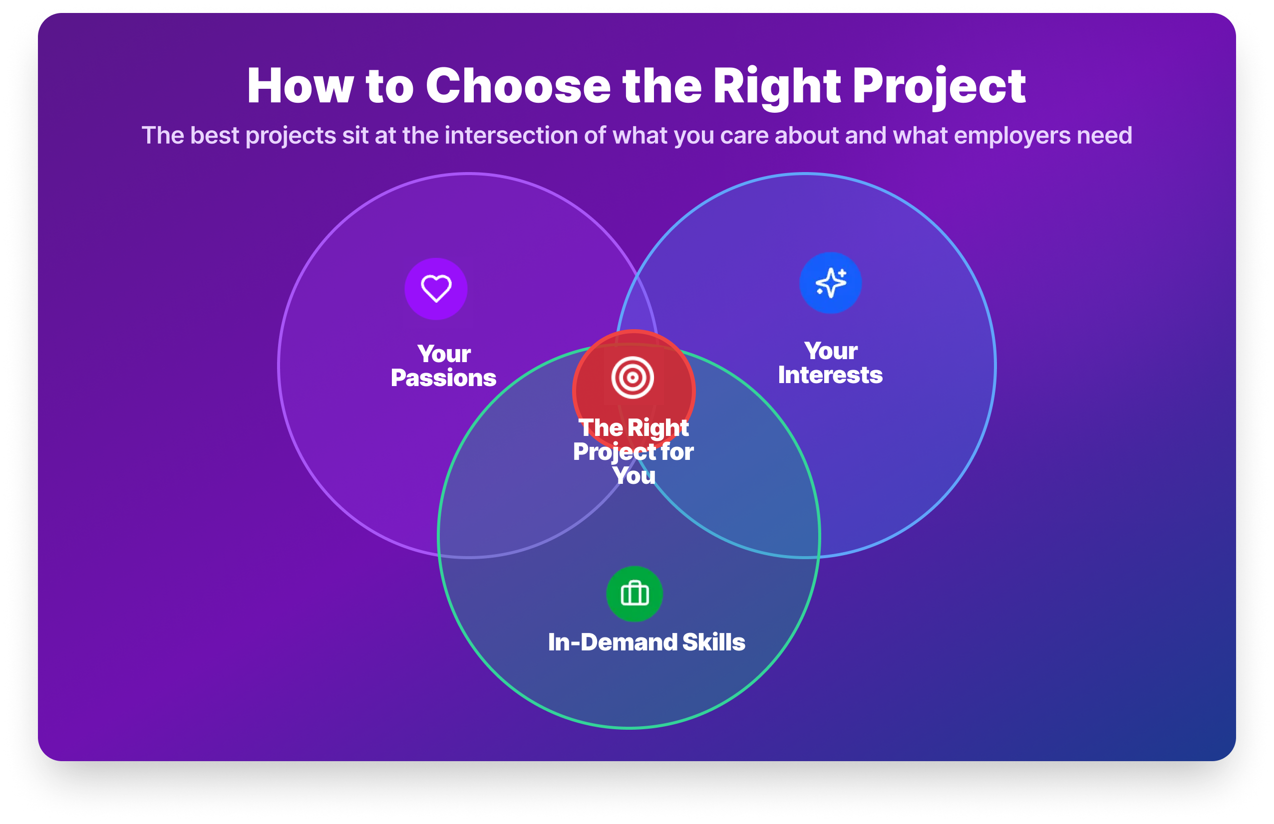
Passions, interests, and in-demand skills
The best project is one that sits at the intersection of three things: your passions, your interests, and the skills employers are actually hiring for.
- Passions are the areas you’re deeply committed to: healthcare, finance, sports, sustainability. Working on something you care about keeps you going when the project gets difficult, and it gives you something genuine to talk about in interviews.
- Interests are the topics that spark your curiosity even without deep commitment. Sports analytics, music data, food trends, if it makes you want to ask questions, it’s worth exploring.
- In-demand data skills are what the market wants. SQL, Python, pandas, and a BI tool appear in the overwhelming majority of analyst job postings. Make sure your portfolio demonstrates these tools, even if the topic is something more personal.
Steps to picking the right project
Step 1: Assess where you are. If you’re completely new to data analysis, start with Projects 2, 4, and 19. If you already have Python skills, jump to the more complex projects like Project 20.
Step 2: Plan before you code. Define your question, identify your data source, and sketch your analysis approach before opening Jupyter. Projects that start without a clear question tend to trail off.
Step 3: Focus on fundamentals first. Clean data thoroughly. Use techniques that match your objective. Create clear visualizations. Document your process. These four things matter more than whether you used a sophisticated model.
Step 4: Start small, then scale. Complete one project fully before starting another. A finished, documented project is worth more than three projects stuck at 60%.
Step 5: Get feedback. Share your completed projects in the Dataquest Community or on Reddit’s r/dataanalysis. Peer feedback makes your work better and builds visibility with people in the field.
Free datasets for your own data analyst projects
Once you’ve completed the guided projects, you’ll likely want to build independent projects using your own datasets. Here are reliable places to find data worth analyzing.
Kaggle: The largest free dataset repository. Covers every domain from finance to sports to healthcare, and many datasets include community notebooks showing how others have approached the analysis.
Data.gov: US government data across health, education, transportation, and economics. Well-documented and generally clean.
NYC Open Data: Hundreds of datasets on the city: Citi Bike trips, restaurant inspections, school performance, traffic patterns.
World Happiness Report: Annual happiness index data by country, useful for time-series and comparative analysis.
Our World in Data: Long-run historical datasets on everything from CO₂ emissions to life expectancy. Strong for trend analysis.
FiveThirtyEight: Datasets behind their journalism. Politics, sports, culture — all real, all interesting.
World Bank Open Data: Economic and development indicators across 200+ countries.
For the most realistic practice, look for datasets with multiple files from different sources, missing values, and inconsistent formatting. That messiness is what makes cleaning projects feel real.
Your next steps
Building a portfolio takes time, and the biggest obstacle is usually getting started rather than the work itself. We've put together a free checklist that walks you from your first project to a portfolio ready to show employers. Download it below, then come back to this guide whenever you need a project to tackle next.

Here's what you should focus on:
Today: Create a GitHub account if you don't have one. It takes five minutes and you'll need it before your first project is done.
This week: Complete Project 2 Profitable App Profiles. It's the right blend of beginner-friendly and genuinely portfolio-worthy, and finishing it gives you the momentum to keep going.
This month: Complete the three-project starter pack (Projects 2, 4, and 19). Push each one to GitHub with a README. You'll have a basic but real portfolio before the month is out.

Frequently Asked Questions
How many projects should I include in my data analyst portfolio?
Three to five well-documented projects is the standard advice from hiring managers, and it holds.
Quantity rarely impresses. A recruiter who sees 12 GitHub repositories with no READMEs and no clear findings will be less impressed than one who sees four clean, well-explained projects.
Aim for range: at least one Python project, one SQL project, and one visualization project (Tableau or Power BI).
Can I get a data analyst job with only personal projects and no work experience?
Yes, and it’s more common than you might think.
Many analysts land their first role with nothing but portfolio projects on their resume.
The key is documentation and the ability to explain your process clearly in an interview. A well-documented project on GitHub with a clear README, backed by your ability to walk through your thinking, is meaningful evidence of skill.
Certificates alone are not.
What is the best first data analyst project for a beginner?
Start with an exploratory data analysis (EDA) on a dataset that genuinely interests you.
If you want a structured starting point, Project 2 (Profitable App Profiles) is ideal: it uses real data, asks a genuine business question, and teaches the core Python/EDA workflow in a beginner-friendly context.
Do I need to know Python to build a data analyst portfolio?
No, you can start with Excel or SQL projects and add Python later as your skills develop.
However, Python fluency significantly expands what you can analyze and how efficiently you can work, so it’s worth investing in early.
If you’re not sure where to start, our Introduction to Python Programming course is a good first step.
What datasets can I use for data analyst projects?
Kaggle is the most accessible starting point. It has thousands of free datasets across every domain, and many include community notebooks for reference.
Data.gov, NYC Open Data, Our World in Data, and the FiveThirtyEight GitHub repository are all excellent for independently motivated projects.
For realistic practice, prioritize “dirty” datasets with missing values and multiple source files.
Should I put my data analyst projects on GitHub?
Yes, without exception.
Recruiters increasingly check GitHub to verify the skills on your resume. A project without a repository is much harder to validate.
At minimum, each project needs a README that explains what you did, what data you used, and what you found.
Clean, organized repositories signal professionalism even before someone reads a line of your code.
How long does it take to complete a data analyst portfolio?
Most learners complete their first three portfolio projects within 4–8 weeks, assuming 5–10 hours of study per week.
The guided projects in this list range from 1–8 hours each.
Starting with Projects 2, 4, and 19 gives you a complete, balanced data project portfolio in roughly a month with dedicated, consistent effort.
What data analyst projects should I avoid putting in my portfolio?
Avoid projects everyone else is submitting. The Titanic survival dataset and Iris flower classification appear in hundreds of portfolios and signal that you followed a tutorial rather than applied independent thinking.
The same goes for projects with no clear business question or outcome.
Choose datasets that genuinely interest you and frame your analysis around a question that a real manager would ask.