The Best Way to Learn Python (Verified by 100K+ Students)
After teaching over 100K students at Dataquest, I've discovered that the best way to learn Python is to start building projects as soon as possible.
Most people waste months memorizing syntax from tutorials. They get stuck in "beginner mode" and eventually quit. I did the same thing when I started. I spent nearly a year bouncing between resources before I figured out the right approach.
The solution is simpler than you think. Pick what excites you, learn just enough to start, and let projects teach you the rest.
This guide is the Python learning roadmap I wish I had. It will take you from complete beginner to job-ready in months, not years.
Step 1: Pick Your Area of Interest
Learning Python is easier when you're excited about what you're building. Pick one or two areas that spark your curiosity:
- Data Science and Machine Learning
- Web Development
- Automation and Scripting
- Game Development
- Hardware and Robotics
- Data Analysis
- Artificial Intelligence and Chatbots
- Web Scraping and Data Collection
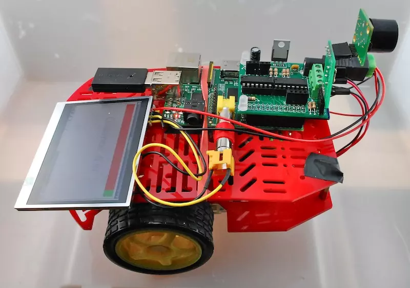
Yes, you can make robots like this one using the Python programming language! This one is from the Raspberry Pi Cookbook.
Step 2: Learn Basic Syntax (2 Weeks Maximum)
Start with essential Python syntax. Learn just enough to begin building. Most beginners spend too much time here and get frustrated.
Focus on:
- Variables and data types
- Loops and conditionals
- Functions
- Basic data structures (lists, dictionaries)
- Data visualization
Recommended resources:
- Intro to Python Course
- Data Visualization with Python Skill Path
- Data Cleaning with Python Skill Path
After two weeks, move on. You'll learn the rest naturally as you build projects you’re excited about.
Step 3: Complete Guided Projects (Weeks 3-6)
Once you know the basics, start building with guided projects. Jumping straight into your own project leads to decision paralysis and frustration. Guided projects give you confidence without the overwhelm.
Start with Dataquest's free guided projects. These walk you through real-world projects with step-by-step instructions and an embedded code editor. No setup required. You can start coding right away:
- Interactive Word Game — Build a playable game using loops and logic
- Exploring Hacker News Posts — Analyze post trends and popularity
- Predicting Heart Disease — Build a simple machine learning model
- Explore eBay Car Sales — Clean and analyze real sales data
Here's a list of all of our free projects.
Step 4: Build Your Own Projects (Months 2-3)
After completing a few guided projects, create your own. This is where real learning happens.
Start small. Finishing a simple project beats getting stuck on a complex one. Progress comes from consistency, not perfection.
How to find Python project ideas:
- Read our Python project ideas guide
- Extend projects you've already built
- Browse Python repositories on GitHub
- Volunteer with nonprofits needing developers (like Catchafire or Volunteer HQ)
- Build tools that solve your everyday problems
When you get stuck:
- Search StackOverflow for similar problems
- Read the official Python documentation
- Use AI coding assistants like Claude Code
Step 5: Specialize and Go Deeper (Months 4-6)
Once you're comfortable with independent projects, focus on your chosen field. Specialization prepares you for professional work.
Actions to take:
- Master relevant libraries (pandas for data, PyTorch for deep learning, Django for web)
- Build more complex projects that challenge you
- Create a portfolio showcasing your best work
- Contribute to open-source projects
Getting Started Today
That's the method. Five steps, six months, project-first learning from day one. No wasted time memorizing syntax you'll forget. No tutorial paralysis.
The hardest part isn't learning Python. It's picking a resource and starting. Most people spend weeks researching the "perfect" course and never write a single line of code.
Don't do that. Pick one resource below, commit to it for a month, and start building.
Where to Learn Python
For the project-first approach in this guide, your choice of resource matters. Some platforms get you building immediately. Others make you watch hours of lectures first.
My Primary Recommendation: Interactive Platforms
Dataquest is designed for those who learn best by doing. You start coding on day one in an interactive browser environment. No setup, no videos to watch. Just immediate hands-on practice with real projects.
Why this works: You build your portfolio while learning. No delay between "learning" and "doing."
Career paths that follow this guide: Dataquest offers structured career paths that use this exact methodology—project-first learning from basics to job-ready skills:
- Data Analyst in Python — Learn data cleaning, visualization, and SQL for analysis roles
- Data Scientist in Python — Master machine learning, statistics, and advanced analytics
- Data Engineer in Python — Build data pipelines, work with databases, and learn cloud computing
Each path takes you from complete beginner to portfolio-ready in months, following the same 5-step method outlined above.
Books: Good for Self-Paced Learners
If you prefer reading to interactive platforms, Automate the Boring Stuff with Python by Al Sweigart is free online and gets you building automation tools immediately. Python Crash Course by Eric Matthes is another solid project-based option.
The tradeoff: Books require more self-discipline. You need to type all the code yourself and troubleshoot without instant feedback.
Tutorials and Documentation: Essential Supplements
Online tutorials and cheat sheets are invaluable when you get stuck on specific concepts.
Use these: As references while working on projects, not as your primary learning method.
Bootcamps: Fast but Expensive
Python bootcamps like those from General Assembly, Le Wagon, and Flatiron School offer 12-16 week intensive courses with career support. However, they can cost \$10,000 to \$20,000 and require a full-time commitment.
Choose bootcamps if: You need external accountability, want job placement support, and can afford to study full-time. The structure works, but you're paying for accountability you could create yourself.
University Courses: Theory-Heavy
Free courses from Harvard (CS50), MIT, and Stanford provide strong computer science foundations but move slowly. They emphasize theory before application.
Best for: Graduate school preparation or deep CS understanding. Not ideal if your goal is to build projects and get hired quickly.
Bottom Line
Start with one primary resource and stick with it. I recommend Dataquest for data science and AI paths because it aligns with project-first learning. Use tutorials and documentation as supplements when you hit specific roadblocks.
Switching between multiple courses wastes time. Pick one, commit for at least 4-6 weeks, then evaluate.
Final Thoughts
Python is always evolving. No one fully masters it. Six months from now, your early code will look rough. This is a sign you're on the right track.
The difference between beginners who quit and those who succeed isn't talent. It's consistency and the right approach.
Start today. Pick your area of interest, spend two weeks on basics, and begin building projects. That's all it takes.
Your Python journey starts now.
FAQs
Is Python still popular in 2026?
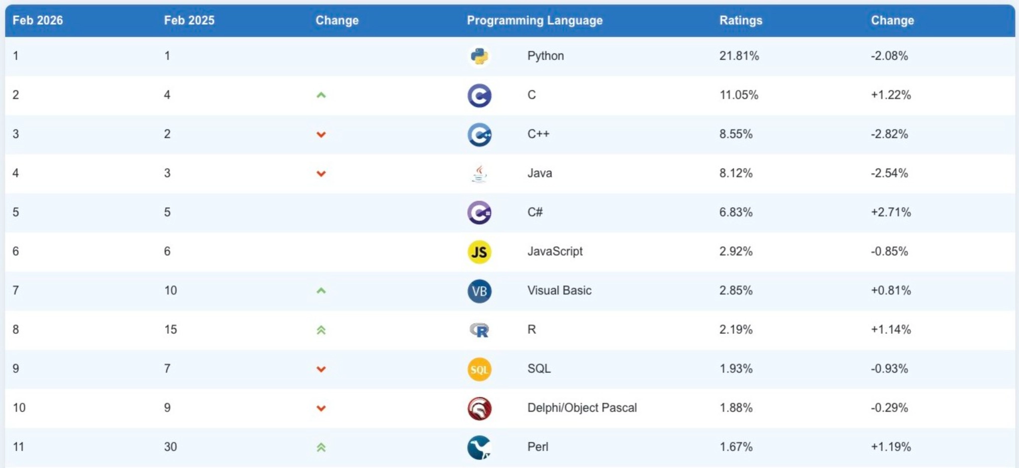
Yes. Python ranks #1 on the TIOBE Programming Community index as of February 2026. It's more in demand than ever, especially with the rise of AI. Many AI tools and applications are built with Python, and it remains essential for machine learning, data analysis, web development, and automation.
How long does it take to learn Python?
You can learn the basics in a few weeks. To become job-ready, expect to spend 4-12 months on consistent practice. This timeline depends on your background and how much time you dedicate to learning. With an effective learning plan, it may take less time than you think.
Can I use AI tools to learn Python?
Yes. AI assistants can explain concepts, help debug errors, and generate code examples. However, they work best alongside a structured learning path. Combining AI tools with hands-on coding practice helps you learn faster and retain more.
Is Python hard to learn?
Python is one of the easiest programming languages for beginners. Its syntax reads almost like English. Some concepts can be tricky at first, but with regular practice and small projects, most learners find Python easier than expected.
Can I teach myself Python?
Absolutely. Many successful Python developers are self-taught. The key is consistency, regular practice, and working on projects. Following a structured platform like Dataquest makes self-learning easier with step-by-step guidance, hands-on exercises, and progress tracking.