Analyzing Kaggle Data Science Survey: Programming Languages and Compensation
In this project walkthrough, I'll share how to analyze a Kaggle Data Science Survey to practice core skills for data science professionals and gain insights into salary expectations based on years of experience. This analysis uses fundamental Python skills like lists, loops, and conditional logic. While more advanced tools like pandas could streamline this process, working with basic Python can help you build a strong foundation in data manipulation and analysis.
Project Overview
For this project, we assume the role of a data analyst for Kaggle, examining survey data from data scientists who shared details about:
- Their years of coding experience (
experience_coding) - Programming languages they use (
python_user,r_user,sql_user) - Preferred libraries and tools (
most_used) - Compensation (
compensation)
Our goal is to answer two key questions:
- What programming languages are most common among data scientists?
- How does compensation relate to years of experience?
Setting Up the Environment
1. Set Up Your Workspace
We'll work with an .ipynb file, which can be rendered in the following tools:
- Jupyter Notebook (create your own .ipynb file if working locally, installation required)
- Google Colab (Jupyter Notebook alternative, no installation required)
- Dataquest platform (work directly in your browser, no installation required)
2. Download the Resource File
To follow along with the tutorial, you'll need two essential resources: the Basics.ipynb Jupyter notebook containing all the code and analysis steps we'll explore together, and the kaggle2021-short.csv dataset file, which houses the Kaggle survey responses we'll be analyzing.
Let's start by loading our data from the CSV file. For this beginner-friendly approach, we'll use Python's built-in CSV module rather than pandas:
import csv

with open('kaggle2021-short.csv') as f:
    reader = csv.reader(f, delimiter=",")
    kaggle_data = list(reader)

column_names = kaggle_data[0]
survey_responses = kaggle_data[1:]

print(column_names)
for row in range(0,5):
    print(survey_responses[row])
The output shows the column structure and first few rows of our data:
['experience_coding', 'python_user', 'r_user', 'sql_user', 'most_used', 'compensation']
['6.1', 'TRUE', 'FALSE', 'TRUE', 'Scikit-learn', '124267']
['12.3', 'TRUE', 'TRUE', 'TRUE', 'Scikit-learn', '236889']
['2.2', 'TRUE', 'FALSE', 'FALSE', 'None', '74321']
['2.7', 'FALSE', 'FALSE', 'TRUE', 'None', '62593']
['1.2', 'TRUE', 'FALSE', 'FALSE', 'Scikit-learn', '36288']
Instructor Insight: When I first started this project, looking at the raw data like this was important. It immediately showed me that all values were stored as strings (notice the quotes around the numbers), which wouldn't work for numerical calculations. Always take time to understand your data structure before diving into analysis!
Data Cleaning
The data needs some cleaning before we can analyze it properly. When we read the CSV file, everything comes in as strings, but we need:
experience_codingas a float (decimal number)python_user,r_user, andsql_useras boolean values (True/False)most_usedasNoneor a stringcompensationas an integer
Here's how I converted each column to the appropriate data type:
# Iterate over the indices so that we can update all of the data
num_rows = len(survey_responses)
for i in range(num_rows):

    # experience_coding
    survey_responses[i][0] = float(survey_responses[i][0])

    # python_user
    if survey_responses[i][1] == "TRUE":
        survey_responses[i][1] = True
    else:
        survey_responses[i][1] = False

    # r_user
    if survey_responses[i][2] == "TRUE":
        survey_responses[i][2] = True
    else:
        survey_responses[i][2] = False

    # sql_user
    if survey_responses[i][3] == "TRUE":
        survey_responses[i][3] = True
    else:
        survey_responses[i][3] = False

    # most_used
    if survey_responses[i][4] == "None":
        survey_responses[i][4] = None
    else:
        survey_responses[i][4] = survey_responses[i][4]

    # compensation
    survey_responses[i][5] = int(survey_responses[i][5])
Let's verify that our data conversion worked correctly:
print(column_names)
for row in range(0,4):
    print(survey_responses[row])
Output:
['experience_coding', 'python_user', 'r_user', 'sql_user', 'most_used', 'compensation']
[6.1, True, False, True, 'Scikit-learn', 124267]
[12.3, True, True, True, 'Scikit-learn', 236889]
[2.2, True, False, False, None, 74321]
[2.7, False, False, True, None, 62593]
Instructor Insight: I once spent hours debugging why calculations weren't working, only to realize I was trying to perform math operations on strings instead of numbers! Now, checking data types is one of my first steps in any analysis.
Analyzing Programming Language Usage
Now that our data is cleaned, let's find out how many data scientists use each programming language:
# Initialize counters
python_user_count = 0
r_user_count = 0
sql_user_count = 0

for i in range(num_rows):

    # Detect if python_user column is True
    if survey_responses[i][1]:
        python_user_count = python_user_count + 1

    # Detect if r_user column is True
    if survey_responses[i][2]:
        r_user_count = r_user_count + 1

    # Detect if sql_user column is True
    if survey_responses[i][3]:
        sql_user_count = sql_user_count + 1
To display the results in a more readable format, I'll use a dictionary and formatted strings:
user_counts = {
    "Python": python_user_count,
    "R": r_user_count,
    "SQL": sql_user_count
}

for language, count in user_counts.items():
    print(f"Number of {language} users: {count}")
    print(f"Proportion of {language} users: {count / num_rows}\n")
Output:
Number of Python users: 21860
Proportion of Python users: 0.8416432449081739

Number of R users: 5335
Proportion of R users: 0.20540561352173412

Number of SQL users: 10757
Proportion of SQL users: 0.4141608593539445
Instructor Insight: I love using f-strings (formatted strings) for displaying results. Before I discovered them, I would use string concatenation with + signs and had to convert numbers to strings using str(). F-strings make everything cleaner and more readable. Just add an f before the string and use curly braces {} to include variables!
The results clearly show that Python dominates in the data science field, with over 84% of respondents using it. SQL is the second most popular at around 41%, while R is used by about 20% of respondents.
Experience and Compensation Analysis
Now, let's explore the second question: How does compensation relate to years of experience? First, I'll separate these columns into their own lists to make them easier to work with:
# Aggregating all years of experience and compensation together into a single list
experience_coding_column = []
compensation_column = []

for i in range(num_rows):
    experience_coding_column.append(survey_responses[i][0])
    compensation_column.append(survey_responses[i][5])

# testing that the loop acted as-expected
print(experience_coding_column[0:5])
print(compensation_column[0:5])
Output:
[6.1, 12.3, 2.2, 2.7, 1.2]
[124267, 236889, 74321, 62593, 36288]
Let's look at some summary statistics for years of experience:
# Summarizing the experience_coding column
min_experience_coding = min(experience_coding_column)
max_experience_coding = max(experience_coding_column)
avg_experience_coding = sum(experience_coding_column) / num_rows

print(f"Minimum years of experience: {min_experience_coding}")
print(f"Maximum years of experience: {max_experience_coding}")
print(f"Average years of experience: {avg_experience_coding}")
Output:
Minimum years of experience: 0.0
Maximum years of experience: 30.0
Average years of experience: 5.297231740653729
While these summary statistics are helpful, a visualization will give us a better understanding of the distribution. Let's create a histogram of years of experience:
import matplotlib.pyplot as plt

%matplotlib inline
plt.hist(experience_coding_column)
plt.show()
The histogram reveals that most data scientists in the survey have relatively few years of experience (0-5 years), with a long tail of professionals having more experience.
Now, let's look at the compensation data:
# Summarizing the compensation column
min_compensation = min(compensation_column)
max_compensation = max(compensation_column)
avg_compensation = sum(compensation_column) / num_rows

print(f"Minimum compensation: {min_compensation}")
print(f"Maximum compensation: {max_compensation}")
print(f"Average compensation: {round(avg_compensation, 2)}")
Output:
Minimum compensation: 0
Maximum compensation: 1492951
Average compensation: 53252.82
Instructor Insight: When I first saw the maximum compensation of nearly $1.5 million, I was shocked! This is likely an outlier and might be skewing our average. In a more thorough analysis, I would investigate this further and perhaps remove extreme outliers. Always question data points that seem unusually high or low.
Let's also create a histogram for compensation:
plt.hist(compensation_column)
plt.show()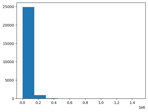
The histogram for compensation is extremely right-skewed, with most values clustered on the left side and a few extremely high values stretching out to the right. This makes it difficult to see the details of the distribution.
Analyzing Compensation by Experience Level
To better understand the relationship between experience and compensation, let's categorize experience into bins and analyze the average compensation for each bin.
First, let's add a new categorical column to our dataset that groups years of experience:
for i in range(num_rows):

    if survey_responses[i][0] < 5:
        survey_responses[i].append("<5 Years")

    elif survey_responses[i][0] >= 5 and survey_responses[i][0] < 10:
        survey_responses[i].append("5-10 Years")

    elif survey_responses[i][0] >= 10 and survey_responses[i][0] < 15:
        survey_responses[i].append("10-15 Years")

    elif survey_responses[i][0] >= 15 and survey_responses[i][0] < 20:
        survey_responses[i].append("15-20 Years")

    elif survey_responses[i][0] >= 20 and survey_responses[i][0] < 25:
        survey_responses[i].append("20-25 Years")

    else:
        survey_responses[i].append("25+ Years")
Now, let's create separate lists for compensation in each experience bin:
bin_0_to_5 = []
bin_5_to_10 = []
bin_10_to_15 = []
bin_15_to_20 = []
bin_20_to_25 = []
bin_25_to_30 = []

for i in range(num_rows):

    if survey_responses[i][6] == "<5 Years":
        bin_0_to_5.append(survey_responses[i][5])

    elif survey_responses[i][6] == "5-10 Years":
        bin_5_to_10.append(survey_responses[i][5])

    elif survey_responses[i][6] == "10-15 Years":
        bin_10_to_15.append(survey_responses[i][5])

    elif survey_responses[i][6] == "15-20 Years":
        bin_15_to_20.append(survey_responses[i][5])

    elif survey_responses[i][6] == "20-25 Years":
        bin_20_to_25.append(survey_responses[i][5])

    else:
        bin_25_to_30.append(survey_responses[i][5])
Let's see how many people fall into each experience bin:
# Checking the distribution of experience in the dataset
print("People with < 5 years of experience: " + str(len(bin_0_to_5)))
print("People with 5 - 10 years of experience: " + str(len(bin_5_to_10)))
print("People with 10 - 15 years of experience: " + str(len(bin_10_to_15)))
print("People with 15 - 20 years of experience: " + str(len(bin_15_to_20)))
print("People with 20 - 25 years of experience: " + str(len(bin_20_to_25)))
print("People with 25+ years of experience: " + str(len(bin_25_to_30)))
Output:
People with < 5 years of experience: 18753
People with 5 - 10 years of experience: 3167
People with 10 - 15 years of experience: 1118
People with 15 - 20 years of experience: 1069
People with 20 - 25 years of experience: 925
People with 25+ years of experience: 941
Let's visualize this distribution:
bar_labels = ["<5", "5-10", "10-15", "15-20", "20-25", "25+"]
experience_counts = [len(bin_0_to_5),
               len(bin_5_to_10),
               len(bin_10_to_15),
               len(bin_15_to_20),
               len(bin_20_to_25),
               len(bin_25_to_30)]

plt.bar(bar_labels, experience_counts)
plt.title("Years of Experience")
plt.xlabel("Years")
plt.ylabel("Count")
plt.show()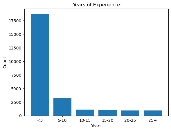
Instructor Insight: This visualization clearly shows that the vast majority of respondents (over 18,000) have less than 5 years of experience. This makes sense given how rapidly the data science field has grown in recent years, with many newcomers entering the profession.
Now, let's calculate and display the average compensation for each experience bin:
avg_0_5 = sum(bin_0_to_5) / len(bin_0_to_5)
avg_5_10 = sum(bin_5_to_10) / len(bin_5_to_10)
avg_10_15 = sum(bin_10_to_15) / len(bin_10_to_15)
avg_15_20 = sum(bin_15_to_20) / len(bin_15_to_20)
avg_20_25 = sum(bin_20_to_25) / len(bin_20_to_25)
avg_25_30 = sum(bin_25_to_30) / len(bin_25_to_30)

salary_averages = [avg_0_5,
                   avg_5_10,
                   avg_10_15,
                   avg_15_20,
                   avg_20_25,
                   avg_25_30]

# Checking the distribution of experience in the dataset
print(f"Average salary of people with < 5 years of experience: {avg_0_5}")
print(f"Average salary of people with 5 - 10 years of experience: {avg_5_10}")
print(f"Average salary of people with 10 - 15 years of experience: {avg_10_15}")
print(f"Average salary of people with 15 - 20 years of experience: {avg_15_20}")
print(f"Average salary of people with 20 - 25 years of experience: {avg_20_25}")
print(f"Average salary of people with 25+ years of experience: {avg_25_30}")
Output:
Average salary of people with < 5 years of experience: 45047.87484669119
Average salary of people with 5 - 10 years of experience: 59312.82033470161
Average salary of people with 10 - 15 years of experience: 80226.75581395348
Average salary of people with 15 - 20 years of experience: 75101.82694106642
Average salary of people with 20 - 25 years of experience: 103159.80432432433
Average salary of people with 25+ years of experience: 90444.98512221042
Finally, let's visualize this relationship:
plt.bar(bar_labels, salary_averages)
plt.title("Average Salary by Years of Experience")
plt.xlabel("Years")
plt.ylabel("Salary Average")
plt.axhline(avg_compensation, linestyle="--", color="black", label="overall avg")
plt.show()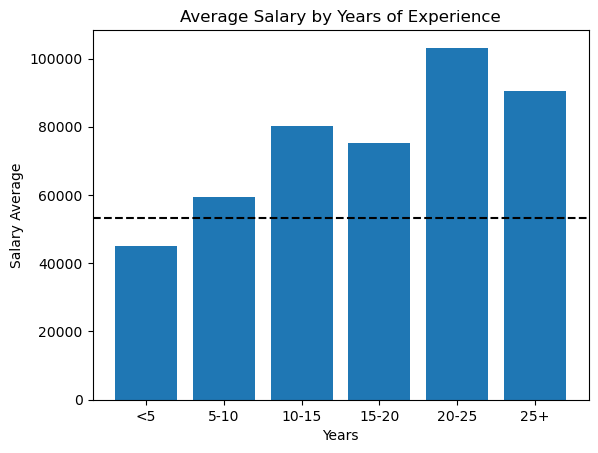
Instructor Insight: I was surprised to see that the relationship between experience and salary isn't perfectly linear. While salaries generally increase with experience, there's an unexpected dip in the 15-20 years range. I suspect this might be due to other factors like industry, role type, or location influencing compensation. It's a reminder that correlation doesn't always follow the pattern we expect!
The horizontal dashed line represents the overall average compensation across all experience levels. Notice that it's only higher than the lowest experience bracket, which makes sense considering that the majority of respondents have less than 5 years of experience, pulling the overall average down.
Key Findings
From this analysis, we can draw several interesting conclusions:
- Programming Language Popularity:
- Python is by far the most popular language, used by 84% of data scientists
- SQL is in second place with 41% usage
- R is less common but still significant at 20% usage
- Experience Distribution:
- The majority of data scientists (72%) have less than 5 years of experience
- This suggests data science is a relatively young field with many newcomers
- Compensation Trends:
- There is a general upward trend in compensation as experience increases
- The highest average compensation is for those with 20-25 years of experience (~$103,000)
- The relationship isn't perfectly linear, with some fluctuations in the trend
Next Steps and Further Analysis
This analysis provides valuable insights, but there are several ways we could extend it:
- Investigate Compensation Outliers:
- The maximum compensation of nearly $1.5 million seems unusually high and may be skewing our averages
- Cleaning the data to remove or cap outliers might give more accurate results
- Deeper Language Analysis:
- Do certain programming languages correlate with higher salaries?
- Are people who know multiple languages (e.g., Python and SQL) compensated better?
- Library and Tool Analysis:
- We haven't yet explored the
most_usedcolumn - Do users of certain libraries (like TensorFlow vs. scikit-learn) earn different salaries?
- We haven't yet explored the
- Time-based Analysis:
- This dataset is from 2021 - comparing it with more recent surveys could reveal changing trends
If you are new to Python, get started with our Python Basics for Data Analysis skill path to build the foundational skills needed for this project.
Looking for more about Kaggle? Check out these posts:
- Getting Started with Kaggle: House Prices Competition
- Kaggle Fundamentals: The Titanic Competition
- Kaggle Competition: How I Ranked in the Top 15 with My First Attempt
- The Tips and Tricks I used to succeed on Kaggle
Final Thoughts
I hope this walkthrough has been helpful in demonstrating how to perform data analysis using basic Python skills. Even without advanced tools like pandas, we can extract meaningful insights from data using fundamental programming techniques.
If you have questions about this analysis or would like to share your own insights, feel free to join the discussion in the Dataquest Community. I'd love to hear how you would approach this dataset!