Getting Started with Kaggle: House Prices Competition
Founded in 2010, Kaggle is a Data Science platform where users can share, collaborate, and compete. One key feature of Kaggle is “Competitions”, which offers users the ability to practice on real-world data and to test their skills with, and against, an international community.
This guide will teach you how to approach and enter a Kaggle competition, including exploring the data, creating and engineering features, building models, and submitting predictions. We’ll use Python 3 and Jupyter Notebook.
The Competition
We'll work through the House Prices: Advanced Regression Techniques competition.We’ll follow these steps to a successful Kaggle Competition submission:
- Acquire the data
- Explore the data
- Engineer and transform the features and the target variable
- Build a model
- Make and submit predictions
Step 1: Acquire the data and create our environment
We need to acquire the data for the competition. The descriptions of the features and some other helpful information are contained in a file with an obvious name,data_description.txt.
Download the data and save it into a folder where you’ll keep everything you need for the competition.
We will first look at the train.csv data. After we’ve trained a model, we’ll make predictions using the test.csv data.
First, import Pandas, a fantastic library for working with data in Python. Next we’ll import Numpy.
import pandas as pd
import numpy as np
We can use Pandas to read in csv files. The pd.read_csv() method creates a DataFrame from a csv file.
train = pd.read_csv('train.csv')
test = pd.read_csv('test.csv')
Let’s check out the size of the data.
print ("Train data shape:", train.shape)
print ("Test data shape:", test.shape)
Train data shape: (1460, 81)
Test data shape: (1459, 80)We see that test has only 80 columns, while train has 81. This is due to, of course, the fact that the test data do not include the final sale price information!
Next, we’ll look at a few rows using the DataFrame.head() method.
train.head()data dictionary available in our folder for the competition. You can also find it here.
Here’s a brief version of what you’ll find in the data description file:
SalePrice— the property's sale price in dollars. This is the target variable that you're trying to predict.MSSubClass— The building classMSZoning— The general zoning classificationLotFrontage— Linear feet of street connected to propertyLotArea— Lot size in square feetStreet— Type of road accessAlley— Type of alley accessLotShape— General shape of propertyLandContour— Flatness of the propertyUtilities— Type of utilities availableLotConfig— Lot configuration
The competition challenges you to predict the final price of each home. At this point, we should start to think about what we know about housing prices, Ames, Iowa, and what we might expect to see in this dataset.
Looking at the data, we see features we expected, like YrSold (the year the home was last sold) and SalePrice. Others we might not have anticipated, such as LandSlope (the slope of the land the home is built upon) and RoofMatl (the materials used to construct the roof). Later, we’ll have to make decisions about how we’ll approach these and other features.
We want to do some plotting during the exploration stage of our project, and we’ll need to import that functionality into our environment as well. Plotting allows us to visualize the distribution of the data, check for outliers, and see other patterns that we might miss otherwise. We’ll use Matplotlib, a popular visualization library.
import matplotlib.pyplot as plt
plt.style.use(style='ggplot')
plt.rcParams['figure.figsize'] = (10, 6)
Step 2: Explore the data and engineer Features
The challenge is to predict the final sale price of the homes. This information is stored in theSalePrice column. The value we are trying to predict is often called the target variable.
We can use Series.describe() to get more information.
train.SalePrice.describe()count 1460.000000
mean 180921.195890
std 79442.502883
min 34900.000000
25% 129975.000000
50% 163000.000000
75% 214000.00000
0max 755000.000000
Name: SalePrice, dtype: float64Series.describe() gives you more information about any series. count displays the total number of rows in the series. For numerical data, Series.describe() also gives the mean, std, min and max values as well.
The average sale price of a house in our dataset is close to $180,000, with most of the values falling within the $130,000 to $215,000 range.
Next, we’ll check for skewness, which is a measure of the shape of the distribution of values.
When performing regression, sometimes it makes sense to log-transform the target variable when it is skewed. One reason for this is to improve the linearity of the data. Although the justification is beyond the scope of this tutorial, more information can be found here.
Importantly, the predictions generated by the final model will also be log-transformed, so we’ll need to convert these predictions back to their original form later.
np.log() will transform the variable, and np.exp() will reverse the transformation.
We use plt.hist() to plot a histogram of SalePrice. Notice that the distribution has a longer tail on the right. The distribution is positively skewed.
print ("Skew is:", train.SalePrice.skew())
plt.hist(train.SalePrice, color='blue')
plt.show()
Skew is: 1.88287575977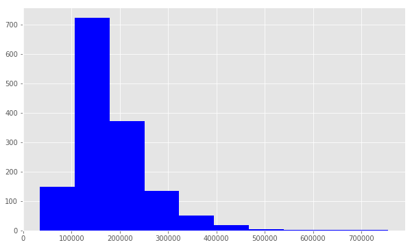
np.log() to transform train.SalePric and calculate the skewness a second time, as well as re-plot the data. A value closer to 0 means that we have improved the skewness of the data. We can see visually that the data will more resembles a normal distribution.
target = np.log(train.SalePrice)
print ("Skew is:", target.skew())
plt.hist(target, color='blue')
plt.show()
Skew is: 0.121335062205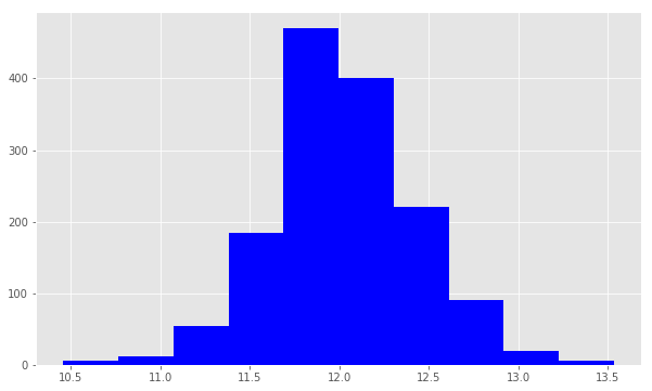
.select_dtypes() method will return a subset of columns matching the specified data types.
Working with Numeric Features
numeric_features = train.select_dtypes(include=[np.number])
numeric_features.dtypes
Id int64
MSSubClass int64
LotFrontage float64
LotArea int64
OverallQual int64
OverallCond int64
YearBuilt int64
YearRemodAdd int64
MasVnrArea float64
BsmtFinSF1 int64
BsmtFinSF2 int64
BsmtUnfSF int64
TotalBsmtSF int64
1stFlrSF int64
2ndFlrSF int64
LowQualFinSF int64
GrLivArea int64
BsmtFullBath int64
BsmtHalfBath int64
FullBath int64
HalfBath int64
BedroomAbvGr int64
KitchenAbvGr int64
TotRmsAbvGrd int64
Fireplaces int64
GarageYrBlt float64
GarageCars int64
GarageArea int64
WoodDeckSF int64
OpenPorchSF int64
EnclosedPorch int64
3SsnPorch int64
ScreenPorch int64
PoolArea int64
MiscVal int64
MoSold int64
YrSold int64
SalePrice int64
dtype: objectThe DataFrame.corr() method displays the correlation (or relationship) between the columns. We’ll examine the correlations between the features and the target.
corr = numeric_features.corr()
print (corr['SalePrice'].sort_values(ascending=False)[:5], '\n')
print (corr['SalePrice'].sort_values(ascending=False)[-5:])
SalePrice 1.000000
OverallQual 0.790982
GrLivArea 0.708624
GarageCars 0.640409
GarageArea 0.623431
Name: SalePrice, dtype: float64
YrSold -0.028923
OverallCond -0.077856
MSSubClass -0.084284
EnclosedPorch -0.128578
KitchenAbvGr -0.135907
Name: SalePrice, dtype: float64The first five features are the most positively correlated with SalePrice, while the next five are the most negatively correlated.
Let’s dig deeper on OverallQual. We can use the .unique() method to get the unique values.
train.OverallQual.unique()array([ 7, 6, 8, 5, 9, 4, 10, 3, 1, 2])The OverallQual data are integer values in the interval 1 to 10 inclusive.
We can create a pivot table to further investigate the relationship between OverallQual and SalePrice. The Pandas docs demonstrate how to accomplish this task. We set index=‘OverallQual’ and values=‘SalePrice’. We chose to look at the median here.
quality_pivot = train.pivot_table(index='OverallQual',
values='SalePrice', aggfunc=np.median)quality_pivotOverallQual
1 50150
2 60000
3 86250
4 108000
5 133000
6 160000
7 200141
8 269750
9 345000
10 432390
Name: SalePrice, dtype: int64To help us visualize this pivot table more easily, we can create a bar plot using the Series.plot() method.
quality_pivot.plot(kind='bar', color='blue')
plt.xlabel('Overall Quality')
plt.ylabel('Median Sale Price')
plt.xticks(rotation=0)plt.show()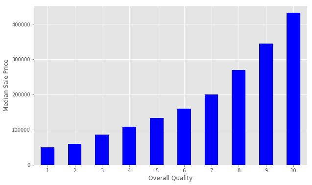
Next, let’s use plt.scatter() to generate some scatter plots and visualize the relationship between the Ground Living Area GrLivArea and SalePrice.
plt.scatter(x=train['GrLivArea'], y=target)
plt.ylabel('Sale Price')
plt.xlabel('Above grade (ground) living area square feet')
plt.show()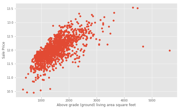
GarageArea.
plt.scatter(x=train['GarageArea'], y=target)
plt.ylabel('Sale Price')
plt.xlabel('Garage Area')
plt.show()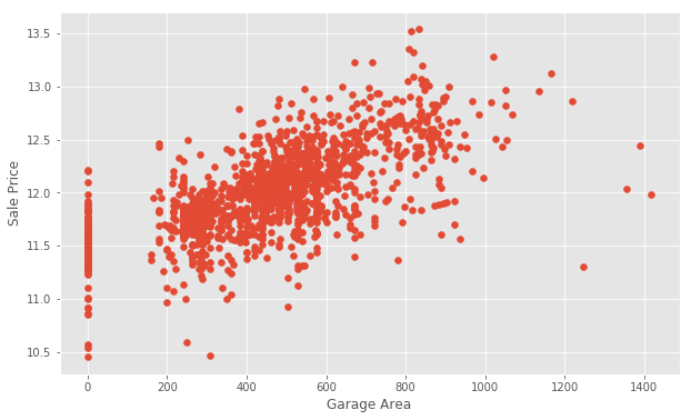
0 for Garage Area, indicating that they don't have a garage. We'll transform other features later to reflect this assumption. There are a few outliers as well. Outliers can affect a regression model by pulling our estimated regression line further away from the true population regression line. So, we'll remove those observations from our data. Removing outliers is an art and a science. There are many techniques for dealing with outliers.
We will create a new dataframe with some outliers removed.
train = train[train['GarageArea'] < 1200]Let’s take another look.
plt.scatter(x=train['GarageArea'], y=np.log(train.SalePrice))
plt.xlim(-200,1600) # This forces the same scale as before
plt.ylabel('Sale Price')
plt.xlabel('Garage Area')
plt.show()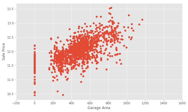
Handling Null Values
Next, we'll examine the null or missing values.We will create a DataFrame to view the top null columns. Chaining together the train.isnull().sum() methods, we return a Series of the counts of the null values in each column.
nulls = pd.DataFrame(train.isnull().sum().sort_values(ascending=False)[:25])
nulls.columns = ['Null Count']
nulls.index.name = 'Feature'
nullsPoolQC, the column refers to Pool Quality. Pool quality is NaN when PoolArea is 0, or there is no pool.
We can find a similar relationship between many of the Garage-related columns.
Let’s take a look at one of the other columns, MiscFeature. We’ll use the Series.unique() method to return a list of the unique values.
print ("Unique values are:", train.MiscFeature.unique())Unique values are: [nan 'Shed' 'Gar2' 'Othr' 'TenC']We can use the documentation to find out what these values indicate:
MiscFeature: Miscellaneous feature not covered in other categories

   Elev Elevator
   Gar2 2nd Garage (if not described in garage section)
   Othr Other
   Shed Shed (over 100 SF)
   TenC Tennis Court
   NA   None
These values describe whether or not the house has a shed over 100 sqft, a second garage, and so on. We might want to use this information later. It’s important to gather domain knowledge in order to make the best decisions when dealing with missing data.
Wrangling the non-numeric Features
Let's now consider the non-numeric features.categoricals = train.select_dtypes(exclude=[np.number])
categoricals.describe()count column indicates the count of non-null observations, while unique counts the number of unique values. top is the most commonly occurring value, with the frequency of the top value shown by freq.
For many of these features, we might want to use one-hot encoding to make use of the information for modeling. One-hot encoding is a technique which will transform categorical data into numbers so the model can understand whether or not a particular observation falls into one category or another.
Transforming and engineering features
When transforming features, it's important to remember that any transformations that you've applied to the training data before fitting the model must be applied to the test data.Our model expects that the shape of the features from the train set match those from the test set. This means that any feature engineering that occurred while working on the train data should be applied again on the test set.
To demonstrate how this works, consider the Street data, which indicates whether there is Gravel or Paved road access to the property.
print ("Original: \n")
print (train.Street.value_counts(), "\n")
Original:
Pave 1450
Grvl 5
Name: Street, dtype: int64In the Street column, the unique values are Pave and Grvl, which describe the type of road access to the property. In the training set, only 5 homes have gravel access. Our model needs numerical data, so we will use one-hot encoding to transform the data into a Boolean column.
We create a new column called enc_street. The pd.get_dummies() method will handle this for us.
As mentioned earlier, we need to do this on both the train and test data.
train['enc_street'] = pd.get_dummies(train.Street, drop_first=True)
test['enc_street'] = pd.get_dummies(train.Street, drop_first=True)
print ('Encoded: \n')
print (train.enc_street.value_counts())Encoded:
1 1450
0 5
Name: enc_street, dtype: int64The values agree. We’ve engineered our first feature! Feature Engineering is the process of making features of the data suitable for use in machine learning and modelling. When we encoded the Street feature into a column of Boolean values, we engineered a feature.
Let’s try engineering another feature. We’ll look at SaleCondition by constructing and plotting a pivot table, as we did above for OverallQual.
condition_pivot = train.pivot_table(index='SaleCondition', values='SalePrice', aggfunc=np.median)
condition_pivot.plot(kind='bar', color='blue')
plt.xlabel('Sale Condition')
plt.ylabel('Median Sale Price')
plt.xticks(rotation=0)
plt.show()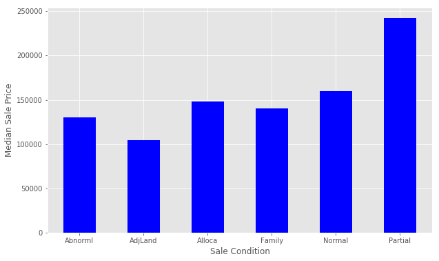
Partial has a significantly higher Median Sale Price than the others. We will encode this as a new feature. We select all of the houses where SaleCondition is equal to Patrial and assign the value 1, otherwise assign 0.
Follow a similar method that we used for Street above.
def encode(x):
 return 1 if x == 'Partial' else 0
train['enc_condition'] = train.SaleCondition.apply(encode)
test['enc_condition'] = test.SaleCondition.apply(encode)
Let’s explore this new feature as a plot.
condition_pivot = train.pivot_table(index='enc_condition', values='SalePrice', aggfunc=np.median)
condition_pivot.plot(kind='bar', color='blue')
plt.xlabel('Encoded Sale Condition')
plt.ylabel('Median Sale Price')
plt.xticks(rotation=0)
plt.show()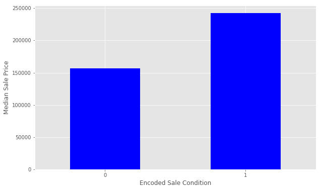
Before we prepare the data for modeling, we need to deal with the missing data. We’ll fill the missing values with an average value and then assign the results to data. This is a method of interpolation. The DataFrame.interpolate() method makes this simple.
This is a quick and simple method of dealing with missing values, and might not lead to the best performance of the model on new data. Handling missing values is an important part of the modeling process, where creativity and insight can make a big difference. This is another area where you can extend on this tutorial.
data = train.select_dtypes(include=[np.number]).interpolate().dropna()Check if the all of the columns have 0 null values.
sum(data.isnull().sum() != 0)0Step 3 : Build a linear model
Let's perform the final steps to prepare our data for modeling. We'll separate the features and the target variable for modeling. We will assign the features toX and the target variable to y. We use np.log() as explained above to transform the y variable for the model. data.drop([features], axis=1) tells pandas which columns we want to exclude. We won't include SalePrice for obvious reasons, and Id is just an index with no relationship to SalePrice.
y = np.log(train.SalePrice)
X = data.drop(['SalePrice', 'Id'], axis=1)
Let’s partition the data and start modeling.
We will use the train_test_split() function from scikit-learn to create a training set and a hold-out set. Partitioning the data in this way allows us to evaluate how our model might perform on data that it has never seen before. If we train the model on all of the test data, it will be difficult to tell if overfitting has taken place.
train_test_split() returns four objects:
X_trainis the subset of our features used for training.X_testis the subset which will be our 'hold-out' set - what we'll use to test the model.y_trainis the target variableSalePricewhich corresponds toX_train.y_testis the target variableSalePricewhich corresponds toX_test.
X denotes the set of predictor data, and y is the target variable. Next, we set random_state=42. This provides for reproducible results, since sci-kit learn's train_test_split will randomly partition the data. The test_size parameter tells the function what proportion of the data should be in the test partition. In this example, about 33% of the data is devoted to the hold-out set.
from sklearn.model_selection import train_test_split
X_train, X_test, y_train, y_test = train_test_split(
                          X, y, random_state=42, test_size=.33)
Begin modelling
We will first create a Linear Regression model. First, we instantiate the model.from sklearn import linear_model
lr = linear_model.LinearRegression()Next, we need to fit the model. First instantiate the model and next fit the model. Model fitting is a procedure that varies for different types of models. Put simply, we are estimating the relationship between our predictors and the target variable so we can make accurate predictions on new data.
We fit the model using X_train and y_train, and we’ll score with X_test and y_test. The lr.fit() method will fit the linear regression on the features and target variable that we pass.
model = lr.fit(X_train, y_train)Evaluate the performance and visualize results
Now, we want to evaluate the performance of the model. Each competition might evaluate the submissions differently. In this competition, Kaggle will evaluate our submission using root-mean-squared-error (RMSE). We'll also look at The r-squared value. The r-squared value is a measure of how close the data are to the fitted regression line. It takes a value between 0 and 1, 1 meaning that all of the variance in the target is explained by the data. In general, a higher r-squared value means a better fit.The model.score() method returns the r-squared value by default.
print ("R^2 is: \n", model.score(X_test, y_test))R^2 is:
0.888247770926This means that our features explain approximately 89% of the variance in our target variable. Follow the link above to learn more.
Next, we’ll consider rmse. To do so, use the model we have built to make predictions on the test data set.
predictions = model.predict(X_test)The model.predict() method will return a list of predictions given a set of predictors. Use model.predict() after fitting the model.
The mean_squared_error function takes two arrays and calculates the rmse.
from sklearn.metrics import mean_squared_error
print ('RMSE is: \n', mean_squared_error(y_test, predictions))
RMSE is:
0.0178417945196Interpreting this value is somewhat more intuitive that the r-squared value. The RMSE measures the distance between our predicted values and actual values.
We can view this relationship graphically with a scatter plot.
actual_values = y_test
plt.scatter(predictions, actual_values, alpha=.7,
            color='b') #alpha helps to show overlapping data
plt.xlabel('Predicted Price')
plt.ylabel('Actual Price')
plt.title('Linear Regression Model')
plt.show()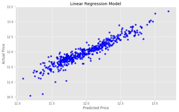
y=x because each predicted value x would be equal to each actual value y.
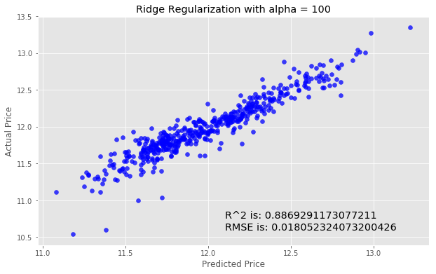
Try to improve the model
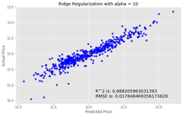
We'll next try using Ridge Regularization to decrease the influence of less important features. Ridge Regularization is a process which shrinks the regression coefficients of less important features.We’ll once again instantiate the model. The Ridge Regularization model takes a parameter, alpha , which controls the strength of the regularization.
We’ll experiment by looping through a few different values of alpha, and see how this changes our results.
for i in range (-2, 3):
    alpha = 10**i
    rm = linear_model.Ridge(alpha=alpha)
    ridge_model = rm.fit(X_train, y_train)
    preds_ridge = ridge_model.predict(X_test)

    plt.scatter(preds_ridge, actual_values, alpha=.75, color='b')
    plt.xlabel('Predicted Price')
    plt.ylabel('Actual Price')
    plt.title('Ridge Regularization with alpha = {}'.format(alpha))
    overlay = 'R^2 is: {}\nRMSE is: {}'.format(
                    ridge_model.score(X_test, y_test),
                    mean_squared_error(y_test, preds_ridge))
    plt.annotate(s=overlay,xy=(12.1,10.6),size='x-large')
    plt.show()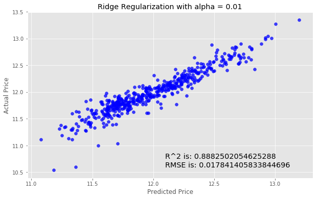


Step 4: Make a submission
We'll need to create acsv that contains the predicted SalePrice for each observation in the test.csv dataset.
We’ll log in to our Kaggle account and go to the submission page to make a submission.
We will use the DataFrame.to_csv() to create a csv to submit.
The first column must the contain the ID from the test data.
submission = pd.DataFrame()
submission['Id'] = test.Id
Now, select the features from the test data for the model as we did above.
feats = test.select_dtypes(
        include=[np.number]).drop(['Id'], axis=1).interpolate()
Next, we generate our predictions.
predictions = model.predict(feats)Now we’ll transform the predictions to the correct form. Remember that to reverse log() we do exp().
So we will apply np.exp() to our predictions becasuse we have taken the logarithm previously.
final_predictions = np.exp(predictions)Look at the difference.
print ("Original predictions are: \n", predictions[:5], "\n")
print ("Final predictions are: \n", final_predictions[:5])
Original predictions are:
[ 11.76725362 11.71929504 12.07656074 12.20632678 12.11217655]
Final predictions are:
[ 128959.49172586 122920.74024358 175704.82598102 200050.83263756 182075.46986405]Lets assign these predictions and check that everything looks good.
submission['SalePrice'] = final_predictions
submission.head().csv file as Kaggle expects. We pass index=False because Pandas otherwise would create a new index for us.
submission.to_csv('submission.csv', index=False)Submit our results
We've created a file calledsubmission1.csv in our working directory that conforms to the correct format. Go to the submission page to make a submission.
We placed 1602 out of about 2400 competitors. Almost middle of the pack, not bad! Notice that our score here is .15097, which is better than the score we observed on the test data. That’s a good result, but will not always be the case.
Next steps
You can extend this tutorial and improve your results by:- Working with and transforming other features in the training set
- Experimenting with different modeling techniques, such as Random Forest Regressors or Gradient Boosting
- Using ensembling models
categoricals that were not all included in the final model. Go back and try to include these features. There are other methods that might help with categorical data, notably the pd.get_dummies() method. After working on these features, repeat the transformations for the test data and make another submission.
Working on models and participating in Kaggle competitions can be an iterative process — it’s important to experiment with new ideas, learn about the data, and test newer models and techniques.
With these tools, you can build upon your work and improve your results.
Good luck!
