Tutorial 3: Telling Stories Using Data Visualization and Information Design
Main Guide Page
Tutorial 1: Introduction to NumPy and pandas for Data Analysis
Tutorial 2: Introduction to Data Visualization in Python
Tutorial 3: Data Storytelling and Information Design - You are here
NumPy Cheat Sheet and PDF Download
Pandas Cheat Sheet and PDF Download
Presenting data analysis findings to non-technical audiences is a tough gig. I've been there—standing in front of a room, watching eyes glaze over as I clicked through slide after slide of charts. The numbers made perfect sense to me, but they just weren't landing with my audience. It was frustrating (and a bit embarrassing), but I realized that simply showing data wasn't enough. I needed to tell a story with it. By focusing on visual design and weaving in a clear narrative, I found I could transform raw data into something engaging, turning complex insights into a data story that stuck with the audience.
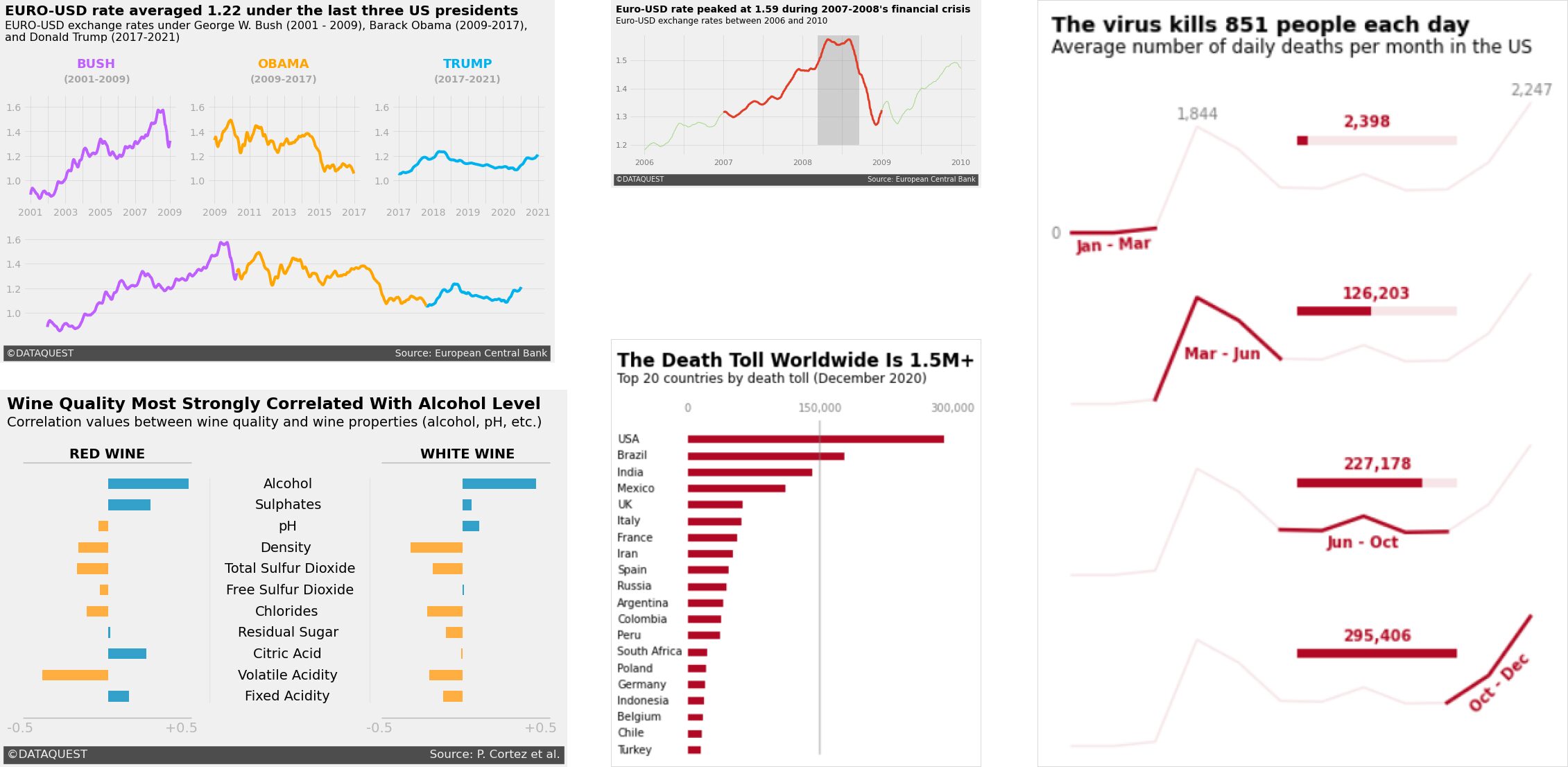
When done well, data visualizations don't just present information—they tell a story. Think of the best ones you've seen: they go beyond showing numbers on a chart and give you insights that stick with you. Take a look at the image below. These charts, inspired by the clean and engaging style of FiveThirtyEight, each tell a unique story using the same principles. Whether it's tracking currency trends, showing the impact of a virus, or uncovering correlations in wine quality, the design draws you in and helps you understand the data on a deeper level.
But style is just the start. To be truly gifted at data storytelling, it's important to understand how people perceive and process visuals. That's where concepts like Gestalt principles and pre-attentive attributes come into play. When I was working on a machine learning project with weather data, I used these principles to refine my visualizations. By thinking carefully about proximity, similarity, and continuity, I grouped related weather data points closer together, making seasonal patterns stand out more clearly.
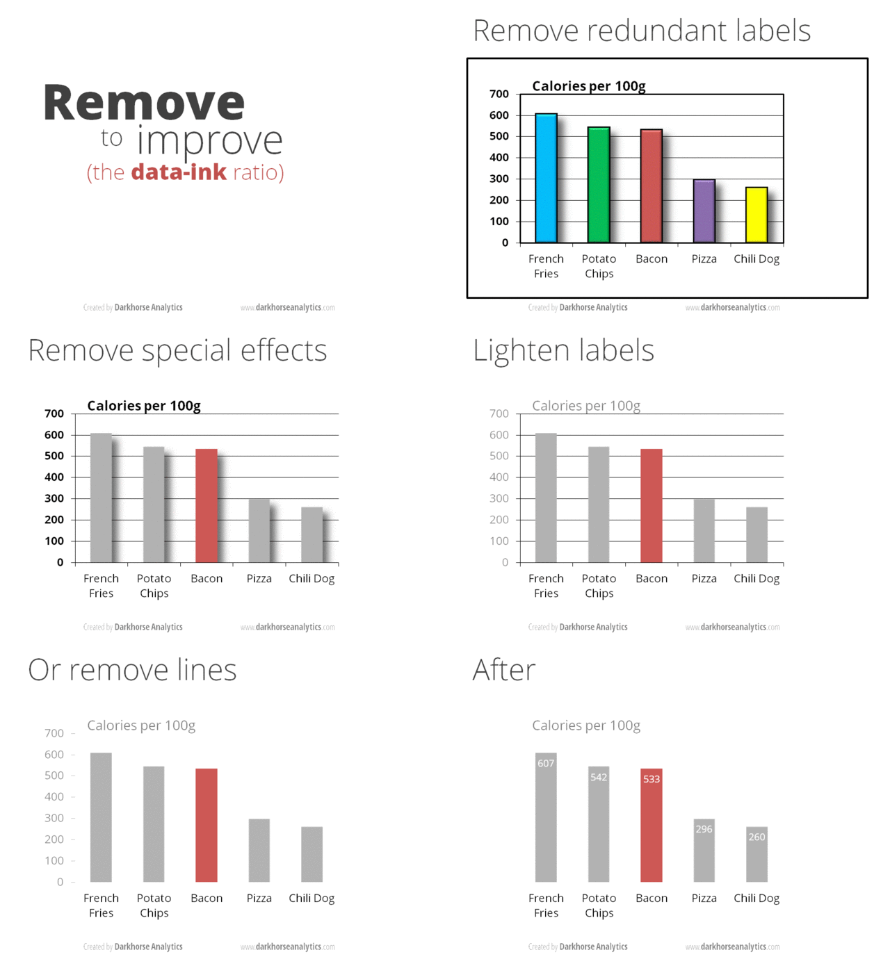
One of the most valuable lessons I've learned in data storytelling is the importance of maximizing the data-ink ratio, a concept coined by Edward Tufte. This principle encourages us to strip away unnecessary elements from our visualizations so that every bit of ink on the page serves a purpose—communicating data. Whether you're presenting to a technical team or a group of executives, removing excess decoration and focusing on the data itself makes your insights clearer and more impactful. The animation below beautifully illustrates this 'less is more' approach in action.
In this tutorial, we'll explore how to craft compelling visual narratives from complex data, improving your skills in data visualization and storytelling with Python. You'll learn how to use Matplotlib and seaborn to create professional visualizations that effectively communicate insights, helping you to better convey your findings and drive meaningful discussions.
Let's start off by looking at how to design visualizations with our audience in mind. This essential first step will set the foundation for creating impactful data stories that speak to your audience and effectively convey your insights.
Lesson 1 – Design for an Audience
When creating data visualizations, we should remember that different audiences need different approaches. I've learned this firsthand at Dataquest, where I've seen how tailoring visualizations to specific audiences can significantly impact the effectiveness of data storytelling.
While analyzing the performance of one of our courses, I created a detailed, technical visualization that showed completion rates, time spent, and difficulty ratings for each lesson in the course. Our content team absolutely loved it―they could see exactly where students were struggling and excelling. However, when I showed it to our marketing team, they were flooded by information they didn't understand. And honestly, it was information they didn't actually need. What they needed was something simpler that highlighted the overall value of our courses.
This experience taught me a valuable lesson: know your audience. I ended up creating two separate visualizations―one for our content team with all the details, and another for marketing that focused on the big picture success metrics. The result? Both teams got exactly what they needed, and we were able to make more informed decisions across the board.
Designing for Clarity and Impact
So, how can you apply this lesson to your own data visualizations? Let's take a look at how we can use Matplotlib to create graphs that speak directly to our intended audience.
When designing for your audience, think about what information is most relevant to them. For example, if you were creating a visualization about COVID-19 death tolls for a news article, you might want to focus on the countries with the highest numbers and present the information in a clear, easy-to-understand format. You can download the dataset here for this lesson if you want to code along with me.
Here's how we might start creating such a visualization using Matplotlib:
import pandas as pd
import matplotlib.pyplot as plt

top20_deathtoll = pd.read_csv('top20_deathtoll.csv')
plt.barh(top20_deathtoll['Country_Other'],
         top20_deathtoll['Total_Deaths'])
plt.show()
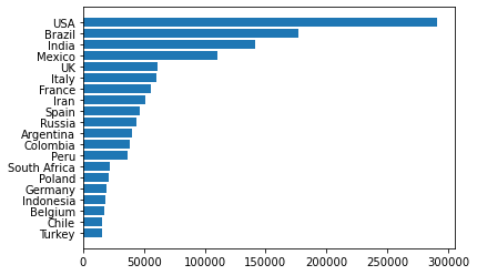
At first glance, the plot above seems to be doing its job—it gives us the numbers. But we can already spot a few opportunities for improvement:
- Thinner bars: We'll reduce the thickness of the bars to create more visual breathing room, making the data feel less cramped.
- Frame removal: We'll eliminate the borders (spines) around the plot that don't contribute to understanding the data.
- Custom x-ticks: Instead of the default ticks, we'll set specific values to show only the most important points (0; 150,000; 300,000).
- Move x-axis labels: We'll move the x-axis labels to the top of the chart so that the labels are closer to the countries with higher values.
- Subtle color scheme: We'll change the color of the bars to a deeper red, drawing attention to the data while maintaining a minimalist design.
- Clean tick marks: We'll remove the distracting tick marks and adjust the remaining ones for a cleaner look.
Object-Oriented Interface
To make these improvements, we will switch from Matplotlib's functional interface (where plotting is done using plt functions) to its more powerful object-oriented (OO) interface. The OO interface gives us more control over the fine details of our plot, allowing us to maximize the data-ink ratio by removing unnecessary design elements and focusing purely on the data. As we iterate to improve this plot, we'll use this approach to refine our data visualization, ensuring that every design choice amplifies the data and enhances clarity.
fig, ax = plt.subplots(figsize=(4.5, 6))
ax.barh(top20_deathtoll['Country_Other'],
        top20_deathtoll['Total_Deaths'],
        height=0.45, color='#af0b1e')  # Reduce the thickness of bars

# Remove the frame around the plot
for location in ['left', 'right', 'top', 'bottom']:
    ax.spines[location].set_visible(False)

ax.set_xticks([0, 150000, 300000])  # Set specific x-axis ticks
ax.xaxis.tick_top()  # Move x-axis labels to the top
ax.tick_params(top=False, left=False)  # Remove tick marks
ax.tick_params(axis='x', colors='grey')  # Color x-axis labels grey
plt.show()
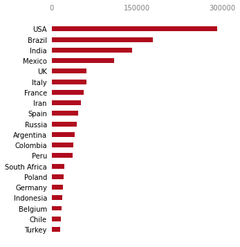
As you can see, we've improved upon the previous plot significantly. Here's a breakdown of the adjustments we've made:
- We reduced the bar thickness, creating more visual breathing room and improving readability.
- The removal of spines (borders) eliminates unnecessary visual noise, keeping the focus squarely on the data.
- We've moved the x-axis labels to the top and styled them in grey, ensuring they're visible but don't distract from the main data.
- By changing the bar color to a deeper red, we've added subtle emphasis that helps the data stand out while maintaining a clean design.
Although we've improved the plot's overall appearance and functionality, we can still make a few more tweaks to further increase clarity and context for our audience.
Final Touches
Here's what we'll adjust in the final round of adjustments:
- Add a bold title and subtitle: These will provide context and emphasize the key takeaway at a glance.
- Customize axis labels: We'll standardize the x-axis labels and remove the default y-axis labels to declutter the plot.
- Align the country names manually: By left-justifying the country names beside their corresponding bars, we'll make the text easier to read. Our brains tend to find left-justified text in a column format more natural and readable compared to the default right-justified layout.
- Add a reference line: We'll add a vertical line at 150,000 will to serve as a visual benchmark, helping readers gauge the death tolls more effectively.
ax.text(x=-80000, y=23.5,
        s='The Death Toll Worldwide Is 1.5M+', weight='bold', size=17)  # Add a bold title
ax.text(x=-80000, y=22.5,
        s='Top 20 countries by death toll (December 2020)', size=12)  # Add a smaller subtitle
ax.set_xticklabels(['0', '150,000', '300,000'])
ax.set_yticklabels([]) # an empty list removes the labels
country_names = top20_deathtoll['Country_Other']
for i, country in zip(range(20), country_names):
    ax.text(x=-80000, y=i-0.15, s=country)
ax.axvline(x=150000, ymin=0.045, c='grey', alpha=0.5)

plt.show()
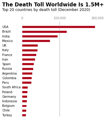
With these final tweaks, we've turned a basic bar chart into a clear, engaging visualization. The bold title and subtitle deliver the main point at a glance, while the left-aligned country names make it easier for the eye to follow. By adding a reference line at 150,000 and simplifying the axis labels, we've helped the viewer quickly spot meaningful patterns without distractions.
This final version focuses entirely on the data, keeping the design clean and purposeful. Every element adds value, ensuring the chart is both easy to understand and visually appealing. In the next section, we'll look at some best practices to keep in mind when designing your own data visualizations.
Best Practices for Audience-Focused Design
When you're designing visualizations for your audience, keep these points in mind:
- Think about your audience's level of understanding. Are they data scientists who can handle complex statistical concepts, or are they executives who need to see the big picture?
- Consider what information is most relevant to your audience. If you're presenting to executives, they might care more about overall trends and bottom-line impacts. For a technical team, detailed breakdowns might be more appropriate.
- Choose your visual elements carefully. Colors, fonts, and layout all play a role in how your audience perceives the information. For example, using red for the bars in our COVID-19 visualization subtly reinforces the serious nature of the data.
- Always test your visualizations with members of your target audience. What seems clear to you might be confusing to them. Be ready to iterate based on their feedback.
- Consider the medium of presentation. A visualization for a printed report might need to be designed differently than one for a live presentation or an interactive dashboard.
Remember, the goal of data visualization isn't just to present data―it's to communicate insights effectively. By keeping your audience at the forefront of your design process, you can create visualizations that not only inform but also engage and inspire action.
In the next lesson, we'll explore how to take these audience-focused visualizations a step further by incorporating storytelling techniques. This will help us create even more compelling and impactful data narratives, turning complex data into visual stories that resonate with our audience.
Lesson 2 – Storytelling Data Visualization
Now that we've seen how to design clear visualizations for our audience using Matplotlib's OO interface, it's time to take things a step further. Let's explore how to use these skills to tell a compelling data story. Instead of simply presenting data, we'll guide the viewer through a sequence of events to make the story come alive.
Key Elements of a Good Data Story
A good data story has three key elements: a sequence of events, change over time, and context. In this lesson, we'll use Matplotlib to create a multi-panel visualization that shows how the COVID-19 death toll progressed over the course of 2020. By breaking the data into four distinct sections, we'll highlight important shifts in the data, helping us tell the story of how the pandemic unfolded.
You can download the dataset here if you'd like to code along with this tutorial.
Here's how we can start setting up the visualization:
import pandas as pd
import matplotlib.pyplot as plt

death_toll = pd.read_csv('covid_avg_deaths.csv')  # Load the dataset

# Create a figure with four vertically stacked panels
fig, axes = plt.subplots(nrows=4, ncols=1, figsize=(6, 8))

# Plot the data on each panel
for ax in axes:
    ax.plot(death_toll['Month'], death_toll['New_deaths'], color='#af0b1e', alpha=0.1)
    ax.set_yticklabels([])
    ax.set_xticklabels([])
    ax.tick_params(bottom=False, left=False)
    for location in ['left', 'right', 'top', 'bottom']:
        ax.spines[location].set_visible(False)
plt.show()

By splitting the data across four panels, we're creating a visual timeline that shows the progression of the pandemic in stages. This allows us to break the data down into digestible sections, guiding the viewer through the key moments in 2020. In the next step, we'll refine this plot by adding more context and narrative elements, drawing attention to significant changes over time.
Adding Context and Narrative Elements
Simply displaying a sequence of charts isn't enough to tell a clear story. To truly bring the data to life, we need to add narrative elements like labels, titles, and subtitles. These help contextualize the data and guide the viewer through the story we're telling.
Let's start by refining our plot to add key dates and annotations. We'll highlight specific time periods, making the progression of the pandemic more obvious to the viewer:
# Add thicker lines to represent key time periods in the pandemic
axes[0].plot(death_toll['Month'][:3], death_toll['New_deaths'][:3], color='#af0b1e', linewidth=2.5)
axes[1].plot(death_toll['Month'][2:6], death_toll['New_deaths'][2:6], color='#af0b1e', linewidth=2.5)
axes[2].plot(death_toll['Month'][5:10], death_toll['New_deaths'][5:10], color='#af0b1e', linewidth=2.5)
axes[3].plot(death_toll['Month'][9:12], death_toll['New_deaths'][9:12], color='#af0b1e', linewidth=2.5)

# Add text to highlight specific death toll values at key points
axes[0].text(0.5, -80, '0', alpha=0.5)  # Text at start of the timeline
axes[0].text(3.5, 2000, '1,844', alpha=0.5)  # Death toll in March
axes[0].text(11.5, 2400, '2,247', alpha=0.5)  # Death toll in December

# Add bold labels for each time period
axes[0].text(1.1, -300, 'Jan - Mar', color='#af0b1e', weight='bold', rotation=3)  # First quarter
axes[1].text(3.7, 800, 'Mar - Jun', color='#af0b1e', weight='bold')  # Second quarter
axes[2].text(7.1, 500, 'Jun - Oct', color='#af0b1e', weight='bold')  # Third quarter
axes[3].text(10.5, 600, 'Oct - Dec', color='#af0b1e', weight='bold', rotation=45)  # Final quarter
plt.show()
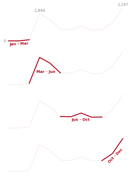
In this code, we've done a few important things:
- We increased the thickness of the lines in each panel to draw attention to the key periods.
- We added textual labels to highlight significant values in the dataset, such as death tolls in March and December.
- We labeled each panel with its respective time period, using bold text to emphasize the transitions between different phases of the pandemic.
By breaking up the year into distinct sections and annotating key moments, we're giving the viewer a clearer sense of how events progressed over time. This makes the data more approachable and emphasizes the most important parts of the story.
We have one final round of adjustments to bring everything together. In the next section, we'll add finishing touches, such as a headline, a more descriptive subtitle, and additional context for the data.
Final Touches
To complete our visualization and deliver a clear message, we'll add a bold headline, a descriptive subtitle, and further visual context with horizontal bars and annotations. These final touches will make the chart feel cohesive and easier to interpret, guiding the audience through the data story effectively.
Here's the final code that will pull everything together:
# Add a headline and subtitle for context
axes[0].text(0.5, 3500, 'The virus kills 851 people each day', size=14, weight='bold')
axes[0].text(0.5, 3150, 'Average number of daily deaths per month in the US', size=12)

# Loop through the axes to add horizontal bars and death toll labels
for ax, xmax, death in zip(axes, xmax_vals, deaths):
    # Add a light background bar for each period
    ax.axhline(y=1600, xmin=0.5, xmax=0.8, linewidth=6, color='#af0b1e', alpha=0.1)

    # Add a darker, more prominent bar for each death toll period
    ax.axhline(y=1600, xmin=0.5, xmax=xmax, linewidth=6, color='#af0b1e')

    # Add bold text to show the specific death toll for each period
    ax.text(7.5, 1850, format(death, ','), color='#af0b1e', weight='bold')

plt.show()
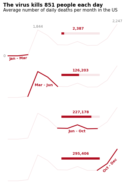
In this final round of tweaks, we've added several important elements to make the story stand out:
- Headline and subtitle: The headline, "The virus kills 851 people each day," conveys a key message that grabs attention immediately. The subtitle provides a more specific explanation of what the chart is showing: the average number of daily deaths per month in the US.
- Horizontal bars: Each horizontal bar represents the death toll for a specific time period. The lighter background bar helps provide context, while the darker bar shows the actual number of deaths for each section of the year.
- Death toll annotations: We've added bold, red text at the end of each section to highlight the exact number of deaths during that period. This makes it easier for viewers to see the significant jumps in the data at a glance.
These final touches ensure the data is not only accessible but also visually compelling. By emphasizing key numbers, adding clear narrative elements, and visually breaking down the year into distinct phases, we've created a chart that effectively communicates a data story in a way that's easy to understand.
With these skills, you can now confidently create visualizations that tell powerful stories. Remember, the goal is to make data meaningful for your audience, and the right combination of visual elements and narrative structure can make all the difference.
Tips for Effective Data Storytelling
When you're crafting a data story, small details can make a big difference. Here are some simple tips that have helped me make my visualizations clearer and more engaging:
- Start with a clear message: What's the one key takeaway you want your audience to remember? Make sure your entire visualization points toward that insight.
- Use color intentionally: In our example, we kept the same color (
#af0b1e) throughout to keep things visually consistent and easy to follow. - Guide the eye: Lay out your visuals in a way that naturally leads people from one point to the next. Don't make them guess what's important.
- Provide context: Add titles, subtitles, and annotations to help your audience understand what they're looking at and why it matters.
- Keep it simple: Too much information can be overwhelming. If you've got a lot to share, break it up into smaller, easier-to-digest visualizations.
Using these techniques will help turn a simple visualization into something that really connects with your audience. In the next lesson, we'll take things further by looking at Gestalt principles and pre-attentive attributes—two concepts that will help you design visuals that feel intuitive and make an impact right away.
Lesson 3 – Gestalt Principles and Pre-Attentive Attributes
Have you ever looked at a chart and instantly grasped its message, while others left you puzzled? The difference often lies in the application of Gestalt principles and pre-attentive attributes―powerful tools that can transform your data visualizations from confusing to compelling.
I've been in the situation (more than once) where my charts didn't quite connect with my audience. But once I started applying these psychological principles, I saw a real shift—my visualizations became much clearer and more impactful.
Gestalt Principles in Data Visualization
Gestalt principles describe how our brains naturally organize visual information. They help explain why certain visual elements seem grouped together or related. When applied to data visualization, these principles can make our charts more intuitive and engaging.
We'll explore four key Gestalt principles:
- Proximity
- Similarity
- Enclosure
- Connection
Each of these principles play a unique role in shaping how we perceive data, and we'll break down how each one works using examples. Let's get started!
1. Proximity
The principle of proximity tells us that objects close to each other are perceived as belonging to the same group. Let's see this in action:
At first glance, you probably just see a single rectangle made up of little grey circles. But what happens if we separate them a little?
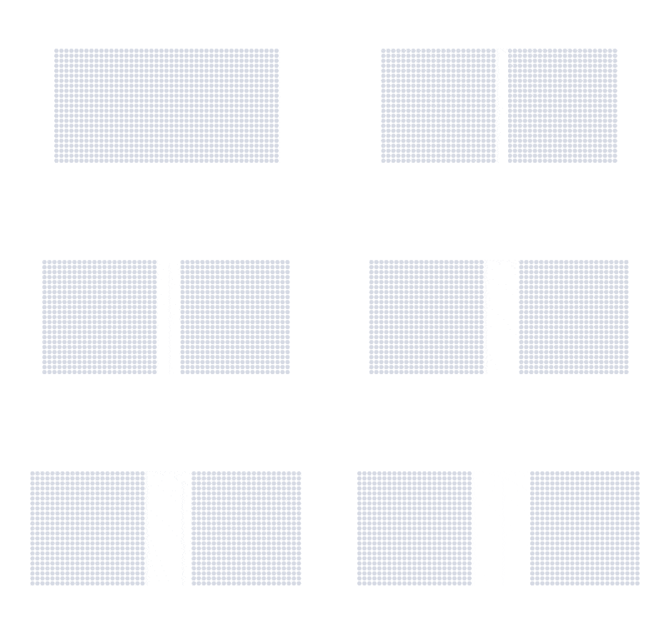
Now, you probably see two squares made up of little grey circles. The grouping that you see changes depending on how close the elements are to one another. Rearranging them again...
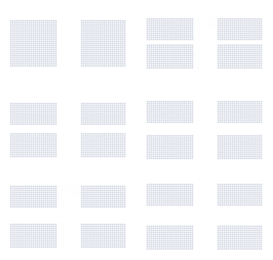
...makes us see four rectangles. The way we see groups of elements is heavily influenced by their spatial arrangement. This is the principle of proximity at work.
We can see how this principle works on our four line plots from the previous lesson:

In this plot, we instinctively group the elements within each row—such as the lines, progress bars, and labels—because of their close proximity. Each panel presents its data in a horizontal layout, making it easier for us to interpret the time periods at a glance. Our brains naturally perceive each row as a separate unit, helping to create a clear distinction between the different phases of the pandemic.
2. Similarity
Similarity refers to our tendency to group elements that look alike. These could share visual traits like color, shape, or size:
As the diagram demonstrates, we automatically group elements based on their shared color, shape, or size.
We used this principle in our death toll visualization too. Although we separated the time periods using proximity, the four panels are still part of the same story due to their similarity in style:

Notice how, despite being separated by rows, all the panels use the same visual style. This consistency in design—using the same color, line thickness, and text formatting—helps reinforce the idea that each panel is part of the same overall narrative. By making them visually similar, we let the audience know that they're seeing variations of the same plot, even with minimal labels, helping maximize the data-ink ratio.
3. Enclosure
Enclosure tells us that elements enclosed within a boundary are perceived as a group. Let's look at this in action:
Here, the circle and square in the first row are grouped because they are enclosed within a rectangle. This makes us see them as related.
We can use different types of enclosures too. Below, we create a grouping with a shaded ellipse:
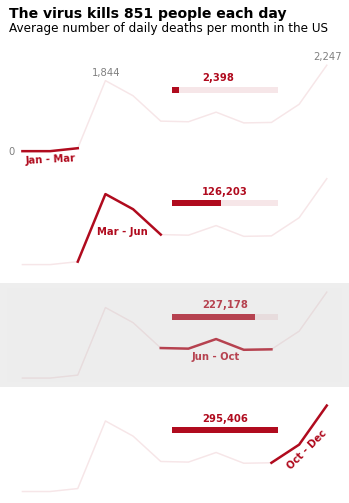
Enclosures are particularly useful in data visualizations when we need to highlight or separate elements. For example, we can use enclosure to emphasize the third panel in our death toll plot:
4. Connection
Connection works similarly to enclosure, but instead of boundaries, we use lines or other linking elements to show relationships:
In this example, we perceive the circle on the first row as related to the triangle on the last row because they are connected by a line.
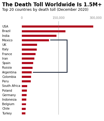
We can use this principle to create visual relationships in our data visualizations. Below, we highlight the relationship between Mexico and Argentina:
Visual Hierarchy
Not all Gestalt principles are equally strong. For instance, connection is typically stronger than proximity or similarity. Take a look at the following example:
We see the first two squares as belonging together because of the line connecting them, despite the distance. This shows how connection can sometimes overpower proximity.
Here's an example of connection versus similarity:
In each row, the line connecting the square and circle makes them feel like a group, even though we might expect to see squares and circles grouped together based on similarity. Again, connection wins.
Connection and enclosure are often on par, but certain visual elements (like color and thickness) can tip the scales. Take a look:
The visual hierarchy in this example shows how connection and enclosure can interact. Thicker, darker lines create a stronger connection, while shaded enclosures might overpower thinner connections.
Understanding visual hierarchy helps ensure that you're communicating the right message, and that no principle inadvertently cancels out another, leading to confusion.
Pre-Attentive Attributes: Guiding Attention
Gestalt principles help us group visual elements, but pre-attentive attributes help us direct attention. These attributes include color, size, and orientation—features our brains process almost instantly.
Let's take a look at an example:
Above, we see a series of parallel lines. Nothing stands out. But now, let's add some variation:
The thicker green line draws our attention immediately, guiding us to focus on it first. This is the power of pre-attentive attributes.
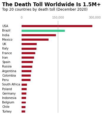
We can apply this technique in our visualizations to guide the viewer's focus. Here's an example where color is used to emphasize Brazil:
However, it's important to use pre-attentive attributes sparingly. If overused, they lose their effectiveness. Take a look at this example:
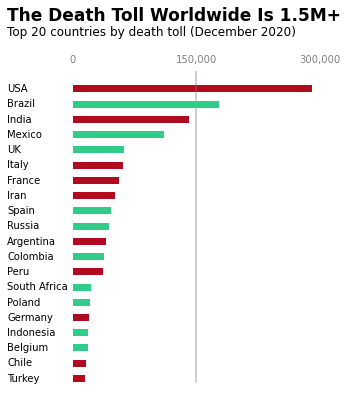
With too many elements standing out, nothing really captures our attention. The power of pre-attentive attributes comes from their subtlety, so it's best to use them only where they add value to the story.
In data visualization, the goal is to communicate your message clearly and efficiently. By leveraging the science of Gestalt principles and pre-attentive attributes, you can turn complex data into compelling, easy-to-understand visual stories.
Tips for Effective Use of Gestalt Principles and Pre-Attentive Attributes
Here are some tips I've learned for effectively using Gestalt principles and pre-attentive attributes when data storytelling:
- Use proximity to group related data points, making trends and patterns more obvious
- Apply consistent colors or shapes to similar data categories to reinforce relationships
- Use enclosure (like boxes or background colors) to define distinct sections of your visualization
- Be intentional with connecting lines―they imply relationships between elements
- Use pre-attentive attributes sparingly. A little goes a long way in guiding attention
Remember, the goal is to create visualizations that not only look professional but also effectively convey your data's story. By understanding and applying these principles, you'll be able to craft visual narratives that engage your audience and communicate insights clearly and quickly.
In the next lesson, we'll explore how to apply these principles using Matplotlib's styles, with a particular focus on the clean and impactful design of FiveThirtyEight visualizations. You'll see how combining these psychological principles with specific styling choices can create charts that are both informative and visually appealing.
Lesson 4 – Matplotlib Styles: A FiveThirtyEight Case Study
When I started creating data visualizations, I often felt like something was missing. My graphs had all the right information, but they lacked the professional polish I saw in publications like FiveThirtyEight. That's when I discovered Matplotlib styles, and it completely changed how I approached data visualization.
Matplotlib styles are like preset themes for your graphs. They automatically apply a consistent look and feel to your visualizations, saving you time and ensuring a professional appearance. One style that I've found particularly effective is the FiveThirtyEight style. If you're not familiar with FiveThirtyEight, it's a website known for its data-driven journalism and clean, minimalist graphs.
Applying the FiveThirtyEight Style
Let's take a look at how we can use this style to create compelling visualizations. In the examples below, we'll use datasets that measure red wine and white wine quality. These datasets contain various attributes of red and white wines, along with quality ratings.
To apply the FiveThirtyEight style and create a clean, professional-looking plot, we start by loading the red and white wine datasets, calculating the correlation of various attributes with wine quality, and plotting these correlations using horizontal bar charts. Here's the code that gets us started:
import pandas as pd

red_wine = pd.read_csv('winequality-red.csv', sep=';')
red_corr = red_wine.corr()['quality'][:-1]  # Calculate correlation of wine attributes with quality for red wine

white_wine = pd.read_csv('winequality-white.csv', sep=';')
white_corr = white_wine.corr()['quality'][:-1]  # Calculate correlation of wine attributes with quality for white wine

style.use('fivethirtyeight')  # Apply the FiveThirtyEight style
fig, ax = plt.subplots(figsize=(9, 5))  # Create the figure with a specific size

# Plot the white wine correlation values with a slight horizontal offset
ax.barh(white_corr.index, white_corr, left=2, height=0.5)
# Plot the red wine correlation values without offset
ax.barh(red_corr.index, red_corr, height=0.5)

plt.show()
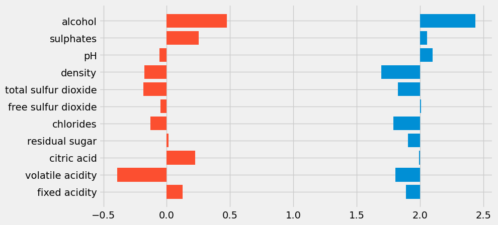
Let's break this down a bit:
style.use('fivethirtyeight')tells Matplotlib to apply the FiveThirtyEight style, giving the plot its distinctive clean, minimalist look.red_corr = red_wine.corr()['quality'][:-1]calculates the correlation between the different wine attributes (like alcohol, pH, and acidity) and the quality rating for red wine, excluding the last row, which isn't needed.white_corr = white_wine.corr()['quality'][:-1]does the same for white wine attributes.fig, ax = plt.subplots(figsize=(9, 5))creates a new figure and an axis with a specific size to accommodate both sets of bars comfortably.ax.barh(white_corr.index, white_corr, left=2, height=0.5)creates a horizontal bar chart for the white wine data, shifting the bars to the right by usingleft=2. This offset ensures the bars don't overlap with the red wine bars, which start at 0.ax.barh(red_corr.index, red_corr, height=0.5)plots the red wine data, with bars starting at 0 (the default behavior).
This code creates a horizontal bar chart comparing the correlation of various attributes with wine quality for both red and white wines. While we're using the FiveThirtyEight style, we also offset the white wine bars to avoid overlap, providing a clear visual distinction between the two datasets.
Customizing the FiveThirtyEight Style
While the default FiveThirtyEight style gives us a clean, polished look, we can take it a step further by customizing the style to better fit our data and the story we're trying to tell. Let's refine the graph with a few important changes:
ax.grid(False)  # Remove the background grid for a cleaner look
ax.set_yticklabels([])  # Remove the y-axis labels
ax.set_xticklabels([])  # Remove the x-axis labels

# Coordinates for manually adding labels to each wine attribute
x_coords = {'Alcohol': 0.82, 'Sulphates': 0.77, 'pH': 0.91,
            'Density': 0.80, 'Total Sulfur Dioxide': 0.59,
            'Free Sulfur Dioxide': 0.6, 'Chlorides': 0.77,
            'Residual Sugar': 0.67, 'Citric Acid': 0.76,
            'Volatile Acidity': 0.67, 'Fixed Acidity': 0.71}
y_coord = 9.8  # Starting y-coordinate for labels
# Loop through the wine attributes and place them at the corresponding coordinates
for y_label, x_coord in x_coords.items():
    ax.text(x_coord, y_coord, y_label)  # Add text labels at specified x and y coordinates
    y_coord -= 1  # Decrease the y-coordinate for the next label

# Add vertical reference lines to indicate key correlation points
ax.axvline(0.5, c='grey', alpha=0.1, linewidth=1, ymin=0.1, ymax=0.9)  # Light grey line at 0.5
ax.axvline(1.45, c='grey', alpha=0.1, linewidth=1, ymin=0.1, ymax=0.9)  # Light grey line at 1.45

# Add horizontal lines and labels to separate red and white wine sections
ax.axhline(-1, color='grey', linewidth=1, alpha=0.5, xmin=0.01, xmax=0.32)  # Horizontal line for red wine
ax.text(-0.7, -1.7, '-0.5'+ ' '*31 + '+0.5', color='grey', alpha=0.5)  # Add correlation scale for red wine

ax.axhline(-1, color='grey', linewidth=1, alpha=0.5, xmin=0.67, xmax=0.98)  # Horizontal line for white wine
ax.text(1.43, -1.7, '-0.5'+ ' '*31 + '+0.5', color='grey', alpha=0.5)  # Add correlation scale for white wine

# Add labels for red and white wine sections
ax.axhline(11, color='grey', linewidth=1, alpha=0.5, xmin=0.01, xmax=0.32)  # Line for red wine label
ax.text(-0.33, 11.2, 'RED WINE', weight='bold')  # Bold red wine label

ax.axhline(11, color='grey', linewidth=1, alpha=0.5, xmin=0.67, xmax=0.98)  # Line for white wine label
ax.text(1.75, 11.2, 'WHITE WINE', weight='bold')  # Bold white wine label

# Add DataQuest and source attribution at the bottom of the graph
ax.text(-0.7, -2.9, '©DATAQUEST' + ' '*94 + 'Source: P. Cortez et al.',
        color = '#f0f0f0', backgroundcolor = '#4d4d4d',
        size=12)

plt.show()
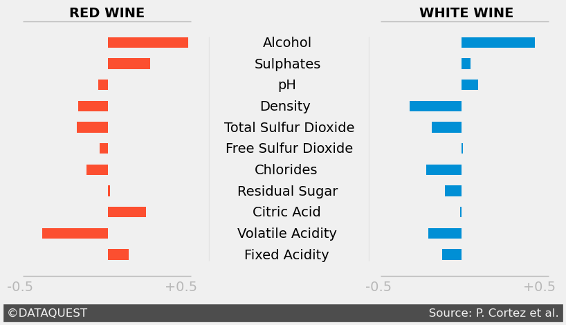
Here’s what we’ve done with these customizations:
ax.grid(False)removes the background grid, allowing the data to stand out more clearly.ax.set_yticklabels([])andax.set_xticklabels([])remove the axis labels to streamline the plot, focusing the viewer’s attention on the data itself.- We’ve manually added labels for each wine attribute at specific coordinates using
ax.text(), which ensures that the labels are clear and aligned with the correct bars. ax.axvline()draws light vertical reference lines at correlation values of 0.5 and 1.45, giving context to the bar lengths.ax.axhline()is used to add horizontal separators between the red and white wine sections, while also adding visual structure to the plot.- Finally, we add attribution for DataQuest and the source of the data at the bottom using
ax.text()with a background color to enhance readability.
These customizations might seem counterintuitive at first. After all, aren’t grids and labels important for understanding a graph? In many cases, yes. But the goal here is minimalism and focus―we're refining the plot to keep the viewer’s attention where it matters most: the data. Removing unnecessary clutter helps to achieve that goal while maintaining the clean, professional aesthetic of the FiveThirtyEight style.
Final Touches
Now that we've refined the graph for clarity and readability, it's time to add some final touches to give the plot a more polished, professional look. These tweaks include adding a bold title and subtitle, customizing the bar colors based on correlation values, and applying some minor layout adjustments. Here’s the code for these final touches:
ax.text(-0.7, 13.5,
        'Wine Quality Most Strongly Correlated With Alcohol Level',
        fontsize=17, weight='bold')  # Add a bold title

ax.text(-0.7, 12.7,
        'Correlation values between wine quality and wine properties (alcohol, pH, etc.)')  # Add a subtitle

# Apply a color map based on whether the correlation is positive or negative for red wine
positive_red = red_corr >= 0
color_map_red = positive_red.map({True:'#33A1C9', False:'#ffae42'})  # Blue for positive, orange for negative

# Plot the bars for the red wine correlations with custom colors
ax.barh(red_corr.index, red_corr, height=0.5, left=-0.1, color=color_map_red)

plt.show()
Let's break down the final modifications we’ve made:
- Add a title and subtitle: The bold title,
ax.text(-0.7, 13.5, ...), introduces the graph’s key takeaway, while the subtitle provides context about what’s being compared in the plot. - Customize the bar colors: Using
positive_red.map, we apply a color scheme that distinguishes positive correlations (in blue) from negative ones (in orange). This visual differentiation adds clarity to the graph and makes it easier to interpret the correlations at a glance. - Left-adjust the bars: We slightly adjust the position of the red wine bars using
left=-0.1to ensure that they align well with the white wine bars, maintaining a clean layout.
Here’s the final visualization after applying all these adjustments:
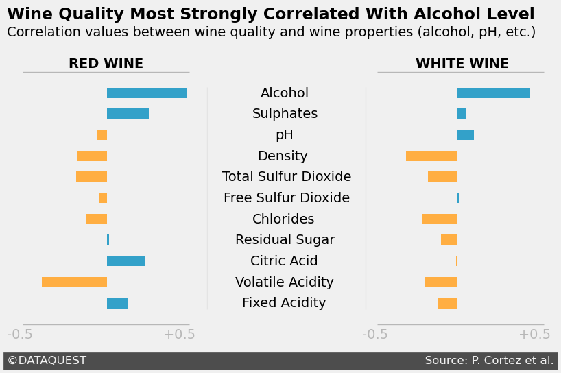
These final touches give the graph a polished, informative finish. By clearly labeling the graph with a title and subtitle, and customizing the bar colors based on correlation, we’re able to convey the key insights more effectively and maintain visual consistency.
Benefits of Using the FiveThirtyEight Style
Using the FiveThirtyEight style has several benefits:
- Professional appearance: It creates a look that's consistent with what people see in reputable data journalism outlets. This can lend credibility to your visualizations, especially when presenting to stakeholders or the public.
- Focused attention: The minimalist approach helps to highlight the most important aspects of your data. By removing unnecessary elements, you're guiding the viewer's attention to what really matters.
- Storytelling: The clean design leaves room for you to add your own annotations and explanations, making it easier to tell a story with your data.
- Consistency: When you use this style across multiple visualizations, it creates a cohesive look that can make your entire presentation or report feel more polished.
Best Practices for Using the FiveThirtyEight Style
It's important to use this style judiciously. While it works well for many types of data, it might not be suitable for all situations. For example, if you're presenting highly technical data to a specialized audience, you might need to include more details and annotations.
When using the FiveThirtyEight style, here are a few tips I've learned:
- Start simple, then customize: Begin with the basic style, then adjust as needed for your specific data. Don't be afraid to tweak things.
- Use clear, concise titles: The minimalist style works best when the text elements are straightforward and to the point. Your title should clearly state the main takeaway from the graph.
- Consider your audience: This style works well for general audiences, but you might need to adjust for more specialized groups. For a technical audience, you might want to add back in some of the elements we removed, like axis labels.
- Use color strategically: The FiveThirtyEight palette is limited, so make sure you're using color to highlight the most important aspects of your data. In our wine quality example, we used different colors for positive and negative correlations to make them stand out.
- Add context where needed: While the style emphasizes minimalism, don't hesitate to add annotations or explanations if they help tell your data story better.
By becoming proficient in the FiveThirtyEight style, you'll be able to create professional-looking graphs that effectively communicate your insights. This style is a great way to create a clean and minimalist design that focuses attention on the data itself.
In my work at Dataquest, I've seen how students who become proficient in this style often create more impactful final projects. They're able to present their findings in a way that's not just accurate, but also visually compelling and easy to understand.
In the final section of this tutorial, we'll put all these skills together in a guided project. We'll be working with a real-world dataset to create a compelling visual narrative. You'll have the chance to apply everything you've learned, from choosing the right chart type to applying and customizing the FiveThirtyEight style. Get ready to bring your data to life!
Guided Project: Storytelling Data Visualization on Exchange Rates
Let's work together on a practical project that allows us to practice everything we've learned. We'll be working with a dataset of Euro daily exchange rates from 1999 to 2021. This is a perfect example of how we can apply storytelling data visualization techniques to real-world data.
Before we get into the visualization, we need to clean the dataset. Trust me, cleaning the data is where the magic starts! It might feel like a tedious task, but it always pays off by making the analysis much smoother. Here’s how we’ll begin:
import pandas as pd

# Load the dataset
exchange_rates = pd.read_csv('euro-daily-hist_1999_2020.csv')

# Rename columns for clarity
exchange_rates.rename(columns={'[US dollar ]': 'US_dollar', 'Period\\\\Unit:': 'Time'}, inplace=True)

# Convert the 'Time' column to datetime format
exchange_rates['Time'] = pd.to_datetime(exchange_rates['Time'])

# Sort the data by date and reset the index
exchange_rates.sort_values('Time', inplace=True)
exchange_rates.reset_index(drop=True, inplace=True)
Let’s break this down step by step:
- Loading the data: We start by loading the dataset into a pandas DataFrame using
pd.read_csv(). This gives us easy access to manipulate and clean the data. - Renaming columns: We rename the columns to make them more readable. The original column names, like
[US dollar ]andPeriod\\Unit:, are not easy to work with, so we change them toUS_dollarandTimefor clarity. - Converting dates: The
Timecolumn, which contains the dates, is converted to a datetime format usingpd.to_datetime(). This allows us to work with the dates in a more intuitive way later on, such as plotting trends over time. - Sorting the data: By sorting the data by date and resetting the index, we ensure that everything is in chronological order. This makes it easier to analyze trends and visualize the data in sequence.
These initial steps may not seem like much, but they set a strong foundation for the rest of the project. Clean, organized data means fewer errors and clearer insights down the road!
Understanding Rolling Means
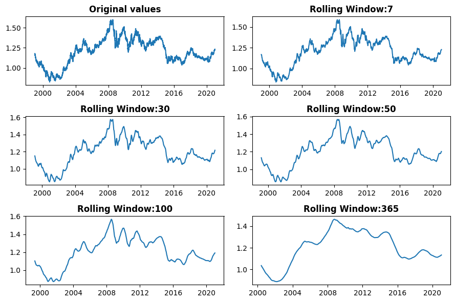
Let's talk about rolling means. If you're new to this concept, don't worry—it can seem tricky at first, but it's a powerful tool once you get the hang of it. A rolling mean helps smooth out short-term fluctuations in your data, allowing you to see longer-term trends more clearly. This is especially useful when working with daily data that might have too much noise to easily spot patterns. Here’s how we can calculate rolling means in our dataset:
euro_to_dollar = exchange_rates[['Time', 'US_dollar']].copy()  # Create a new dataframe for data of interest
plt.figure(figsize=(9, 6))  # Set the figure size for the entire plot

# Plot the original US dollar values for reference
plt.subplot(3, 2, 1)  # First subplot in a 3x2 grid
plt.plot(euro_to_dollar['Time'], euro_to_dollar['US_dollar'])
plt.title('Original values', weight='bold')  # Add a bold title for clarity

# Loop through and calculate rolling means with various window sizes
for i, rolling_mean in zip([2, 3, 4, 5, 6], [7, 30, 50, 100, 365]):
    plt.subplot(3, 2, i)  # Place each plot in the grid layout
    plt.plot(euro_to_dollar['Time'],
             euro_to_dollar['US_dollar'].rolling(rolling_mean).mean())  # Calculate the rolling mean
    plt.title('Rolling Window: ' + str(rolling_mean), weight='bold')  # Title showing the window size

plt.tight_layout()  # Auto-adjusts padding between subplots for a cleaner look
plt.show()  # Display the plot
Here’s what the code does step by step:
plt.figure(figsize=(9, 6))sets the overall figure size to make the plots large enough to easily read.plt.subplot(3, 2, 1)creates a 3x2 grid of subplots and places the first plot in position 1. In this case, it displays the original Euro to US dollar exchange rates.rolling(rolling_mean).mean()calculates the rolling mean over a specified window (e.g., 7 days, 30 days, etc.). This smooths out daily fluctuations to reveal underlying trends.- The
forloop dynamically generates rolling mean plots for five different window sizes (7, 30, 50, 100, and 365 days) and places them in the remaining subplots. plt.tight_layout()ensures that there’s no overlap between the subplots, making the whole figure look tidy.
This code calculates 7-day, 30-day, 50-day, 100-day, and 365-day rolling means. The larger the window size, the smoother the line becomes because it averages out more data points. For example, when I analyze Dataquest course completion rates, I often use a 30-day rolling mean to spot seasonal trends that might be hidden by day-to-day variations.
Brainstorming and Sketching Your Visualization
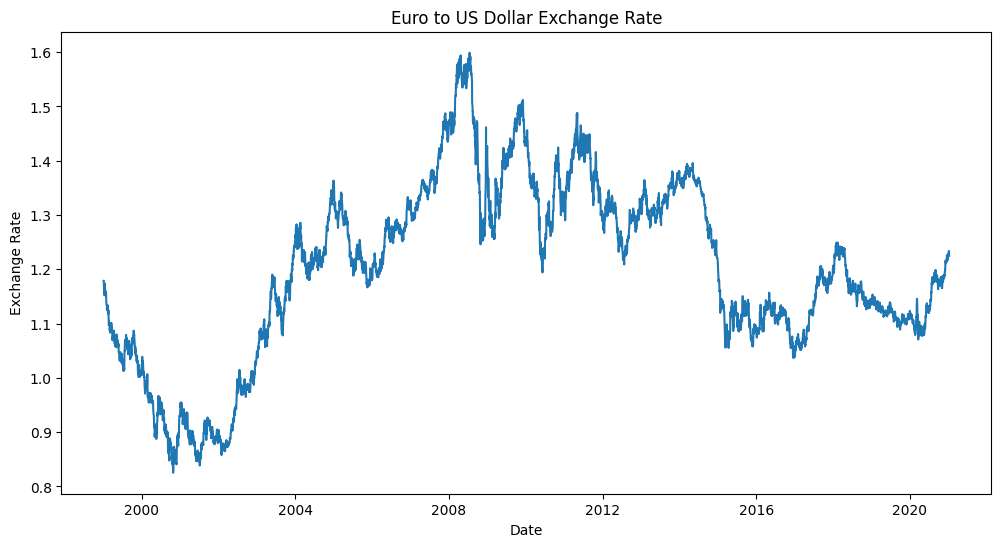
With our data prepared, it's time to brainstorm and sketch our visualization. I always start with pen and paper―it's quicker than coding and allows for more creativity. Ask yourself: What story do you want to tell with this data? Are you interested in how the Euro-Dollar rate changed during specific economic events? Or perhaps you want to show the overall trend since the Euro's introduction?
Once you have a sketch, start coding your visualization. Don't worry if you can't recreate your sketch perfectly at first. Start with the basics and build up. Here's a simple example to get you going:
plt.figure(figsize=(12, 6))
plt.plot(euro_to_dollar['Time'], euro_to_dollar['US_dollar'])
plt.title('Euro to US Dollar Exchange Rate')
plt.xlabel('Date')
plt.ylabel('Exchange Rate')
plt.show()
This creates a basic line plot of the Euro-Dollar exchange rate over time. From here, you can add more elements to match your sketch.
Tips for Refining Your Visualization
As you refine your visualization, keep these tips in mind:
- Know your audience: Are you creating this for financial experts or a general audience? Adjust your terminology and level of detail accordingly.
- Use color effectively: Stick to a limited color palette and use color to highlight important data points or trends.
- Annotate wisely: Add annotations for significant events, but don't overdo it. Too many annotations can clutter your visualization.
- Remove unnecessary elements: I often find myself deleting gridlines and reducing the number of axis ticks.
- Tell a story: Your visualization should have a clear narrative. What's the key takeaway you want your audience to remember?
Iterating and Improving
Remember, data visualization is an iterative process. Don't be discouraged if your first attempt doesn't look perfect. Keep refining your code, adjusting colors, labels, and layout until you're satisfied with the result.
With practice, you'll develop an intuitive sense for what works best in different situations. Keep at it, and don't hesitate to share your visualizations with others for feedback. That's how we all improve.
Applying Advanced Techniques
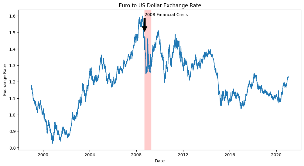
As you become more comfortable with basic visualizations, you can start incorporating more advanced techniques. For instance, you might want to highlight specific periods of economic interest:
plt.figure(figsize=(12, 6))
plt.plot(euro_to_dollar['Time'], euro_to_dollar['US_dollar'])

# Highlight the 2008 financial crisis
crisis_start = pd.to_datetime('2008-09-15')
crisis_end = pd.to_datetime('2009-03-31')
plt.axvspan(crisis_start, crisis_end, color='red', alpha=0.2)

plt.title('Euro to US Dollar Exchange Rate')
plt.xlabel('Date')
plt.ylabel('Exchange Rate')
plt.annotate('2008 Financial Crisis', xy=(crisis_start, 1.5), xytext=(crisis_start, 1.6),
             arrowprops=dict(facecolor='black', shrink=0.05))

plt.show()
This code adds a shaded area to highlight the 2008 financial crisis and includes an annotation to explain its significance. These kinds of additions can really enhance the storytelling aspect of your visualization.
Reflecting on Your Work
As you complete this project, take some time to reflect on what you've learned. How did you apply the principles of data storytelling? What challenges did you face, and how did you overcome them? These reflections will help you continue to grow as a data visualizer.
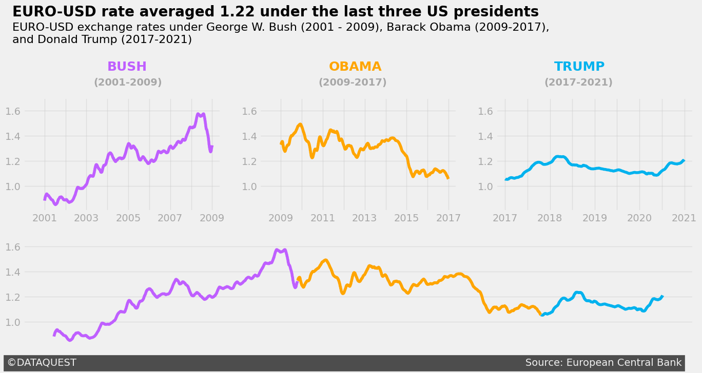
Remember, the goal isn't just to create a pretty chart―it's to tell a compelling story with data. Whether you're presenting to financial experts or explaining currency trends to a general audience, your visualization should make the data accessible and engaging. Here's an example of a "Three US Presidencies" data story you could tell using this dataset:
By working through this project, you're not just learning about exchange rates―you're developing skills that are highly valued in the data science field. The ability to create clear, insightful visualizations of financial data is crucial in many industries, from finance and economics to journalism and public policy.
As you move forward, consider how you can apply these skills to other datasets. Could you use similar techniques to visualize stock market trends, economic indicators, or international trade data? The possibilities are endless, and the skills you've developed here will serve you well in many data storytelling scenarios.
Advice from a Python Expert
When I started learning data visualization techniques, I felt overwhelmed by the numerous options and best practices. However, as I acquired each new skill―from designing audience-focused graphs to applying Gestalt principles―I gained confidence and began creating visualizations that truly spoke to my audience.
In this tutorial, we've explored various aspects of data visualization: designing for your audience, crafting narrative-driven visualizations, leveraging Gestalt principles and pre-attentive attributes, and applying Matplotlib styles like FiveThirtyEight. These skills help transform raw numbers into engaging visual stories.
I've witnessed the impact of these techniques firsthand when I worked on my weather analysis project. I implemented many of the principles we've discussed here, particularly the FiveThirtyEight style. I created visualizations that made complex climate trends clear and engaging for my audience. It was remarkable to see how the right visual approach could make even the most daunting datasets accessible.
If you're inspired to improve your data visualization skills, here's my advice: practice regularly and don't be afraid to experiment. Try these techniques on datasets that fascinate you. Better yet, challenge yourself to tell a story with a dataset you initially find dull―you might be surprised by what you discover! And don't forget to share your work and ask for feedback. The Dataquest Community is a great place for this. It's often through others' eyes that we see new possibilities in our visualizations.
For those looking to explore further, our course on Telling Stories Using Data Visualization and Information Design offers a structured path to picking up these concepts and more.
Remember, developing strong data visualization skills will help you uncover hidden insights and communicate complex data in a way that resonates with your audience. As you continue to refine your skills, you'll be amazed at how they can elevate your work and open up new opportunities. So, take the next step: pick a dataset and try applying one new technique you've learned. Your next great data story is waiting to be told!
Frequently Asked Questions
What is data storytelling in Python and how can it enhance data communication?
Data storytelling in Python is the process of turning complex data into engaging visual narratives using libraries like Matplotlib and seaborn. This approach goes beyond simple charts and graphs by weaving in a clear narrative that makes insights more engaging and memorable for the audience.
By presenting complex information in a clear and concise manner, data storytelling makes it easier for non-technical audiences to understand and interpret data. For example, instead of presenting a series of exchange rate figures, you might create a multi-panel visualization showing how the Euro-Dollar rate changed during different U.S. presidencies. This instantly conveys trends and patterns that might be missed in raw data.
Effective data storytelling in Python involves several key components, including audience-focused design, clear narrative structure, and thoughtful use of visual elements. Some techniques for data storytelling include using multi-panel visualizations to show progression over time, applying color strategically to highlight important data points, and adding annotations to provide context and explain significant events.
Data storytelling has numerous benefits and applications, including making financial data more understandable, identifying trends in course completion rates for online learning platforms, and supporting data-driven decision-making in various industries. By creating narrative-driven, visually appealing, and audience-focused visualizations, you can make your data more impactful and drive better decision-making.
To create effective data stories, consider the following best practices:
- start with a clear message
- design your visualization with your audience in mind
- use color intentionally to guide attention
- provide context through annotations and explanations
- iterate and refine your visualization based on feedback
By following these best practices and using data storytelling techniques, you can create engaging and informative visualizations that help you communicate insights from your data analysis more effectively. This skill can be incredibly valuable in various fields, from finance to public policy, and can help you drive better decision-making and communicate complex information in a clear and concise manner.
How can I tailor my data visualizations for different audiences, such as technical teams versus executives?
When creating data visualizations, it's essential to consider your audience's needs and background. This consideration can significantly impact how well your insights are understood and acted upon.
For technical teams, you'll want to include more detailed data and technical information. Use industry-specific terminology and provide interactive elements that allow for deeper data exploration. Focus on methodology and statistical rigor to help them understand your approach.
When presenting data to executives, focus on highlighting key insights and trends. Use clear, concise visualizations and minimize technical jargon. Connect the data to business objectives or key performance indicators (KPIs) to help them understand the value of your findings.
For example, when analyzing course completion rates at Dataquest, I created detailed visualizations for our content team. These visualizations showed completion rates, time spent, and difficulty ratings for each lesson, allowing them to identify specific areas for improvement.
When presenting the same course data to our marketing team, I simplified the visualization to focus on overall success metrics. This helped them understand the value of our courses and make informed decisions.
Regardless of your audience, keep the following principles in mind:
- Start with a clear message or key takeaway.
- Use consistent styling, such as the FiveThirtyEight style in Matplotlib.
- Provide necessary context to understand the data.
- Iterate based on feedback.
When creating visualizations in Python, use libraries like Matplotlib and seaborn to implement these tailored approaches. For technical audiences, you might use more complex multi-panel visualizations, while for executives, a single, clear chart with annotations might be more effective.
By tailoring your visualizations to your audience, you can create compelling data stories that drive informed decision-making and action.
What are the key elements of a compelling data story, as outlined in the blog post?
A compelling data story in Python engages your audience and effectively communicates insights by combining several key elements. Here are the essential components:
- Know your audience: Tailor your visualization to your specific audience. For example, when analyzing exchange rates, you might create a detailed technical plot for financial analysts and a simplified version highlighting overall trends for executives.
- Tell a story: Organize your data story with a beginning, middle, and end. In Python, you can use multi-panel visualizations to show how trends evolve over time, such as depicting the Euro-Dollar exchange rate across different U.S. presidencies.
- Guide the viewer's attention: Use visual hierarchy to draw attention to important data points or trends. Python libraries like Matplotlib allow you to apply color strategically, highlighting key information.
- Keep it simple: Remove unnecessary elements to focus on the data. The FiveThirtyEight style in Matplotlib exemplifies this approach, creating clean and focused visualizations that let the data speak for itself.
- Provide context: Use Python's annotation features to provide necessary background information. For instance, you might label significant economic events on a timeline of exchange rates to give context to the data.
- Use color intentionally: Use color to convey meaning or emphasize key points. In Python, you can create custom color schemes that align with your narrative and guide the viewer's focus.
- Refine and iterate: Continuously improve your visualization based on feedback and new insights. Python's interactive environments like Jupyter Notebook make this process seamless, allowing you to quickly adjust and refine your plots.
By combining these elements in your Python-based visualizations, you create data stories that not only present information but also engage your audience on a deeper level. The interplay between these components transforms raw data into a narrative that resonates with viewers, making complex information accessible and memorable. Remember, the goal is to use Python's powerful visualization tools to craft a story that your audience can connect with and understand, turning data into actionable insights.
How do Gestalt principles like proximity and similarity apply to creating effective data visualizations?
When creating visualizations for data storytelling in Python, I often rely on Gestalt principles like proximity and similarity to make my charts more intuitive and impactful. These psychological concepts describe how our brains naturally organize visual information, and they're useful for designing clear, effective visualizations.
Proximity is about how we perceive objects that are close together as being related. I use this principle to group related data points or categories in my visualizations. For example, in the multi-panel plot showing COVID-19 death rates over time, we placed panels for consecutive time periods closer together. This spatial arrangement helps viewers of our plot quickly grasp the chronological progression of the data.
Similarity is about how we group elements that look alike. In my Python visualizations, I leverage this by using consistent colors, shapes, or sizes for related data points. For instance, when we created the chart comparing correlations between wine quality and various attributes for red and white wines, we used the same color scheme across different sections of the chart. This visual consistency helps reinforce connections between related data points.
By applying these principles in our Python plots, we can create visualizations that are easier to understand. This is especially helpful when we're trying to tell a compelling data story. Well-designed visualizations that use proximity and similarity can guide the viewer's attention, highlight important relationships, and make complex data more accessible.
When working on a data storytelling project in Python, I consider how I can use proximity to group related elements and similarity to reinforce connections. For example, I might use Matplotlib to create a multi-panel plot where each panel uses the same color scheme and layout, leveraging both proximity and similarity to create a cohesive visual story.
The goal of using these principles is to communicate insights effectively. By thoughtfully applying them in your Python visualizations, you can create data stories that are not only visually appealing but also clear and memorable.
What are pre-attentive attributes, and how can they guide attention in data storytelling?
Pre-attentive attributes are visual elements that our brains process quickly, without conscious effort. These attributes can be powerful tools for guiding the viewer's attention to key information in data storytelling, making your visualizations more effective.
When creating data visualizations in Python, you can use pre-attentive attributes like color, size, shape, and orientation to highlight important data points or trends. For example, in a line plot showing exchange rates over time, you might use a contrasting color to emphasize a specific period of economic significance.
To effectively use pre-attentive attributes in your Python visualizations, keep the following tips in mind:
- Use them sparingly to avoid visual clutter. A single highlighted data point will stand out, but if everything is highlighted, the effect is lost.
- Align them with your data story. Use size to emphasize data points with larger values, for instance, if that's relevant to your narrative.
- Consider your audience when choosing attributes. Cultural differences can affect how visual cues are interpreted.
- Combine them with Gestalt principles for more impactful visualizations. For example, you might use color to create similarity between related data points.
In Python, you can use libraries like Matplotlib to adjust colors, sizes, and shapes of plot elements. For example:
- Use the
colorparameter to change the color of specific data points or lines. - Adjust the
linewidthors(size) parameters to make certain elements larger or thicker. - Use the
markerparameter to change the shape of data points.
However, be cautious of overusing pre-attentive attributes. Too many highlighted elements can overwhelm the viewer and dilute your message. Always test your visualizations to ensure the pre-attentive attributes are effectively guiding attention to the most important aspects of your data story.
By applying pre-attentive attributes thoughtfully in your Python visualizations, you can create more engaging and effective data stories that communicate insights clearly and quickly.
How can I apply the FiveThirtyEight style in Matplotlib to create clean, minimalist visualizations?
The FiveThirtyEight style in Matplotlib is a valuable tool for creating clean and minimalist charts that effectively communicate complex data insights. When I first started using it, I noticed a significant improvement in the way I approached visualizations. I was able to create charts that truly resonated with my audience.
To apply this style and create compelling data stories, follow these steps:
- Import the style: Start by setting the foundation with
plt.style.use('fivethirtyeight'). - Customize thoughtfully: Remove unnecessary elements to focus on the data. For example, you can remove the background grid, y-axis labels, and x-axis labels:
ax.grid(False) # Remove the background grid ax.set_yticklabels([]) # Remove y-axis labels ax.set_xticklabels([]) # Remove x-axis labels - Add context: Use
ax.text()to include titles, subtitles, and annotations. This helps guide viewers through the data story:ax.text(-0.7, 13.5, 'Your Bold Title Here', fontsize=17, weight='bold') ax.text(-0.7, 12.7, 'Your informative subtitle goes here') - Use color strategically: For the lesson where we analyzed wine quality correlations, we used color to distinguish positive and negative correlations:
color_map = positive_values.map({True:'#33A1C9', False:'#ffae42'}) ax.barh(data.index, data, height=0.5, color=color_map) - Refine and iterate: Don't be afraid to make adjustments. I often find myself tweaking element positions or colors to perfect the visual narrative.
A challenge you'll often face will be balancing minimalism against providing the necessary context. To overcome this, I suggest you carefully consider each element and ask yourself: Does this enhance or take away from the data story I'm telling? If you keep asking yourself this question, the answer will guide you what to do!
By applying the FiveThirtyEight style, you'll create visualizations that look professional and effectively communicate complex insights. In my experience, this approach has significantly improved how my audience engages with and understands data, making my data storytelling in Python more effective.
What is the process for refining a data visualization, from initial sketch to final product?
Refining a data visualization is an essential step in effective data storytelling in Python. The process involves several stages:
- Sketch ideas: Start by exploring visualization concepts quickly using pen and paper.
- Create a basic plot: Implement a simple version using libraries like Matplotlib.
- Apply design principles: Incorporate Gestalt principles and pre-attentive attributes to enhance intuitiveness.
- Customize styling: Apply a consistent style, such as FiveThirtyEight in Matplotlib, for a professional look.
- Add context: Incorporate titles, annotations, and narrative elements to guide understanding.
- Iterate and refine: Continuously improve based on feedback and critical assessment.
For example, when refining the Euro-Dollar exchange rate visualization, we began with a basic line plot. We then added shaded areas to highlight periods like the 2008 financial crisis, incorporated annotations for context, and adjusted colors and layout for clarity. Each refinement helped to better communicate the data's story.
To refine your data visualization effectively, keep the following tips in mind:
- Focus on maximizing the data-ink ratio by removing unnecessary elements.
- Use color strategically to guide attention.
- Ensure all elements (titles, annotations, etc.) contribute to the overall narrative.
- Test your visualization with your intended audience and iterate based on their feedback.
Refining a data visualization is an ongoing process. Rather than aiming for perfection on the first try, continually assess and improve your visualization. With practice, you'll develop an intuitive sense for creating compelling data stories in Python that resonate with your audience.
How can rolling means be used to reveal long-term trends in time series data for storytelling purposes?
Rolling means are a valuable technique in data storytelling that help reveal long-term trends in time series data. By averaging data points over a set period, rolling means help to smooth out short-term fluctuations and noise, making it easier to see underlying patterns.
In Python data storytelling, rolling means are particularly useful for simplifying complex data and making it more accessible to your audience. For example, when analyzing the Euro-Dollar exchange rate, we used rolling means with different window sizes (7, 30, 50, 100, and 365 days) to show how the exchange rate evolved over time. This approach revealed both short-term fluctuations and long-term trends, providing a more comprehensive view of the data.
The window size you choose has a significant impact on the story your data tells. A smaller window (e.g., 7 days) will show more detail and short-term variations, while a larger window (e.g., 365 days) will reveal broader, long-term trends. By using multiple window sizes in your visualization, you can guide your audience from granular details to the big picture, creating a more engaging narrative.
To effectively use rolling means in your data storytelling:
- Choose window sizes that align with your narrative goals
- Use color to distinguish between original and smoothed data
- Annotate key events or turning points in the smoothed data
- Consider combining rolling means with other visualization techniques, like shaded areas for significant periods
It's also important to keep in mind that rolling means have limitations. They can lag behind sudden changes in the data and may obscure important short-term events. When deciding how to apply rolling means, always consider the context of your data and the story you want to tell.
By incorporating rolling means into your Python visualizations, you can create more compelling and accessible data stories that effectively communicate long-term trends to your audience. This technique helps bridge the gap between complex data and clear, engaging narratives, making your insights more impactful and memorable.
What techniques can I use to highlight specific periods or events in time series visualizations?
When creating time series visualizations for data storytelling in Python, highlighting specific periods or events can greatly enhance your narrative. Here are some effective techniques to consider:
- Vertical lines: Draw lines at specific dates to mark important events or transitions.
- Shaded areas: Highlight regions of interest, such as economic crises or policy changes.
- Annotations: Add text labels to provide context for significant points or periods in your data.
- Color emphasis: Use contrasting colors to make certain data points or segments stand out.
- Rolling means: Apply different window sizes to smooth out short-term fluctuations and reveal long-term trends.
For example, in our Euro-Dollar exchange rate visualization, we combined several of these techniques to tell a compelling story. We used shaded areas to highlight economic events like the 2008 financial crisis, added annotations to explain their significance, and applied rolling means with various window sizes to show both short-term fluctuations and long-term trends.
By using these highlighting techniques, you can guide your audience's attention to key aspects of the data, making your visualization more engaging and informative. This approach helps create visual cues that aid your audience in understanding the narrative behind the numbers.
Ultimately, the goal of data storytelling is to tell a story with your data. By strategically highlighting specific periods or events in your Python visualizations, you can create compelling visual narratives that enhance understanding and drive home your key insights, making your data storytelling more impactful and memorable.
How can effective data storytelling in Python improve decision-making in professional settings?
As a data scientist, I've witnessed the transformative power of data storytelling in Python. By combining powerful analysis with compelling visuals, we can turn complex data into clear, actionable insights that resonate with stakeholders at all levels.
In my experience, effective data storytelling in Python improves decision-making in several ways:
- It makes complex data accessible. For example, when we visualized Euro-Dollar exchange rates, using rolling means helped smooth out daily fluctuations, revealing long-term trends that might otherwise be obscured.
- It highlights key insights. By applying Gestalt principles and pre-attentive attributes, we guide viewers' attention to the most important aspects of the data. This ensures that critical information doesn't get lost in the noise.
- It provides context. We used Matplotlib to create a multi-panel visualization showing how COVID-19 death tolls progressed over time. This approach allowed us to break down the data into digestible sections, making it easier for viewers to understand the pandemic's progression.
- It engages stakeholders. Using the FiveThirtyEight style in Matplotlib, we created clean, professional-looking charts that can capture attention and encourage deeper exploration of the data.
When creating data stories in Python, I consider several key elements:
- A clear narrative structure
- Thoughtful use of visual elements like color and size
- Audience-focused design
- Strategic annotations to guide understanding
These techniques can be applied to various professional settings:
- Financial analysis: Visualizing exchange rate trends
- Marketing: Illustrating customer behavior patterns
- Operations: Demonstrating efficiency improvements
- Product development: Showcasing user engagement metrics
By applying these techniques, you can create impactful visualizations that drive better business outcomes and foster a data-informed culture within your organization. Every dataset has a story to tell – data storytelling in Python gives you the tools to tell it effectively.
What are some practical tips for improving my data storytelling skills in Python?
As someone who's spent years refining their data storytelling skills in Python, I've come to realize that effective storytelling is a delicate balance of creativity and technical skill. Here are some practical tips I've found invaluable:
- Know your audience: When creating visualizations, I consider who my audience is and tailor my approach accordingly. For example, I once created two separate visualizations of the same course data―a detailed one for our content team and a simplified version for marketing. This helped ensure that each group could easily understand the insights I was trying to convey.
- Start with a clear message: Before I begin coding, I take a step back and sketch out my ideas. This helps me focus on the key takeaway I want to communicate and ensures that my visualization stays on track.
- Use color intentionally: In our Euro-Dollar exchange rate visualization, we used color to highlight specific economic events, making them stand out from the overall trend. This helped viewers quickly grasp the relationships between different data points.
- Apply Gestalt principles: I've found that using principles like proximity and similarity can make complex data more intuitive. For instance, in our multi-panel visualizations, we grouped related elements closer together to create a clearer narrative.
- Leverage pre-attentive attributes: Elements like size and shape can guide attention. We used a thicker, colored line to emphasize a trend in our COVID-19 data, making it easier for viewers to focus on the key insight.
- Implement a clean and minimalist style: I've been inspired by the FiveThirtyEight style, which has helped me create professional-looking graphs that effectively communicate insights without unnecessary clutter. By stripping away distractions, I can ensure that my visualizations are clear and concise.
- Iterate and refine: I never settle for my first draft. I continuously improve my visualizations based on feedback and critical assessment, making sure that they effectively convey the story I want to tell.
- Tell a story: In our visualization of COVID-19 death tolls, we used a multi-panel approach to guide viewers through the progression of the pandemic. This helped create a narrative that was both informative and engaging.
- Use rolling means: When analyzing time series data, like exchange rates, I often apply rolling means to reveal long-term trends that might be obscured by daily fluctuations. This helps us identify patterns that might otherwise be lost in the noise.
- Practice regularly: The more you work with different datasets and experiment with various techniques, the more intuitive data storytelling in Python becomes. By continually challenging myself and exploring new approaches, I've been able to develop the skills I need to create compelling visual narratives.
Remember, effective data storytelling is about making complex information accessible and engaging. By consistently applying these tips and practicing with real-world datasets, you'll develop the ability to create visualizations that resonate with your audience and help you uncover valuable insights.
How can I balance providing detailed information with maintaining a clean, uncluttered visualization?
Balancing detailed information with a clean, uncluttered visualization is a key challenge in data storytelling with Python. To achieve this balance, consider the following strategies:
- Use visual elements strategically: Use color, size, and shape to highlight key information without adding clutter. For example, in the Euro-Dollar exchange rate visualization, we used color to emphasize specific economic events, guiding the viewer's attention without overwhelming the chart.
- Focus on the essential elements: Remove unnecessary elements from your visualization, ensuring that every visual element serves a purpose in communicating data. This approach, exemplified in the FiveThirtyEight style charts, helps maintain clarity while presenting detailed information.
- Break complex data into sections: Use multi-panel visualizations to present complex data in a digestible format. When we created the COVID-19 death toll visualization, we used four panels to show the progression over time. This technique allowed me to present detailed information without cluttering a single chart.
- Use annotations thoughtfully: Add context through carefully placed annotations, but avoid overcrowding. In the exchange rate visualization, we added annotations for significant events like the 2008 financial crisis, providing context without overwhelming the viewer.
- Refine your approach: Don't expect perfection on the first try. I often start with a basic plot and gradually refine it, adjusting colors, labels, and layout until I achieve the right balance of detail and clarity.
When deciding how much detail to include, consider your audience's needs and the story you want to tell. For instance, when I created visualizations for our content team at Dataquest, I included more technical details. However, for the marketing team, I focused on high-level insights with a cleaner design.
By applying these techniques and continually refining your approach, you can create Python visualizations that effectively communicate complex insights without overwhelming your audience.
