
Tutorial 2: Introduction to Data Visualization in Python
Main Guide Page
Tutorial 1: Introduction to NumPy and pandas for Data Analysis
Tutorial 2: Introduction to Data Visualization in Python - You are here
Tutorial 3: Data Storytelling and Information Design
NumPy Cheat Sheet and PDF Download
Pandas Cheat Sheet and PDF Download
Data often has a story to tell, but sometimes it needs a little help with its presentation. That's where data visualization in Python can help―it involves transforming raw numbers into visual narratives that reveal insights hidden within our data. Just as colorful illustrations make children's books more engaging, data visualization transforms raw numbers into vivid, insightful narratives that guide our decisions and deepen our understanding.
Let me share how data visualization transformed my approach to analysis. While working on a weather prediction project, I found myself buried in numbers. I could understand the data logically, but I just couldn’t connect the dots to see the bigger picture. So, I plotted a time series graph to get a clearer view. The moment the line graph appeared on my screen, hidden patterns emerged—suddenly, seasonal trends I hadn’t noticed in the raw data stood out. That one graph not only improved my forecasting accuracy but also changed how I approached data analysis. It made me realize that if a picture is worth a thousand words, then a data visualization is worth a million numbers!
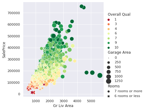
Since there is no end to the data available to us today, being able to create insightful visualizations like the one above is a valuable skill to have. Employers are looking for candidates who can effectively communicate insights through visuals, not just crunch numbers. Many of our students have found that including visualizations in their portfolio of projects has helped them secure data analyst positions.
Lucky for us, Python has several robust libraries for creating data visualizations. I find that Matplotlib is great when I need highly customizable plots, while seaborn excels at creating stunning statistical visualizations. For example, when I used seaborn for feature selection in my machine learning project, I discovered a non-linear relationship between variables that I had overlooked in the raw data. This discovery significantly changed how I approached building my model. Without that visualization, I would have assumed a linear relationship and built a model that struggled to make accurate predictions because of it.
Another change I've made to my workflow is integrating pandas visualizations into my data-exploration phase. It gives me the ability to quickly identify interesting aspects of a dataset with just a couple of lines of code, spotting outliers and trends more efficiently than summary statistics alone. This time-saving step leaves me more room for in-depth analysis and interpretation.
In this tutorial, we'll explore how to create impactful visualizations like the one above using Python. We'll cover various techniques, from basic line graphs to more complex relational plots. These skills are sure to enhance your data analysis capabilities, making your insights more accessible and engaging for others.
Let's start by looking at line graphs and time series, fundamental tools in data visualization. Whether you're analyzing stock prices, tracking temperature fluctuations, or monitoring website traffic, line graphs and time series are ideal for revealing trends and patterns over time. Let's jump right in!
Lesson 1 – Line Graphs and Time Series
Back in 2020, when the COVID-19 pandemic was spreading rapidly, I found myself glued to the data, hoping it would help me make sense of the chaos. But sifting through the numbers on case counts and trends was making me dizzy—it was hard to see any meaningful patterns buried in all that data. So, I decided to visualize it. By plotting the data as a line graph, I was able to spot trends I hadn’t noticed before—peaks, dips, and the effects of lockdowns became much more obvious. That visualization gave me a sense of clarity in an otherwise confusing time. Let’s walk through how you can create a similar line graph using Matplotlib:
import matplotlib.pyplot as plt

month_number = [1, 2, 3, 4, 5, 6, 7]
new_cases = [9926, 76246, 681488, 2336640, 2835147, 4226655, 6942042]

plt.plot(month_number, new_cases)
plt.title('New Reported Cases By Month (Globally)')
plt.xlabel('Month Number')
plt.ylabel('Number Of Cases')
plt.ticklabel_format(axis='y', style='plain')
plt.show()
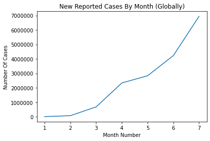
This code creates the basic line graph shown below of new COVID-19 cases over time. The plt.plot() function is at the core of generating line graphs in Matplotlib. In this example, we provide two arrays: one for the x-axis (month_number) and one for the y-axis (new_cases). The first array determines how the data points are distributed along the horizontal axis (representing time), while the second array maps the corresponding number of cases along the vertical axis.
To enhance the clarity of our graph, we’ve added several customizations:
plt.title(): Provides the plot with a meaningful title, 'New Reported Cases By Month (Globally).'plt.xlabel()andplt.ylabel(): Label the axes, improving readability by clearly indicating what each axis represents.plt.ticklabel_format(): Ensures large numbers on the y-axis are displayed in plain format, avoiding scientific notation and making the graph easier to interpret at a glance.
While this example introduces some key features of Matplotlib, like titles, axis labels, and formatting options, there’s much more you can do with this library. For instance, you can customize colors, line styles, and markers to better represent your data. You can also plot multiple lines on the same graph—a technique that’s especially useful for comparing different subsets of data, as we’ll explore in the next section. For now, take a moment to review the plot above and see how even small visual enhancements can make your data more accessible and insightful.
Comparing Multiple Time Series
Building on what we’ve covered so far, let’s look at how you can compare different subsets of data by plotting them on the same graph. This technique is especially helpful when you want to analyze trends side by side. For this example, we’ll compare the cumulative COVID-19 cases for France and the UK. You can download the WHO time series dataset here if you want to code along locally with me.
import pandas as pd
import matplotlib.pyplot as plt

# Load the WHO time series dataset
who_time_series = pd.read_csv('WHO_time_series.csv')

# Filter data for France and the UK
france = who_time_series[who_time_series['Country'] == 'France']
uk = who_time_series[who_time_series['Country'] == 'The United Kingdom']

# Plot cumulative cases for both countries
plt.plot(france['Date_reported'], france['Cumulative_cases'], label='France')
plt.plot(uk['Date_reported'], uk['Cumulative_cases'], label='The UK')

# Add a legend to distinguish between the lines
plt.legend()
plt.show()
Here, we load the dataset and filter it to focus on France and the UK. Each line in the plot below shows the cumulative COVID-19 cases for one of these countries. The label parameter assigns names to the lines, which appear in the legend thanks to plt.legend().
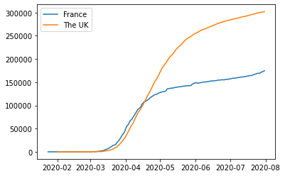
Comparing multiple time series like this lets you see trends side by side. For example, you can quickly tell if cases rose faster in one country than another or if they followed a similar trajectory. Visualizing both on the same graph helps avoid jumping between separate plots and makes patterns easier to spot.
Interpreting Line Graphs
When working with line graphs, pay close attention to trends and patterns. Are the lines moving upward, downward, or staying flat? Do you notice any sudden changes or consistent patterns over time? In the COVID-19 data, many countries showed a pattern of exponential growth followed by a plateau, but the timing and severity of these patterns varied significantly across regions.
A common challenge when comparing multiple lines is handling differences in scale. For example, if one country has far more reported cases than another, the country with fewer cases might look flat in comparison. To address this, you could apply a logarithmic scale to the y-axis using plt.yscale('log'). This scaling spreads out smaller values, making it easier to compare trends across countries with vastly different case counts. Alternatively, instead of plotting absolute numbers, you could plot percentage changes over time to highlight relative differences.
Here are a few tips for creating effective line graphs:
- Choose appropriate scales for your axes. If one variable has a much larger range than the other, you can consider using two y-axes on the same graph.
- Use colors wisely. Pick colors that are easy to distinguish, especially if you're plotting multiple lines.
- Don't overcrowd your graph. If you have too many lines, it becomes hard to read. Consider creating multiple graphs instead.
In the next lesson, we’ll introduce scatter plots—another powerful tool for visualizing relationships between variables. This will add depth to your growing data visualization toolkit.
Lesson 2 – Scatter Plots and Correlations
We’ve covered how line graphs are great for tracking trends over time, but sometimes you want to explore the relationship between two variables—and time isn’t always part of the equation. That’s when scatter plots are handy. While time series show change over time, scatter plots let you see how two variables relate to each other, which can reveal interesting patterns or correlations.
For this part of the tutorial, we’ll switch to a new dataset: daily activity from Capital Bikeshare, a bike-sharing service. This dataset includes things like the number of bikes rented each day and weather conditions, including temperature. If you want to follow along, download the dataset here.
Let’s see if temperature has any impact on how many bikes get rented by creating a scatter plot between these two variables:
import pandas as pd
import matplotlib.pyplot as plt

# Load the Capital Bikeshare dataset
bike_sharing = pd.read_csv('day.csv')

# Create a scatter plot to explore the relationship between temperature and bikes rented
plt.scatter(bike_sharing['temp'], bike_sharing['cnt'])
plt.xlabel('Temperature (Normalized)')
plt.ylabel('Bikes Rented')
plt.show()
Here’s a quick breakdown of the code:
plt.scatter()plots each day’s temperature against the number of bikes rented, with each point showing one day’s activity.plt.xlabel()andplt.ylabel()label the axes to make the plot easier to read.plt.show()displays the plot so you can take a look at the data.
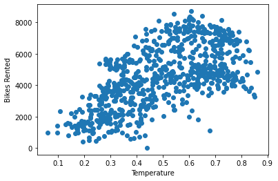
The scatter plot below shows what the code above produces, with each dot representing the total bike rentals for a day and its corresponding temperature. Looking at the plot, you can spot an upward trend—warmer days seem to have more rentals, though it’s not a perfect pattern. There’s still some scatter, which makes it tricky to say how strong the relationship really is. That’s where correlation analysis comes in, and we’ll use it next to put a number on this relationship.
Understanding Correlation
When we talk about correlation, we’re referring to Pearson’s correlation coefficient—often just called correlation or symbolized by r. It’s a statistical measure that tells us how strong the relationship is between two variables and in which direction that relationship goes. The value of r always falls between -1 and 1, and it helps us understand whether changes in one variable are associated with changes in another.
r = 1: A perfect positive relationship—when one variable increases, the other increases proportionally.r = -1: A perfect negative relationship—when one variable increases, the other decreases proportionally.r ≈ 0: No relationship—changes in one variable do not predict changes in the other.
A positive correlation means that as one variable goes up, the other tends to go up as well. For example, we’d expect a positive correlation between temperature and ice cream sales—warmer days likely lead to more sales. On the other hand, a negative correlation means that as one variable increases, the other tends to decrease. Think of temperature and hot chocolate sales—a drop in temperature might increase the number of cups sold and a rise in temperature might see a drop in the number of cups sold.
Calculating Pearson's Correlation Coefficient
Now, let’s calculate the correlation (r) between temperature and bike rentals to see what kind of relationship exists between them:
bike_sharing['temp'].corr(bike_sharing['cnt'], numeric_only=True)
The result is approximately 0.63, indicating a moderately strong positive relationship. In other words, warmer days tend to see more bike rentals, though the relationship isn't perfect—other factors likely come into play as well. This value helps us quantify what the scatter plot hinted at: a general upward trend between temperature and bike rentals.
How Data Visualization Guided Our Curriculum Improvements
I've used these techniques extensively at Dataquest to improve our courses. Once, we were puzzled by varying engagement levels across our data science curriculum. By creating scatter plots of different variables against course completion rates, we discovered a strong positive relationship between the number of practice problems a student completed and their likelihood of finishing the course.
This insight was incredibly valuable. We redesigned our curriculum to include more hands-on practice, which significantly improved our students' learning outcomes. It also taught me a valuable lesson: always let the data guide your decisions. That said, we should remain cautious—even a strong correlation doesn’t necessarily mean one thing causes the other. As the saying goes, “Correlation does not imply causation.”
Understanding Correlation vs. Causation
What exactly do we mean by this? Well, it’s easy to assume that when two variables move together—like warmer weather and an increase in bike rentals—one must be causing the other. But this relationship is known as correlation, and it doesn’t mean one variable causes the other to change. Just because two things happen at the same time doesn’t necessarily mean one is responsible for the other.
Here’s why:
- Lurking variables: A hidden factor can influence both variables, creating a misleading link. For example, ice cream sales and shark attacks might rise together, but it’s not the ice cream causing shark attacks! The real driver here is warmer weather, which boosts both beach attendance and ice cream sales.
- Coincidence: Some correlations are purely random and meaningless, appearing only by chance. For example, the number of Nicolas Cage films released in a given year might correlate with the amount of cheese consumed per capita—an amusing coincidence with no real connection.
- Reverse causality: Cause and effect may be flipped. For example, while owning a pet might seem to make people more active, it’s equally likely that active people are more inclined to get pets—especially the kind that demand daily walks.
It’s easy to get excited when you spot a strong correlation, but remember: it’s just the beginning of the story. Use correlation as a starting point to guide exploration, but proving causation requires deeper analysis—like experiments or statistical models that account for hidden variables. Let correlation spark curiosity, not conclusions.
By creating scatter plots and performing correlation analysis, you'll significantly improve your data science skills. They allow you to uncover hidden patterns in data and communicate insights effectively, making you a valuable asset to any organization.
In the next lesson, we'll explore how to visualize distributions using bar plots and histograms. This will add another powerful tool to your data visualization toolkit, helping you tell even more compelling stories with your data.
Lesson 3 – Bar Plots, Histograms, and Distributions
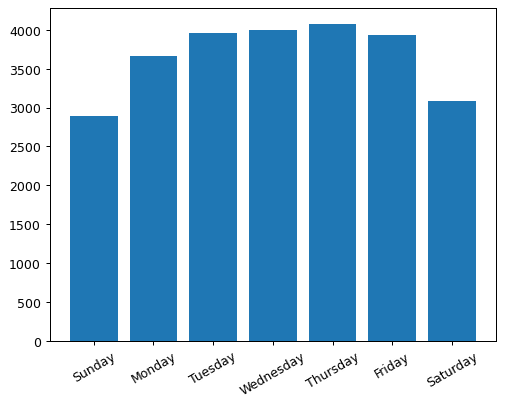
Bar plots are perfect for visualizing categorical data. They allow you to compare values across different categories at a glance. For instance, in our bike-sharing dataset, you can use a bar plot to visualize the average number of bike rentals for each day of the week. Here's how you can create this plot using Matplotlib:
# Group the data by weekday, calculate the mean, and select 'casual' and 'registered' rental columns
weekday_averages = bike_sharing.groupby('weekday').mean(numeric_only=True)[['casual', 'registered']].reset_index()

# Create a bar plot for the average number of registered rentals per weekday
plt.bar(weekday_averages['weekday'], weekday_averages['registered'])

# Customize the x-axis with day names and rotate labels for better readability
plt.xticks(
    ticks=[0, 1, 2, 3, 4, 5, 6],
    labels=['Sunday', 'Monday', 'Tuesday', 'Wednesday', 'Thursday', 'Friday', 'Saturday'],
    rotation=30)
plt.show()
This code creates the bar plot below where each bar represents a day of the week, and the height of the bar shows the average number of registered bike rentals for that day. We've customized the x-axis labels to show the day names and rotated them for better readability.
Exploring Histograms
While bar plots are great for comparing categorical data, histograms are perfect for visualizing the distribution of numerical data. They group continuous data into bins and show the frequency of data points within each bin.
Here's how you can create a histogram of casual bike rentals:
plt.hist(bike_sharing['casual'])
plt.show()
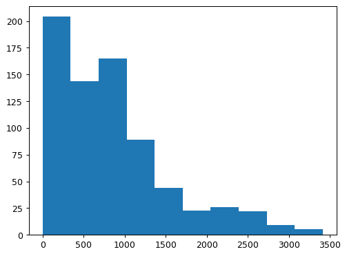
This code creates the histogram below (with 10 equally spaced bins) that shows the distribution of casual bike rentals. The x-axis represents the number of rentals, and the y-axis shows how many days had rental counts that fall within each bin. Each bin covers approximately 340 rentals. For example, the tallest bar in the histogram tells us that on just over 200 days, there were up to 340 casual rentals. The next bar shows that on just under 150 days, rental counts fell between 340 and 680.
Interpreting Histograms
What can you learn from histograms? Look for these common patterns:
- Normal distribution: This looks like a bell curve, with most values clustered around the middle and fewer extreme values on either side. It's common in natural phenomena and often indicates that the data is influenced by many small, independent factors.
- Uniform distribution: This looks like a flat line, where all values occur with roughly equal frequency. It's less common in real-world data but can occur in certain scenarios, like random number generation.
- Skewed distributions: These distributions lean to one side. To quickly determine the skew, look for the long tail—it points to the direction of the skew. A left-skewed distribution has the tail on the left and the body of observations on the right. Conversely, a right-skewed distribution has the body on the left, followed by a long tail on the right. Take a look at the diagram below. Does it show a left-skewed or right-skewed distribution?
Answer: This is a right-skewed distribution.
In our bike-sharing data, the histogram of casual rentals revealed an interesting pattern. It was right-skewed, with many days having few rentals (body) and fewer days with very high rental numbers (tail). This suggests that casual rentals might be influenced by factors like weather or special events, leading to only occasional increases in the total number of rentals on a given day.
Interpreting Distributions
Understanding these distributions is important for making informed decisions. At Dataquest, we use histograms to analyze student performance across different courses. For example, when we launched our SQL courses, the histogram of completion times showed a bimodal distribution―two distinct peaks. This helped us identify that we had two main groups of students: beginners who took longer to complete the course, and experienced programmers who breezed through it. We used this insight to create separate learning paths, ensuring both groups got the support they needed.
Bar Plot or Histogram?
When deciding between bar plots and histograms, consider your data type and what you're trying to communicate. Use bar plots when you have distinct categories and want to compare values between them. Choose histograms when you want to show the shape and spread of numerical data, especially when looking for patterns in the distribution.
These visualization techniques are more than just pictures―they're powerful tools for uncovering insights in your data. By knowing when to use them, you'll be able to spot trends, identify outliers, and make data-driven decisions more effectively.
In the next lesson, we'll explore how to combine multiple visualizations using pandas and grid charts. This will allow you to tell even more complex data stories, bringing together different aspects of your dataset for a comprehensive analysis.
Lesson 4 – Pandas Visualizations and Grid Charts
We’ve explored Matplotlib's capabilities so far, but did you know that pandas—the go-to library for data manipulation—also comes with built-in visualization tools? These methods are built as convenient wrappers around Matplotlib, offering a fast and easy way to generate common visualizations. While Matplotlib shines when you need detailed customization, pandas' plotting functions are perfect for quick data exploration and early insights.
For this part of the tutorial, we’ll switch datasets again. This time, we’ll use a dataset focused on urban traffic in São Paulo, the most populous city in Brazil. The dataset provides insights into how traffic slowness varies throughout the city. If you’d like to follow along, download the dataset here. Heads up: it uses a semicolon (;) as a separator, so we’ll need to account for that when loading the data.
import pandas as pd
import matplotlib.pyplot as plt

# Load the São Paulo traffic dataset
traffic = pd.read_csv('traffic_sao_paulo.csv', sep=';')

# Clean column and convert to float
traffic['Slowness in traffic (%)'] = traffic['Slowness in traffic (%)'].str.replace(',', '.')
traffic['Slowness in traffic (%)'] = traffic['Slowness in traffic (%)'].astype(float)

traffic['Slowness in traffic (%)'].plot.hist()
plt.title('Distribution of Slowness in traffic (%)')
plt.xlabel('Slowness in traffic (%)')
plt.show()
This code is doing a few key things, step by step:
- Loading the dataset: We load the São Paulo traffic dataset using
pd.read_csv(). Since the file uses semicolons as separators, we specifysep=';'to ensure it reads correctly. - Cleaning the data: The values in the
'Slowness in traffic (%)'column use commas instead of decimal points. We replace them usingSeries.str.replace(',', '.')and convert the column tofloatto ensure it’s ready for analysis. - Plotting the histogram: With
Series.plot.hist(), we generate a histogram to visualize the distribution of traffic slowness percentages. This gives us a quick sense of how slowness varies across the data. - Adding context to the plot: We add a title using
plt.title()and label the x-axis withplt.xlabel()to make the visualization easier to interpret. - Displaying the plot: Finally,
plt.show()displays the plot, so we can analyze the results.
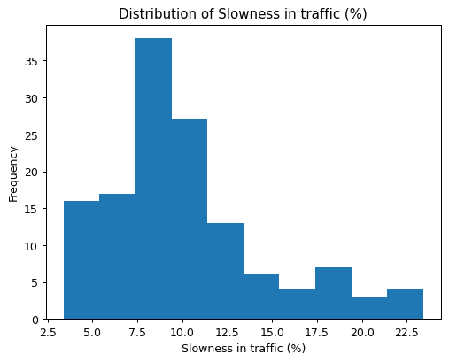
With just a few lines of code, we’ve cleaned the data and created a meaningful visualization. This example highlights how pandas simplifies both the data cleaning and visualization process, making it easier to explore your data quickly and effectively. In the next section, we’ll take these visualizations further by introducing grid charts—perfect for comparing multiple distributions side by side.
In my experience, these quick pandas visualizations have been invaluable in analyzing course completion data at Dataquest. For instance, I often start by creating histograms of lesson completion times. This gives me a quick overview of how long students typically spend on each lesson, helping identify outliers that might indicate particularly challenging content.
One time, I noticed an unusually long tail in the histogram for one of our Python courses. Upon investigation, we discovered that a particularly complex coding exercise was taking students much longer than anticipated. We were able to break this exercise into smaller, more manageable steps, which significantly improved the learning experience and course completion rates.
Exploring Grid Charts
Sometimes, a single plot isn’t enough to reveal all the insights hidden in your data. That’s where grid charts, also known as small multiples, come into play. Grid charts allow you to display multiple related graphs side by side, making it easier to compare different subsets of your data at a glance.
For this example, let's compare traffic slowness across different days of the week. Here’s how we can build a grid chart to visualize the slowness trends from Monday to Friday:
import matplotlib.pyplot as plt

# Prepare the data: Slice traffic data for each weekday
days = ['Monday', 'Tuesday', 'Wednesday', 'Thursday', 'Friday']
traffic_per_day = {}

for i, day in zip(range(0, 135, 27), days):
    each_day_traffic = traffic[i:i+27]
    traffic_per_day[day] = each_day_traffic

# Create a 3x2 grid of subplots
plt.figure(figsize=(10, 12))

for i, day in zip(range(1, 6), days):
    plt.subplot(3, 2, i)
    plt.plot(traffic_per_day[day]['Hour (Coded)'], traffic_per_day[day]['Slowness in traffic (%)'])
    plt.title(day)
    plt.ylim([0, 25])

plt.show()
Here’s what’s happening in this code:
days = ['Monday', 'Tuesday', 'Wednesday', 'Thursday', 'Friday']defines the days we want to compare, focusing on weekdays.traffic_per_dayis a dictionary that stores the sliced data for each day. The loop usesrange(0, 135, 27)to divide the data evenly across the five days, where each day has 27 half-hour readings between 7:00 and 20:00, inclusive. So the first 27 elements correspond to observations recorded on Monday, and the last 27 correspond with Friday.plt.figure(figsize=(10, 12))creates a figure of size 10x12 inches, ensuring there is enough space for all the subplots.plt.subplot(3, 2, i)creates a grid with 3 rows and 2 columns, selecting the i-th subplot for each iteration.plt.plot()generates a line plot for each day's traffic data, using the coded hour (30 minute intervals) as the x-axis and the traffic slowness percentage as the y-axis.plt.title(day)adds a title to each subplot, showing the name of the day.plt.ylim([0, 25])ensures that the y-axis scale remains consistent across all subplots, making it easier to compare trends between days.
The grid chart below shows slowness in traffic throughout the day for each weekday. It reveals several interesting patterns:
- Wednesday and Thursday: Noticeable peaks above 20% slowness during the later hours.
- Monday and Tuesday: Relatively stable slowness levels throughout the day, without significant spikes.
- Friday: A pattern similar to Thursday, but with a dip toward the end of the day—likely signaling lighter traffic as the weekend approaches.
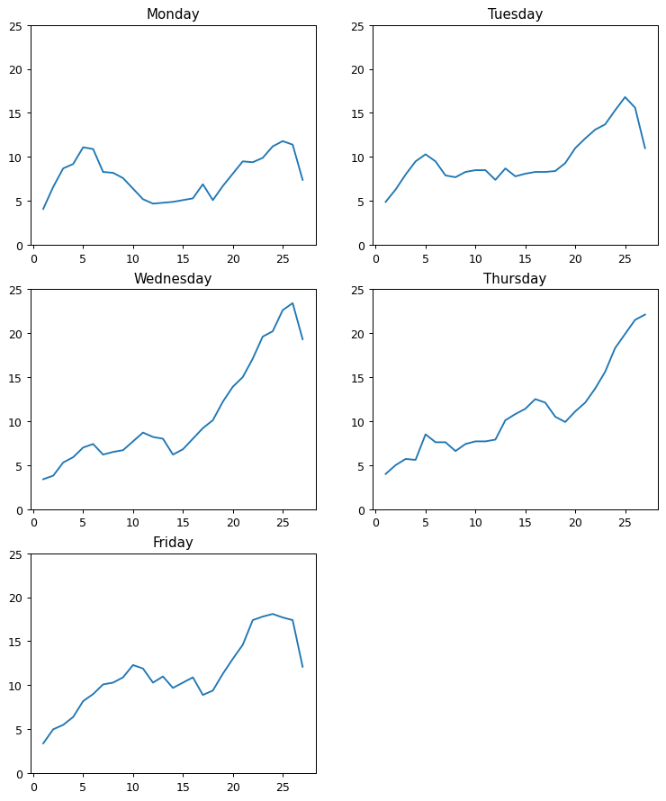
This consistent layout across subplots makes it easy to compare daily trends, showing how grid charts help visualize and analyze multiple time series in a clear and intuitive way.
Applying Grid Charts to Course Analysis
I've used similar grid charts to analyze student performance across different courses at Dataquest. By creating a grid of histograms showing completion rates for various courses, we were able to identify which topics our students found most challenging.
For example, we noticed that our SQL courses consistently showed lower completion rates compared to Python courses. By presenting this data in a grid chart to our content team, we were able to quickly identify the issue and take action. We revamped our SQL curriculum, adding more interactive exercises and real-world examples. Completion rates for SQL soon caught up to Python, reinforcing the idea that good visualizations don’t just tell you what’s happening—they guide you toward actionable solutions.
Tips for Effective Visualizations
When using these visualization techniques, keep the following tips in mind:
- Start with simple plots: Begin with basic plots and add complexity as needed. A simple histogram or line plot often reveals more than you'd expect.
- Consider your audience: Make sure your visualizations are easy to understand for your intended viewers. What's obvious to you might not be to others.
- Be consistent: Use similar scales and colors across related plots to make comparisons easier. This is especially important in grid charts.
- Refine your visualizations: Don't expect to create the perfect visualization on your first try. Experiment and refine based on the insights you gain.
- Avoid common pitfalls: Be cautious of overplotting in histograms with large datasets, and be aware that grid charts can become pointless if you include too many subplots.
Pro tip: Use histograms when you want to understand the distribution of a single variable. They're great for identifying outliers, understanding the central tendency of your data, and spotting any unusual patterns.
Grid charts, on the other hand, are perfect when you need to compare multiple related subsets of data. They're particularly useful for time series data (like our traffic example) or when you want to compare the same metric across different categories.
Pandas visualizations and grid charts are powerful tools that can help you uncover insights in your data more quickly and effectively. As you continue to practice and experiment with these techniques, you'll become more skilled at choosing the right visualization for your data and extracting meaningful insights.
In the next lesson, we'll explore how to represent multiple variables using relational plots, adding another valuable tool to your data visualization toolkit. This will enable you to uncover even more complex relationships in your data.
Lesson 5 – Relational Plots and Multiple Variables
So far, we’ve explored visualizing individual relationships, but many datasets contain multiple variables that interact in complex ways. When dealing with these types of data, it’s easy to feel overwhelmed. Relational plots are an excellent tool for visualizing relationships between multiple variables, helping you uncover patterns that may not be obvious when examining variables in isolation.
For this lesson, we’re switching to a new dataset: house characteristics and sale prices from Ames, Iowa. The dataset captures housing data between 2006 and 2010, including details about the size, quality, and features of the homes sold. If you'd like to follow along with the code, download the dataset here.
Let's create a relational plot using seaborn’s relplot() function to explore how different house features influence sale prices:
import pandas as pd
import seaborn as sns
import matplotlib.pyplot as plt

# Load the housing dataset
housing = pd.read_csv('housing.csv')

# Create a relational plot with multiple variables
sns.relplot(data=housing, x='Gr Liv Area', y='SalePrice',
            hue='Overall Qual', palette='RdYlGn',
            size='Garage Area', sizes=(1, 300),
            style='Rooms', col='Year')
plt.show()
This code generates a powerful visualization that incorporates six variables:
Gr Liv Area(x-axis): Above grade living area in square feetSalePrice(y-axis): Sale price of the house in USDOverall Qual(color): Quality rating of the house’s materials and finishGarage Area(size of points): Size of the garage in square feetRooms(shape of points): Number of rooms in the houseYear(separate plots): Year the house was built
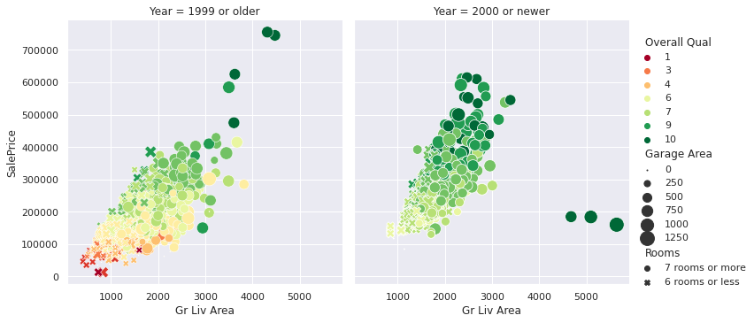
The relational plot above gives us a lot to unpack. Splitting the data between homes built before and after 2000, we can see some interesting patterns. In both groups, larger living areas generally correlate with higher sale prices—although the trend appears slightly stronger for newer homes, suggesting square footage might carry more influence in recent builds. Homes with higher quality ratings (deep green points) also tend to fall within the higher price range, reflecting the value that better craftsmanship and materials can add. Additionally, houses with more rooms (different shapes) and bigger garages (larger points) follow a similar trend: the more features, the higher the price—though there are exceptions.
One curious detail lies in the newer homes. Despite some having the largest living areas, high-quality ratings, and large garages, they remain priced under $200,000. These outliers suggest that other factors—like location, market conditions, or perhaps the timing of their sale—might play a role. This anomaly shows how multi-variable plots help uncover interesting questions that might otherwise go unnoticed.
The older homes group also features a few extreme high-end outliers—something we don’t see as much in the newer builds. This could indicate that some older properties come with unique charm or features that drive their value well beyond the norm. It’s a perfect example of why relational plots are so powerful: they let you explore multiple dimensions at once, helping you uncover patterns and exceptions that a single-variable analysis might miss.
Breaking Down the Patterns
Let’s summarize what this plot tells us:
- There’s a clear positive correlation between living area and sale price—bigger homes almost always cost more.
- Higher quality ratings (darker green points) align with higher sale prices, regardless of the house’s size.
- Larger garages (represented by bigger points) seem to contribute to higher sale prices, but this relationship isn't as strong as the others.
- The patterns are similar for houses built before and after 2000, indicating these relationships are consistent over time.
- Room count (represented by the point shapes) doesn’t show a clear impact on price beyond what’s already explained by the home’s overall size.
This breakdown highlights how relational plots allow us to see how several factors interact, revealing connections and patterns that might not be obvious otherwise. As you continue working with data visualizations, you’ll see how these kinds of insights can drive better decision-making and more nuanced analysis.
Tips for Creating Effective Relational Plots
When creating your own multi-variable plots, keep the following tips in mind:
- Choose variables that you think might be related or that you want to explore.
- Use different visual elements (position, color, size, shape) to represent different types of data.
- Avoid including too many variables―the plot can become cluttered and hard to interpret.
- Always include a legend and clear labels to explain what each visual element represents.
- Take time to examine the plot from different angles―sometimes patterns emerge when you least expect them.
As you practice creating these types of visualizations, you'll develop a keen eye for spotting patterns and relationships in complex datasets. This skill is essential in data science and can set you apart in the job market. It's about telling a story with your data and uncovering insights that can drive real-world decisions.
In the final section of this tutorial, we'll apply these visualization techniques to a guided project, analyzing traffic data to find indicators of heavy traffic on I-94. This is a chance to apply your new skills to a real-world dataset and see how these different visualization techniques can work together to provide a comprehensive view of a complex problem.
Guided Project: Finding Heavy Traffic Indicators on I-94

Let's apply our visualization skills to a real-world dataset: traffic data from the I-94 Interstate highway. Our goal is to identify indicators of heavy traffic, showing how visualization can help us understand complex data.
Analyzing Monthly Traffic Patterns
We'll start by examining monthly traffic patterns. Using the groupby function, we can aggregate our data by month and visualize the trends:
import pandas as pd

# Load the I-94 traffic volume dataset
i_94 = pd.read_csv('Metro_Interstate_Traffic_Volume.csv')

# Convert the 'date_time' column to datetime format for easier manipulation
i_94['date_time'] = pd.to_datetime(i_94['date_time'])

# Filter data to include only daytime hours (7 AM to 7 PM)
day = i_94.copy()[(i_94['date_time'].dt.hour >= 7) &
                  (i_94['date_time'].dt.hour < 19)]

# Extract the month from the 'date_time' column and store it in a new 'month' column
day['month'] = day['date_time'].dt.month

# Group the data by month and calculate the average traffic volume for each month
by_month = day.groupby('month').mean(numeric_only=True)

# Display the average traffic volume for each month
by_month['traffic_volume']
This gives us the average traffic volume for each month:
month
1     4495.613727
2     4711.198394
3     4889.409560
4     4906.894305
5     4911.121609
6     4898.019566
7     4595.035744
8     4928.302035
9     4870.783145
10    4921.234922
11    4704.094319
12    4374.834566
Name: traffic_volume, dtype: float64
Plotting this data below reveals that traffic is generally heavier from March to October and lighter from November to February. However, there is an interesting exception: July. Is there anything special about July? Is traffic significantly lighter every year during this month?
import matplotlib.pyplot as plt

by_month['traffic_volume'].plot.line()
plt.show()
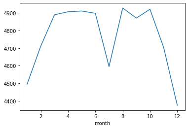
This is a perfect example of how visualizations spark curiosity and encourage deeper exploration. When you notice an unexpected pattern—like the dip in July—the natural next step is to dig further. One way to investigate would be to create a line graph showing traffic volume for each July across the six years in the dataset. Does the drop in July happen every year, or is it an outlier? I highly encourage you to try this on your own. Spoiler: the results will be so surprising that you'll want to dig even further... but for now, I’ll leave this mystery in your capable hands as we move forward with the rest of the tutorial!
Exploring Daily Traffic Patterns
Next, let's examine daily traffic patterns using a line graph:
# Extract weekday as a number (0 = Monday, 6 = Sunday)
day['dayofweek'] = day['date_time'].dt.dayofweek

# Calculate the mean traffic volume for each day
by_dayofweek = day.groupby('dayofweek').mean(numeric_only=True)

# Plot the results as a line graph
by_dayofweek['traffic_volume'].plot.line()
plt.show()
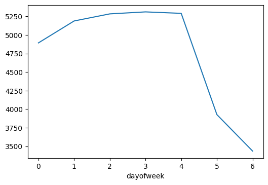
From the line graph, we see that traffic volume builds steadily through the workweek, peaking around the end of the week before dropping off sharply on Saturday and Sunday. This pattern reflects typical commuter behavior—weekday traffic remains heavy as people travel to and from work, while weekends offer a break with fewer vehicles on the road. It's a great reminder that data often mirrors the rhythms of our daily lives.
Key Insights
These visualizations reveal some interesting patterns:
- Monthly trends: Traffic is heaviest from March through October, possibly driven by more outdoor activities and travel during the warmer months.
- Daily trends: Weekday traffic shows a steady pattern, while weekends bring a more relaxed flow, with Saturday and Sunday seeing significantly less traffic volume.
- Friday peak: Traffic volume peaks on Fridays, likely reflecting a combination of end-of-week commutes and early weekend getaways, hinting at how lifestyle patterns impact road usage.
These kinds of insights show how powerful data visualization can be. They make it easier to understand what’s happening beneath the surface of our data and help us make sense of complex patterns with just a quick glance.
Expanding the Analysis
While we've focused on time-based patterns here, the dataset also includes weather information. In my experience, weather can have a big impact on traffic. A rainy day in Eastern Canada, where I used to live, could turn a normal commute into a nightmare! It would be interesting to explore how different weather conditions impact traffic volume on I-94.
You could create a scatter plot with temperature on the x-axis and traffic volume on the y-axis, using color to represent different weather conditions (like rain or snow). This would allow you to visualize how temperature and weather interact to affect traffic patterns.
Guided Project Conclusion and Next Steps
The ability to create these kinds of visualizations is a valuable skill in any data-related field. Whether you're analyzing traffic patterns, financial trends, or user behavior, these techniques will help you understand complex data and communicate your findings effectively.
As you continue to practice and apply these skills, you'll become a more insightful analyst, capable of drawing meaningful conclusions from complex datasets. By mastering these visualization techniques, you're equipping yourself with skills that are in high demand across industries, potentially opening doors to exciting career opportunities in data science and analytics.
For your next steps, consider applying these techniques to a dataset that interests you personally. Maybe it's sports statistics, stock market data, or environmental trends. The more you practice, the more intuitive these visualization skills will become.
Advice from a Python Expert
Data, at its core, is a story waiting to be told—whether you're forecasting the weather or exploring student engagement, every dataset has insights waiting to be uncovered. But raw numbers alone can feel overwhelming, even to experienced analysts. Data visualization in Python bridges that gap, turning abstract data into intuitive insights. Throughout this tutorial, we’ve explored a variety of tools—from line graphs and scatter plots to histograms and relational plots. Each visualization technique brings its own unique lens, helping you find meaning that might otherwise stay buried in the data.
If you're inspired to improve your data analysis skills, I encourage you to start experimenting with these visualization techniques today. Don't worry if your first attempts aren't perfect―every visualization is an opportunity to learn and improve. The key is to stay curious and keep practicing. As you become more proficient, you'll likely find that your ability to communicate complex ideas through visuals will set you apart in the data science field.
Here are some final tips to help you on your data visualization journey:
- Always start with a question. What do you want to know about your data? Let this guide your choice of visualization.
- Experiment with different types of plots. Sometimes, the most insightful visualization isn't the one you initially thought of.
- Pay attention to design. A clean, well-designed plot can make your insights much more accessible to your audience.
- Don't be afraid to iterate. Your first visualization might not reveal much, but tweaking your approach can often uncover hidden insights.
- Practice explaining your visualizations. Being able to clearly communicate what a plot shows is just as important as creating it.
- Join our Dataquest Community. This is where you can ask questions and share your progress with fellow data enthusiasts.
Remember, every dataset has a story to tell. With the right visualizations, you can be the one to tell it. As you continue to work with data, you'll find that these visualization skills are invaluable across a wide range of fields and datasets. Whether you're analyzing financial trends, studying environmental data, or exploring social media patterns, the ability to create clear and insightful visualizations will help you understand your data better and communicate your findings more effectively.
If you're looking to expand your knowledge of data visualization, I recommend checking out the Introduction to Data Visualization in Python course at Dataquest. It provides hands-on practice with the techniques we've discussed and many more. By creating clear, insightful visualizations, you'll be able to tell stories with data and drive informed decision-making. This skill will not only enhance your technical abilities but also empower you to make a real impact in your field.
The more you practice, the more you’ll realize that data isn’t just numbers—it’s a way to understand the world around you. And the best part? There’s always more to learn, more questions to ask, and more stories to tell. Keep exploring, keep visualizing, and let your curiosity guide you. Remember, every dataset has a story to tell. With the right visualizations, you can be the one to tell it.
Frequently Asked Questions
What are the main libraries used for data visualization in Python?
Data visualization in Python is a powerful tool for turning numbers into plots that can help us understand complex information. The main libraries that make this possible are:
- Matplotlib: This library is highly customizable and great for creating basic plots, such as line graphs, scatter plots, and histograms. For example, once you group the
i_94dataset by month, you might use Matplotlib to visualize monthly traffic patterns on I-94, like this:
plt.plot(by_month.index, by_month['traffic_volume'])
plt.xlabel('Month')
plt.ylabel('Traffic Volume')
plt.title('Average Monthly Traffic Volume on I-94')
plt.show()
- Seaborn: Building on Matplotlib, seaborn is particularly useful for creating complex plots that show multiple variables at once. For instance, you can use seaborn to create a relational plot that shows how different house features affect sale prices for the Ames, Iowa
housingdataset:
sns.relplot(data=housing, x='Gr Liv Area', y='SalePrice',
            hue='Overall Qual', palette='RdYlGn',
            size='Garage Area', sizes=(1, 300),
            style='Rooms', col='Year')
plt.show()
- pandas: While pandas is primarily used for data manipulation, it also includes built-in plotting functions that wrap around Matplotlib. This makes it easy to create quick and simple visualizations directly from pandas
DataFrameorSeriesobjects. For example, you can use pandas to create a histogram of traffic slowness percentages for the São Paulotrafficdataset like this:
traffic['Slowness in traffic (%)'].plot.hist()
plt.title('Distribution of Slowness in traffic (%)')
plt.xlabel('Slowness in traffic (%)')
plt.show()
These libraries work well together, each bringing its own strengths to the table. Matplotlib provides a solid foundation for creating custom plots, seaborn offers advanced statistical visualizations, and pandas makes it easy to visualize data directly from your dataset. By using these libraries, you can create visualizations that help you understand complex information and make informed decisions.
How can I create a line graph to visualize time series data using Matplotlib?
Line graphs are a powerful tool for visualizing time series data in Python. They allow you to identify trends, patterns, and anomalies at a glance. To create a line graph using Matplotlib, follow these steps:
-
Import Matplotlib:
import matplotlib.pyplot as plt -
Prepare your time series data, ensuring you have lists or arrays for both time (x-axis) and values (y-axis). For example, you might have:
x_data = ['Jan', 'Feb', 'Mar', 'Apr', 'May'] # Time series data y_data = [10, 15, 7, 12, 9] # Values corresponding to each time point -
Create and display the line graph:
plt.plot(x_data, y_data)
plt.xlabel('Time')
plt.ylabel('Values')
plt.title('Your Time Series Data')
plt.show()
For example, in the tutorial, we used this code to visualize COVID-19 data:
plt.plot(month_number, new_cases)
plt.title('New Reported Cases By Month (Globally)')
plt.xlabel('Month Number')
plt.ylabel('Number Of Cases')
plt.ticklabel_format(axis='y', style='plain')
plt.show()
When working with time series data, consider the following tips:
- Use appropriate time intervals on the x-axis to accurately represent your data.
- Highlight significant events or turning points in your time series.
- If visualizing multiple time series, use different colors or line styles for clarity.
While line graphs are well-suited for most time series data, they may not be ideal for highly volatile data or when you need to show the distribution of values over time. In such cases, consider alternatives like area charts or box plots.
By becoming proficient in creating line graphs and other visualization techniques, you'll be better equipped to extract insights from complex datasets. This skill will help you effectively communicate your findings and tell a compelling story with your data.
What insights can scatter plots reveal about the relationship between variables?
Scatter plots are a great way to visualize relationships between two continuous variables. When you create scatter plots in Python using libraries like Matplotlib or seaborn, you can gain valuable insights into your data. Let's take a closer look at what you can discover:
-
Correlation: Scatter plots show whether there's a positive, negative, or no correlation between variables. For example, in our bike rental analysis, we found a positive correlation between temperature and the number of rentals. The scatter plot showed an upward trend, indicating that as the temperature increased, so did the number of rentals.
-
Strength of relationships: The tightness of the data points indicates how strong the relationship is. In our bike rental scatter plot, we saw a moderately strong relationship, with some scatter around the trend. This resulted in a correlation coefficient of about 0.63.
-
Patterns or clusters: Scatter plots can reveal interesting patterns or groupings in your data. While our bike rental example didn't show distinct clusters, in other datasets you might see clear groupings that suggest different categories or behaviors.
-
Outliers: Points that fall far from the main cluster are easily identifiable in scatter plots, helping you spot anomalies or unusual cases that might warrant further investigation.
In addition to these insights, scatter plots can be enhanced by incorporating additional variables through color, size, or shape of the points. This allows you to visualize multiple dimensions of your data simultaneously. For instance, in our housing price analysis, we used color to represent overall quality, size for garage area, and different shapes for the number of rooms, all in a single plot.
It's essential to keep in mind that correlation doesn't imply causation. While we saw a relationship between temperature and bike rentals, this doesn't necessarily mean that temperature directly causes more rentals. Other factors, like holidays or special events, could also influence rental numbers. By being aware of this, you can avoid misinterpreting your results.
Scatter plots are a valuable tool in data visualization, providing a quick and intuitive way to understand relationships in your data. They can guide further analysis and inform decision-making. For example, a bike rental company might use these insights to adjust their inventory based on weather forecasts, potentially increasing profits during warmer periods.
By learning to create and interpret scatter plots in Python, you'll be better equipped to extract meaningful insights from complex datasets. This skill is highly valued in data science and analytics roles, and can help you make more informed decisions in your work.
How do I interpret a Pearson correlation coefficient in a scatter plot?
When working with scatter plots, understanding the Pearson correlation coefficient (r) is essential for identifying relationships between variables. This coefficient, ranging from -1 to 1, indicates the strength and direction of the linear relationship between two variables.
To interpret a Pearson correlation coefficient in a scatter plot:
- Examine the value of
r:- A value of 1 indicates a very strong positive relationship, where the variables tend to increase or decrease together.
- A value of -1 indicates a very strong negative relationship, where one variable tends to decrease as the other increases or vice versa.
-
A value close to 0 suggests no strong linear relationship between the variables.
- Visually analyze the scatter plot:
- For positive
r, points tend to trend upward from left to right, indicating that as one variable increases, the other tends to increase as well. - For negative
r, points tend to trend downward from left to right, indicating that as one variable increases, the other tends to decrease. - As the absolute value of
rapproaches 1, points cluster more tightly around an imaginary line, indicating a stronger relationship. - A value closer to 0 results in a more dispersed cloud of points, indicating a weaker relationship.
- For positive
For example, in the bike rental analysis, we calculated a correlation coefficient of approximately 0.63 between temperature and bike rentals. This moderately strong positive relationship is visible in the scatter plot, where warmer temperatures generally correspond to more bike rentals. The upward trend is clear, but the spread of points indicates that other factors also influence rental numbers.
When interpreting correlation coefficients, keep in mind:
- Correlation does not imply causation. In other words, just because two variables are related, it doesn't mean that one causes the other.
- Non-linear relationships may not be accurately represented by
r. This means that if the relationship between the variables is not linear, the correlation coefficient may not capture it accurately. - Outliers can significantly impact the coefficient. A single data point that is far away from the others can affect the correlation coefficient and lead to incorrect conclusions.
- The strength of the relationship can be subjective and context-dependent. What one person considers a strong relationship, another person may not.
By understanding how to interpret correlation coefficients in scatter plots, you can gain valuable insights into the relationships between variables and make more informed decisions.
What are the key differences between bar plots and histograms?
When it comes to data visualization in Python, choosing the right type of plot can greatly impact how effectively you communicate your insights. Two common visualization techniques that often cause confusion are bar plots and histograms. While they may appear similar at first glance, they serve distinct purposes and are used for different types of data.
Bar plots are ideal for visualizing categorical data. They display distinct categories on the x-axis and their corresponding values on the y-axis. Each bar represents a specific category, and the height of the bar indicates the value associated with that category. For example, in our bike-sharing analysis, we used a bar plot to show the average number of registered bike rentals for each day of the week:
plt.bar(weekday_averages['weekday'], weekday_averages['registered'])
This visualization made it easy to compare rental patterns across different days, revealing that Fridays had the highest average number of rentals.
Histograms are perfect for visualizing the distribution of continuous numerical data. They divide the data into bins (intervals) and display the frequency of data points falling within each bin. The x-axis represents the range of values, while the y-axis shows the frequency or count of data points in each bin. In our analysis of casual bike rentals, we created a histogram using:
plt.hist(bike_sharing['casual'])
This histogram revealed a right-skewed distribution, indicating that there were many days with few casual rentals and fewer days with very high rental numbers.
So, what sets bar plots and histograms apart? Here are the key differences:
- Data type: Bar plots work with categorical data, while histograms are used for continuous numerical data.
- X-axis representation: In bar plots, each bar represents a distinct category. In histograms, the x-axis represents a continuous range of values divided into bins.
- Y-axis interpretation: For bar plots, the y-axis typically shows actual values. In histograms, the y-axis represents the frequency or count of data points in each bin.
- Visual interpretation: Bar plots allow for easy comparison between categories, while histograms show the shape and spread of a data distribution.
When deciding between a bar plot and a histogram for your data visualization in Python, consider the nature of your data and what you want to communicate. Use bar plots when you have distinct categories to compare, such as sales by product type or survey responses by age group. Choose histograms when you want to understand the distribution of a continuous variable, like ages in a population or test scores in a class.
It's also important to keep in mind that both plots have limitations. Bar plots can become cluttered with too many categories, and histograms can be sensitive to the number of bins chosen. Always consider your audience and the story you want to tell with your data when selecting the most appropriate visualization technique.
By understanding the strengths and weaknesses of both bar plots and histograms, you'll be better equipped to uncover and communicate insights hidden in your datasets, whether you're analyzing bike rental patterns, traffic trends, or any other type of data.
How can I use pandas for quick data visualization during the exploration phase?
When exploring a new dataset, visualizing your data can help you identify patterns and trends that might not be immediately apparent. Pandas, a powerful data manipulation library in Python, provides built-in plotting capabilities that make it easy to create insightful visualizations.
Pandas' plotting functions are convenient wrappers around Matplotlib, allowing you to create a range of visualizations with minimal code. For example, you can use the following code to generate a histogram that shows the distribution of slowness in traffic for the São Paulo traffic dataset:
traffic['Slowness in traffic (%)'].plot.hist()
plt.title('Distribution of Slowness in traffic (%)')
plt.xlabel('Slowness in traffic (%)')
plt.show()
This code produces a histogram that reveals patterns in the data, such as skewness or multiple peaks, that might not be visible from summary statistics alone.
Using pandas for data visualization during exploration has several benefits. Firstly, it saves time by allowing you to create plots directly from your DataFrame without additional data manipulation. Secondly, the syntax is straightforward and requires minimal code. Finally, it integrates seamlessly into your data cleaning and analysis workflow.
While pandas is ideal for initial exploration, you may want to use specialized libraries like Matplotlib or seaborn for more complex or customized visualizations later in your analysis. However, pandas visualizations provide a useful first look at your data, allowing you to identify areas that require further investigation.
To get the most out of pandas visualizations during exploration, try creating multiple plot types (histograms, scatter plots, line plots) for each variable of interest. This approach can help you identify different aspects of your data and inform your subsequent analysis steps.
By using pandas' plotting functions, you can gain a deeper understanding of your data and make informed decisions about further analysis and visualization. This approach can significantly streamline your exploratory data analysis process.
What is a relational plot and how can it help visualize multiple variables?
Relational plots are a powerful tool for data visualization in Python that allow you to represent multiple variables on a single graph. They can show you how several factors interact with each other, giving you a more complete picture of your data.
When creating a relational plot, you can use different visual elements to represent various data points, such as position (x and y coordinates), color, size, and shape.
For example, the code below creates a relational plot for the Ames, Iowa housing dataset using six different variables:
sns.relplot(data=housing, x='Gr Liv Area', y='SalePrice',
            hue='Overall Qual', palette='RdYlGn',
            size='Garage Area', sizes=(1, 300),
            style='Rooms', col='Year')
plt.show()

This single plot reveals multiple insights, such as how larger living areas and higher quality ratings generally correlate with higher sale prices. It also shows how these relationships differ for houses built before and after 2000.
Relational plots offer a more comprehensive view of your data compared to simpler plots like line graphs or scatter plots. They're particularly useful when working with complex datasets and trying to uncover hidden patterns or relationships that might not be obvious when looking at variables separately.
That said, it's essential to balance the amount of information you include in a relational plot. You want to show enough information to be insightful, but not so much that the plot becomes confusing.
By using relational plots effectively, you can gain a deeper understanding of your data and uncover valuable insights that might otherwise remain hidden. Whether you're analyzing housing prices, studying climate data, or exploring customer behavior, relational plots can help you see the bigger picture and make more informed decisions.
How do I create separate Matplotlib plots in Python?
Creating separate Matplotlib plots is a useful technique in data visualization with Python. By comparing different aspects of your data side by side, you can gain a deeper understanding of your data and identify patterns that might not be apparent in a single plot.
To create separate plots, follow these simple steps:
- Import the Matplotlib library using
import matplotlib.pyplot as plt - Create a figure with multiple subplots using
plt.figure()andplt.subplot() - Plot your data on each subplot
- Customize each subplot with titles, labels, and other formatting options
- Display the plots using
plt.show()
Here's an example from our analysis of the São Paulo traffic dataset that demonstrates this technique:
plt.figure(figsize=(10, 12))

for i, day in zip(range(1, 6), days):
    plt.subplot(3, 2, i)
    plt.plot(traffic_per_day[day]['Hour (Coded)'], traffic_per_day[day]['Slowness in traffic (%)'])
    plt.title(day)
    plt.ylim([0, 25])

plt.show()
In this code, we first create a figure with a specified size. Then, we use a loop to iterate through each day and create a subplot for each day. We plot the data for each day on its respective subplot and add a title to each subplot. Finally, we display the plots using plt.show().
Using separate plots offers several benefits in data visualization. Firstly, it allows for easy comparison of trends across different categories or time periods. Secondly, it helps in identifying patterns that might not be apparent in a single, combined plot. Lastly, it provides a clearer view of individual datasets, especially when dealing with complex or diverse data.
This technique is particularly useful when analyzing data with multiple dimensions or when you want to highlight differences between subsets of your data. For instance, in our traffic analysis, we used separate plots to compare traffic patterns across different days of the week, making it easy to spot daily trends and variations.
By learning how to create separate Matplotlib plots, you'll be able to extract more meaningful insights from your data and tell a clearer story with your data.
How do I set axis limits in Matplotlib?
Setting axis limits is a useful skill in data visualization with Python, allowing you to focus on specific ranges of your data and create more effective visualizations. This technique is particularly helpful when you want to highlight important features, exclude outliers, or ensure consistency across multiple plots.
In matplotlib, you can set axis limits using the following functions:
plt.xlim(xmin, xmax): Sets the limits for the x-axisplt.ylim(ymin, ymax): Sets the limits for the y-axis
For example, when creating a grid chart to compare traffic slowness across different days, you might use:
plt.ylim([0, 25])This ensures that the y-axis scale remains consistent across all subplots, making it easier to compare trends between days. By doing so, you can enhance the clarity of your visualization.
Custom axis limits are particularly useful in several scenarios:
- When you need to focus on a specific range of values that are most relevant to your analysis
- To exclude extreme outliers that might skew the overall visualization
- When creating multiple plots that need to be directly comparable
When setting axis limits, it's essential to consider the full range of your data to avoid inadvertently hiding important information. A good practice is to first use plt.axis('tight') to automatically adjust your axis limits to fit your data closely, then fine-tune as needed for the best visual representation.
By understanding how to use axis limits effectively, you'll be able to create more focused, clear, and insightful data visualizations in Python, ultimately enhancing your ability to communicate complex data stories effectively.
How do I import Matplotlib in Python?
When working with data visualization in Python, I rely on Matplotlib to create a variety of plots. To import it into my Python scripts, I use the following statement:
import matplotlib.pyplot as pltThis import statement brings in the pyplot module from matplotlib and assigns it the alias plt. Using plt as an alias is a common convention in the data science community, making it easier for others to understand your code.
With the module imported, you can create different types of visualizations. For example, to create a line graph of monthly traffic patterns for our i_94 dataset:
plt.plot(by_month.index, by_month['traffic_volume'])
plt.show()
Importing matplotlib in this way provides convenient access to all the plotting functions while keeping your code organized and easy to read. This is especially useful when working with multiple visualization libraries in the same script, as it helps avoid naming conflicts.
While this is the most common way to import matplotlib, you may occasionally see alternative methods. Some developers prefer to import specific functions directly:
from matplotlib.pyplot import plot, showHowever, I recommend using the standard import method for consistency and flexibility in your data visualization projects.
Consistent import practices make your code more readable and help you collaborate more effectively with other data scientists and analysts. As you develop your skills in data visualization with Python, adopting these standard practices will help you create clearer, more impactful visualizations to tell your data's story.
How does the bins parameter affect histogram appearance in seaborn?
bins parameter affect histogram appearance in seaborn?When creating histograms in seaborn, the bins parameter plays a significant role in how your data is presented. This parameter determines the number of intervals or "bins" into which your data is grouped, which in turn affects the histogram's appearance and the insights you can extract.
The number of bins you choose can greatly impact the story your histogram tells. With more bins, you get a detailed view that can reveal subtle patterns or structures in your data distribution. On the other hand, fewer bins provide a broader, more generalized perspective. For example, in our bike rental analysis, we used a default of 10 bins:
plt.hist(bike_sharing['casual'])
plt.show()
This histogram showed a right-skewed distribution of casual rentals, with many days having few rentals and fewer days with high rental numbers. By experimenting with different bin counts, you can potentially uncover more nuanced patterns in rental behavior.
Finding the right number of bins is a delicate balance. If you use too few bins, you might oversimplify your data and miss important details. Conversely, too many bins can introduce noise, making it harder to discern overall trends. The optimal number often depends on your dataset's size and the specific insights you're trying to uncover.
While there's no one-size-fits-all solution, some Python libraries offer methods to suggest optimal bin sizes based on your data characteristics. These can be useful starting points, but you'll often need to experiment to find the most informative representation for your specific analysis.
Understanding how to effectively use the bins parameter is key to creating meaningful histograms in Python. By using this parameter thoughtfully, you can significantly enhance your ability to extract valuable insights from data distributions and communicate your findings clearly.