
Tutorial 3: Data Cleaning Project Walkthrough
Main Data Cleaning Guide Page
Tutorial 1: Data Cleaning and Analysis in Python
Tutorial 2: Advanced Data Cleaning in Python
Tutorial 3: Data Cleaning Project Walk-through - You are here
Pandas Cheat Sheet and PDF Download
RegEx Cheet Sheet and PDF Download
When I started working on my first machine learning project predicting weather patterns, I was excited to build sophisticated models. Instead, I spent weeks cleaning messy data. My datasets had temperature readings in different units, inconsistent weather descriptions like "partly cloudy" versus "p. cloudy", and gaps scattered throughout the records.
That experience taught me that data cleaning isn't just about fixing errors—it's about preparing data to effectively tell its story. For example, I used regular expressions to standardize those weather descriptions, making the data useful for analysis. I developed techniques to fill missing values using historical patterns and readings from nearby stations. Working with JSON data from weather APIs initially felt overwhelming, but I learned to integrate external data smoothly into my analysis.
The most valuable lesson came when I finally combined all my cleaned datasets. Hidden patterns emerged that weren't visible before. Temperature trends became clear. Weather system movements made sense. My machine learning models finally had reliable data to work with. The visualizations I created revealed relationships I couldn't see in the raw numbers.
Through working with various datasets at Dataquest, I've found that these same principles apply whether you're analyzing education statistics, survey responses, or scientific measurements. In this tutorial, we'll work through practical techniques for:
- Standardizing data across different sources
- Handling missing values effectively
- Using advanced Python techniques for efficient data cleaning
- Combining datasets to create unified views
- Creating visualizations to validate your cleaning steps
We'll practice these skills using real datasets, including NYC high school data and Star Wars survey results. You'll apply the techniques to answer meaningful questions and uncover insights that would remain hidden in messy data. Let's start by examining our initial datasets and planning our cleaning approach.
Lesson 1 - Data Cleaning Walkthrough
Have you ever tried to analyze data from multiple sources only to find that each file uses different formats, naming conventions, or structures? That's what I ran into with my weather prediction project―I had temperature readings from various stations, each with its own way of recording data. Some used Fahrenheit, others Celsius. Station IDs followed different formats. It was impossible to analyze the data until I standardized everything.
In this lesson, we'll tackle a similar challenge using real data from New York City schools. We'll learn how to load multiple data files, understand their structure, and prepare them for analysis. By the end, you'll know how to organize and standardize data from various sources―a fundamental skill for any data analysis project.
Understanding Our Data Sources
We have eight data files about NYC schools, each containing different information:
- ap_2010.csv - Data on AP test results
- class_size.csv - Data on class size
- demographics.csv - Data on demographics
- graduation.csv - Data on graduation outcomes
- hs_directory.csv - A directory of high schools
- sat_results.csv - Data on SAT scores
- survey_all.txt - Data on surveys from all schools
- survey_d75.txt - Data on surveys from New York City district 75
Before we get into the data, take some time to understand its context by reading about:
Loading the Data Files
Let's start by reading the CSV files. We'll store them in a dictionary for easy access:
data_files = [
    "ap_2010.csv",
    "class_size.csv",
    "demographics.csv",
    "graduation.csv",
    "hs_directory.csv",
    "sat_results.csv"
]
data = {}

for f in data_files:
    key_name = f.replace(".csv", "")
    d = pd.read_csv(f"schools/{f}")
    data[key_name] = d
Next, let's look at the SAT results data by running print(data["sat_results"].head()) to see what we're working with:
| DBN | SCHOOL NAME | Num of SAT Test Takers | SAT Critical Reading Avg. Score | SAT Math Avg. Score | SAT Writing Avg. Score |
|---|---|---|---|---|---|
| 01M292 | HENRY STREET SCHOOL FOR INTERNATIONAL STUDIES | 29 | 355 | 404 | 363 |
| 01M448 | UNIVERSITY NEIGHBORHOOD HIGH SCHOOL | 91 | 383 | 423 | 366 |
| 01M450 | EAST SIDE COMMUNITY SCHOOL | 70 | 377 | 402 | 370 |
| 01M458 | FORSYTH SATELLITE ACADEMY | 7 | 414 | 401 | 359 |
| 01M509 | MARTA VALLE HIGH SCHOOL | 44 | 390 | 433 | 384 |
Handling Survey Data
Now let's load our survey data, which requires special handling due to its format:
all_survey = pd.read_csv("schools/survey_all.txt", delimiter="\t", encoding='windows-1252')
d75_survey = pd.read_csv("schools/survey_d75.txt", delimiter="\t", encoding='windows-1252')
survey = pd.concat([all_survey, d75_survey], axis=0)
The survey dataset is quite large―it has 2,773 columns! Most of these columns aren't relevant for our analysis. Let's create a focused dataset with just the columns we need:
survey = survey.copy()
survey["DBN"] = survey["dbn"]

survey_fields = [
    "DBN", "rr_s", "rr_t", "rr_p", "N_s", "N_t", "N_p",
    "saf_p_11", "com_p_11", "eng_p_11", "aca_p_11",
    "saf_t_11", "com_t_11", "eng_t_11", "aca_t_11",
    "saf_s_11", "com_s_11", "eng_s_11", "aca_s_11",
    "saf_tot_11", "com_tot_11", "eng_tot_11", "aca_tot_11"
]
survey = survey[survey_fields]
data["survey"] = survey
print(survey.head())
Here's what our filtered survey data looks like:
| DBN | rr_s | rr_t | rr_p | N_s | N_t | N_p | saf_p_11 | com_p_11 | eng_p_11 |
|---|---|---|---|---|---|---|---|---|---|
| 01M015 | NaN | 88 | 60 | NaN | 22.0 | 90.0 | 8.5 | 7.6 | 7.5 |
| 01M019 | NaN | 100 | 60 | NaN | 34.0 | 161.0 | 8.4 | 7.6 | 7.6 |
| 01M020 | NaN | 88 | 73 | NaN | 42.0 | 367.0 | 8.9 | 8.3 | 8.3 |
| 01M034 | 89.0 | 73 | 50 | 145.0 | 29.0 | 151.0 | 8.8 | 8.2 | 8.0 |
| 01M063 | NaN | 100 | 60 | NaN | 23.0 | 90.0 | 8.7 | 7.9 | 8.1 |
Standardizing School Identifiers
Notice that each dataset uses a unique identifier called DBN (District Borough Number) to identify schools. However, some datasets use different formats. Let's standardize these:
data["hs_directory"]["DBN"] = data["hs_directory"]["dbn"]

def pad_csd(num):
    return str(num).zfill(2)

data["class_size"]["padded_csd"] = data["class_size"]["CSD"].apply(pad_csd)
data["class_size"]["DBN"] = data["class_size"]["padded_csd"] + data["class_size"]["SCHOOL CODE"]
Here's how our class_size data looks after standardizing the DBN:
| CSD | BOROUGH | SCHOOL CODE | SCHOOL NAME | GRADE | padded_csd | DBN |
|---|---|---|---|---|---|---|
| 1 | M | M015 | P.S. 015 Roberto Clemente | 0K | 01 | 01M015 |
| 1 | M | M015 | P.S. 015 Roberto Clemente | 0K | 01 | 01M015 |
| 1 | M | M015 | P.S. 015 Roberto Clemente | 01 | 01 | 01M015 |
| 1 | M | M015 | P.S. 015 Roberto Clemente | 01 | 01 | 01M015 |
| 1 | M | M015 | P.S. 015 Roberto Clemente | 02 | 01 | 01M015 |
Best Practices for Data Organization
Through this process, we've learned several important practices for handling multiple datasets:
- Always check your file formats before starting. Opening files in a text editor can reveal their structure and potential quirks.
- Create a consistent organization system for your data. Using a dictionary with meaningful keys makes your code more readable and maintainable.
- Verify your data after reading it. Examine a few rows of each dataset to make sure everything loaded correctly.
- Document any special handling required. Note down things like encodings and delimiters―you'll thank yourself later.
- Standardize identifiers across datasets. This makes combining data much easier in later steps.
Next, we'll explore how to combine these datasets effectively. The survey responses, SAT scores, and demographic information all need to come together to tell the full story of NYC schools. But first, make sure you understand how each piece of your data is structured―it's the foundation for everything that follows.
Lesson 2 - Data Cleaning Walkthrough: Combining the Data
When analyzing data from multiple sources, you often need to piece together information from different files to get the complete picture. In my weather prediction project, some files contained temperature readings, others had precipitation data, and still others tracked wind speeds. Only by combining these datasets correctly could I understand how these factors worked together to influence weather patterns.
In this lesson, we'll continue working with our New York City public schools data, combining information about SAT scores, demographics, and survey responses. We'll learn how to merge datasets effectively and handle the missing values that often result from these combinations.
Understanding Join Operations
When combining datasets, we need to choose the right type of join operation. Think of it like merging class rosters—sometimes you only need the students enrolled in both classes (inner join), sometimes you want everyone on one class roster with any matching names from the other (left join), and other times you want a full list of students from both rosters, whether or not they appear in both (outer join).
Let's start by combining our SAT results with AP test and graduation data using left joins to preserve all our SAT score data:
combined = data['sat_results']
combined = combined.merge(data['ap_2010'], on='DBN', how='left')
combined = combined.merge(data['graduation'], on='DBN', how='left')
For our demographic and survey data, we'll use inner joins to ensure we only keep schools where we have complete information:
to_merge = ['class_size', 'demographics', 'survey', 'hs_directory']
for m in to_merge:
    combined = combined.merge(data[m], on='DBN', how='inner')
Understanding the Impact of Different Joins
Our inner joins resulted in 116 fewer rows than we started with in the sat_results dataset. This happened because some schools in the SAT dataset didn't have matching records in other datasets. While investigating these missing schools could be interesting, we'll focus on the schools where we have complete information for our analysis.
Here's what our combined dataset looks like at this point:
| DBN | SCHOOL NAME | SAT Critical Reading Avg. Score | SAT Math Avg. Score | SAT Writing Avg. Score | AP Test Takers |
|---|---|---|---|---|---|
| 01M448 | UNIVERSITY NEIGHBORHOOD HIGH SCHOOL | 383 | 423 | 366 | 49 |
| 01M450 | EAST SIDE COMMUNITY SCHOOL | 377 | 402 | 370 | 35 |
| 01M458 | FORSYTH SATELLITE ACADEMY | 414 | 401 | 359 | 18 |
| 01M509 | MARTA VALLE HIGH SCHOOL | 390 | 433 | 384 | 41 |
| 01M515 | LOWER EAST SIDE PREPARATORY HIGH SCHOOL | 332 | 557 | 316 | 112 |
Filling in Missing Values
After combining our datasets, we notice many columns contain null (NaN) values. This is common when performing left joins, as not all schools have data in every dataset. Rather than removing these schools entirely, we can fill in the missing values thoughtfully.
For numeric columns, we'll fill missing values with the mean of that column:
combined = combined.fillna(combined.mean(numeric_only=True))However, we need to be careful with non-numeric columns. Before filling any remaining missing values with zeros, we should ensure proper data type handling:
combined = combined.infer_objects(copy=False).fillna(0)Let's examine our data after filling in missing values:
| DBN | SCHOOL NAME | SAT Critical Reading Avg. Score | SAT Math Avg. Score | student_response_rate |
|---|---|---|---|---|
| 01M448 | UNIVERSITY NEIGHBORHOOD HIGH SCHOOL | 383 | 423 | 72 |
| 01M450 | EAST SIDE COMMUNITY SCHOOL | 377 | 402 | 85 |
| 01M458 | FORSYTH SATELLITE ACADEMY | 414 | 401 | 68 |
| 01M509 | MARTA VALLE HIGH SCHOOL | 390 | 433 | 75 |
| 01M515 | LOWER EAST SIDE PREPARATORY HIGH SCHOOL | 332 | 557 | 81 |
Best Practices for Combining Data
- Choose your join type carefully based on your analysis goals
- Verify row counts before and after joins to understand data loss
- Handle missing values appropriately for different data types
- Document your decisions about handling missing data
- Validate your combined dataset to ensure it makes sense
In the next lesson, we'll analyze our cleaned and combined dataset to uncover relationships between different factors in NYC schools. We'll create visualizations to help us understand these relationships better and identify patterns that might have been hidden in the separate datasets.
Lesson 3 - Data Cleaning Walkthrough: Analyzing and Visualizing the Data
After spending weeks cleaning weather station data for my project, I discovered something interesting: the relationships between variables only became clear once I could visualize the clean, combined data. Temperature patterns that seemed random in isolation suddenly showed clear correlations with wind direction and humidity when plotted together.
Now that we've cleaned and combined our NYC schools data, we can uncover similar insights. In this lesson, we'll explore relationships between different factors like SAT scores, demographics, and survey responses, using both statistical analysis and visualizations to tell the story in our data.
Understanding Correlations
We'll use Pearson's correlation coefficient (r) to measure the strength and direction of relationships between variables. This coefficient ranges from -1 to 1, where:
- r = 1 indicates a perfect positive correlation (as one variable increases, the other increases proportionally)
- r = -1 indicates a perfect negative correlation (as one variable increases, the other decreases proportionally)
- r = 0 indicates no linear correlation
- Values between 0.3 and 0.7 (or -0.3 to -0.7) suggest moderate correlation
- Values above 0.7 (or below -0.7) suggest strong correlation
Let's calculate correlations with SAT scores, focusing on moderate to strong relationships:
correlations = combined.corr(numeric_only=True)
correlations = correlations["sat_score"]
moderate_to_strong_correlations = correlations[correlations.abs() > 0.30]
print(moderate_to_strong_correlations)
Note: We used numeric_only=True because correlation calculations only work with numeric data. This argument tells pandas to ignore non-numeric columns, preventing errors.
| Variable | Correlation |
|---|---|
| SAT Critical Reading Avg. Score | 0.987 |
| SAT Math Avg. Score | 0.973 |
| SAT Writing Avg. Score | 0.988 |
| sat_score | 1.000 |
| AP Test Takers | 0.523 |
| Total Exams Taken | 0.514 |
| Number of Exams with scores 3 4 or 5 | 0.463 |
| Total Cohort | 0.325 |
| NUMBER OF STUDENTS / SEATS FILLED | 0.395 |
| NUMBER OF SECTIONS | 0.363 |
| AVERAGE CLASS SIZE | 0.381 |
| SIZE OF LARGEST CLASS | 0.314 |
| frl_percent | -0.722 |
| total_enrollment | 0.368 |
| ell_percent | -0.399 |
| sped_percent | -0.448 |
| asian_num | 0.475 |
| asian_per | 0.571 |
| hispanic_per | -0.397 |
| white_num | 0.450 |
| white_per | 0.621 |
| male_num | 0.326 |
| female_num | 0.389 |
| N_s | 0.423 |
| N_p | 0.422 |
| saf_t_11 | 0.314 |
| saf_s_11 | 0.338 |
| aca_s_11 | 0.339 |
| saf_tot_11 | 0.319 |
| total_students | 0.408 |
Looking at the correlations above, we notice that individual SAT section scores (Critical Reading, Math, and Writing) show very strong correlations with the overall SAT score (r > 0.97). This is expected since these sections make up the total score, so we won't analyze them separately. Instead, we'll focus on three interesting relationships:
- School size (
total_enrollment, r = 0.368) - English language learner percentage (
ell_percent, r = -0.399) - Free/reduced lunch percentage (
frl_percent, r = -0.722)
These factors could provide insights into how school characteristics and socioeconomic factors relate to academic performance.
Exploring School Size and SAT Scores
The correlation results show that total_enrollment has a moderate positive correlation (r = 0.368) with SAT scores. This is surprising because conventional wisdom suggests that smaller schools, where students might receive more individual attention, would have higher scores. Before jumping to conclusions, let's visualize this relationship:
combined.plot.scatter(x='total_enrollment', y='sat_score')
plt.show()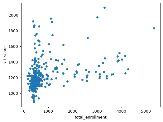
The scatter plot reveals a more nuanced story than the correlation coefficient alone. We can see that:
- Most schools cluster in the 0-1000 enrollment range with SAT scores between 1000-1400
- There's high variability in SAT scores for smaller schools
- A few larger schools (3000+ students) show relatively high SAT scores
- The relationship isn't strictly linear, which means the correlation coefficient doesn't tell the whole story
Understanding the Role of English Language Learners
Looking at schools with both low enrollment and low SAT scores reveals an important pattern:
low_enrollment = combined[combined["total_enrollment"] < 1000]
low_enrollment = low_enrollment[low_enrollment["sat_score"] < 1000]
print(low_enrollment["School Name"])| Index | School Name |
|---|---|
| 91 | INTERNATIONAL COMMUNITY HIGH SCHOOL |
| 125 | 0 |
| 126 | BRONX INTERNATIONAL HIGH SCHOOL |
| 139 | KINGSBRIDGE INTERNATIONAL HIGH SCHOOL |
| 141 | INTERNATIONAL SCHOOL FOR LIBERAL ARTS |
| 176 | 0 |
| 179 | HIGH SCHOOL OF WORLD CULTURES |
| 188 | BROOKLYN INTERNATIONAL HIGH SCHOOL |
| 225 | INTERNATIONAL HIGH SCHOOL AT PROSPECT |
| 237 | IT TAKES A VILLAGE ACADEMY |
| 253 | MULTICULTURAL HIGH SCHOOL |
| 286 | PAN AMERICAN INTERNATIONAL HIGH SCHOOL |
Many of these schools specifically serve international students and English language learners. This leads us to examine the relationship between English language learner percentage and SAT scores:
combined.plot.scatter(x='ell_percent', y='sat_score')
plt.show()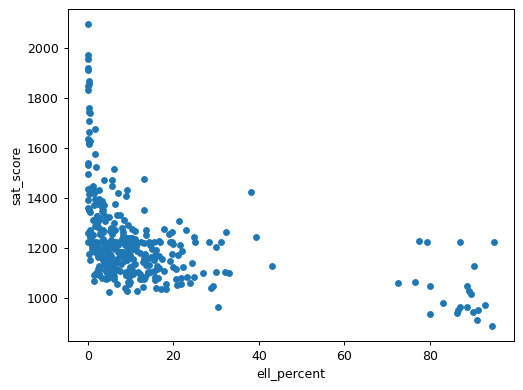
The scatter plot reveals a distinctive L-shaped pattern. Schools with low ELL percentages show a wide range of SAT scores, while schools with high ELL percentages (above 80%) consistently show lower SAT scores. However, we should be very careful about interpreting these results. The SAT, like many standardized tests, has been criticized for cultural and linguistic bias. Lower scores in schools with high ELL populations likely reflect the challenges of taking a standardized test in a non-native language rather than any difference in academic ability or school quality. These results raise important questions about whether traditional standardized tests effectively measure the capabilities of all students.
Economic Factors and Academic Performance
The strongest correlation in our data is between the percentage of students eligible for free/reduced lunch and SAT scores (r = -0.722). Let's visualize this relationship:
combined.plot.scatter(x='frl_percent', y='sat_score')
plt.show()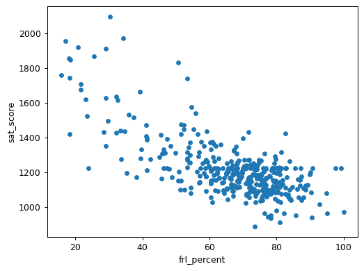
The scatter plot shows a clear negative trend: as the percentage of students eligible for free/reduced lunch increases, SAT scores tend to decrease. This pattern reflects broader socioeconomic challenges that extend far beyond the lunch program itself. Students from lower-income households might have limited access to:
- SAT preparation resources and tutoring
- Advanced academic programs
- Technology and study materials at home
- Time for study due to family responsibilities or part-time work
- Enrichment activities outside of school
These factors highlight how educational outcomes often reflect broader societal inequities rather than student potential or school quality alone. The correlations also reveal concerning racial disparities, with positive correlations for white_per (r = 0.621) and asian_per (r = 0.571), and negative correlations for hispanic_per (r = -0.397) and black_per (r = -0.284).
While some of these correlations are stronger than others, they all point to persistent systemic inequities in resources, opportunities, and support systems across different communities. Understanding these relationships is crucial for addressing educational disparities and working toward more equitable outcomes for all students.
Up next is a guided project where we'll perform an investigative analysis using our cleaned datasets, exploring relationships between school safety, demographic factors, and academic performance. We'll examine specific schools that help illustrate these patterns, giving us a chance to apply our data cleaning skills while uncovering meaningful insights about educational equity in NYC schools.
Guided Project: Analyzing NYC High School Data
During the lessons, we cleaned and combined various datasets about New York City high schools. Now it's time to put our data cleaning skills to work by conducting an investigative analysis. We'll explore three key relationships: school safety and academic performance, demographic patterns in SAT scores, and potential gender differences in academic outcomes.
Data Preparation Review
We've prepared our data through several key steps:
- Loaded multiple CSV files and survey data into a dictionary
- Added standardized DBN columns across all datasets
- Converted relevant columns to numeric data types
- Combined all datasets into a single DataFrame called
combined - Handled missing values using means and zero-filling where appropriate
Exploring Safety and Academic Performance
Let's examine how students' perceptions of school safety relate to academic performance:
combined.plot.scatter("saf_s_11", "sat_score")
plt.show()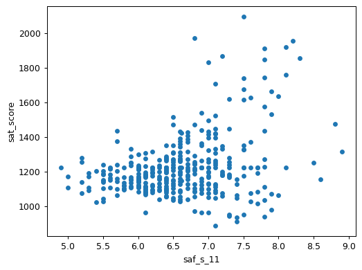
The scatter plot reveals an interesting pattern: while there's a positive correlation between safety scores and SAT performance, the relationship isn't straightforward. Schools with high safety ratings (7.5+) show a wide range of SAT scores, from below 1200 to above 1800. This suggests that while a safe learning environment might support academic achievement, it's just one of many important factors.
Understanding Racial Differences in SAT Scores
Let's examine correlations between demographic composition and SAT scores:
race_fields = ["white_per", "asian_per", "black_per", "hispanic_per"]
combined.corr(numeric_only=True)["sat_score"][race_fields].plot.bar()
plt.show()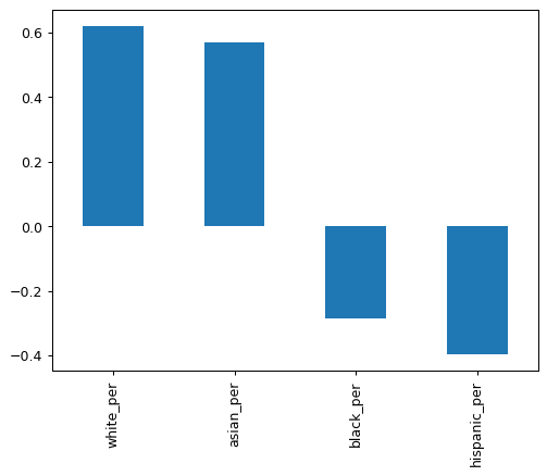
The bar plot shows concerning disparities that likely reflect systemic inequities in educational resources and opportunities. Let's look more closely at specific cases:
combined.plot.scatter("hispanic_per", "sat_score")
plt.show()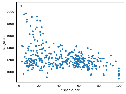
print(combined[combined["hispanic_per"] > 95]["SCHOOL NAME"])| Index | School Name |
|---|---|
| 44 | MANHATTAN BRIDGES HIGH SCHOOL |
| 82 | WASHINGTON HEIGHTS EXPEDITIONARY LEARNING SCHOOL |
| 89 | GREGORIO LUPERON HIGH SCHOOL FOR SCIENCE AND MATHEMATICS |
| 125 | ACADEMY FOR LANGUAGE AND TECHNOLOGY |
| 141 | INTERNATIONAL SCHOOL FOR LIBERAL ARTS |
| 176 | PAN AMERICAN INTERNATIONAL HIGH SCHOOL AT MONROE |
| 253 | MULTICULTURAL HIGH SCHOOL |
| 286 | PAN AMERICAN INTERNATIONAL HIGH SCHOOL |
print(combined[(combined["hispanic_per"] < 10) & (combined["sat_score"] > 1800)]["SCHOOL NAME"])| Index | School Name |
|---|---|
| 37 | STUYVESANT HIGH SCHOOL |
| 151 | BRONX HIGH SCHOOL OF SCIENCE |
| 187 | BROOKLYN TECHNICAL HIGH SCHOOL |
| 327 | QUEENS HIGH SCHOOL FOR THE SCIENCES AT YORK COLLEGE |
| 356 | STATEN ISLAND TECHNICAL HIGH SCHOOL |
This analysis reveals important systemic patterns. The schools with high SAT scores are specialized science and technology schools that admit students through competitive entrance exams and receive additional funding. Many schools with high Hispanic populations are international schools specifically designed to serve recent immigrants and English language learners. These patterns reflect broader societal inequities in resource distribution and access to educational opportunities.
Examining Gender Differences in SAT Scores
gender_fields = ["male_per", "female_per"]
combined.corr(numeric_only=True)["sat_score"][gender_fields].plot.bar()
plt.show()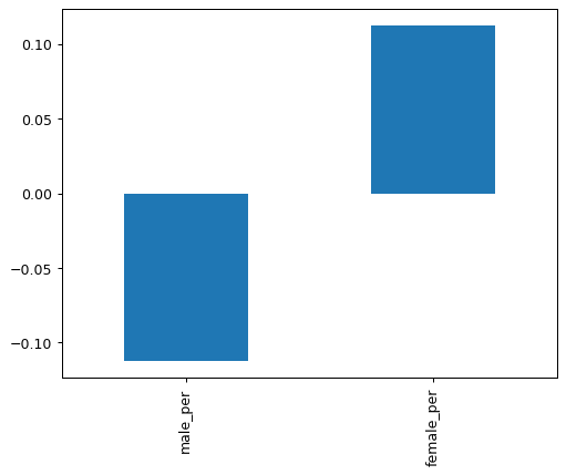
combined.plot.scatter("female_per", "sat_score")
plt.show()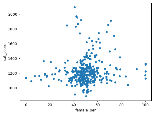
print(combined[(combined["female_per"] > 60) & (combined["sat_score"] > 1700)]["SCHOOL NAME"])| Index | School Name |
|---|---|
| 5 | BARD HIGH SCHOOL EARLY COLLEGE |
| 26 | ELEANOR ROOSEVELT HIGH SCHOOL |
| 60 | BEACON HIGH SCHOOL |
| 61 | FIORELLO H. LAGUARDIA HIGH SCHOOL OF MUSIC & ARTS |
| 302 | TOWNSEND HARRIS HIGH SCHOOL |
While the correlation analysis shows slight differences between male and female percentages, the scatter plot reveals no strong relationship between gender composition and SAT scores. However, we do notice a cluster of schools with both high female enrollment (60-80%) and high SAT scores. These tend to be selective liberal arts schools with strong academic programs.
Taking Your Analysis Further
Our investigation has only scratched the surface of what we can learn from this rich dataset. Here are some ways you could extend this analysis:
- Investigate the relationship between class size and academic performance across different types of schools
- Create a school performance index that accounts for ELL population and socioeconomic factors
- Combine this data with NYC neighborhood demographics to understand community effects on education
- Analyze differences between parent, teacher, and student survey responses
- Study AP test participation rates and scores alongside SAT performance
- Compare academic outcomes with school funding and resource allocation
- Track changes over time by incorporating data from different years
- Map school performance against property values to find high-performing schools in affordable neighborhoods
In our next lesson, we'll shift gears to focus on deliberate practice through a structured challenge. We'll work with data about Marvel's Avengers from the Marvel Wikia site, compiled by FiveThirtyEight. While this dataset might seem quite different from our NYC schools analysis, it will help reinforce the data cleaning techniques we've learned by applying them to a new context. You'll practice standardizing formats, handling missing values, and combining information spread across multiple columns—all essential skills you've developed throughout these lessons. The challenge format will provide less instructional guidance, allowing you to build confidence in your ability to tackle data cleaning problems independently.
Challenge: Cleaning Data
Now it's time to put your data cleaning skills to the test! While our previous lessons focused on learning concepts through guided examples, this challenge encourages deliberate practice through structured problem-solving. You can learn more about the importance of deliberate practice on Wikipedia and in this fascinating Nautilus article.
We'll be working with an interesting dataset about Marvel's Avengers, the superhero team introduced in 1960s comic books and recently popularized through the Marvel Cinematic Universe. The data comes from the Marvel Wikia site and was collected by FiveThirtyEight. You can read about their data collection process in their detailed write-up and access the raw data in their GitHub repository.
Task 1: Exploring the Data
First, let's load and examine the data. While the FiveThirtyEight team did excellent work collecting this information, the crowdsourced nature of the data means we'll need to clean it up before analysis.
Your first task is to read the avengers.csv file into a pandas DataFrame and examine its structure.
Hint
Use pandas' read_csv() function to load the data, then try viewing the first few rows with the head() method.
Solution
import pandas as pd
avengers = pd.read_csv("avengers.csv")
print(avengers.head())
After loading the data correctly, you should see information about various Avengers, including their names, appearances, and multiple "Death" columns:
| URL | Name/Alias | Appearances | Current? | Gender | Year | Years since joining | Death1 | Return1 |
|---|---|---|---|---|---|---|---|---|
| http://marvel.wikia.com/Henry_Pym_(Earth-616) | Henry Jonathan "Hank" Pym | 1269 | YES | MALE | 1963 | 52 | YES | NO |
| http://marvel.wikia.com/Janet_van_Dyne_(Earth-616) | Janet van Dyne | 1165 | YES | FEMALE | 1963 | 52 | YES | YES |
| http://marvel.wikia.com/Anthony_Stark_(Earth-616) | Anthony Edward "Tony" Stark | 3068 | YES | MALE | 1963 | 52 | YES | YES |
Task 2: Filtering Invalid Years
Looking at the Year column, you might notice something strange―some Avengers apparently joined the team in 1900! Since we know the Avengers weren't introduced until the 1960s, we need to clean up this data.
Create a new DataFrame called true_avengers that only contains records from 1960 onward.
Hint
Use boolean indexing to filter the DataFrame. Consider which years should be included in your filtered dataset.
Solution
import matplotlib.pyplot as plt
avengers['Year'].hist()
plt.show()
true_avengers = avengers[avengers["Year"] > 1959]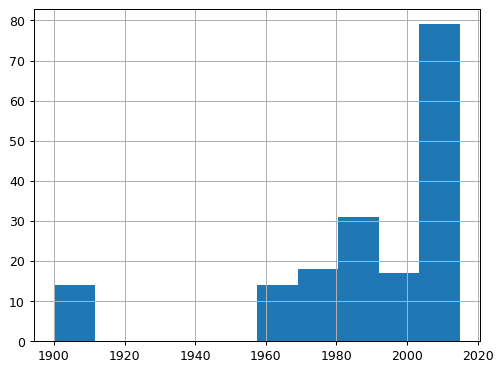
Task 3: Consolidating Death Information
Our data tracks superhero deaths across five separate columns (Death1 through Death5). Each column contains 'YES', 'NO', or NaN values. To make this information more useful for analysis, we need to consolidate it into a single Deaths column that counts how many times each character died.
Create a function that:
- Takes a row of data as input
- Checks the five death columns
- Counts the number of actual deaths (YES values)
- Handles missing values appropriately
After creating your function and using it to create the Deaths column, create a visualization to verify your results:
Hint
Consider using:
pd.isnull()to check for missing values- pandas'
apply()method with a custom function - A counter variable to track deaths
Solution
def clean_deaths(row):
    num_deaths = 0
    columns = ['Death1', 'Death2', 'Death3', 'Death4', 'Death5']
    for c in columns:
        death = row[c]
        if pd.isnull(death) or death == 'NO':
            continue
        elif death == 'YES':
            num_deaths += 1
    return num_deaths

true_avengers['Deaths'] = true_avengers.apply(clean_deaths, axis=1)
value_counts = true_avengers['Deaths'].value_counts().sort_index()
plt.bar(value_counts.index, value_counts.values, width=0.8, align='center')
plt.xlabel("Deaths")
plt.ylabel("Frequency")
plt.show()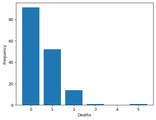
Task 4: Verifying Time Calculations
Finally, let's verify the accuracy of the Years since joining column. Using 2015 as our reference year (when this data was collected), check whether this column correctly reflects the time since each character's introduction year.
Hint
Compare the Years since joining column with the difference between 2015 and the Year column.
Solution
joined_accuracy_count = sum(true_avengers['Years since joining'] == (2015 - true_avengers['Year']))Taking the Challenge Further
Once you've completed these tasks, consider extending your analysis:
- Investigate patterns in character deaths over different decades
- Analyze the relationship between a character's popularity (
Appearances) and their likelihood of dying - Explore gender differences in character treatment
- Create a visualization showing when most characters joined the team
- Examine the
Notescolumn for interesting patterns about how characters return from death
In our final guided project, we'll analyze Star Wars survey data collected by FiveThirtyEight. This project offers another opportunity to apply the data cleaning techniques we've learned throughout this tutorial, from standardizing responses to handling missing values in survey data.
Guided Project: Star Wars Survey Analysis
Guided projects help you apply the concepts you've learned and start building a portfolio of data analysis work. Unlike our previous lessons that focused on specific techniques, this project gives you the opportunity to combine various data cleaning methods to analyze an interesting real-world dataset. When you're finished, you'll have a complete analysis that you can either add to your portfolio or expand on your own.
While there were waiting for Star Wars: The Force Awakens to be released, the team at FiveThirtyEight wondered: does everyone realize that "The Empire Strikes Back" is clearly the best of the bunch? To answer this question, they conducted a survey using SurveyMonkey, collecting responses about Star Wars viewing habits, movie rankings, and demographic information.
In this guided project, we'll clean and analyze this survey data, which is available for download from Kaggle. We'll practice the data cleaning techniques we've learned throughout this tutorial while uncovering interesting patterns in how people view the Star Wars franchise.
Understanding the Data Structure
Let's start by loading the data and examining its key columns:
import pandas as pd
star_wars = pd.read_csv("star_wars.csv", encoding="ISO-8859-1")
columns_to_show = ['RespondentID',
                   'Have you seen any of the 6 films in the Star Wars franchise?',
                   'Do you consider yourself to be a fan of the Star Wars film franchise?',
                   'Gender',
                   'Age']
print(star_wars[columns_to_show].head())| RespondentID | Have you seen any of the 6 films in the Star Wars franchise? | Do you consider yourself to be a fan of the Star Wars film franchise? | Gender | Age |
|---|---|---|---|---|
| 3292879998 | Yes | Yes | Male | 18-29 |
| 3292879538 | No | NaN | Male | 18-29 |
| 3292765271 | Yes | No | Male | 18-29 |
| 3292763116 | Yes | Yes | Male | 18-29 |
| 3292731220 | Yes | Yes | Male | 18-29 |
We can see several data cleaning challenges:
- Yes/No responses that should be converted to boolean values
- Missing values (
NaN) that need handling - Categorical demographic data
- Additional columns (not shown) for movie viewing and rankings
Cleaning Yes/No Responses
Let's start by converting the basic Yes/No responses to boolean values for easier analysis:
yes_no = {
    "Yes": True,
    "No": False
}
star_wars['seen_any'] = star_wars['Have you seen any of the 6 films in the Star Wars franchise?'].map(yes_no)
star_wars['fan'] = star_wars['Do you consider yourself to be a fan of the Star Wars film franchise?'].map(yes_no)
print(star_wars[['seen_any', 'fan']].head())| seen_any | fan |
|---|---|
| True | True |
| False | NaN |
| True | False |
| True | True |
| True | True |
This conversion makes our data more suitable for analysis. Notice how missing values (NaN) are preserved―this is important because a missing response is different from a "No" response. In the next section, we'll tackle a more complex challenge: cleaning the movie viewing data spread across multiple columns.
Cleaning Movie Viewing Data
The survey tracked which Star Wars movies each respondent had seen, but this information is spread across six columns with unhelpful names. Let's clean this data by:
- Creating clear column names for each movie
- Converting the responses to boolean values
- Analyzing viewing patterns
First, let's standardize the movie viewing columns:
movie_mapping = {
    'Star Wars: Episode I The Phantom Menace': True,
    'Star Wars: Episode II Attack of the Clones': True,
    'Star Wars: Episode III Revenge of the Sith': True,
    'Star Wars: Episode IV A New Hope': True,
    'Star Wars: Episode V The Empire Strikes Back': True,
    'Star Wars: Episode VI Return of the Jedi': True,
    np.nan: False
}

# Create new columns for each movie
star_wars['seen_1'] = star_wars['Which of the following Star Wars films have you seen? Please select all that apply.'].map(movie_mapping)
star_wars['seen_2'] = star_wars['Unnamed: 4'].map(movie_mapping)
star_wars['seen_3'] = star_wars['Unnamed: 5'].map(movie_mapping)
star_wars['seen_4'] = star_wars['Unnamed: 6'].map(movie_mapping)
star_wars['seen_5'] = star_wars['Unnamed: 7'].map(movie_mapping)
star_wars['seen_6'] = star_wars['Unnamed: 8'].map(movie_mapping)

# Visualize viewing patterns
seen_movies = star_wars[['seen_1', 'seen_2', 'seen_3', 'seen_4', 'seen_5', 'seen_6']].sum()
seen_movies.plot(kind='bar')
plt.title("Number of Viewers by Star Wars Movie")
plt.xlabel("Movie")
plt.ylabel("Number of Respondents")
plt.show()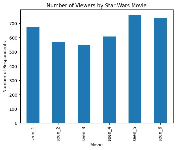
The visualization reveals interesting viewing patterns:
- Episodes V and VI (the latter two films of the original trilogy) have the highest viewership
- The prequel trilogy (Episodes I-III) shows slightly lower but consistent viewing numbers
- Episode IV, despite being the original Star Wars film, shows slightly lower viewership than V and VI
Cleaning Movie Rankings
Next, let's analyze how respondents ranked the movies. The rankings are on a scale of 1 (favorite) to 6 (least favorite), but we need to clean and standardize this data first:
# Convert ranking columns to numeric and rename them
ranking_cols = star_wars.columns[9:15]
rankings = star_wars[ranking_cols].astype(float)

# Rename columns for clarity
rankings.columns = ['ranking_1', 'ranking_2', 'ranking_3', 'ranking_4', 'ranking_5', 'ranking_6']

# Calculate and visualize average rankings
avg_rankings = rankings.mean()
avg_rankings.plot(kind='bar')
plt.title("Average Star Wars Movie Rankings")
plt.xlabel("Movie")
plt.ylabel("Average Ranking (1=Best, 6=Worst)")
plt.show()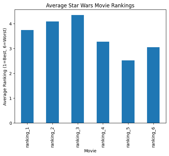
The rankings data tells an interesting story:
- Episode V (The Empire Strikes Back) has the best average ranking, supporting FiveThirtyEight's initial hypothesis
- The original trilogy (Episodes IV-VI) generally ranks better than the prequel trilogy (Episodes I-III)
- Episode III ranks the lowest among all films
Analyzing Demographic Patterns
Finally, let's explore how movie viewing patterns differ by gender. This requires cleaning the gender data and combining it with our movie viewing information:
import matplotlib.pyplot as plt
import numpy as np

# Create a figure with larger size
plt.figure(figsize=(10, 6))

# Calculate viewing rates by gender
males = star_wars[star_wars["Gender"] == "Male"]
females = star_wars[star_wars["Gender"] == "Female"]

male_views = males[['seen_1', 'seen_2', 'seen_3', 'seen_4', 'seen_5', 'seen_6']].mean()
female_views = females[['seen_1', 'seen_2', 'seen_3', 'seen_4', 'seen_5', 'seen_6']].mean()

# Set up positions for bars
x = np.arange(6)
width = 0.35

# Create bars
plt.bar(x - width/2, male_views, width, label='Male')
plt.bar(x + width/2, female_views, width, label='Female')

# Customize the plot
plt.xlabel('Movie Episode')
plt.ylabel('Viewing Rate')
plt.title('Star Wars Movie Viewing Rates by Gender')
plt.xticks(x, ['Episode I', 'Episode II', 'Episode III', 'Episode IV', 'Episode V', 'Episode VI'])
plt.legend()

# Adjust layout to prevent label cutoff
plt.tight_layout()

plt.show()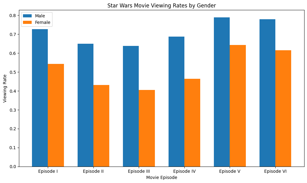
The gender comparison reveals several patterns:
- Male respondents report higher viewing rates across all movies
- The viewing pattern (which movies are most/least watched) is similar between genders
- The gap in viewing rates is smallest for Episodes V and VI
Taking Your Analysis Further
This guided project has demonstrated several key data cleaning techniques, but there's much more you could explore with this dataset:
- Analyze how age groups differ in their movie preferences
- Investigate the relationship between being a Star Wars fan and a Star Trek fan
- Clean and analyze the character preference data (not covered in this analysis)
- Explore how household income or education level relates to Star Wars viewership
- Create a composite score that combines viewing patterns and rankings to identify the most dedicated fans
- Examine regional differences in Star Wars popularity using the census region data
This guided project has given you another opportunity to apply the data cleaning techniques we've learned throughout the tutorial. Consider expanding upon this analysis by exploring additional demographic patterns, investigating character preferences, or analyzing how viewing habits relate to other factors in the dataset. The more you practice these data cleaning skills with real-world data, the more confident you'll become in handling similar challenges in your own projects.
Advice from a Python Expert
Looking back on my journey from cleaning weather station data to analyzing messy datasets like NYC schools and Star Wars surveys, I've learned that data cleaning isn't just a preliminary step—it's the foundation of meaningful analysis. Through this tutorial, we've seen how proper data preparation reveals patterns that would otherwise remain hidden in messy data.
Here's what I've learned from years of working with various datasets:
- Always examine your raw data first:
- Check for inconsistent formatting
- Look for missing or invalid values
- Understand what each column represents
- Document any anomalies you find
- Develop a systematic cleaning approach:
- Start with simple standardization tasks
- Handle missing values consistently
- Keep track of your cleaning steps
- Validate results after each transformation
- When combining datasets:
- Verify matching keys across files
- Choose appropriate join types
- Check row counts before and after merging
- Confirm the merged data makes sense
- Use visualization to verify your cleaning:
- Plot key variables before and after cleaning
- Look for unexpected patterns or outliers
- Create summary statistics to catch errors
- Compare results with domain knowledge
Start with small datasets that spark your curiosity, and clean them step by step using these approaches. If you want to explore data cleaning and analysis techniques further, our Data Cleaning Project Walkthrough course offers additional practice with these essential skills.
Share your work and get feedback from others in the Dataquest Community. The Community can provide valuable insights on your analysis approaches and suggest ways to tackle challenging data cleaning problems.
Remember, every dataset tells a story—data cleaning is about making that story clear and accessible. With practice and persistence, you'll develop an intuition for handling messy data and confidence in your ability to prepare any dataset for analysis.
Frequently Asked Questions
What are the essential steps in a data cleaning project?
A successful data cleaning project involves several key steps that help transform messy data into reliable insights. Here's a step-by-step guide to help you approach it systematically:
- Initial Data Examination
- Start by opening your files in a text editor to check their formats and encoding.
- Review the column names, data types, and value ranges to get a sense of what you're working with.
- Look for any inconsistencies, such as different date formats or varying text cases.
- Make a note of any potential issues you find before making any changes.
- Standardization
- Convert your data into the right formats, such as changing strings to numbers or dates.
- Create consistent naming conventions for your columns to make them easier to understand.
- Make sure your identifiers and keys are consistent across different datasets.
- Standardize your categorical variables, such as yes/no responses, to make them easier to analyze.
- Handle text case and whitespace consistently to avoid any confusion.
- Missing Value Treatment
- Take a close look at your missing data to understand why it's missing and what it might mean.
- Choose the right method for handling missing values based on the type of data and the context.
- For numeric data, you might use the mean value to fill in the gaps.
- For categorical data, you might use the mode (the most common value).
- Make a note of any decisions you make about handling missing values.
- Data Combination
- Verify that your datasets match up correctly and that the relationships between them make sense.
- Choose the right type of join to combine your datasets based on your analysis needs.
- Compare the number of rows before and after merging to make sure everything looks right.
- Check for any duplicate records that might have been created.
- Validate that your combined data still makes sense and is accurate.
- Validation and Verification
- Use visualizations to verify that your cleaning steps have worked as expected.
- Calculate summary statistics for your key variables to get a sense of what's going on.
- Look for any unexpected patterns or outliers that might indicate a problem.
- Compare your results with what you know about the data to make sure everything looks right.
- Test out any unusual values or edge cases to make sure your data can handle them.
Throughout the process, keep detailed notes about your cleaning steps and decisions. This will help you keep track of what you've done and why, and make it easier to reproduce your results if needed.
Remember that data cleaning is a process that requires patience and attention to detail. You may need to go back and revisit earlier steps as you discover new issues. The goal is to prepare your data in a way that reveals meaningful insights while maintaining its integrity and accuracy.
How do you handle missing values when analyzing educational performance data?
When working with educational performance data, missing values can be a challenge. To address this issue, let's start by understanding why the data might be missing. In educational contexts, missing values can indicate student absences, incomplete tests, or systematic data collection issues. For example, English language learners might have missing standardized test scores, or certain schools might have incomplete survey responses. Identifying these patterns helps inform how you should treat the missing data.
When dealing with numeric data like test scores or completion rates, you have several options to fill the gaps:
- Use the average value to maintain overall averages
- Use the middle value (median) when there are outliers that might skew the average
- Use group averages based on relevant categories (like grade level or program type)
- Verify your approach by comparing summary statistics before and after filling missing values
For categorical data, such as survey responses or demographic information:
- Use the most common value (mode) for simple categories
- Create a "No Response" category when it makes sense to do so
- Consider whether missing values might be meaningful in themselves
- Document any assumptions you make during the process
When working with multiple educational datasets, it's essential to maintain consistent treatment of missing values across all sources. For instance, if you're analyzing both standardized test scores and demographic data, your approach should account for potential relationships between missing values in different datasets.
After handling missing values, always validate your results. Compare distributions before and after treatment, check for unexpected patterns, and verify that your conclusions make sense in the educational context. This helps ensure your analysis remains reliable while addressing gaps in the data.
What methods help identify data quality issues in demographic datasets?
When working with demographic datasets, it's essential to identify potential data quality issues to ensure accurate analysis and insights. Here are some key methods to help you do so:
Initial Data Examination
Start by taking a close look at your data. Open your files in a text editor to check formats and encoding. Review column names and data types to ensure they match your expectations. Look for inconsistent formatting in demographic categories, such as "M/F" vs "Male/Female". Check value ranges for age groups and other numeric fields to identify any outliers or errors. Finally, create frequency tables for categorical variables to spot any anomalies.
Statistical Analysis
Next, use statistical methods to analyze your data. Calculate summary statistics for numeric fields to identify any unusual patterns or outliers. Look for impossible values, such as negative ages or percentages over 100%. Check for unrealistic proportions in demographic breakdowns, and identify suspicious patterns in categorical variables. Use visualizations like histograms to spot unusual distributions.
Missing Value Analysis
Missing values can be a significant issue in demographic datasets. Map patterns of missing data across demographic categories to identify any systematic biases. Check if certain groups have disproportionate missing values, and examine relationships between missing fields. Document potential systematic biases in data collection, and consider whether missing values might represent meaningful patterns.
Standardization Checks
Standardization is critical to ensuring data quality. Verify consistent formatting of identifiers, and check for variations in category names. Look for inconsistent date formats, and identify mixed case or extra whitespace issues. Ensure consistent handling of special characters in names.
Cross-Validation
Finally, cross-validate your data to ensure accuracy. Compare totals across different demographic breakdowns, and verify that percentages sum to 100%. Check for logical consistency between related fields, and compare against known population statistics when possible. Look for unexpected correlations between variables.
When handling sensitive demographic data, it's essential to verify that your data cleaning methods don't inadvertently introduce bias or compromise privacy. Document all quality issues found and maintain detailed notes about your cleaning decisions to ensure reproducibility and transparency in your analysis.
To validate your cleaning steps, try the following:
- Create visualizations before and after cleaning to compare results
- Check summary statistics at each stage to ensure accuracy
- Review a sample of records manually to verify changes
- Get feedback from subject matter experts to ensure accuracy
- Test your cleaning process on a subset of data first to ensure it works as expected.
How can pandas help streamline the data cleaning process?
Pandas makes data cleaning easier by providing a range of useful tools that help you work with messy datasets. Its DataFrame structure allows you to easily standardize formats, handle missing values, and combine information from multiple sources.
One of the main benefits of using pandas for data cleaning is its flexibility. For example, you can load data from various file formats and encoding options, making it easy to work with different types of data. Additionally, pandas provides built-in functions for converting data types and standardizing values, which helps to ensure consistency in your data.
When it comes to handling missing data, pandas offers multiple methods to choose from, ranging from simple filling to complex imputations. This flexibility makes it easier to find the approach that works best for your specific data cleaning project. Furthermore, pandas' powerful merge operations allow you to combine datasets accurately, which is especially useful when working with large datasets.
Another useful feature of pandas is its ability to create consistent identifiers and clear column names. This can be especially helpful when working with datasets that have inconsistent or unclear identifiers.
For example, when standardizing school identifiers, pandas makes it simple to apply consistent formatting:
def pad_csd(num):
    return str(num).zfill(2)

data["class_size"]["padded_csd"] = data["class_size"]["CSD"].apply(pad_csd)
data["class_size"]["DBN"] = data["class_size"]["padded_csd"] + data["class_size"]["SCHOOL CODE"]
This code efficiently standardizes identifiers across an entire dataset, a task that would be time-consuming and error-prone if done manually.
Overall, pandas' ability to handle large datasets while maintaining data integrity makes it an essential tool for data cleaning projects. Whether you're cleaning survey responses, standardizing geographic data, or preparing financial information for analysis, pandas provides the tools to make your data cleaning process more efficient and reliable.
What steps should I take before combining datasets with different formats?
Before combining datasets with different formats, it's essential to prepare them properly to ensure accurate and reliable analysis results. Here's a step-by-step guide to help you get started:
Examine Your Data Closely
Open each file in a text editor to check the formats and encoding. Review the column names, data types, and value ranges. Take note of any inconsistencies or potential issues, such as variations in how similar information is recorded. This initial examination will help you identify areas that need attention before combining the datasets.
Standardize Your Data
Create consistent naming conventions for columns across all datasets. Standardize categorical variables, such as yes/no responses or ratings. Handle text case and whitespace uniformly, and ensure that date formats match across all datasets. Additionally, convert numeric fields to the appropriate types to prevent errors during analysis.
Verify Identifiers
Confirm that matching keys exist across all datasets. Standardize identifier formats, such as padding numbers with zeros, and check for duplicate or missing identifiers. Verify that the relationships between datasets make sense and are consistent.
Assess Missing Values
Check for missing values in key joining fields and determine the best handling strategy. Document any systematic patterns you notice and plan how missing values will affect the combination of datasets.
Verify Data Quality
Calculate summary statistics for key variables and create visualizations to spot anomalies. Compare row counts between datasets and test your standardization on a small subset first. This quality verification step will help you identify any issues before combining the datasets.
Document Your Steps
Finally, document all preparation steps and decisions you make during this process. This documentation will help maintain data integrity and make it easier to reproduce or modify your approach later. By following these steps, you'll be able to combine datasets with different formats with confidence and ensure more reliable analysis results.
How do I verify the accuracy of my data cleaning results?
Verifying the accuracy of data cleaning results involves a careful, multi-step process. To ensure your cleaned data is reliable, follow these steps:
First, use statistical validation to check your data. Calculate summary statistics before and after cleaning, and verify row counts when combining datasets. Look for unexpected patterns or outliers. For example, when working with school performance data, compare total enrollment numbers and demographic percentages to ensure they align with expected ranges. This helps you catch any errors or inconsistencies early on.
Next, use visualization to examine relationships between variables and identify potential issues. Create scatter plots and histograms to see if standardization steps worked as intended or if there are anomalies that need attention. Visualizations can quickly reveal problems that might be hard to spot otherwise.
Cross-validation is also important. When standardizing identifiers or categorical variables, verify that your cleaning steps work correctly across different subgroups. Check that school codes follow the same format across all years and districts, for instance.
When dealing with missing values, it's essential to document your approach. Decide how you'll handle missing data, whether through mean imputation, zero-filling, or other methods. Then, verify that your chosen approach maintains the integrity of relationships between variables.
Keep detailed notes about:
- Each cleaning step performed
- Decisions made about handling edge cases
- Results of validation checks
- Any anomalies discovered and how they were resolved
Remember, verification is an ongoing process. Be prepared to revisit your cleaning methods if you discover issues during validation. The goal is to ensure your cleaned data accurately represents the underlying information while maintaining its analytical value.
What visualization techniques help validate cleaned data?
Visualizations are a great way to validate cleaned data by revealing trends, inconsistencies, and correlations that might be hidden in rows of numbers. I've found several visualization techniques to be particularly helpful for validation:
Scatter plots are useful for verifying relationships between variables and spotting potential errors. For instance, when validating school performance data, a scatter plot can reveal whether test scores align sensibly with other metrics, helping identify any problematic data points that need attention.
Bar plots and histograms are effective for validating category standardization, frequency distributions, missing value treatments, and data transformations. These plots can quickly reveal issues such as inconsistent naming, unexpected patterns, or incorrect handling of missing values.
To thoroughly validate your data, I recommend the following key steps:
- Create "before and after" visualizations to compare your data distributions and see how they've changed.
- Look for unexpected gaps or spikes that might indicate cleaning errors.
- Verify that relationships between variables align with your domain knowledge.
- Examine the tails of your distributions for potential outliers.
- Compare your results against known benchmarks or previous analyses.
For example, when validating survey data, a simple bar plot can quickly reveal whether response standardization worked correctly or if certain categories need additional cleaning. The visualization might show unusual patterns like duplicate categories or unexpected frequencies that weren't obvious in the raw data.
Remember that visualizations are just one part of a comprehensive validation strategy. While plots can reveal obvious issues, combine them with statistical checks and domain knowledge for the most thorough validation of your cleaned data.
How do I clean and standardize categorical variables in survey data?
When working with categorical variables in survey data, it's essential to ensure that the data is clean and consistent. This process, called standardization, helps you analyze the data accurately and gain meaningful insights.
To start, take a close look at your raw data to identify common issues that can affect analysis. These might include:
- Inconsistent spellings or formats (e.g., "Male" vs "M" vs "male")
- Extra whitespace or special characters
- Different ways of expressing the same response (e.g., "Y", "Yes", "YES")
- Missing or invalid values
To address these issues, you can create a standardization mapping to convert various responses to consistent values. For example:
yes_no = {
    "Yes": True,
    "No": False
}
To standardize your categorical variables, follow these key steps:
- Convert all text to consistent case (upper or lower)
- Remove leading/trailing whitespace
- Create standard categories for similar responses
- Handle missing values appropriately (consider whether they're truly missing or represent "Not Applicable")
To ensure that your cleaning process is effective, validate your results by:
- Creating frequency tables before and after standardization
- Checking for unexpected categories
- Verifying that standardized categories maintain original meaning
- Documenting all cleaning decisions and assumptions
Remember that cleaning categorical data is often an iterative process. You may need to refine your approach as you discover new patterns or edge cases. By following these steps and validating your results, you can ensure that your data is clean, consistent, and ready for analysis.
What approaches work best for handling outliers in educational data?
When working with educational data, handling outliers requires careful consideration of both statistical patterns and educational context. For example, an unusually high test score might represent an exceptional student rather than an error, while a score of zero could indicate either non-participation or a data entry issue. To effectively handle outliers, you can follow these steps:
-
Identify unusual patterns: Create visualizations to spot unusual patterns, calculate basic statistics to identify extreme values, and look for systematic patterns in outliers (like specific schools or demographic groups).
-
Verify the context: Check whether extreme values make sense given the educational setting, consider program-specific factors (like specialized schools or ELL programs), and see if outliers cluster within certain demographic groups.
-
Make informed treatment decisions: Keep outliers that represent valid educational scenarios, remove clear errors while documenting your reasoning, and consider creating separate analyses for special cases. You may also need to transform data when appropriate (like using percentiles instead of raw scores).
When validating your outlier treatment, compare distributions before and after cleaning, verify that relationships between variables remain logical, and check that your cleaning doesn't disproportionately affect certain groups. Be sure to document all decisions and their rationale.
It's essential to remember that outliers in educational data often represent important subgroups or special cases that deserve closer examination rather than elimination. For instance, a school showing unusually high performance despite socioeconomic challenges might offer valuable insights into effective educational practices.
By taking a thoughtful approach to outlier handling, you can maintain data integrity while ensuring your analysis accurately represents the educational context you're studying.
How can I maintain data integrity while filling missing values?
When dealing with missing data, it's essential to understand the nature of the gaps and choose the right methods to fill them. Start by examining the patterns in your missing data―are they random or do they follow specific patterns that might be meaningful?
For numeric data, consider the following approaches:
- Use the average value when the data is normally distributed.
- Use the median value when dealing with outliers.
- Calculate group averages based on relevant categories.
- Verify that the filled values make sense in relation to other variables.
When it comes to categorical data:
- Use the most common value (mode) for simple categories.
- Create a "No Response" category when missing values are meaningful.
- Consider the logical relationships between categories before filling.
To ensure your approach is correct:
- Compare summary statistics before and after filling values.
- Create visualizations to verify that the distributions remain realistic.
- Check that the relationships between variables stay consistent.
- Test your assumptions with a small subset of data first.
It's also important to document your decisions:
- Explain why you chose specific filling methods.
- Describe which variables influenced your choices.
- Note any patterns you discovered in the missing data.
- Record your validation results and any adjustments you made.
Remember, maintaining data integrity is not just about filling gaps―it's about ensuring that the filled values make logical sense and support valid analysis. Regular validation checks and thorough documentation will help you ensure that your data cleaning decisions are sound.
What methods help standardize inconsistent text responses in surveys?
When working with survey responses, it's common to encounter inconsistent text data. This can make it difficult to analyze the results and identify patterns. To overcome this challenge, you need to standardize the text data.
Start by examining your raw responses to identify common variations. For example, you might find different spellings or formats for the same answer, such as "Male" vs "M" vs "male." You might also notice extra whitespace or special characters, or various ways of expressing the same response, such as "Y", "Yes", or "YES." Additionally, you might encounter missing or invalid values.
To standardize these variations, create a mapping to convert them to consistent values. For instance, you can create a dictionary like this:
yes_no = {
    "Yes": True,
    "No": False
}
To standardize your text data, follow these key steps:
- Convert all text to a consistent case, such as upper or lower case.
- Remove any leading or trailing whitespace.
- Create standard categories for similar responses.
- Handle missing values appropriately, considering whether they're truly missing or represent "Not Applicable."
Once you've standardized your data, it's essential to validate your approach. Here are some steps to follow:
- Create frequency tables before and after cleaning to compare the results.
- Check for unexpected categories that might have been created during the standardization process.
- Verify that your standardized categories maintain the original meaning of the responses.
- Compare the distributions of your data before and after standardization to ensure that the process hasn't introduced any biases.
- Test your cleaning process on a subset of data first to ensure it works as expected.
Remember that standardizing text data is often an iterative process. You may need to refine your approach as you discover new patterns or edge cases. To ensure consistency and reproducibility in your analysis, document all decisions and assumptions made during the process.
By following these steps and maintaining careful documentation, you can transform inconsistent survey responses into clean, analyzable data while preserving the integrity of your respondents' input.
How do you document data cleaning steps for reproducibility?
Documenting your data cleaning steps is essential for transparency and reproducibility. When you take the time to thoroughly document your process, you make it easier for others to understand and verify your work. In this answer, I'll walk you through a systematic approach to documenting your data cleaning steps.
When you're cleaning a dataset, it's helpful to think about what information you need to capture at each stage. Here's a suggested framework to follow:
Initial Data Assessment
- Start by documenting the format and encoding of your source files.
- Note any quality issues you found during your preliminary review, such as missing values or inconsistencies.
- Consider the patterns of missing values and potential causes.
- Make assumptions about the relationships between different data points.
Cleaning Decisions
- Explain the rationale behind your standardization choices.
- Describe the methods you used to handle missing values.
- Outline the criteria you used to remove or transform outliers.
- Discuss the impact of your cleaning decisions on your analysis.
Transformations and Validation
- Record the row counts before and after each operation.
- Document the results of your data validation checks.
- Note any unexpected patterns you discovered.
- Describe changes in value distributions.
To keep track of your cleaning steps, maintain a log that includes:
- The date and a brief description of each cleaning step
- Any SQL queries or Python code used
- The results of your quality checks
- Any manual interventions required
For example, when standardizing identifiers, you might document a function like this:
def pad_csd(num):
    return str(num).zfill(2)
In addition to the code, explain why you chose this approach and how you verified it worked correctly.
Best Practices
- Write clear, descriptive comments in your code.
- Create reproducible cleaning scripts that others can use.
- Document your validation results to show that your data is clean and accurate.
- Include examples of before/after data to illustrate your cleaning steps.
- Note any external reference data you used to inform your cleaning decisions.
By following these guidelines, you'll be able to create a clear and transparent record of your data cleaning steps. This will make it easier for others to understand and reproduce your work, which is essential for collaborative analysis and maintaining data quality.