6 Must-Know Data Visualization Techniques
Although it's a core skill for any data practitioner, data visualization techniques are often taken for granted in many newcomers’ data science learning paths. It may seem trivial to plot a simple chart to show, for instance, that the revenue increased last month.
Compared with other tasks, data visualization might seem overly simple. But properly showing your data is an art and can be the difference between having your project accepted or declined. For your visualization to stand out from the crowd, every little detail counts.
In this blog post, we’ll cover the most common data visualization techniques, with practical examples for each case. These techniques can be implemented using a variety of tools, from Excel to specific data visualization programming languages and data visualization software, such as Power BI and Tableau.
We’ll use Python to create the plots you’ll see in this article, but don’t worry, no coding experience is necessary to follow along. Also, if you don’t want to get into coding right away, you can start creating your own visualizations using Tableau Public, the free version of one of the most important data visualization tools on the market.
If you would like to get into coding right away, you should know that there are a lot of options available to you. To make things easier, here is a comparision of the most used data visualization libraries in Python.
Datasets for Our Visualization
We’ll use two datasets for the data visualization techniques demonstrated throughout this article. Let's take a quick look at them so you can gain some context on the visualizations we’ll create.
The first dataset contains daily data on the weather and the power generated by solar panels in a particular place. Here are the variables it contains:
temperature_min: the minimum temperature in ºC.temperature_max: the maximum temperature in ºC.humidity_min: the minimum humidity in %.humidity_max: the maximum humidity in %.rain_vol: the volume of rain in mm.kwh: the amount of power generated.
Click here to download this dataset.
The second dataset contains data on customers of a credit card company and is used to predict churn. Here are the variables it contains:
education_level: the level of education of each customer.credit_limit: the credit limit of the customer.total_trans_count: the number of transactions made.total_trans_amount: the total transaction amount.churn: whether or not the customer has churned.
Click here to download this dataset.
1. Tables and Heatmaps
Tables
Let’s warm up with the simplest way to visualize data. Tables are often the original form of the data, but they are also a valuable technique to visualize summarized data. However, we should be cautious: tables can contain too much information, which may lead to interpretation problems for your audience.
The table below contains the average maximum temperature and power generation per quarter of the year:
| Quarter | temperature_max | kwh |
| 1 | 29.27 | 32.88 |
| 2 | 26.45 | 25.19 |
| 3 | 27.11 | 24.36 |
| 4 | 26.92 | 26.77 |
This table is created with just a single line of Python code after we've read the data:
df = pd.read_csv('power_and_weather21.csv')
round(df.groupby('quarter')['temperature_max','kwh'].mean(), 2)
If you want to do it in Excel, you just need to insert a pivot table and sum the values of the quarters of the year.
Tables are not necessarily hard to read, but it can take some time to find the information you’re looking for. The main tip here is that in order to use tables in a presentation, you should ensure that they’re not too long or have a lot of columns. Other little tips for formatting: remove or increase the transparency of borders and unnecessary gridlines in order to highlight the data. The idea is to increase the proportion of ink (in this case, pixels) used to represent the data compared to the total amount of ink (pixels) in the entire plot. The higher this proportion, the more the plot emphasizes the data. This concept is called the Data-Ink Ratio.
Heatmaps
A heatmap uses color to make tables easier to read. The image below contains the same data as the table we just saw:
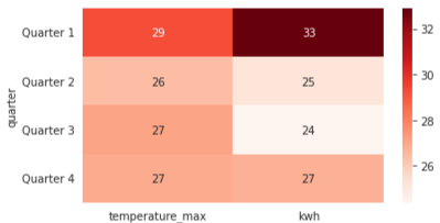
The color scale makes it easier to see that the first quarter had the highest temperature and power generation.
Heatmaps can be an excellent way to make tables easier to read and draw conclusions from.
Since we are talking about the possibility of using different tools, here are a few resources to help you create this same heat map using Google Sheets.
Download, if you haven’t yet, the power generation dataset and upload it to Sheets. Then you’ll only need to create a pivot table and add conditional filtering to the columns you want to create your heat map on. The process is fully customizable and you can make your chart look the way you want it to!
2. Line Charts
Line charts are suitable for plotting time series--how one or more series changes over time. Although plotting a time series is not the only use of this kind of chart, it is the best fit for it. That’s because the line gives the reader a sense of continuity that would not look good if you were to compare two categories, as we’ll see below.
For instance, the following chart shows how the maximum temperature changes over a year:

We can also plot more series in a single chart. Below, we have the daily maximum temperatures for each month:

However, it becomes a bit messy if we plot too many series together, even if each of them is in a different color. Try to focus on the message you want to convey to your audience. Here is the same chart plotted in another way:
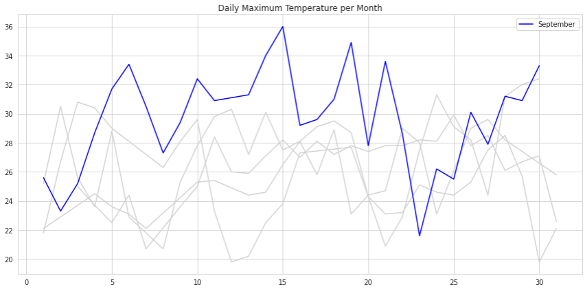
Notice that although we still have all the series plotted on the same chart, our audience is able to focus on September.
When plotting multiple lines at once, the difference between a messy chart and a good one lies in using formatting to send messages to your audience. The two images above use the same data, but send completely different messages.
Although we could write an entire article on how to make our plots prettier, the main idea is to make our visualizations as clean as possible and put emphasis on the data.
Here are some extra resources you could use:
If you want to learn how to tell stories with data, Cole Knaflic’s book Storytelling with Data is the best resource available. Also, while still on this subject, Cole’s lesson on Talks at Google is definitely worth your time if you want to improve your plots.
3. Area Charts
The area chart is just a variation of the line chart with the key difference being that the area chart applies shading to the area between the line and the x-axis. This kind of chart is used to compare how multiple variables behave over time.
For instance, using this modified version of the customer's dataset, we can plot an area chart of the total number of customers per year. This new data contains data from different years, which adds numerous possibilities.

We need to be careful not to use area charts unnecessarily, though. The plot above looks just like a normal line chart, and the filled area makes almost no difference, except for perhaps confusing the reader.
However, when more than one variable is plotted, we can see how a stacked area chart makes much more sense. The chart below shows not only the total number of customers by year, but also the number of churned and non-churned customers:
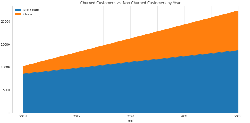
Now we can see that although the total number of customers is increasing, the churn seems to be increasing at a higher rate as well.
If Tableau is your tool of choice, here’s a quick tutorial on creating area charts using Tableau.
4. Bar Charts
Bar charts are one of the most common, easy-to-read kinds of plots. Their most common use case is to show how values change between different categories. They're a good alternative to tables.
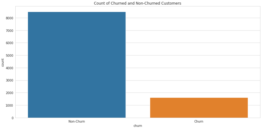
They're easy to interpret, and your reader will understand your message with just a quick look at the chart. For example, in the chart below, we can easily see that we have a lot more non-churned than churned customers in this dataset:
It’s important to notice, though, how this kind of chart can be deceiving if we don’t use them correctly. The following chart shows the average income for each group of customers:

A quick look at the chart might make you conclude that there is a significant difference between the two groups, and that churned customers make significantly less money than non-churned customers. However, this is not the case. Notice that the y-axis starts at 60,000, which completely changes the visual impact of the plot. Here’s how this same chart looks when the y-axis starts from zero:
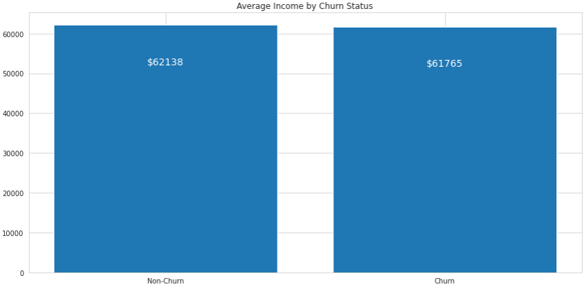
Although the churned customers still make less money on average, the difference is minimal and the height of the bars looks almost the same. We need to be very careful when using bar charts and modifying the units along the y-axis.
Notice that we wrote the values on the bars to make the difference between each group explicit. Python allows for a lot of possibilities when it comes to customizing charts. Here’s the source code for this one:
import pandas as pd
import matplotlib.pyplot as plt
df_churn = pd.read_csv('churn_predict.csv')
fig = plt.figure(figsize=(12,6))
df_income = df_churn.groupby('churn')['estimated_income'].mean().reset_index().sort_values('estimated_income', ascending=False)
plt.bar(df_income['churn'], df_income['estimated_income'])

for _, row in df_income.iterrows():
    plt.text(row['churn'], row['estimated_income'] - 10000,
             '$'+str(int(row['estimated_income'])), ha='center',
             fontsize=14, color='w')

plt.title('Average Income by Churn Status')
plt.tight_layout()
plt.show()
Horizontal Bar Charts
A horizontal bar chart is a variation of a bar chart that works just as well as its original form. This is a highly recommended chart for visualizing values per category, especially if we have many categories with longer names.
That’s because the chart flows in the same direction we are used to reading--left to right. For instance, take a look at the following plot that represents the number of churned customers by their level of education:

Notice that we have the label for each bar at the leftmost part of the figure, which is where our eyes first go when we look at it, and then we flow into the data already knowing what it means.
Also, it’s easier to draw an imaginary vertical line to compare the size of each bar than it is a horizontal one. It’s easier to understand that graduates are more likely to churn than others.
While in a regular bar chart we need to be careful with the y-axis, in a horizontal bar chart the concern is with respect to the x-axis. It’s important to make sure it always starts at zero or has a really good reason not to.
The color choice in a bar chart is also an interesting point, especially if we have several bars. If every bar represents a category, we should use colors to differentiate them. But if the bars represent variations within a category, then a gradient might be a nice way to demonstrate this relationship.
Here’s a complete article on how to choose colors for your charts.
Stacked Bar Charts
Another variation of the bar chart is the stacked bar chart. This type of visualization is used to display another variable within each bar. It’s the bar chart version of the stacked area chart we just saw.
For example, we can take our first bar chart and segment each bar by another category, the level of education:
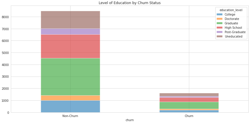
This new plot shows not only the number of churned and non-churned customers, but also how they’re segmented by another category.
We need to be careful with the insights drawn from such a chart. For instance, it’s easy to say that there are more non-churned than churned graduates, but it’s harder to say if that's true when taking into consideration the size of the two groups.
Therefore, a good tip is to use percentages instead of the nominal amount. This is referred to as normalizing the data. This makes it so that the bars have the same height, which makes comparison much easier:
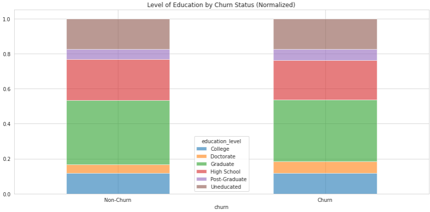
Notice that although the nominal values in the first chart are clearly different, the normalized values are pretty much the same.
To make your plots even better, here are a few design tips to help with your visualizations.
Waterfall Charts
The waterfall chart is another variation of the bar chart. Just like with stacked bar charts, waterfall charts aim to visualize the composition of a bar broken down into other variables. Going back to our first dataset, here’s a waterfall chart showing the power generation of the first six months of the year, along with the second half of the year broken down by month:

Notice that each green bar begins at the height where the last one ended. If we add all the green bars together, it will result in the difference between the two blue bars on either side of the chart.
Also, as each month becomes a bar of its own, the entire plot is capable of showing the decomposition of only one bar--in this case, the power generation for the year.
Another difference between waterfall charts and stacked bar charts is that a waterfall chart can represent negative values in the decomposition of the main variable. Imagine that, for some weird reason, we had a couple of months of negative power generation. This is what the plot would look like:
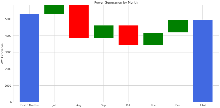
An important thing to keep in mind when creating this kind of chart is to make good use of colors. In this case, we will need three of them: one for the consolidated bars on the left and right of the chart, and two other colors for the positive and negative bars, respectively.
The red bars represent negative values. They start at the top of the previous green bar and finish below that mark. The next bar starts at the bottom of the red bar.
If you like Power BI, here’s a complete guide on how to create a waterfall chart using Power BI.
5. Scatter Plots
Scatter plots are used to show the relationship between two variables and to check if there’s any correlation between them. They are not as intuitive as the previous visualizations, and it can take an unprepared reader a few moments to figure them out.
For instance, the chart below shows that an interesting correlation exists between the total number of transactions and the total amount of those transactions:
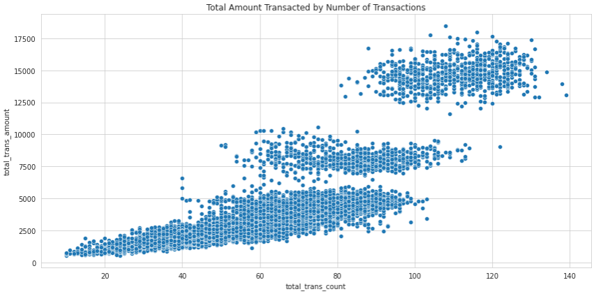
This makes perfect sense: the more times a person uses a credit card to make a purchase, the higher their total amount tends to be.
We can also add another dimension to this chart by using a color to represent the categorical variable for churned customers:
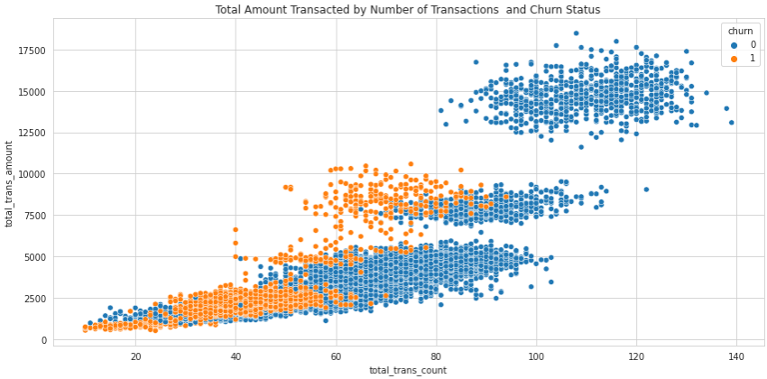
We can see that when the number of transactions or the total amount of transactions reaches a certain level, customers become very unlikely to churn.
We can also add another axis to scatter plots to create a 3D chart, but that’s usually not recommended, as it makes the chart confusing and much more difficult to read.
When looking at scatter plots that clearly show a correlation, we must be very careful when drawing conclusions. Even though the two variables might be strongly correlated, it does not necessarily mean there is a causal relationship going on. In other words, correlation does not imply causation. For example, a scatter plot of ice cream sales will show a strong corelation with the number of shark attacks. This does not mean buying ice cream causes shark attacks, but it does hint at the possibility that whatever is driving one is also driving the other. In this case, the temperature outside causes people to buy ice cream or go swimming on hotter days.
There are a series of statistical tests and analyses used to determine causation. At Dataquest, you can learn more about this using both Python and R.
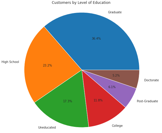
6. Pie Charts
Pie charts are also used to visualize how a categorical variable is subdivided into its different categories. However, we should be very careful when using this kind of chart. That’s because they are usually hard to read accurately. When two or more categories have similar values, it’s almost impossible for the human eye to distinguish which one is greater than the other because we aren't very good at estimating angles.
Here are the categories of the education_level variable in the customer dataset as a pie chart:

As you can see, it's a challenge to tell if Post-Graduate or Doctorate represents a larger group of customers. However, if we add percentages to the chart, it becomes much easier to distinguish:
In this case, it’s likely that a bar chart would make it easier for your reader to compare values across categories.
Pie charts do best when they have just two or three categories so there are fewer comparisons that can be made. For example, here’s the number of churned customers and non-churned customers as a pie chart:

Since we have only two categories to compare, it’s much easier to confirm which category is larger than the other.
Now that we’ve covered a few visualization techniques, and you have the dataset to plot them, if you want to get started with a no-code tool such as PowerBI, we have not one, but two video tutorials to get you going.
Next Steps
Although it’s beyond the scope of this article to cover all the data visualization techniques out there, the ones we’ve covered here will likely be enough to get the job done for most basic visualizations.
If you want to make your visualizations even more effective and beautiful, here’s a tutorial completely focused on how to do that.
However, if you’re interested in diving even deeper into data visualization and creating your own charts using real data, Dataquest has multiple data visualization courses that will take you from zero to hero while creating beautiful visualizations in:
Make sure to check them out!