Python Data Visualization Libraries
Libraries like vispy, bokeh, seaborn, pygal, folium, and networkx have brought new approaches and capabilities to the table. Each library has its strengths, from creating detailed statistical plots to visualizing geospatial data or networks.
In this post, we’ll work through a real-world dataset and see how these seven libraries can help bring your data to life. Along the way, we’ll highlight the best use cases for each tool and how they fit together to support a complete data visualization workflow. If you’re ready to learn more, check out our data visualization courses skill path for in-depth, hands-on practice. If you're looking for more examples, check out our posts on data visualization techniques and designing clear and impactful visuals.
Exploring the Dataset
Before we get into visualizing the data, let's take a quick look at the dataset we'll be working with. We'll be using data from openflights. We'll be using route, airport, and airline data. Each row in the route data corresponds to an airline route between two airports. Each row in the airport data corresponds to an airport in the world, and has information about it. Each row in the airline data represents a single airline. We first read in the data:
# Import the pandas library.
import pandas

# Read in the airports data.
airports = pandas.read_csv("airports.csv", header=None, dtype=str)
airports.columns = ["id", "name", "city", "country", "code", "icao", "latitude", "longitude", "altitude", "offset", "dst", "timezone"]

# Read in the airlines data.airlines = pandas.read_csv("airlines.csv", header=None, dtype=str)
airlines.columns = ["id", "name", "alias", "iata", "icao", "callsign", "country", "active"]

# Read in the routes data.routes = pandas.read_csv("routes.csv", header=None, dtype=str)
routes.columns = ["airline", "airline_id", "source", "source_id", "dest", "dest_id", "codeshare", "stops", "equipment"]
The data doesn't have column headers, so we add them in by assigning to the columns attribute. We want to read every column in as a string -- this will make comparing across dataframes easier later, when we want to match rows based on id. We do this by setting the dtype parameter when reading in the data. We can take a quick look at each dataframe:
airports.head()| id | name | city | country | code | icao | latitude | longitude | altitude | offset | dst | timezone | |
|---|---|---|---|---|---|---|---|---|---|---|---|---|
| 0 | 1 | Goroka | Goroka | Papua New Guinea | GKA | AYGA | -6.081689 | 145.391881 | 5282 | 10 | U | Pacific/Port_Moresby |
| 1 | 2 | Madang | Madang | Papua New Guinea | MAG | AYMD | -5.207083 | 145.788700 | 20 | 10 | U | Pacific/Port_Moresby |
| 2 | 3 | Mount Hagen | Mount Hagen | Papua New Guinea | HGU | AYMH | -5.826789 | 144.295861 | 5388 | 10 | U | Pacific/Port_Moresby |
| 3 | 4 | Nadzab | Nadzab | Papua New Guinea | LAE | AYNZ | -6.569828 | 146.726242 | 239 | 10 | U | Pacific/Port_Moresby |
| 4 | 5 | Port Moresby Jacksons Intl | Port Moresby | Papua New Guinea | POM | AYPY | -9.443383 | 147.220050 | 146 | 10 | U | Pacific/Port_Moresby |
airlines.head()| id | name | alias | iata | icao | callsign | country | active | |
|---|---|---|---|---|---|---|---|---|
| 0 | 1 | Private flight | \N | - | NaN | NaN | NaN | Y |
| 1 | 2 | 135 Airways | \N | NaN | GNL | GENERAL | United States | N |
| 2 | 3 | 1Time Airline | \N | 1T | RNX | NEXTIME | South Africa | Y |
| 3 | 4 | 2 Sqn No 1 Elementary Flying Training School | \N | NaN | WYT | NaN | United Kingdom | N |
| 4 | 5 | 213 Flight Unit | \N | NaN | TFU | NaN | Russia | N |
routes.head()| airline | airline_id | source | source_id | dest | dest_id | codeshare | stops | equipment | |
|---|---|---|---|---|---|---|---|---|---|
| 0 | 2B | 410 | AER | 2965 | KZN | 2990 | NaN | 0 | CR2 |
| 1 | 2B | 410 | ASF | 2966 | KZN | 2990 | NaN | 0 | CR2 |
| 2 | 2B | 410 | ASF | 2966 | MRV | 2962 | NaN | 0 | CR2 |
| 3 | 2B | 410 | CEK | 2968 | KZN | 2990 | NaN | 0 | CR2 |
| 4 | 2B | 410 | CEK | 2968 | OVB | 4078 | NaN | 0 | CR2 |
We can do a variety of interesting explorations with each dataset individually, but it's through combining them that we'll see the most gains. Pandas will aid us as we do our analysis because it can easily filter matrices or apply functions across them. We'll dive into a few interesting metrics, such as analyzing airlines and routes. Before we can do so, we need to do a bit of data cleaning:
routes = routes[routes["airline_id"] != "\\N"] This line ensures that we have only numeric data in the airline_id column.
Making a Histogram
Now that we understand the structure of the data, we can go ahead and start making plots to explore it. For our first plot, we'll use matplotlib. matplotlib is a relatively low-level plotting library in the Python stack, so it generally takes more commands to make nice-looking plots than it does with other libraries. On the other hand, you can make almost any kind of plot with matplotlib. It's very flexible, but that flexibility comes at the cost of verbosity. We'll first make a histogram showing the distribution of route lengths by airlines. A histogram divides all the route lengths into ranges (or "bins"), and counts how many routes fall into each range. This can tell us if airlines fly more shorter routes, or more longer ones. In order to do this, we need to first calculate route lengths. The first step is a distance formula. We'll use haversine distance, which calculates the distance between latitude, longitude pairs.
import math
def haversine(lon1, lat1, lon2, lat2):
    # Convert coordinates to floats.
    lon1, lat1, lon2, lat2 = [float(lon1), float(lat1), float(lon2), float(lat2)]

    # Convert to radians from degrees.
    lon1, lat1, lon2, lat2 = map(math.radians, [lon1, lat1, lon2, lat2])

    # Compute distance.
    dlon = lon2 - lon1
    dlat = lat2 - lat1
    a = math.sin(dlat/2)**2 + math.cos(lat1) * math.cos(lat2) * math.sin(dlon/2)**2
    c = 2 * math.asin(math.sqrt(a))
    km = 6367 * c
    return km
Then we can make a function that calculates distance between the source and dest airports for a single route. To do this, we need to get the source_id and dest_id airports from the routes dataframe, then match them up with the id column in the airports dataframe to get the latitude and longitude of those airports. Then, it's just a matter of doing the calculation. Here's the function:
def calc_dist(row):
    dist = 0
    try:
        # Match source and destination to get coordinates.
        source = airports[airports["id"] == row["source_id"]].iloc[0]
        dest = airports[airports["id"] == row["dest_id"]].iloc[0]

        # Use coordinates to compute distance.
        dist = haversine(dest["longitude"], dest["latitude"], source["longitude"], source["latitude"])
    except (ValueError, IndexError):
        pass
    return dist
The function can fail if there's an invalid value in the source_id or dest_id columns, so we'll add in a try/except block to catch these. Finally, we'll use pandas to apply the distance calculation function across the routes dataframe. This will give us a pandas series containing all the route lengths. The route lengths are all in kilometers.
route_lengths = routes.apply(calc_dist, axis=1)Now that we have a series of route lengths, we can create a histogram, which will bin the values into ranges and count how many routes fall into each range:
import matplotlib.pyplot as plt
%matplotlib inline
plt.hist(route_lengths, bins=20)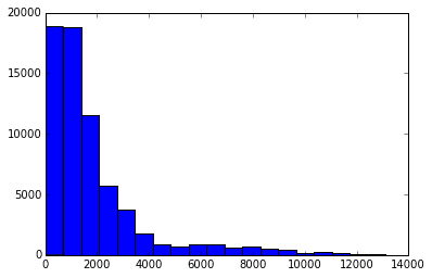
We import the matplotlib plotting functions with import matplotlib.pyplot as plt. We then setup matplotlib to show plots in an ipython notebook with %matplotlib inline. Finally, we can make a histogram with plt.hist(route_lengths, bins=20). As we can see, airlines fly more short routes than long routes.
Using Seaborn
We can make a similar plot with seaborn, a higher-level plotting library for Python. Seaborn builds on matplotlib and makes certain types of plots, usually having to do with statistical work, simpler. We can use the distplot function to plot a histogram with a kernel density estimate on top of it. A kernel density estimate is a curve -- essentially a smoothed version of the histogram that's easier to see patterns in.
import seaborn

seaborn.distplot(route_lengths, bins=20)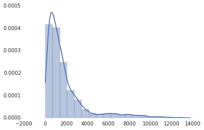
As you can see, seaborn also has nicer default styles than matplotlib. Seaborn doesn't have its own version of all the matplotlib plots, but it's a nice way to quickly get nice-looking plots that go into more depth than default matplotlib charts. It's also a good library if you need to go more into depth and do more statistical work.
Bar Charts
Histograms are great, but maybe we want to see the average route length by airline. We can instead use a bar chart -- this will have an individual bar for each airline, telling us the average length by airline. This will let us see which carriers are regional, and which are international. We can use pandas, a python data analysis library, to figure out the average route length per airline.
import numpy

# Put relevant columns into a dataframe.
route_length_df = pandas.DataFrame({"length": route_lengths, "id": routes["airline_id"]})

# Compute the mean route length per airline.
airline_route_lengths = route_length_df.groupby("id").aggregate(numpy.mean)

# Sort by length so we can make a better chart.
airline_route_lengths = airline_route_lengths.sort("length", ascending=False)
We first make a new dataframe with the route lengths and the airline ids. We split route_length_df into groups based on the airline_id, essentially making one dataframe per airline. We then use the pandas aggregate function to take the mean of the length column in each airline dataframe, and recombine each result into a new dataframe. We then sort the dataframe so that the airlines with the most routes come first. We can then plot this out with matplotlib:
plt.bar(range(airline_route_lengths.shape[0]), airline_route_lengths["length"])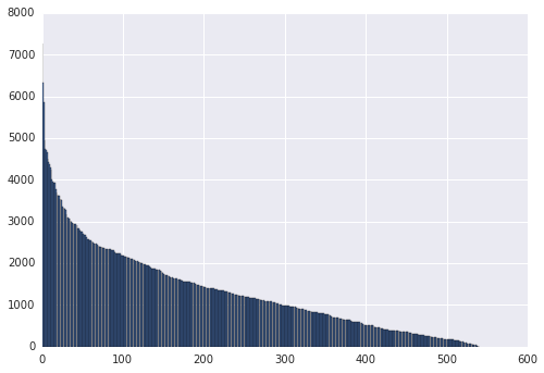
The matplotlib plt.bar method plots each airline against the average route length each airline flies(airline_route_lengths["length"]). The problem with the plot above is that we can't easily see which airline has what route length. In order to do this, we'll need to be able to see the axis labels. This is a bit tough since there are so many airlines. One way to make this easier to work with is to make the plot interactive, which will allow us to zoom in and out to see the labels. We can use the bokeh library for this -- it makes it simple to make interactive, zoomable plots. To use bokeh, we'll need to preprocess our data first:
def lookup_name(row):
    try:
        # Match the row id to the id in the airlines dataframe so we can get the name.
        name = airlines["name"][airlines["id"] == row["id"]].iloc[0]

    except (ValueError, IndexError):
        name = ""
    return name

# Add the index (the airline ids) as a column.
airline_route_lengths["id"] = airline_route_lengths.index.copy()

# Find all the airline names.
airline_route_lengths["name"] = airline_route_lengths.apply(lookup_name, axis=1)

# Remove duplicate values in the index.
airline_route_lengths.index = range(airline_route_lengths.shape[0])
The code above will get the names for each row in airline_route_lengths, and add in the name column, which contains the name of each airline. We also add in the id column so we can do this lookup (the apply function doesn't pass in an index). Finally, we reset the index column to have all unique values. Bokeh doesn't work properly without this. Now, we can move on to the charting piece:
import numpy as np
from bokeh.io import output_notebook
from bokeh.charts import Bar, show

p = Bar(airline_route_lengths, 'name', values='length', title="Average airline route lengths")
output_notebook()
show(p)
We call output_notebook to setup bokeh to show a plot in an ipython notebook. Then, we make a bar plot, using our dataframe and certain columns. Finally, the show function shows the plot. The plot generated in your notebook isn't an image -- it's actually a javascript widget. Because of this, we're showing a screenshot below instead of the actual chart.
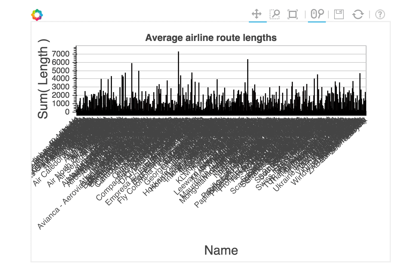
With this plot, we can zoom in and see which airlines fly the longest routes. The image above makes the labels looked crunched together, but they are much easier to see as you zoom in.
Horizontal Bar Charts
Pygal is a python data analysis library that makes attractive charts quickly. We can use it to make a breakdown of routes by length. We'll first divide our routes into short, medium, and long, and calculate the percentage of each in our route_lengths.
long_routes = len([k for k in route_lengths if k > 10000]) / len(route_lengths)
medium_routes = len([k for k in route_lengths if k < 10000 and k > 2000]) / len(route_lengths)
short_routes = len([k for k in route_lengths if k < 2000]) / len(route_lengths)
We can then plot each one as a bar in a pygal horizontal bar chart:
import pygal
from IPython.display import SVG

chart = pygal.HorizontalBar()
chart.title = 'Long, medium, and short routes'
chart.add('Long', long_routes * 100)
chart.add('Medium', medium_routes * 100)
chart.add('Short', short_routes * 100)
chart.render_to_file('/blog/content/images/routes.svg')
SVG(filename='/blog/content/images/routes.svg')

Above, we first create an empty chart. Then, we add elements, including a title and bars. Each bar is passed a percentage value (out of 100) showing how common that type of route is. Finally, we render the chart to a file, and use IPython's SVG display capabilities to load and show the file. This plot looks quite a bit nicer than the default matplotlib charts, but we did need to write more code to create it. Pygal may be good for small presentation-quality graphics.
Scatter Plots
Scatter plots enable us to compare columns of data. We can make a simple scatter plot to compare airline id number to length of airline names:
name_lengths = airlines["name"].apply(lambda x: len(str(x)))
plt.scatter(airlines["id"].astype(int), name_lengths)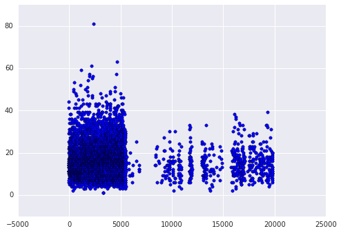
First we calculate the length of each name by using the pandas apply method. This will find the number of characters long each airline name is. We then make a scatter plot comparing the airline ids to the name lengths using matplotlib. When we plot, we convert the id column of airlines to an integer type. If we don't do this, the plot won't work, as it needs numeric values on the x-axis. We can see that quite a few of the longer names appear in the earlier ids. This may mean that airlines founded earlier tend to have longer names. We can verify this hunch using seaborn. Seaborn has an augmented version of a scatterplot, a joint plot, that shows how correlated the two variables are, as well as the individual distributions of each.
data = pandas.DataFrame({"lengths": name_lengths, "ids": airlines["id"].astype(int)})
seaborn.jointplot(x="ids", y="lengths", data=data)
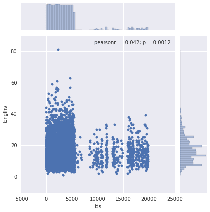
The above plot shows that there isn't any real correlation between the two variables -- the r squared value is low.
Static Maps
Our data is inherently a good fit for mapping -- we have latitude and longitude pairs for airports, and for source and destination airports. The first map we can make is one that shows all the airports all over the world. We can do this with the basemap extension to matplotlib. This enables drawing world maps and adding points, and is very customizable.
# Import the basemap package
from mpl_toolkits.basemap import Basemap

# Create a map on which to draw.  We're using a mercator projection, and showing the whole world.
m = Basemap(projection='merc',llcrnrlat=-80,urcrnrlat=80,llcrnrlon=-180,urcrnrlon=180,lat_ts=20,resolution='c')

# Draw coastlines, and the edges of the map.
m.drawcoastlines()
m.drawmapboundary()

# Convert latitude and longitude to x and y coordinatesx, y = m(list(airports["longitude"].astype(float)), list(airports["latitude"].astype(float)))

# Use matplotlib to draw the points onto the map.
m.scatter(x,y,1,marker='o',color='red')

# Show the plot.
plt.show()
In the above code, we first draw a map of the world, using a mercator projection. A mercator projection is a way to project the whole plot of the world onto a 2-d surface. Then, we draw the airports on top of the map, using red dots.
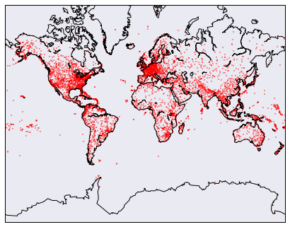
The problem with the above map is that it's hard to see where each airport is -- they just kind of merge into a red blob in areas with high airport density. Just like with bokeh, there's an interactive mapping library, folium, we can use to zoom into the map and help us find individual airports.
import folium

# Get a basic world map.
airports_map = folium.Map(location=[30, 0], zoom_start=2)

# Draw markers on the map.
for name, row in airports.iterrows():
    # For some reason, this one airport causes issues with the map.
    if row["name"] != "South Pole Station":
        airports_map.circle_marker(location=[row["latitude"], row["longitude"]], popup=row["name"])

# Create and show the map
airports_map.create_map('airports.html')
airports_map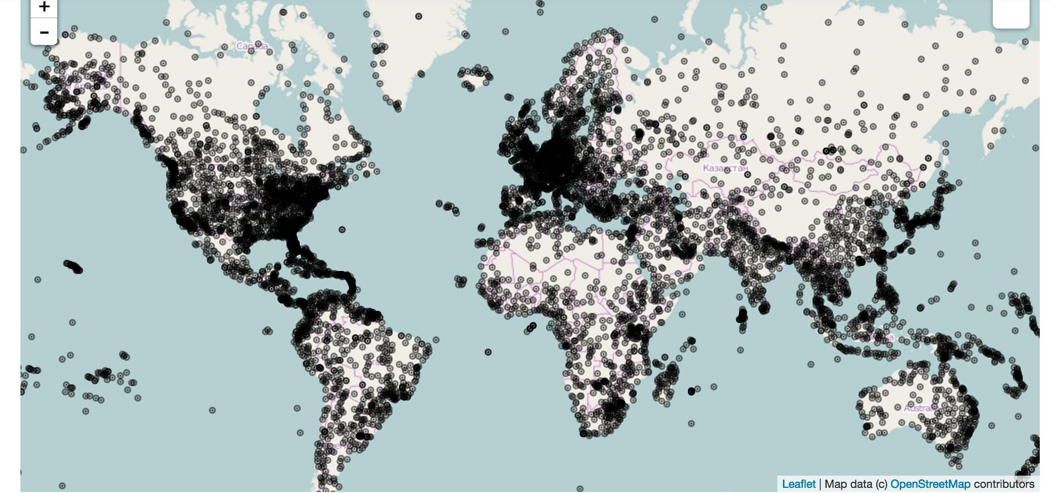
Folium uses leaflet.js to make a fully interactive map. You can click on each airport to see the name in the popup. A screenshot is shown above, but the actual map is much more impressive. Folium also lets you modify options pretty extensively to make nicer markers, or add more things to the map.
Drawing Great Circles
It would be pretty cool to see all the air routes on a map. Luckily, we can use basemap to do this. We'll draw great circles connecting source and destination airports. Each circle will show the route of a single airliner. Unfortunately, there are so many routes that showing them all would be a mess. Instead, we'll show the first 3000 routes.
# Make a base map with a mercator projection.
# Draw the coastlines.
m = Basemap(projection='merc',llcrnrlat=-80,urcrnrlat=80,llcrnrlon=-180,urcrnrlon=180,lat_ts=20,resolution='c')
m.drawcoastlines()

# Iterate through the first 3000 rows.
for name, row in routes[:3000].iterrows():
    try:
        # Get the source and dest airports.
        source = airports[airports["id"] == row["source_id"]].iloc[0]
        dest = airports[airports["id"] == row["dest_id"]].iloc[0]

        # Don't draw overly long routes.
        if abs(float(source["longitude"]) - float(dest["longitude"])) < 90:
            # Draw a great circle between source and dest airports.
            m.drawgreatcircle(float(source["longitude"]), float(source["latitude"]), float(dest["longitude"]), float(dest["latitude"]),linewidth=1,color='b')
    except (ValueError, IndexError):
        pass
# Show the map.
plt.show()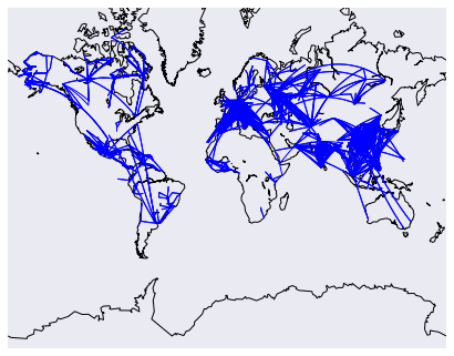
The above code will draw a map, then draw the routes on top of it. We add in some filters to prevent overly long routes from obscuring the others.
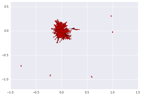
Drawing Network Diagrams
The final exploration we'll do is drawing a network diagram of airports. Each airport will be a node in the network, and we'll draw edges between nodes if there's a route between the airports. If there are multiple routes, we'll add to the edge weight, to show that the airports are more connected. We'll use the networkx library to do this. First, we'll need to compute the edge weights between airports.
# Initialize the weights dictionary.
weights = {}

# Keep track of keys that have been added once -- we only want edges with a weight of more than 1 to keep our network size manageable.added_keys = []

# Iterate through each route.
for name, row in routes.iterrows():
    # Extract the source and dest airport ids.
    source = row["source_id"]
    dest = row["dest_id"]

    # Create a key for the weights dictionary.
    # This corresponds to one edge, and has the start and end of the route.
    key = "{0}_{1}".format(source, dest)

    # If the key is already in weights, increment the weight.
    if key in weights:
        weights[key] += 1

    # If the key is in added keys, initialize the key in the weights dictionary, with a weight of 2.
    elif key in added_keys:
        weights[key] = 2

    # If the key isn't in added_keys yet, append it.
    # This ensures that we aren't adding edges with a weight of 1.
    else:
        added_keys.append(key)
Once the above code finishes running, the weights dictionary contains every edge between two airports that has a weight higher than 2. So any airports that are connected by 2 or more routes will appear. Now, we need to draw the graph.
import networkx as nx

# Initialize the graph.
graph = nx.Graph()

# Keep track of added nodes in this set so we don't add twice.
nodes = set()

# Iterate through each edge.
for k, weight in weights.items():
    try:
        # Split the source and dest ids and convert to integers.
        source, dest = k.split("_")
        source, dest = [int(source), int(dest)]

        # Add the source if it isn't in the nodes.
        if source not in nodes:
            graph.add_node(source)
        # Add the dest if it isn't in the nodes.
        if dest not in nodes:
            graph.add_node(dest)

        # Add both source and dest to the nodes set.
        # Sets don't allow duplicates.
        nodes.add(source)
        nodes.add(dest)

        # Add the edge to the graph.
        graph.add_edge(source, dest, weight=weight)
    except (ValueError, IndexError):
        passpos=nx.spring_layout(graph)
# Draw the nodes and edges.nx.draw_networkx_nodes(graph,pos, node_color='red', node_size=10, alpha=0.8)
nx.draw_networkx_edges(graph,pos,width=1.0,alpha=1)
# Show the plot.
plt.show()
Conclusion
There are now a ton of Python data visualization libraries, and so it's possible to make almost any kind of visualization you can think of. Most libraries build on matplotlib and make certain use cases simpler. If you want to learn in more depth how to visualize data using matplotlib, seaborn, and other tools, check out our interactive Introduction to Data Visualization in Python and Telling Stories Using Data Visualization and Information Design courses.