11 Design Tips for Data Visualization
Here’s an important fact that’s easy to forget: our data is only as helpful as it is understandable.
Most of the time, making data understandable means creating some kind of data visualization. And while a simple bar graph might cut it for internal work, making your data both visually understandable and visually attractive can help it get more attention and help you stand out, whether your audience is the entirety of the internet or just your company’s CEO in the weekly meeting.
But the world of graphic design is messy and subjective, and most data scientists probably don’t have the time to dive into learning design. Luckily, you don’t have to! Here are some easy rules and techniques you can follow to make your data look better.
To pick good colors, cheat
Color choice is important for data visualization, but it’s easy to get deep into the weeds when it comes to color. If you want to go the DIY route, we have a lengthy post you can read about choosing colors for your data visualization. But there are even easier paths you can take:
Let a website pick your colors: If you want a machine to pick your colors entirely, Coolors is a great site that’ll do all of the work for you. Press spacebar to generate random well-matched color schemes until you find one you like. Note that you can “lock” colors you like and then press spacebar to find more colors that match with them.
Paletton is another great online tool that will let you pick or input a base color and then generate a variety of matching colors based on other parameters you select. Playing with the Triad and Tetrad options will give you some good three- and four-color schemes, respectively. And don’t forget you can experiment with the hue and distance settings to get even more options (try moving the distance to 60 or 90 if you don’t like what you find at the default 30 setting).
Paletton also has options for simulating various types of color blindness so that you can be sure your chosen colors are still distinct from each other even to people with colorblindness.

Steal your colors from a photo: One fun and easy trick for generating a simple color palette is to pick a photo with colors you like, then open it in an image editor and pixelate the heck out it (in Photoshop, you can do this by going to Effect > Pixelate > Mosaic). Pixelate it repeatedly (or just turn up the cell size, depending on your software) and you’ll be left with a few giant pixels that represent the colors from your photo. Usually, these colors will work quite well together, so you can simply copy them and use them in your data viz design.

Steal your colors from another design: You shouldn’t do this in the context of any sort of design competition, obviously, but for work like an internal company presentation, borrowing some or all of your colors from some other design is a totally viable option. And if your company has previous presentations you can pull from or a brand guide with a predefined color palette, then you should absolutely make use of those resources rather than trying to reinvent the wheel.
Keep it minimal
This is advice that you can apply to virtually every aspect of your design: don’t include anything more than what’s necessary for understanding the chart you’re creating.
A few examples:
Eliminate unnecessary gridlines (often, none are required)
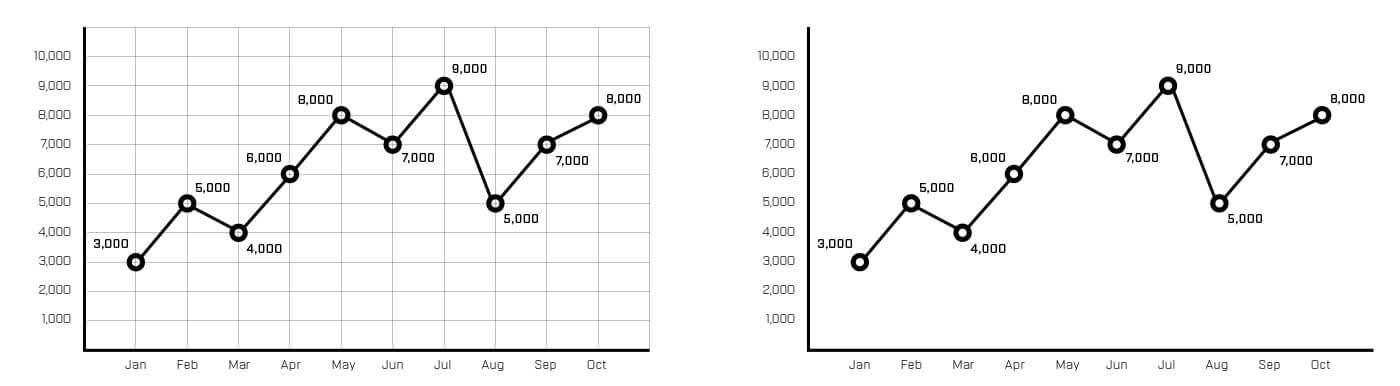
Eliminate any call-outs or labels that aren’t necessary for getting the point of your chart

Reduce the thickness of line graphs and other graphic elements

Eliminate the Y or X axis scale and labels entirely if you can convey the important information more simply with a call-out. Elimate any data points that are superfluous (but don't elimate so much that the chart becomes misleading).

Avoid using decimal places, just round to whole numbers unless the decimals are actually essential to conveying the meaning of your data.
These design principles apply across all visualization projects. To practice implementing them with real data using Python libraries like Matplotlib and Seaborn, check out our courses on data visualization.
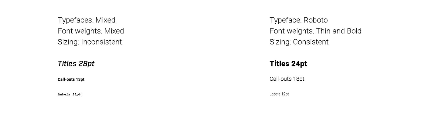
Use one typeface, two weights, and proportional font sizes
Matching fonts and typesetting is as complex a topic as matching colors, but you can avoid it entirely by picking a mainstream typeface (when in doubt, grab one of the most popular ones from Google Fonts) and sticking to using only that typeface throughout your design. Restrict yourself to two or at most three different font weights that have strong contrast.
So if we pick the typeface Roboto, for example, we might choose to use only the “Light” and “Black” fonts. These will fit well together in the same design (since they’re part of the same typeface), but you can use “Black” for titles and other key info and “Light” for less crucial details that don’t have to be as eye-catching.
When choosing sizes for your type, make them proportional to each other. For example, you can use multiples of six:
- Axis labels: 12 pt
- Call-outs and data labels: 18 pt
- Titles: 24 pt
Lose the icons
When putting data together to tell a story, it’s always tempting to add in some more concrete visual elements alongside the data visualization. But does that shopping cart icon actually add any meaningful info to our chart about sales trends? Probably not. There are occasions where including an icon might be helpful, but nine times out of ten they’re just added visual noise that will clutter up our design without adding any meaning.
![]()
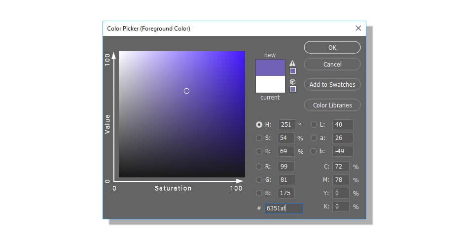
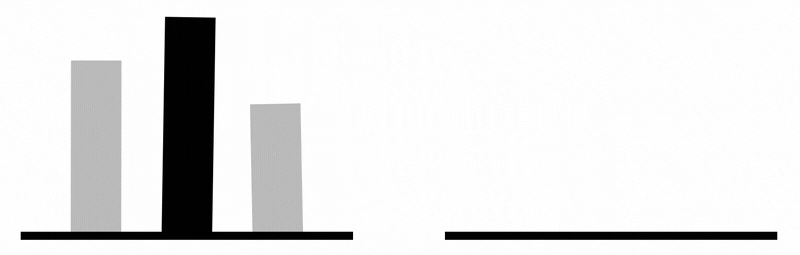
Use value and saturation to hack your viewer’s eyes
In design, a color’s value is a measure of its brightness, and saturation is a measure of the color’s intensity. You can think of them a bit like two axes of a graph, with value represented from 0 to 100 on the vertical axis and saturation represented from 0 to 100 on the horizontal axis.
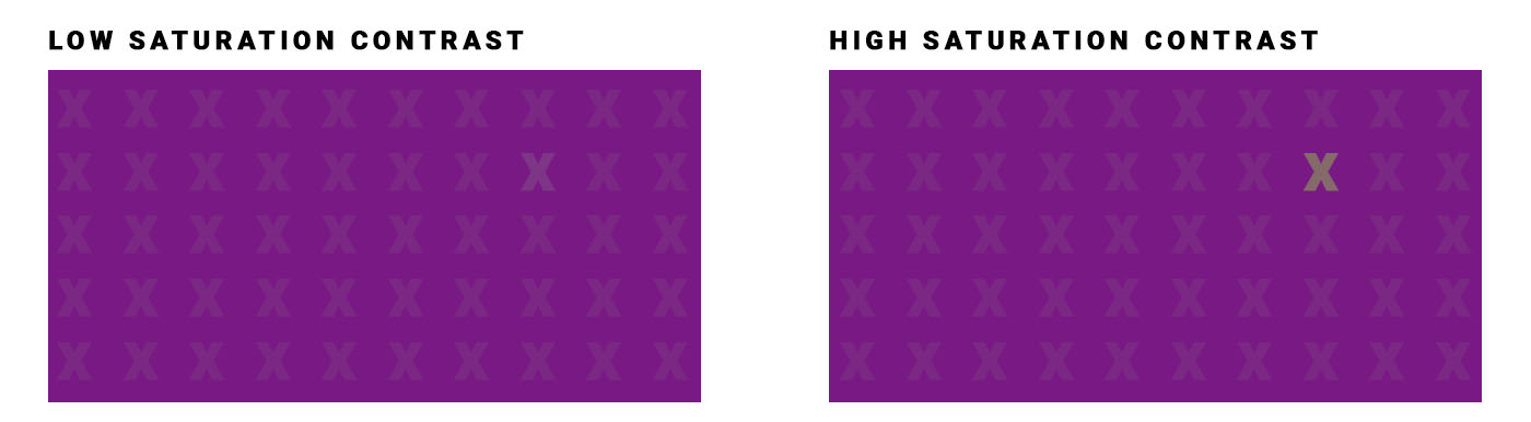
You can use these concepts to your advantage to control the eyes of a viewer as they look at your chart, because viewers’ eyes are naturally drawn to areas of contrast. So if you want to draw attention to a particular area of your visualization, make it stand out with strong contrast between its value and saturation (or both) and the value and saturation of the rest of the chart. For example, where is your eye drawn in these images?

Never place text dead center
This one only really applies to those of you who frequently have to make slideshows or other presentations with title pages, but if that’s you, this is a killer tip: don’t place your titles right in the center of the page or screen. Instead, place them slightly above that point. You’ll find that this often makes your design “feel” a lot better.

(We’ve heard designers explain this by saying that because humans experience gravity every day, we subconsciously add a little “gravity” to images that we’re looking at, and thus perfectly-centered text “feels” a little low, like it’s about to fall off the screen. We’re not sure there’s any actual science to back that up, but there’s no denying above-center titles often “feel” better.)
Animation only when it’s meaningful
Animated charts are increasingly common in the world of data visualization, and there are some neat tools out there that make producing these kinds of charts pretty easy. But it’s worth remembering that like any design tool, they should be employed only when there’s a good reason to use them. Motion can be used to help illustrate the evolution of a value over time, for example, or to call attention to a particularly important bit of a chart (since our eyes are naturally drawn to motion). But it can also be a meaningless and off-putting distraction, and it may also slow down your project’s loading time if it’s hosted on the web.
Neither of the above animations is necessary. If you're not concerned about loading times, the upward motion elements in the chart on the right could be used to convey growth. The shaking motion of the graph on the left, however, is distracting and doesn't add any value.
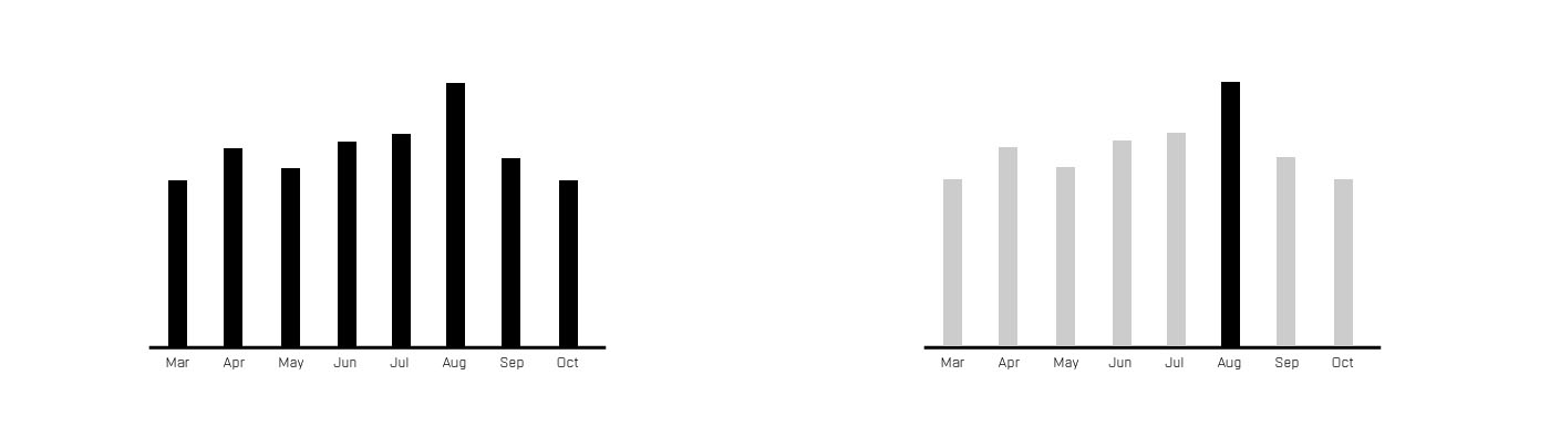
Squint at your design
Squinting is a great quick-and-dirty way to test the effectiveness of a design - when you squint, the most important elements of the design should still be visible while the less important details get blurred out. You’ll find that larger and higher-contrast elements are the easiest to see when squinting, so if you aren’t getting the key message when squinting at your design, playing with color values and saturation to increase contrast in key areas, or adjusting the size of key data points (where possible) are good ways to make those elements “pop” more.
Squint at the following charts and see if you can tell which design is working better at quickly conveying the key information.
Test your design
The squint is a quick way to self-test your design, but for any project that matters, you should really test your design with other people, too. In particular, you want to ask them for their quick takeaways (to see which information your design is communicating first and foremost), and ask them if they saw any connections between the data.
That second question is particularly important because people will sometimes draw conclusions based on things like proximity - chart A is next to chart B so people assume the data are related - that you may not have anticipated. Testing your design with a small audience and getting feedback on what they took away from it will help you ensure that it’s communicating what you want before you show it to your main audience.
The golden rule: readability comes first
It’s easy to go down the rabbit hole trying to make your data look pretty, but remember that good design is about communicating information first and foremost, and aesthetics are a distant second. In a perfect world, your design will be both clear and pretty, but if you can only choose one, go for clear every time. An ugly but readable chart still conveys information, a beautiful but unreadable chart is useless.
Design is a discipline that’s nearly as deep as data science, but you don’t have to be a professional designer to create data visualizations that are both effective and attractive. Here are some additional design resources for data scientists looking to improve their data viz design skills:
- Venngage has a data viz design guide that includes some great-looking examples.
- Hubspot’s data viz design PDF has some great best-practice tips for specific chart types starting on page 8).
- Geckoboard offers a printable data visualization tips poster that you can hang in your office to keep some important guidelines fresh in your mind.
- Our own guide to color in data viz, which includes links to a number of other great color-specific resources
- Data Viz Project’s big gallery of chart types has real-world examples for each chart type and many are gorgeous and inspiring.
- UC Berkeley has a 30-minute video on graphic design for data visualization that has some great info if you’ve got the time to go through it.
- A cool guide on designing infographics, which can be a great way to present data science projects to a large audience.
- Great presentation tips for data based presentations from the Visme blog.
