Analyze Facebook Data to Find Out If You Post Too Much

As of this writing, Facebook claims more than 3.07 billion monthly active users. That means that if you're reading this article, chances are you're a Facebook user. But just how much of a Facebook user are you? How much do you really post? We can find out if we analyze Facebook data using Python!
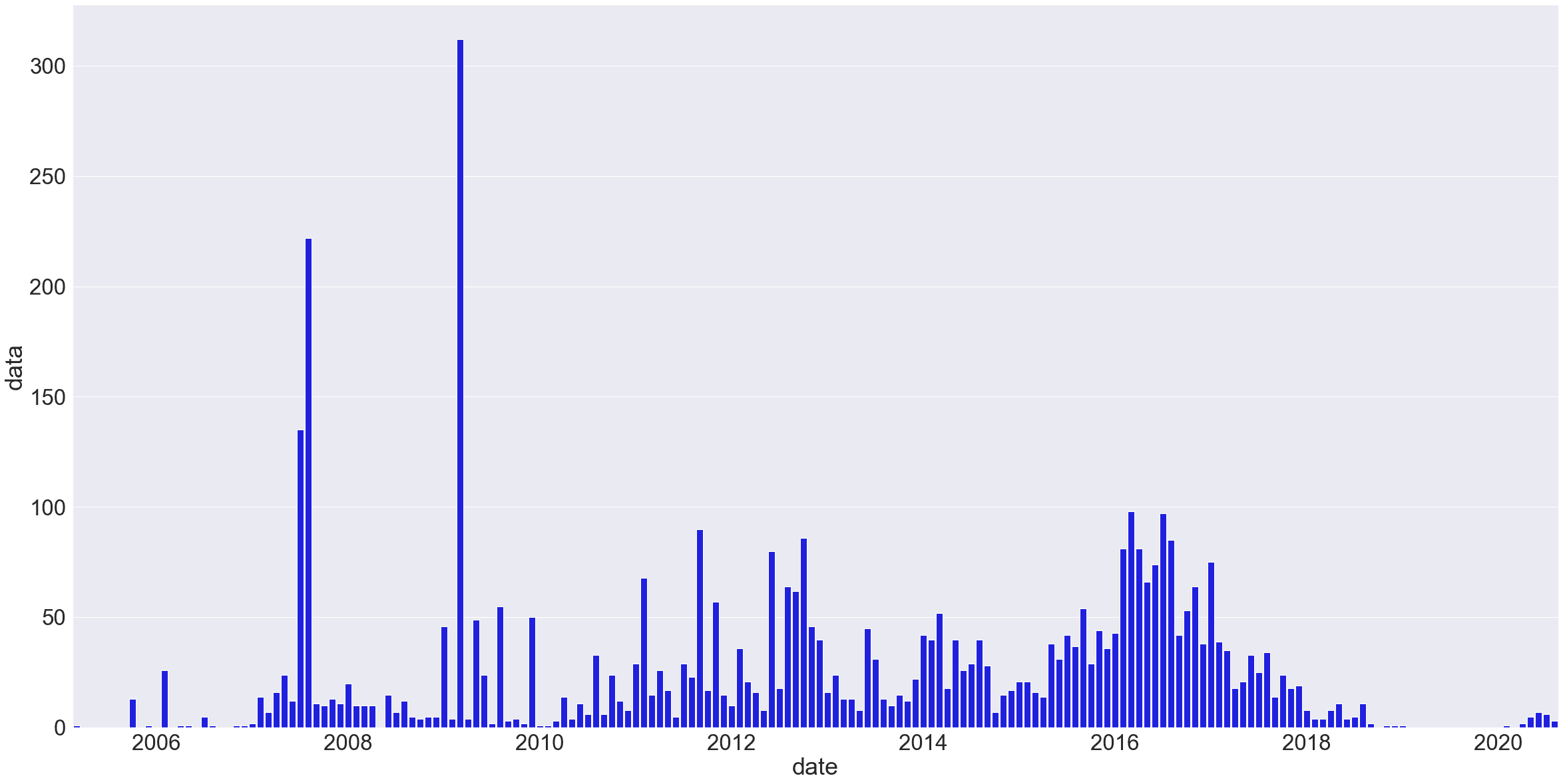
Specifically, we're going to use Python to create this — a chart that shows how often we've posted each month over time:

For the purposes of this tutorial, we'll assume you're familiar with the basics of Python and with Jupyter Notebooks — if not, check out this tutorial on analyzing your Amazon spending first.
Step 1: Download Your Facebook Data
Facebook actually allows us to download pretty much everything we've ever done on the site. You can download your data here, but you may not want to download all of it — that file could be massive, depending on how often you use Facebook and how long you've been on it.
For this tutorial, we'll look specifically at our own personal Facebook posts, and try answer the questions:
- How often do I post?
- Am I using Facebook more or less than I used to?
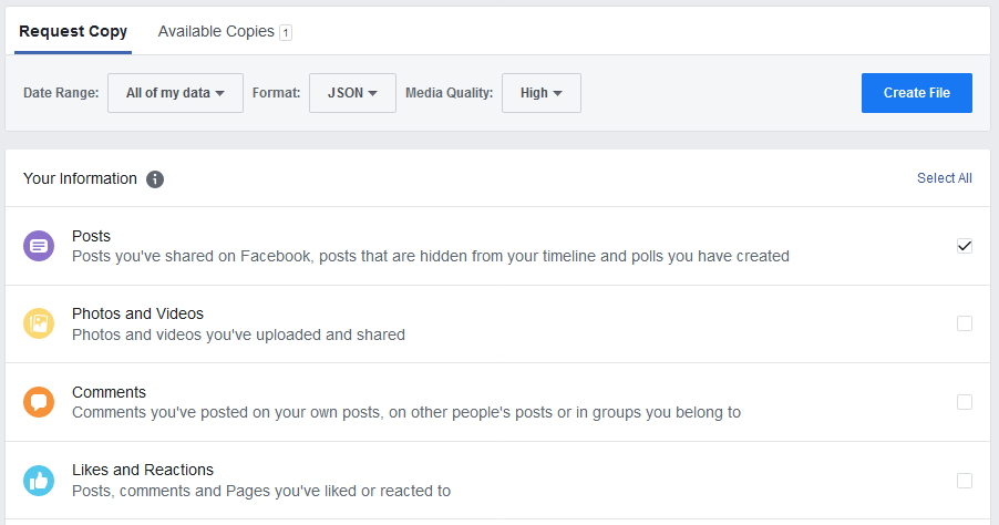
To get just the data related to posts, go to the data download page. Change the requested file format from HTML to JSON, and then deselect everything from the options below, check off only posts, and hit Create File.

Facebook will notify you when your file has been created and is ready for download — it could take a while, depending on your Facebook history and options.
Download the zip file, unzip it, and look for the posts folder and a file called your_posts_1.json. That's the file we'll be using for this tutorial.
Step 2: Import and Format Your Data
Next, we've got to get this data into a pandas dataframe, so fire up Jupyter Notebooks (here's a beginner's guide to Jupyter Notebooks if you need a refresher). We'll start by importing the data and reading it into a DataFrame.
The built-in pd.read_json() function will be able to interpret our JSON data in a DataFrame automatically. (It's not perfect, as you'll see, but it'll work for our purposes here).
import pandas as pd

# read the json file into a dataframe
df = pd.read_json('your_posts_1.json')

df.head(3)| timestamp | attachments | data | title | tags | |
|---|---|---|---|---|---|
| 0 | 2020-08-12 16:54:03 | [{'data': [{'external_context': {'url': 'https... | [{'post': 'Put together a little video on clea... | Charlie Custer posted in YT Industries Owners ... | NaN |
| 1 | 2020-08-09 23:41:14 | [{'data': [{'external_context': {'url': 'https... | [{'post': 'More challenging but somehow less d... | NaN | NaN |
| 2 | 2020-08-02 20:11:51 | [{'data': [{'external_context': {'url': 'https... | [{'post': 'New video up on the channel...total... | NaN | NaN |
As we can see, this isn't perfect. Some of our columns have nested sub-columns in each row that are still in JSON format. If we wanted to work with that data, we'd need to deal with this.
But to answer our question here — are we posting more or less than we used to on Facebook? — we really don't need to deal with the actual post content, or with other information like attached media files. We're just concerned with frequency — how often new posts were being made.
Next, we'll ensure that timestamp column is in the right format bu converting it to a datetime object using to_datetime(). We'll also rename it 'date' and drop some of the unnecessary columns just for clarity — this step isn't strictly necessary, but it helps give us something simpler to look at.
# rename the timestamp column
df.rename(columns={'timestamp': 'date'}, inplace=True)

#drop some unnecessary columns
df = df.drop(['attachments', 'title', 'tags'], axis=1)

# making sure it's datetime format
pd.to_datetime(df['date'])

df.head(3)| date | data | |
|---|---|---|
| 0 | 2020-08-12 16:54:03 | [{'post': 'Put together a little video on clea... |
| 1 | 2020-08-09 23:41:14 | [{'post': 'More challenging but somehow less d... |
| 2 | 2020-08-02 20:11:51 | [{'post': 'New video up on the channel...total... |
Now we've got something a little cleaner to work with! If we want to check how many posts we're analyzing, we could use df.shape to count the rows.
It might also be a good idea to use df.tail() to check the end of our dataframe, just to be sure it really spans our entire Facebook usage:
print(df.shape)
df.tail(3)
(4407, 2)| date | data | |
|---|---|---|
| 4404 | 2005-10-20 03:23:30 | NaN |
| 4405 | 2005-10-20 03:23:30 | NaN |
| 4406 | 2005-03-07 01:05:54 | [{'post': 'Wet Hot American Summer Teessince... |
In the case of my personal Facebook data, it looks like I've posted over 4,000 times in total. My data begins back in early 2005, when I apparently posted something about Wet Hot American Summer. I was in college in 2005, so that timing checks out.
You may notice that some rows say NaN — these were posts that included only images, no text. The images would be linked in the 'attachments' column, but we've dropped that, so it isn't visible here.
Step 3: Analyze Facebook Data to Figure Out Your Monthly Post Count
Now that we've got our data, we need to get it into a format that tells us something about post frequency. Given that we're spanning years of history here, looking at it month-to-month makes the most sense. This means we need to group our 'date' column by months, and count how many rows (i.e., posts) are associated with each month.
Thankfully, pandas is designed to make it relatively simple to work with time series data. We need to do two things here:
- Set the
datecolumn as the index of our DataFrame. - Resample the data by month, counting how many posts occur in each month.
For the first step, we can use set_index(). The second step is a bit more complex, so let's break it down into four separate steps to break down the code we need to write:
- Select the column we want to resample by — in this case, is the
datacolumn. - Use the
.resample()function with the argument'MS'(for "Month Start") to resample our data by month. - Use
.size()to specify what we want to measure each month — in this case, the number of rows (i.e., posts) with a post date that fall within that month. - Assign the resulting Series to a variable called
post_counts.
Here's what that looks like in practice:
date
2005-03-01    1
2005-04-01    0
2005-05-01    0
2005-06-01    0
2005-07-01    0
             ..
2020-04-01    2
2020-05-01    5
2020-06-01    7
2020-07-01    6
2020-08-01    3
Freq: MS, Name: data, Length: 186, dtype: int64
That looks great! We've got our post counts broken down by month, and if we check the original data set, we can quickly see the counts are correct.
Note that months with no posts have been correctly counted as 0 rather than simply skipped. That's one of the reasons why using resample(), which is designed to work with time series, is better for this kind of task than using something like groupby(), where it's easy to skip months with no data if we're not careful.
Step 4: Visualize Your Facebook Usage
Anyway, now that we're past the tricky part, all that's left is the fun: visualization! To do that, we'll import matplotlib (and use the $matplotlib inline magic to make our chart appear in the Jupyter Notebook. We'll also import Seaborn and NumPy, which will help us make a more readable-looking chart.
Once we've done our imports, we'll use sns.set() to set the size and font size of our chart. Since we're working with a lot of data here, we'll make the chart fairly large and make sure the font size is big enough to be readable.
Then, we'll set the x labels to use the index of post_counts (the dates), and use sns.barplot() to create a bar chart. In the arguments for sns.barplot(), we'll tell the function to use the x labels we defined, to plot the data in post_counts, and to make the bar color blue.
That alone would be enough to create a basic chart, but in this case, we'll want to take a few additional steps to make the chart readable. Specifically, we'll want to arrange the tick positions on the x axis to once every 24 months, so that we see a tick every other year in the resultant chart. We'll also want to reformat the dates in the chart so that only the year is displayed.
Note: Since this isn't a tutorial about data viz, we won't go into depth on how this works as part of this tutorial, but if you'd like to learn more about how to make great data visualizations with Python, we have Introduction to Data Visualization in Python and Storytelling Through Data Visualization courses that you can try for free.
%matplotlib inline
import matplotlib.pyplot as plt
import seaborn as sns
import numpy as np

# set figure size and font size
sns.set(rc={'figure.figsize':(40,20)})
sns.set(font_scale=3)

# set x labels
x_labels = post_counts.index

#create bar plot
sns.barplot(x_labels, post_counts, color="blue")

# only show x-axis labels for Jan 1 of every other year
tick_positions = np.arange(10, len(x_labels), step=24)

#reformat date to display year onlyplt.ylabel("post counts")
plt.xticks(tick_positions, x_labels[tick_positions].strftime("$Y"))

# display the plot
plt.show()
Here's the chart — you can click to view it at full size.
There are still some ways we could make this chart even prettier, but for our purposes, this is plenty to be able to understand the data and analyze our Facebook posting history.
In my case — the chart above is my personal Facebook data — we can see that I only posted on Facebook rarely in the early days. I had big flurries of posts — hundreds per month! — in the summer of 2007 and the spring of 2009, which coincided with travel.
My regular usage started to pick up around 2011, and hit peak levels around 2016. After that, it died down, and I stopped using Facebook entirely for quite some time starting in 2019. At peak levels, I was posting nearly 100 times each month!
And remember, that's just posts, not comments! There's a whole other JSON file for comments, but I'm embarrassed enough as it is. If you want to take your Facebook data analysis further, digging into your comments file would be a great next step!
Let's call it good on this tutorial and review what we've done:
- We downloaded personal usage data from Facebook
- We read the JSON file into a pandas DataFrame
- We broke the data down by month and counted the number of posts each month
- We visualized the Facebook usage and learned something: Charlie used to spend entirely too much time on Facebook.
If you enjoy doing projects like this, check out Dataquest's interactive, in-your-browser data science courses! They're more immersive and way, way more in-depth than what we've covered here. In fact, we've got seamless course sequences that can take you from total beginner to job-qualified data analyst, data scientist, or data engineer.
Now that you've seen how much time you've wasted on Facebook, why not log into Dataquest and spend some of your online time building valuable job skills? You can create an account and start learning for free — no credit card required!