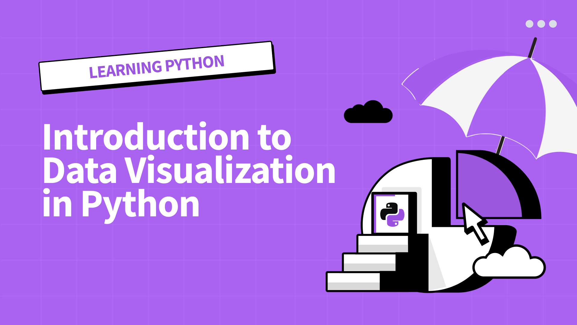
Explore Matplotlib & Seaborn
September 6, 2024
|
Hey there, Dataquesters! In our last edition, we explored the powerful world of NumPy and pandas. Today, I’m excited to share with you how to bring your data to life through visualization in Python. Remember when we were kids and we’d flip through picture books? The colorful illustrations made stories come alive in ways that words alone couldn’t. That’s exactly what data visualization does for our datasets. It transforms dry numbers into vivid, insightful stories. I still remember the first time I used Matplotlib to visualize a time series. I was working on a machine learning project involving weather prediction, and I was drowning in a sea of numbers. The data made sense logically, but I couldn’t see the bigger picture. Then, on a whim, I decided to plot the time series. What happened next was nothing short of amazing. As the line graph popped up on my screen, hidden patterns emerged like invisible ink revealed under a blacklight. Seasonal trends that had been completely obscured in the raw data now stood out clear as day. This simple visualization not only led to more accurate forecasting but also forever changed how I approach data analysis. But Matplotlib is just the tip of the iceberg. Let me tell you about seaborn, another fantastic library that’s become my go-to for many visualizations. When I used it for feature selection in my machine learning project, creating scatter plots to understand relationships between variables, I stumbled upon a clear non-linear relationship I had completely overlooked in the raw data. Instead of just looking at numbers, visualization helps us understand the underlying patterns and trends in our data. It’s also an incredibly powerful tool for assessing data quality. Let me give you an example. As I was exploring a large dataset for my weather prediction project, something felt off about the data. The numbers looked fine at first glance, but my gut told me there was more to the story. So, I created a simple histogram. Lo and behold, instead of the normal distribution I expected, I saw two distinct peaks – a bimodal distribution. This discovery led me to create separate models for each subgroup of data, resulting in much more accurate predictions. One of the best changes I’ve made to my workflow is integrating pandas visualizations. It’s like having a data-savvy assistant who quickly points out the most interesting aspects of your dataset. Now, I can spot outliers and trends in half the time, leaving more room for deep analysis. If you’re feeling inspired to start your own data visualization journey, I’ve got great news. Our Introduction to Data Visualization in Python course is designed to help you create compelling visualizations using libraries like Matplotlib and seaborn. You’ll learn how to transform raw data into insightful visual representations, from simple line graphs to complex grid charts. Remember, the ability to create clear, meaningful visualizations can really set you apart in the job market. Many of our students have found that applying these visualization techniques to portfolio projects has helped them land data analyst roles. Employers value candidates who can not only crunch numbers but also communicate insights effectively through visuals. As you start exploring data visualization, here’s a tip: try recreating visualizations you admire in publications or on data-focused websites. It’s a great way to practice and develop your skills. And don’t be afraid to experiment with different types of plots and charts. The more you practice, the more intuitive the process will become. I’m genuinely excited to see what insights you’ll uncover with your new data visualization skills. Every dataset has a story to tell, and now you’ll have the tools to help it speak through compelling visuals. So, I’m curious – what dataset are you itching to visualize? What hidden patterns do you think you might find? Share your thoughts in the Dataquest community. Happy visualizing, Dataquesters!
Mike |
|
What We're Reading
📖 Sieve of Eratosthenes
Learn about the “Sieve of Eratosthenes,” an efficient algorithm for identifying prime numbers, a useful concept in programming. Read more
📖 The Rise and Fall of Stack Overflow
Explore the rise of Stack Overflow in developer culture and how AI tools like GitHub Copilot and ChatGPT are challenging its relevance. Read more
📖 How to Get a Job at a Startup
Discover what it takes to join the top 0.4% of engineers hired at fast-growing startups. Learn tips on standing out during the hiring process, from the initial application to the final interview. Read more
Dataquest Webinars
If you’re new to data science and unsure where to begin, we’ve got you covered! Introducing our Getting Started with Dataquest webinar series—a 5-part journey designed to guide you through the data science landscape, explore key roles in the field, and show you how to make the most of the Dataquest platform. You’ll gain the confidence to kick off your first course and project and start working toward your career goals.
Catch the recording of our first webinar, Success with Dataquest, featuring a Q&A session with our CEO.
Don’t miss out on exclusive access to future live webinars—make sure to sign up for our weekly newsletter.
Give 20%, Get $20: Time to Refer a Friend!
Give 20% Get $20
Now is the perfect time to share Dataquest with a friend. Gift a 20% discount, and for every friend who subscribes, earn a $20 bonus. Use your bonuses for digital gift cards, prepaid cards, or donate to charity. Your choice! Click here
Community highlights
Project Spotlight
Sharing and reviewing others’ projects is one of the best things you can do to sharpen your skills. Twice a month we will share a project from the community. The top pick wins a $20 gift card!
In this edition, we spotlight Dimitar Mikov‘s project on Decoding Dissatisfaction: A Comparative Analysis of Employee Resignations at DETE and TAFE. Dimitar’s project stands out for its meticulous cleaning and analysis of Australian employee exit polls. With a well-structured approach, he delivers an engaging narrative, insightful observations, striking visualizations, and impeccably documented code that is both readable and highly informative.
|
Want your project in the spotlight? Share it in the community. |
Ask Our Community
|
We’re excited to introduce our new Ask Our Community section, where you can connect with fellow learners for peer-to-peer advice and support. This week, we’re spotlighting the question, “Is Dataquest still good?” along with the top advice from our community. Do you have insights to share? Join the conversation here! From Cyprian: I would say the courses are up to date and are being updated regular. As you would see from my dashboard, while I was completing Data Scientist in Python v1, version 2.5 was already up! I also think Generative AI Fundamentals in Python is a new addition to the suite of courses. This is a must-have skill for every data scientist. From Dimitar: If you are mainly interested in the content quality and relevance, Dataquest is a solid choice, even with the premium pricing. While Dataquest is on the pricier side, its project-based learning approach and specialized content may justify the cost depending on your goals. From Alina: Lucky you that you’ve started your Data Science journey 4 years ago with Dataquest! I’ve started much later and so far, from my experience, it’s the most convenient platform to learn. If you’ve already started the course it would be very productive to refresh your knowledge and redo some of the guided projects and try the Community Champion program, I’m not sure if it existed 4 years ago, it’s not only a huge motivation to apply your knowledge but also a way to get a free extension to your subscription. |
High-fives from Vik, Celeste, Anna P, Anna S, Anishta, Bruno, Elena, Mike, Daniel, and Brayan.