15 Power BI Project Ideas to Build Your Portfolio in 2026
Building a Power BI portfolio of projects is one of the most direct paths into a business analyst or data analyst role. Employers want evidence that you can take messy data, build a clean model, and produce a dashboard that actually helps someone make a decision. Projects give you that evidence.
This post covers 15 Power BI projects, organized from beginner to advanced. Three of them are fully guided experiences you can complete right on Dataquest with no setup, or hunting for data. The rest are independent projects with dataset links so you can get started immediately. We've also included tips on building a portfolio that stands out and how to land your first Power BI job.
Table of Contents
- Beginner Power BI Projects
- Intermediate Power BI Projects
- Advanced Power BI Projects
- What Makes a Strong Power BI Portfolio?
- Overcoming Common Power BI Project Challenges
- Getting Started with Power BI Projects
- How to Prepare for a Power BI Job
- Frequently Asked Questions
Beginner Power BI Projects
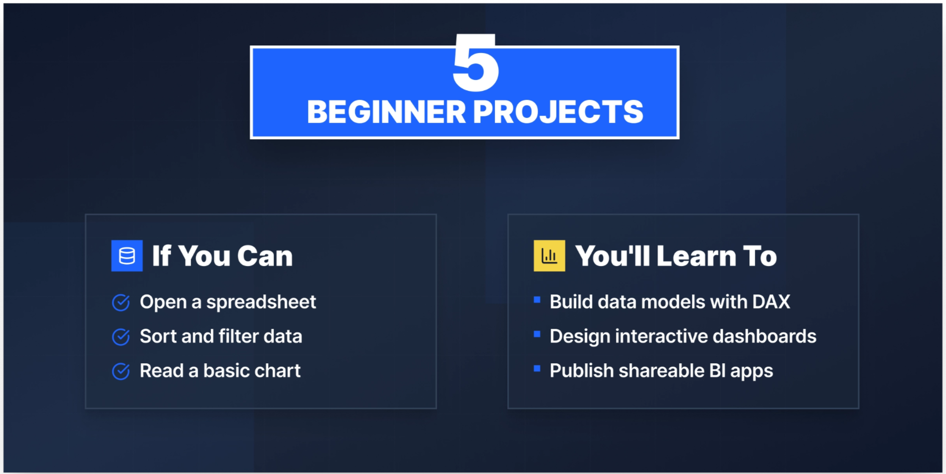
If you're new to Power BI, start here. These projects will teach you the full workflow by importing data, cleaning it, building a model, and creating visualizations. The first three are guided experiences you can complete directly on the Dataquest platform, in your browser, without any local setup. That's a genuine advantage when you're starting out: you spend your energy learning Power BI, not troubleshooting installations.
1. Modeling Data in Power BI
Difficulty: Beginner | Guided — Complete this on Dataquest
Sales analysts spend a surprising amount of their time not building dashboards, but preparing the data those dashboards run on. This project puts you in that role.
You'll step into the role of an analyst at a company that sells scale model cars, working with their sales records database. Your job is to import the raw data into Power BI, clean and transform it, then design a data model that supports meaningful analysis. You'll create calculated columns and DAX measures to surface business insights and review how your model affects report performance.
By the end, you’ll have practiced one of the most overlooked parts of Power BI: building a model that doesn't fall apart when the data gets more complex.
What you'll build: A structured data model with calculated columns, DAX measures, and performance-optimized relationships, the foundation every dashboard needs.
Tools: Power BI
Resources: Official Power BI documentation | Microsoft · Power BI Community | Microsoft
2. Visualization of Life Expectancy and GDP Variation Over Time
Difficulty: Beginner | Guided — Complete this on Dataquest
Data visualization is a communication skill. This project teaches you to tell a story with numbers that span decades and dozens of countries.
Using the Gapminder dataset, you'll build interactive scatter plots and stacked column charts showing how life expectancy and GDP have changed across regions over time. You'll practice the full report development cycle by loading data, cleaning it, configuring visuals, and publishing your finished dashboard. The Gapminder data is rich enough to yield genuinely interesting findings, making this one of the more portfolio-worthy beginner projects available.
What you'll build: An interactive, published dashboard with scatter plots, stacked column charts, and a customized, accessible layout that’s ready to link from your resume.
Tools: Power BI
Resources: Official Power BI Support | Microsoft
3. Building a BI App
Difficulty: Beginner | Guided — Complete this on Dataquest
This project puts you in the role of a BI analyst at Dataquest, working with real course data to answer a question every learning platform cares about: which courses need improvement, and why?
You'll import and model completion rate and NPS data, create a data model, and write DAX measures for the key metrics. From there, you'll build KPI cards, line charts, and scatter plots to surface trends and compare course performance, then make a data-driven recommendation. The final step is publishing your report to Power BI Service and packaging it as a shareable app. That end-to-end workflow, from raw data to a published, decision-ready app, is what makes this one stand out at the beginner level.
Once you've completed it, the natural next step is learning row-level security (RLS) to control what different users see in your reports. Dataquest's Analyzing Data with Microsoft Power BI skill path covers RLS and continues directly from this project.
What you'll build: A published Power BI app with KPI metrics, line charts, and scatter plots analyzing course completion rates and NPS — with a written recommendation on which courses to prioritize for improvement.
Tools: Power BI
Resources:
- Sample datasets from Power BI | Microsoft
- What's the best way to learn Microsoft Power BI? | Dataquest
4. Customer Segmentation Analysis
Difficulty: Beginner
Marketing and e-commerce teams typically segment their customers by spending behavior, purchase frequency, and recency. This project teaches you the most widely used framework for doing that: RFM analysis (Recency, Frequency, Monetary).
Using the Global Superstore dataset below from Kaggle, you'll import customer data into Power BI Desktop, use Power Query to clean and standardize it, and create calculated columns for your segmentation criteria. From there, you'll build interactive dashboards that let a stakeholder explore which customer segments are most valuable and which are at risk of churning. It's a genuinely useful analytical framework that appears in real job descriptions.
What you'll build: An interactive RFM segmentation dashboard with slicers for segment filtering and calculated DAX columns for customer value scoring.
Tools: Power BI Desktop, Power Query
Dataset: Global Superstore Dataset | Kaggle
5. HR Attrition and Headcount Dashboard
Difficulty: Beginner
HR teams at mid-sized companies often track headcount and attrition in Excel spreadsheets, refreshed manually every month. This project shows employers you can automate that entire workflow in Power BI. This is a skill that comes up specifically in people analytics and HR operations roles.
Using IBM's HR Analytics dataset, you'll import employee records, clean the data with Power Query, and build a model that tracks attrition rates, department headcount, and key demographic breakdowns. Your dashboard will let an HR manager filter by department, job role, or tenure to identify where attrition is highest. You'll create KPI cards for the overall attrition rate, DAX measures for rolling headcount, and a bar chart breaking down voluntary vs. involuntary departures.
What you'll build: A two-page HR dashboard with attrition KPI cards, headcount trend lines, and department-level drill-downs using slicers.
Tools: Power BI Desktop, Power Query, DAX
Dataset: IBM HR Analytics Employee Attrition Dataset | Kaggle
Intermediate Power BI Projects
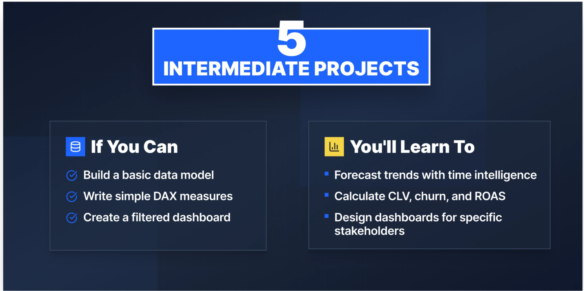
At this level, you're comfortable with the basics and ready to tackle more complex data models, time intelligence, and multi-source datasets. These projects will push you to write more sophisticated DAX, think carefully about model design, and build dashboards that serve a specific stakeholder.
6. Predictive Sales Forecasting
Difficulty: Intermediate
Sales managers need to know where revenue is heading, not just where it's been. This project gives you hands-on experience with the kind of forward-looking analysis that makes a BI analyst genuinely useful to a business team.
Using historical sales data, you'll build a data model, establish table relationships, and write DAX measures for KPIs and time intelligence functions. Then you'll implement Power BI's built-in time series forecasting to project future sales trends and visualize confidence intervals. The final dashboard gives a sales team a single place to track performance against targets and see where the trend line is heading.
What you'll build: A sales performance dashboard with trend lines, DAX-powered KPI cards, and a forecasting visual with confidence bands.
Tools: Power BI, Power Query, DAX
Dataset: Superstore Sales Analysis and Forecasting Dataset | Kaggle
7. Customer Lifetime Value Analysis
Difficulty: Intermediate
CLV is one of those metrics that sounds straightforward until you try to calculate it correctly. This project teaches you how to model it properly in Power BI and why getting the model right matters more than the formula.
Using a real customer transaction dataset, you'll design a data model with proper date and customer hierarchies, then build DAX measures for total spend, average order value, purchase frequency, and customer lifespan. The dashboard lets a retention team identify high-value customers, visualize CLV distribution across segments, and track how CLV trends over time using time intelligence functions.
What you'll build: A CLV dashboard with segment distribution charts, trend visuals, and DAX-calculated metrics for average order value, frequency, and lifespan — plus slicers for cohort exploration.
Tools: Power BI Desktop, Power Query, DAX
Dataset: Customer Transaction Dataset
Additional resource: How to Use Power BI to Calculate Customer Lifetime Value
8. Social Media Sentiment Analysis
Difficulty: Intermediate
Brand and marketing teams track how customers talk about them online. This project teaches you to build a dashboard that gives a comms team a real-time view of sentiment shifts and the ability to act before a negative trend becomes a crisis.
You'll import social media data, use Power Query to structure text fields, and apply Microsoft Cognitive Services (or a custom method) to score each post as positive, negative, or neutral. From there, you'll write DAX measures that define sentiment thresholds and categorize results, then build visualizations showing sentiment trends over time by platform and topic.
What you'll build: A sentiment trend dashboard with platform filters, time-series line charts, and DAX-driven sentiment scoring — with a summary narrative view for non-technical stakeholders.
Tools: Power BI, Power Query, DAX, Microsoft Cognitive Services
Dataset: Sentiment Analysis Dataset
Additional resources:
- Sentiment Analysis in Power BI | Microsoft
- Use DAX and Slicers to Define Sentiment Thresholds | DataChant
9. Customer Churn Analysis
Difficulty: Intermediate
Subscription businesses live and die by churn. A data analyst who can identify which customers are likely to leave (and why) is solving a problem every SaaS, telecom, and streaming company cares about.
Using the Telco Customer Churn dataset, you'll import and clean customer account data with Power Query, create calculated columns for contract type, tenure, and usage patterns, and apply RFM-style scoring to identify at-risk segments. Your dashboard will surface churn rates by region, product, and customer profile using heatmaps and clustered bar charts. A combo chart will let you overlay churn rate against contract length to reveal the relationship between commitment and retention.
What you'll build: A churn analysis dashboard with regional heatmaps, customer profile filters, churn rate KPI cards, and a combo chart showing the contract length vs. churn relationship.
Tools: Power BI Desktop, Power Query, DAX
Dataset: Telco Customer Churn Dataset | Kaggle
10. Marketing Campaign Performance
Difficulty: Intermediate
Marketing analysts spend a lot of time answering one question: which campaigns are actually working? This project gives you a framework for answering it, and the DAX skills to back it up.
Using a marketing analytics dataset, you'll build a model that tracks campaign spend, conversions, and revenue across channels and customer segments. Power Query handles the data shaping; DAX measures calculate conversion rate, customer acquisition cost (CAC), and return on ad spend (ROAS). Your dashboard will include a clustered bar chart comparing campaign ROI, a demographic breakdown of which age and income groups respond best, and a pie chart showing channel distribution for conversions.
What you'll build: A multi-page campaign performance dashboard with ROI comparison charts, demographic breakdowns, DAX-calculated CAC and ROAS, and Smart Narrative for executive summaries.
Tools: Power BI Desktop, Power Query, DAX
Dataset: Marketing Analytics Dataset | Kaggle
Advanced Power BI Projects

Advanced projects aren't just technically harder; they also require you to think like a consultant. You're dealing with messy multi-source data, complex business logic, and stakeholders with specific requirements. These projects will test your DAX, your data modeling instincts, and your ability to build a dashboard that someone other than you can actually use.
11. Healthcare Claims Fraud Detection
Difficulty: Advanced
Healthcare fraud costs insurers billions annually, and catching it requires more than clean DAX. You need to understand what fraudulent billing patterns actually look like in the data and build a model that brings those patterns to the surface.
Using an extensive healthcare claims dataset, you'll design a star schema optimized for fraud detection and implement feature engineering in DAX to create fraud indicator scores. You'll integrate a Python or R machine learning model for fraud prediction, then build a dashboard that lets compliance teams filter by provider, claim type, and risk score, giving investigators a clear starting point rather than a spreadsheet to wade through.
What you'll build: A fraud detection dashboard with provider-level risk scoring, anomaly flags, ML-integrated prediction visuals, and a compliance workflow view.
Tools: Power BI, Power Query, DAX, Python/R
Dataset: Healthcare Provider Fraud Detection Analysis Dataset | Kaggle
Additional resources:
12. Energy Consumption Patterns Analysis
Difficulty: Advanced
Energy companies need to know when demand peaks, where it peaks, and what drives it, so that they can manage supply, price accordingly, and identify where conservation programs would have the most impact.
Using large-scale energy consumption data, you'll build a model handling time-series data at high granularity, write complex DAX measures for total consumption, average daily usage, and rolling peak windows, and create heat maps showing consumption intensity by hour of day and day of week. A time-series line chart with anomaly detection will flag unusual consumption spikes. Slicers by region, energy type, and time period let operations teams drill into the data without needing to request a new report every time.
What you'll build: A multi-dimensional energy dashboard with heat maps, anomaly-flagged time-series charts, DAX rolling window measures, and drill-down filters by region and energy type.
Tools: Power BI, Power Query, DAX
Dataset: Energy Consumption Dashboard Dataset | Kaggle
Additional resource: Energy Consumption Dashboard Using Power BI | Medium
13. Global Supply Chain Analysis
Difficulty: Advanced
Supply chain visibility has become a boardroom priority. Companies want to know where their inventory is, which suppliers are underperforming, and where lead times are creating bottlenecks. Ideally, this is done in one place, updated regularly, and accessible to non-technical stakeholders.
Using a comprehensive Kaggle dataset covering suppliers, transportation routes, lead times, and inventory levels, you'll clean and consolidate data from multiple sources in Power Query, design a model representing the relationships between supply chain elements, and develop DAX measures for order-to-delivery time, inventory turnover, and supplier performance scores. Your final dashboard spans multiple pages: an executive summary, a supplier performance view, and a route-level logistics breakdown.
What you'll build: A multi-page supply chain dashboard with KPI summary cards, supplier performance rankings, route-level maps, and DAX-calculated turnover and delivery metrics.
Tools: Power BI, Power Query, DAX, Microsoft Excel (optional)
Dataset: DataCo Smart Supply Chain Dataset | Kaggle
Additional resources:
- Data Analysis — Visualize Supply Chain Data Using Power BI | Medium
- Power BI Supply Chain Dashboard | ARKA Softwares
14. Financial Performance Dashboard
Difficulty: Advanced | New Project
Finance teams at most companies still build their monthly reports in Excel by manually refreshing pivot tables, copying numbers between tabs, sending static PDFs to leadership. This project shows you how to replace that entire workflow with a dynamic Power BI dashboard that updates automatically.
Using multi-company financial statement data, you'll import and model income statements, balance sheets, and cash flow data in Power BI. Power Query handles data shaping across multiple source files. DAX measures calculate key ratios: gross margin, current ratio, year-over-year revenue growth, and operating income. You'll build a waterfall chart to show how revenue flows to net profit, a combo chart tracking revenue and profit trends over time, and a balance sheet table with drill-through to department-level detail.
What you'll build: A three-page financial dashboard with a waterfall P&L view, trend combo charts, DAX-calculated financial ratios, and a drill-through balance sheet to replace a manual Excel reporting process.
Tools: Power BI Desktop, Power Query, DAX
Dataset: Financial Statements Dataset | Kaggle
15. Real-Time IoT Sensor Data Dashboard
Difficulty: Advanced | New Project
Factories, farms, and energy grids generate continuous sensor data, and the analysts who can surface that data in real time are increasingly valuable. This project builds that capability using Microsoft Fabric Real-Time Intelligence, which is where Microsoft has directed its investment for streaming workloads going forward.
Using smart agriculture or industrial sensor data, you'll ingest a streaming data feed into Fabric via Eventstream, store it in an Eventhouse, and connect Power BI to query it in near-real time. From there you'll build a dashboard that monitors sensor readings across multiple locations, with DAX measures for rolling averages, conditional formatting to flag readings outside normal operating ranges, and threshold alert visuals for operations managers.
What you'll build: A live-updating sensor dashboard connected to a Fabric Eventhouse, with rolling average DAX measures, conditional formatting for anomaly flags, and multi-location filters.
Tools: Power BI, Microsoft Fabric (Eventstream, Eventhouse, Real-Time Intelligence), DAX
Dataset: Smart Agriculture Sensor Dataset | Kaggle
Additional resource: Real-Time Intelligence in Microsoft Fabric | Microsoft Learn
What Makes a Strong Power BI Portfolio?
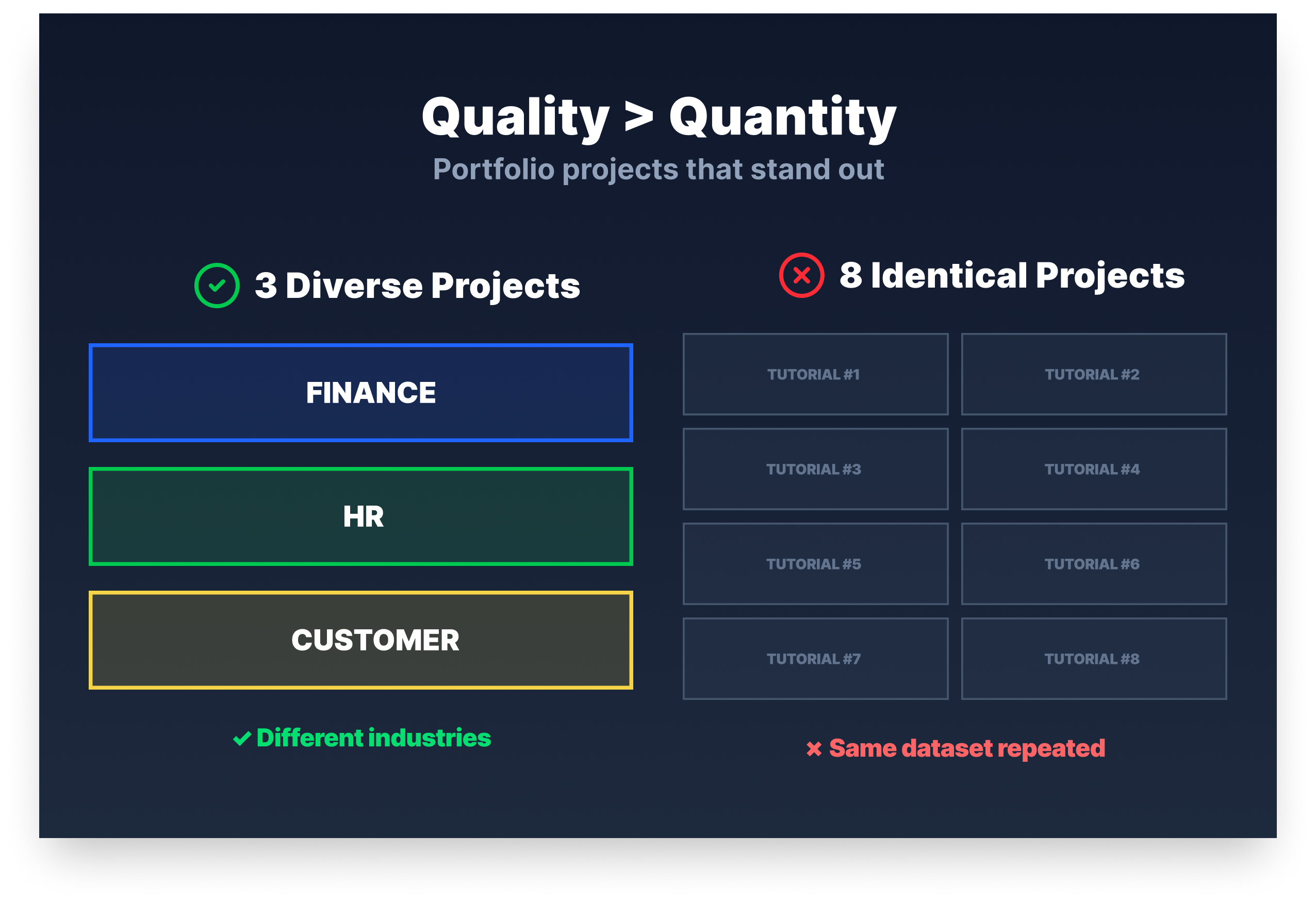
Practitioners who've built Power BI solutions professionally are consistent about what separates a strong portfolio from a list of completed projects. Variety matters because employers want to see that you can work with HR data, financial data, and operational data, not just one dataset from a tutorial.
Data model quality matters more than visual polish because a bad model causes performance problems and DAX headaches that no amount of formatting fixes. And at least one project should show automation: replacing a manual Excel process with a dashboard that refreshes automatically is the kind of concrete business impact that gets you invited to interviews.
Overcoming Common Power BI Project Challenges
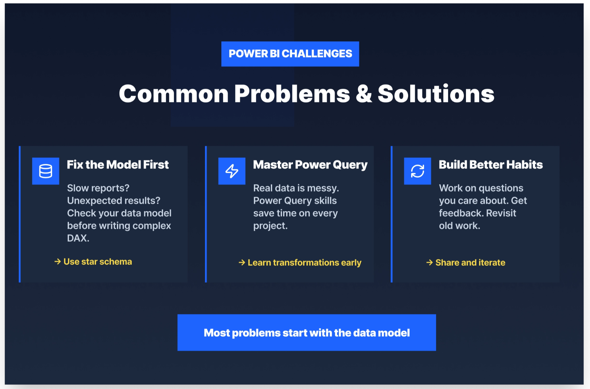
Most Power BI problems trace back to the same root cause: the data model. If your report runs slowly, if your DAX measures return unexpected results, if relationships aren't filtering the way you expect, then the first place to look is the model, not the formula.
Practitioners in the field are consistent on this point. A good star schema (fact tables connected to dimension tables, not many-to-many relationships patched together with workarounds) makes DAX simpler, queries faster, and debugging manageable. If you find yourself writing increasingly complex DAX to compensate for how your tables are structured, step back and fix the model first.
Power Query is the other skill that tutorials tend to underinvest in. Real-world data is messy with inconsistent formats, missing values, undocumented columns, and source systems nobody fully understands. Getting comfortable with Power Query transformations early will save you significant time on every project you take on.
A few practical habits that help:
- Work on projects where you genuinely care about the question the data is answering (you'll push further when you're curious about the result).
- Share your work with someone and ask them to find something that doesn't make sense (stakeholder feedback surfaces problems your own familiarity hides).
- Revisit projects as your skills grow — a dashboard you built six months ago will look very different after you've learned proper data modeling.
Real Learner, Real Results
Yassine Alouini, a Data Scientist at Qucit, built his skills through Dataquest's project-based curriculum:
"Data science is hard and it becomes harder if one only relies on theory. One must practice to become better at the trade. In fact, learning through projects is very rewarding."
Working through real-world projects, Yassine ran into the kinds of problems that tutorials rarely prepare you for — bad data formats, correlated features, hard-to-visualize data, and overfit algorithms. Solving them gave him experience he could apply immediately on the job.
"Dataquest helped me to get a more in depth knowledge of data science subjects. For instance, I have been using Matplotlib for quite some time but never really understood the internals until recently. It has also helped me organize my thoughts and gain more confidence when working with data."
Getting Started with Power BI Projects
The Essential Power BI Toolkit
Before your first project, it helps to know what each piece of the Power BI ecosystem does:
- Power BI Desktop is where you build — data models, visualizations, DAX measures. Everything starts here. Power Query is your data preparation layer; you'll use it on every single project, and the time you invest learning it pays off immediately.
- DAX is the formula language for calculations; it feels strange at first but becomes intuitive once your data model is solid.
- Power BI Service is the cloud platform where you publish and share your reports.
- Power BI Mobile lets stakeholders access dashboards on the go.
You don't need to master all of these skills before working on your portfolio. Pick a project, work through the friction, and the toolkit will make more sense with each one you complete.
The Most Important Thing No Tutorial Tells You
Before you write a single DAX formula, think about your data model. Draw it out if you have to. Identify your fact tables (what happened: sales, transactions, events, etc.) and your dimension tables (the context: customers, products, dates, etc.). Connect them properly. This upfront work is what separates a Power BI report that performs well from one that gets slower every time someone adds a filter.
The practitioners who build production reports with hundreds of millions of rows didn't get there by learning more DAX. They got there by learning data modeling.
How to Prepare for a Power BI Job
Finding Power BI Roles
The highest concentration of Power BI job listings is on LinkedIn, Indeed, and Glassdoor. Search for "Power BI analyst," "BI developer," or "data analyst Power BI" and read 10–15 job descriptions before you build your next project. The skills that appear most often across those descriptions are the skills you should be prioritizing.
Building Skills Employers Want
Most Power BI roles expect some combination of DAX, Power Query, and SQL. SQL matters because real-world data almost always lives in a database before it reaches Power BI, and analysts who can write a clean query before importing are dramatically easier to work with. Data modeling knowledge, specifically star schema design, is what takes a working report and makes it fast, maintainable, and easy for stakeholders to actually use.
Business analyst certifications can help signal foundational knowledge, but projects are more convincing. A hiring manager who can look at a published dashboard and understand the business problem it solves will remember that longer than any cert on your resume.
Showcasing Your Work
Publish your dashboards to the Power BI Service and, for public portfolio projects, share them via Publish to Web from your portfolio or resume. Keep your GitHub tidy with well-named files, a README that explains what the project does, and why it matters. When you include dashboard screenshots with your resume, write one sentence under each one explaining the business question it answered.
In interviews, don't just describe what you built. Instead, describe the problem you were solving and the decision the dashboard was designed to support. That framing signals business thinking, which is what most interviewers are actually evaluating.
When to Start Applying
Apply when you have three solid projects and a genuine grasp of DAX, Power Query, and data modeling basics. You don't need to have mastered everything. Aim to meet about 70–80% of a job description's requirements. Many employers value learning ability and practical experience over a perfect checklist. The best time to apply is slightly before you feel completely ready.
Wrapping Up
The fastest way to build real Power BI skills is to work on real problems. The 15 projects in this post give you a clear path from your first data model to an advanced fraud detection system, with datasets, tools, and expected outcomes for each one.
Pick one project at your current level and start today. The first project is always the hardest because the tool is unfamiliar. By the third, you'll be moving faster than you expected.
If you want structured support along the way, Dataquest's Analyzing Data with Microsoft Power BI skill path covers the foundations and includes the three guided projects on this list. It's the most direct way to build the skills employers are actually looking for.
Frequently Asked Questions
What are good Power BI projects for beginners?
The three best starting points are available as guided projects on Dataquest:
- Modeling Data in Power BI
- Visualization of Life Expectancy and GDP Variation Over Time
- Building a BI App
Each project teaches a distinct skill: data modeling, visualization, and workspace management.
Each one can be completed directly in your browser without any local setup.
If you want to go independent, Customer Segmentation Analysis using the Global Superstore dataset is a well-documented option with strong community support.
How many Power BI projects do I need for a portfolio?
Three to five well-documented projects are enough to start applying.
Quality matters more than quantity. A hiring manager who clearly understands what problem you solved and how will be more impressed by two strong projects than by eight average ones.
Aim for variety:
- One project using sales or financial data
- One involving customer analysis
- One that includes data wrangling with messy source data
What datasets should I use for Power BI projects?
Kaggle is one of the most reliable sources for project datasets. It includes dedicated Power BI datasets covering customer data, financial data, HR data, and more.
Microsoft also provides sample datasets directly inside Power BI Desktop (File → Get Data → Samples).
If you want a broader list of options, Dataquest has a curated guide to free datasets for projects across industries.
Can I do Power BI projects for free?
Yes.
Power BI Desktop is free to download and includes everything you need to build, model, and visualize data.
Power BI Service also provides free ways to publish and share certain public portfolio projects.
The guided projects mentioned above are included within Dataquest’s curriculum, and the datasets linked are free to access.
What is the best first Power BI project?
Modeling Data in Power BI is the strongest starting point.
It teaches the foundation that everything else in Power BI depends on: getting your data model right.
Many beginners jump straight to dashboards and later run into performance or DAX issues that trace back to a poorly structured model.
Starting with modeling gives you a foundation that makes every subsequent project easier.