Project Tutorial: Exploring Financial Data Using the Nasdaq Data Link API
Working with financial data used to mean downloading spreadsheets or paying for expensive data subscriptions. APIs have changed that. With a few lines of Python, we can now pull structured financial datasets directly from providers like Nasdaq and start analyzing them in minutes.
In this tutorial, we'll connect to the Nasdaq Data Link API, pull 10,000 rows of financial data, clean it up, and visualize EBITDA margin trends over time and across countries. Along the way, we'll handle some real-world messiness: outliers that can skew an entire analysis, country codes that need translating, and the occasional API error that every developer runs into eventually.
By the end, you'll have a working financial analysis project and a much clearer sense of how APIs fit into a data workflow.
What You'll Learn
By the end of this tutorial, you'll know how to:
- Securely store and load an API key using a local config file
- Send GET requests with query parameters using the
requestslibrary - Parse nested JSON responses and convert them into a pandas DataFrame
- Clean and filter financial data for focused analysis
- Identify and handle extreme outliers that distort summary statistics
- Visualize distributions and trends using
matplotlibandseaborn
Before You Start
To make the most of this project walkthrough, follow these preparatory steps:
- Get a Nasdaq API Key
Visit Nasdaq Data Link and register for a free account. Once logged in, navigate to Settings to find your API key. You'll need this to retrieve data during the project. - Review the Project
Access the project and familiarize yourself with the goals and structure: Exploring Financial Data Using Nasdaq Data Link API. - Prepare Your Environment
- If you're using the Dataquest platform, everything is already set up for you.
- If working locally, make sure you have Python and Jupyter Notebook installed, along with these libraries:
requests,pandas,matplotlib, andseaborn. - This project works in VS Code, Jupyter Notebook, or Google Colab.
- Prerequisites
- Comfortable with Python basics: loops, functions, and especially dictionaries (we'll be navigating nested JSON structures)
- Familiar with pandas DataFrames and basic data manipulation
- Some exposure to APIs is helpful but not required — we'll cover what you need
New to APIs? The APIs and Web Scraping in Python for Data Science course covers the foundational skills used throughout this project.
Setting Up Your Environment
Storing Your API Key Securely
Before we write a single line of analysis code, we need to handle the API key. The key is free, but it still identifies you to Nasdaq, so we don't want it sitting in plain sight in our notebook, especially if you plan to share the project publicly.
The approach we'll use is to store the key in a separate Python file called config.py. In your JupyterLab sidebar, create a new Python file (under "Other"), add this line, and save it as config.py:
api_key = "your_api_key_here"Make sure config.py lives in the same directory as your notebook. If you ever share this project on GitHub, add config.py to your .gitignore file so the key never gets uploaded.
Learning Insight: For production applications, environment variables are the gold standard for storing credentials. For a free API like this one, a local config file is a reasonable middle ground that keeps your key out of your notebook without adding much complexity.
Importing Libraries
Now let's set up our notebook:
import requests
import json
import pandas as pd
import matplotlib.pyplot as plt
import config  # our local config.py file
# Load API key from config file
API_KEY = config.api_key
print("API key loaded successfully")API key loaded successfullyNotice that config here is not a library you install with pip — it's the local file we just created. We capitalize API_KEY because it functions as a global constant throughout the notebook.
Connecting to the Nasdaq API
Understanding the Endpoint
Before we pull data, let's look at what we're connecting to. The Nasdaq Data Link API organizes financial data into tables. We'll be working with the MER/F1 table, which contains detailed financial statements including balance sheets, income statements, and derived indicators.
api_url = 'https://data.nasdaq.com/api/v3/datatables/MER/F1.json'This URL is the API endpoint — the specific address where Nasdaq makes this data available. Think of it like a web address for data rather than a webpage.
Making the Request
We'll add our API key and specify how many rows we want:
parameters = {
    'api_key': API_KEY,
    'qopts.per_page': 10000
}

json_data = requests.get(api_url, params=parameters).json()
The qopts.per_page parameter tells the API how many rows to return. The free tier allows a maximum of 10,000 rows per request. We'll start with just 2 rows to confirm the connection works before requesting the full dataset.
Learning Insight: When testing a new API connection, always start small. Requesting 10,000 rows and then printing the result will flood your notebook output and can even cause Jupyter to slow down or error out. Confirm the connection with 2 rows first, then scale up once you know the format looks right.
Parsing the JSON Response
The raw API response is nested JSON, which is similar to nested Python dictionaries. Let's look at its structure before converting it to a DataFrame. The data lives at json_data['datatable']['data'], and the column names are at json_data['datatable']['columns'].
data = json_data['datatable']['data']
columns = [col['name'] for col in json_data['datatable']['columns']]

df = pd.DataFrame(data, columns=columns)
df['reportdate'] = pd.to_datetime(df['reportdate'], errors='coerce')
We immediately convert reportdate to a proper datetime type since we'll need it for time-series analysis later. The errors='coerce' argument handles any malformed dates gracefully by converting them to NaT instead of raising an error.
Now let's pull the full 10,000 rows and check what we have:
df.info()<class 'pandas.core.frame.DataFrame'>
RangeIndex: 10000 entries, 0 to 9999
Data columns (total 32 columns):
# Column Non-Null Count Dtype
--- ------ -------------- -----
0 compnumber 10000 non-null int64
1 reportid 10000 non-null int64
2 mapcode 10000 non-null int64
3 amount 10000 non-null float64
4 reportdate 10000 non-null datetime64[ns]
5 reporttype 10000 non-null object
...
18 address1 10000 non-null object
19 address2 6001 non-null object
20 address3 1298 non-null object
21 address4 0 non-null object
...
30 indicator 10000 non-null object
31 statement 10000 non-null object
dtypes: datetime64[ns](1), float64(1), int64(4), object(26)
memory usage: 2.4+ MB32 columns, and most of them we won't need. The address, phonenumber, faxnumber, and website columns aren't going to help us understand financial trends. Let's trim this down.
Cleaning the Data
Selecting Relevant Columns
necessary_columns = ['reportid', 'reportdate', 'reporttype', 'amount',
                     'longname', 'country', 'region', 'indicator', 'statement']
df = df[necessary_columns]
df.head()
reportid reportdate reporttype amount longname country region indicator statement
0 1868192544 2011-06-30 Q2 10.481948 Deutsche Bank AG DEU Europe Accrued Expenses Turnover Derived
1 1868216112 2011-09-30 Q3 8.161754 Deutsche Bank AG DEU Europe Accrued Expenses Turnover Derived
2 1885063456 2012-06-30 Q2 10.788213 Deutsche Bank AG DEU Europe Accrued Expenses Turnover Derived
3 1885087024 2012-09-30 Q3 9.437545 Deutsche Bank AG DEU Europe Accrued Expenses Turnover Derived
4 1901934112 2013-06-30 Q2 8.755041 Deutsche Bank AG DEU Europe Accrued Expenses Turnover DerivedTranslating Country Codes
The country column currently holds ISO codes like DEU and USA. Let's make those human-readable:
country_mapping = {
    'USA': 'United States of America',
    'DEU': 'Germany',
    'JPN': 'Japan',
    'CYM': 'Cayman Islands',
    'BHS': 'Bahamas',
    'IRL': 'Ireland',
    'IND': 'India',
    'AUS': 'Australia',
    'CAN': 'Canada',
    'BRA': 'Brazil',
    'IDN': 'Indonesia',
    'ISR': 'Israel',
    'FIN': 'Finland',
    'CHE': 'Switzerland',
    'KOR': 'South Korea',
    'GBR': 'United Kingdom',
    'FRA': 'France',
    'CHL': 'Chile',
    'BEL': 'Belgium',
    'ITA': 'Italy',
    'HKG': 'Hong Kong',
    'DNK': 'Denmark',
    'ESP': 'Spain'
}

df['country'] = df['country'].replace(country_mapping)
Learning Insight: Creating this mapping dictionary by hand would be tedious. This is a great use case for AI — paste a list of all unique country codes into a chat and ask it to generate the mapping dictionary. Just verify the output before using it. AI is excellent at mechanical tasks like this, but the final check is always on you.
Renaming Columns to Snake Case
df.columns = ['report_id', 'report_date', 'report_type',
              'amount', 'company_name', 'country', 'region',
              'indicator', 'statement']
Let's confirm the country distribution in our dataset:
df['country'].value_counts()country
United States of America 3253
Cayman Islands 1556
Japan 1303
Ireland 1155
Bahamas 898
India 608
Switzerland 554
Australia 228
Canada 106
Brazil 62
South Korea 54
United Kingdom 51
France 33
Chile 22
Indonesia 21
Finland 16
Belgium 14
Italy 14
Israel 12
Hong Kong 12
Denmark 12
Germany 8
Spain 8
Name: count, dtype: int64The Cayman Islands showing up as the second most represented country is interesting — this reflects how many companies incorporate there for tax purposes, which already tells a small financial story.
Choosing an Indicator to Analyze
Our dataset covers more than 50 different financial indicators. Let's check the distribution:
df['indicator'].value_counts()indicator
EBITDA 291
EBITDA Margin 289
Total Assets Per Share 244
Shares Outstanding 239
...
Accrued Expenses Turnover 139
...We'll focus on EBITDA Margin — it's the most represented indicator in our dataset and it's particularly well-suited for cross-country comparisons. EBITDA Margin measures profitability before accounting for taxes, interest, and depreciation, which means tax differences between countries don't distort the comparison. A company in Japan and a company in Canada can be compared on a more level playing field.
filtered_df = df[df['indicator'] == 'EBITDA Margin'].copy()
filtered_df.head()
report_id report_date report_type amount company_name country region indicator statement
662 1868192512 2011-06-30 A -1979.328191 Immutep Ltd Australia Asia Pacific EBITDA Margin Derived
768 1918804736 2014-06-30 A -86142.858937 Immutep Ltd Australia Asia Pacific EBITDA Margin Derived
817 1935675392 2015-06-30 A -19363.385060 Immutep Ltd Australia Asia Pacific EBITDA Margin Derived
845 1851368960 2010-12-31 A 26.841546 Ultrapetrol (Bahamas) Ltd Bahamas Latin America EBITDA Margin Derived
889 1851369024 2010-12-31 Q4 14.403761 Ultrapetrol (Bahamas) Ltd Bahamas Latin America EBITDA Margin DerivedHandling Outliers
Something looks off immediately. Let's check the summary statistics:
filtered_df.describe() report_id report_date amount
count 2.890000e+02 289 289.000000
mean 1.747260e+09 2013-06-26 03:59:10.173 -353.917085
min 1.504051e+09 2010-12-31 00:00:00 -86142.858937
25% 1.569850e+09 2011-12-31 00:00:00 13.932416
50% 1.868169e+09 2013-06-30 00:00:00 17.234169
75% 1.901958e+09 2014-11-30 00:00:00 26.044164
max 1.952476e+09 2015-12-31 00:00:00 47.410116
std 1.693446e+08 NaN 5191.939353The mean is -353 but the median is 17, and even the 25th percentile is 13. A mean that sits below the first quartile is a clear signal that something extreme is pulling it down. Let's sort by amount to find the culprit:
filtered_df.sort_values(by='amount') report_id report_date report_type amount company_name country region indicator statement
768 1918804736 2014-06-30 A -86142.858937 Immutep Ltd Australia Asia Pacific EBITDA Margin Derived
817 1935675392 2015-06-30 A -19363.385060 Immutep Ltd Australia Asia Pacific EBITDA Margin Derived
662 1868192512 2011-06-30 A -1979.328191 Immutep Ltd Australia Asia Pacific EBITDA Margin Derived
...Three rows from Immutep Ltd are responsible for the entire distortion. A quick search reveals the company was acquired in 2014, which likely explains the extreme values around that period. With only three rows in our 289-row filtered dataset and a clear business explanation for the anomaly, removing them is the right call.
filtered_df = filtered_df[filtered_df['company_name'] != 'Immutep Ltd']
filtered_df.describe()
amount
count 286.000000
mean 18.194177
min -26.841528
25% 14.146726
50% 17.296259
75% 26.055693
max 47.410116
std 13.189965Now the mean (18.2) and median (17.3) are close together, which is exactly what we'd expect from a reasonably well-behaved distribution.
Learning Insight: Outliers in financial data often have real-world explanations — mergers, acquisitions, bankruptcies, accounting restatements. When something looks wildly off, it's worth a quick search before deciding whether to remove it. Blindly dropping outliers is lazy; understanding why they exist and then making a deliberate choice is good data science.
Visualizing the Data
Distribution of EBITDA Margin
plt.figure(figsize=(10, 6))
plt.hist(filtered_df['amount'], bins=30, edgecolor='black')
plt.xlabel('EBITDA Margin (%)')
plt.ylabel('Number of Companies')
plt.title('Distribution of EBITDA Margin Across Companies')
plt.show()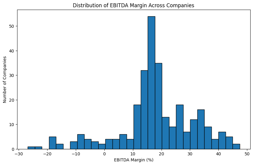
The distribution is roughly normal, centered around 15 to 20%. The fact that the peak is positive rather than at zero reflects something intuitive: companies that remain in business tend to be profitable. Persistent losses usually lead to companies shutting down or being acquired, which acts as a natural filter in the data.
Let's also look at a box plot for a clearer picture of the median and spread:
plt.figure(figsize=(10, 6))
plt.boxplot(filtered_df['amount'])
plt.ylabel('EBITDA Margin (%)')
plt.title('EBITDA Margin Distribution')
plt.show()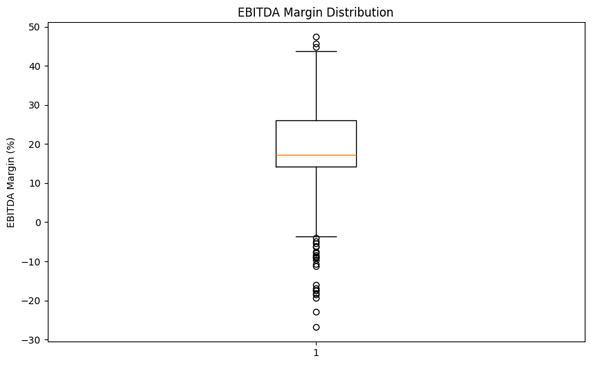
The median sits around 17%, with most companies falling between roughly 13% and 26%. The whiskers and a few points below zero confirm that some companies in our dataset are operating at a loss, but they're the exception rather than the rule.
EBITDA Margin by Country
Now let's see whether profitability differs across countries:
import seaborn as sns

plt.figure(figsize=(14, 6))
sns.boxplot(data=filtered_df, x='country', y='amount')
plt.xlabel('Country')
plt.ylabel('EBITDA Margin (%)')
plt.title('EBITDA Margin Distribution by Country')
plt.xticks(rotation=45, ha='right')
plt.tight_layout()
plt.show()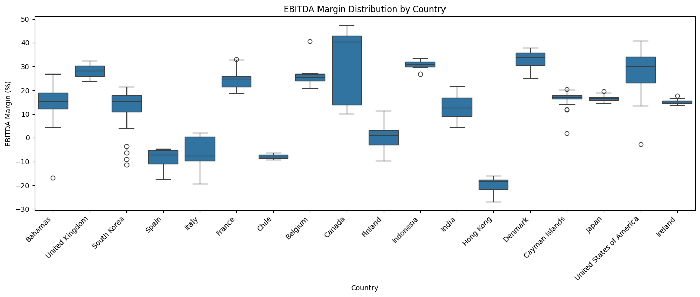
A few things stand out. Canada shows the highest median profitability in this dataset, hovering around 40%. Hong Kong, Chile, Spain, and Italy show negative medians, meaning the typical company from those countries in our data is operating at a loss for this period.
It's important to note that this dataset is a small, non-random slice of global financial data. The country-level patterns here are starting points for investigation, not definitive conclusions about national business performance.
Learning Insight: Seaborn is a great choice when you need to split a visualization by a categorical variable like country. The equivalent plot in pure matplotlib would require manually looping through each country and positioning multiple box plots by hand. Seaborn handles all of that in one line.
EBITDA Margin Over Time
Finally, let's look at how profitability has trended between 2010 and 2015:
time_trend = filtered_df.groupby('report_date')['amount'].mean()

fig, ax = plt.subplots(figsize=(14, 6))

ax.plot(time_trend.index, time_trend.values, alpha=0.3, label='Original', linewidth=1)

smoothed = time_trend.rolling(window=3).mean()
ax.plot(smoothed.index, smoothed.values, label='3-Period Moving Average', linewidth=2)

ax.set_xlabel('Report Date')
ax.set_ylabel('Average EBITDA Margin (%)')
ax.set_title('EBITDA Margin Over Time (Smoothed)')
ax.legend()
ax.grid(True, alpha=0.3)
plt.xticks(rotation=45, ha='right')
plt.tight_layout()
plt.show()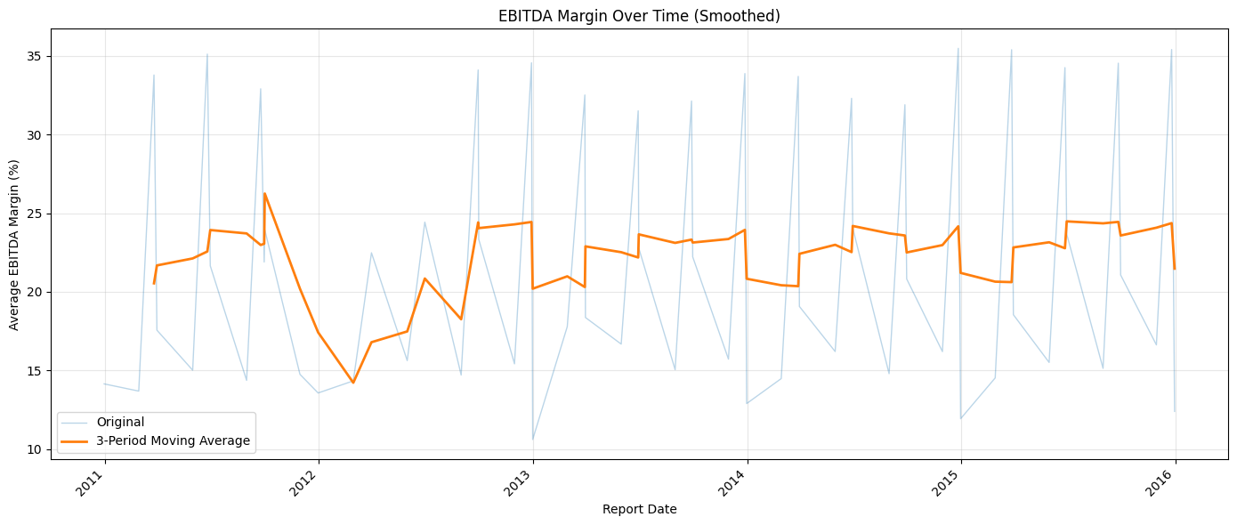
The faded line shows the raw quarterly averages, which swing sharply because the data is reported at different points in the year. The bold line applies a 3-period rolling average to smooth out that noise and reveal the underlying trend.
In general, the smoothed margin hovers between 20% and 25%, but there's a notable dip around 2012. Whether that's a genuine market effect from that period, perhaps lingering fallout from the 2008 financial crisis, or a data quality issue in this particular 10,000-row slice is a question worth investigating further.
Learning Insight: Raw time-series data reported quarterly will almost always produce noisy charts with sharp peaks and valleys. A rolling average smooths the noise while preserving the real trend. The window size (3 periods here) controls how much smoothing occurs — larger windows produce a smoother line but may hide genuine short-term movements.
Key Takeaways
Working through this project, a few things stand out.
APIs are less intimidating than they look. The actual line of code that talks to the Nasdaq API is a single requests.get() call. Everything else (parsing, cleaning, analyzing) uses the same pandas and matplotlib tools you've likely already practiced.
Reading the raw data before transforming it is essential. We caught the Immutep outlier by sorting the values and asking why the mean was so far from the median. Skipping that step would have produced misleading visualizations.
EBITDA Margin is a useful cross-country metric precisely because it excludes taxes. If we had used net income instead, differences in national tax rates would have made country-to-country comparisons much harder to interpret cleanly.
The 2012 dip is an open question. A visualization raised a question that the data alone can't answer. That's often how real analysis works — the chart points you toward the next investigation.
Next Steps
There are several natural directions to take this project further:
Compare two indicators. Look at EBITDA Margin alongside Net Margin or Operating Margin and see how they correlate. Do companies with high EBITDA margins also show strong net margins, or do taxes and interest expenses change the story?
Focus on a single country. The United States (3,253 rows), Japan (1,303 rows), and Cayman Islands (1,556 rows) all have enough data for a meaningful standalone analysis. A deep dive on one country would let you explore more indicators without running into small sample size problems.
Investigate 2012. Something happened in our data around 2012 that caused an average profitability dip. Was it a real economic event, a data quality issue, or a sampling artifact from this particular 10,000-row slice? This is a great research thread to pull on.
Build a company comparison function. Write a function that takes two company names and returns side-by-side visualizations of their financial indicators over time. This kind of tool makes for a compelling portfolio piece.
Explore other financial APIs. Alpha Vantage and FRED (Federal Reserve Economic Data) are both free and cover different aspects of financial and macroeconomic data. If financial analysis interests you, these are great next stops.
Sharing Your Work
When you're ready to share this project, remember to exclude your config.py file from any public GitHub repository. You can do this by adding it to .gitignore before your first commit. The notebook itself, with well-written markdown cells explaining your reasoning at each step, is the portfolio piece.
If you get stuck or want to discuss your results, tag @Anna_strahl in the Dataquest Community. And if you want to build a stronger foundation in APIs before or alongside this project, the APIs and Web Scraping in Python for Data Science course covers everything you need.
Happy coding!