Building a Data Science Portfolio: Storytelling with Data
This is the first in a series of posts on how to build a Data Science Portfolio. You can find links to the other posts in this series at the bottom of the post.
Hiring managers are increasingly looking at portfolios when making hiring decisions. One of the reasons for this is that a portfolio is the best way to judge someone’s real-world skills. The good news for you is that a portfolio is entirely within your control. If you put some work in, you can make a great portfolio that companies are impressed by.
The first step in making a high-quality portfolio is to know what skills to demonstrate. The primary skills that companies want in data scientists, and thus the primary skills they want a portfolio to demonstrate, are:
- Ability to communicate
- Ability to collaborate with others
- Technical competence
- Ability to reason about data
- Motivation and ability to take initiative
Any good portfolio will be composed of multiple projects, each of which may demonstrate 1-2 of the above points. This is the first post in a series that will cover how to make a well-rounded data science portfolio. In this post, we'll cover how to make your first project for a data science portfolio, and how to tell an effective story using data. At the end, you'll have a project that will help demonstrate your ability to communicate, and your ability to reason about data. If you want to strengthen your ability to create compelling visualizations as part of your data storytelling, consider our online courses on data visualization.
Storytelling with data
Data science is fundamentally about communication. You’ll discover some insight in the data, then figure out an effective way to communicate that insight to others, then sell them on the course of action you propose. One of the most critical skills in data science is being able to tell an effective story using data. An effective story can make your insights much more compelling, and help others understand your ideas.
A story in the data science context is a narrative around what you found, how you found it, and what it means. An example might be the discovery that your company’s revenue has dropped 20 percent in the last year. It’s not enough to just state that fact — you’ll have to communicate why revenue dropped, and how to potentially fix it.
The main components of storytelling with data are:
- Understanding and setting the context
- Exploring multiple angles
- Using compelling visualizations
- Using varied data sources
- Having a consistent narrative
The best tool to effectively tell a story with data is Jupyter notebook. If you’re unfamiliar, here’s a good tutorial. Jupyter notebook allows you to interactively explore data, then share your results on various sites, including Github. Sharing your results is helpful both for collaboration, and so others can extend your analysis.
We’ll use Jupyter notebook, along with Python libraries like Pandas and matplotlib in this post.
Choosing a topic for your data science project
The first step in creating a project is to decide on your topic. You want the topic to be something you’re interested in, and are motivated to explore. It’s very obvious when people are making projects just to make them, and when people are making projects because they’re genuinely interested in exploring the data. It’s worth spending extra time on this step, so ensure that you find something you’re actually interested in.
A good way to find a topic is to browse different datasets and seeing what looks interesting. Here are some good sites to start with:
- Data.gov — contains government data.
- /r/datasets — a subreddit that has hundreds of interesting datasets.
- Awesome datasets — a list of datasets, hosted on Github.
- A currated list of free datasets, and example datasets from each.
In real-world data science, you often won’t find a nice single dataset that you can browse. You might have to aggregate disparate data sources, or do a good amount of data cleaning. If a topic is very interesting to you, it’s worth doing the same here, so you can show off your skills better.
For the purposes of this post, we’ll be using data about New York city public schools, which can be found here.
Pick a topic
It’s important to be able to take the project from start to finish. In order to do this, it can be helpful to restrict the scope of the project, and make it something we know we can finish. It’s easier to add to a finished project than to complete a project that you just can’t seem to ever get enough motivation to finish.
In this case, we’ll look at the SAT scores of high schoolers, along with various demographic and other information about them. The SAT, or Scholastic Aptitude Test, is a test that high schoolers take in the US before applying to college. Colleges take the test scores into account when making admissions decisions, so it’s fairly important to do well on. The test is divided into 3 sections, each of which is scored out of 800 points. The total score is out of 2400 (although this has changed back and forth a few times, the scores in this dataset are out of 2400). High schools are often ranked by their average SAT scores, and high SAT scores are considered a sign of how good a school district is.
There have been allegations about the SAT being unfair to certain racial groups in the US, so doing this analysis on New York City data will help shed some light on the fairness of the SAT.
We have a dataset of SAT scores here, and a dataset that contains information on each high school here. These will form the base of our project, but we’ll need to add more information to create compelling analysis.
Supplementing the data
Once you have a good topic, it’s good to scope out other datasets that can enhance the topic or give you more depth to explore. It’s good to do this upfront, so you have as much data as possible to explore as you’re building your project. Having too little data might mean that you give up on your project too early.
In this case, there are several related datasets on the same website that cover demographic information and test scores.
Here are the links to all of the datasets we’ll be using:
- SAT scores by school — SAT scores for each high school in New York City.
- School attendance — attendance information on every school in NYC.
- Math test results — math test results for every school in NYC.
- Class size — class size information for each school in NYC.
- AP test results — Advanced Placement exam results for each high school. Passing AP exams can get you college credit in the US.
- Graduation outcomes — percentage of students who graduated, and other outcome information.
- Demographics — demographic information for each school.
- School survey — surveys of parents, teachers, and students at each school.
- School district maps — contains information on the layout of the school districts, so that we can map them out.
All of these datasets are interrelated, and we’ll be able to combine them before we do any analysis.
Getting background information
Before diving into analyzing the data, it’s useful to research some background information. In this case, we know a few facts that will be useful:
- New York City is divided into
5boroughs, which are essentially distinct regions. - Schools in New York City are divided into several school district, each of which can contains dozens of schools.
- Not all the schools in all of the datasets are high schools, so we’ll need to do some data cleaning.
- Each school in New York City has a unique code called a
DBN, or District Borough Number. - By aggregating data by district, we can use the district mapping data to plot district-by-district differences.
Understanding the data
In order to really understand the context of the data, you’ll want to spend time exploring and reading about the data. In this case, each link above has a description of the data, along with the relevant columns. It looks like we have data on the SAT scores of high schoolers, along with other datasets that contain demographic and other information.
We can run some code to read in the data. We’ll be using Jupyter notebook to explore the data. The below code will:
- Loop through each data file we downloaded.
- Read the file into a Pandas DataFrame.
- Put each DataFrame into a Python dictionary.
import pandas
import numpy as np
files = ["ap_2010.csv", "class_size.csv", "demographics.csv", "graduation.csv", "hs_directory.csv", "math_test_results.csv", "sat_results.csv"]
data = {}
for f in files:
d = pandas.read_csv("schools/{0}".format(f))
data[f.replace(".csv", "")] = d
Once we’ve read the data in, we can use the head method on DataFrames to print the first 5 lines of each DataFrame:
for k,v in data.items():
print("\n" + k + "\n")
print(v.head())
math_test_results
DBN Grade Year Category Number Tested Mean Scale Score Level 1 # \
0 01M015 3 2006 All Students 39 667 21 01M015 3 2007 All Students 31 672 22 01M015 3 2008 All Students 37 668 03 01M015 3 2009 All Students 33 668 04 01M015 3 2010 All Students 26 677 6 Level 1 % Level 2 # Level 2 % Level 3 # Level 3 % Level 4 # Level 4 % \0 5.1% 11 28.2% 20 51.3% 6 15.4%1 6.5% 3 9.7% 22 71% 4 12.9%2 0% 6 16.2% 29 78.4% 2 5.4%3 0% 4 12.1% 28 84.8% 1 3%4 23.1% 12 46.2% 6 23.1% 2 7.7% Level 3+4 # Level 3+4 %0 26 66.7%1 26 83.9%2 31 83.8%3 29 87.9%4 8 30.8%ap_2010 DBN SchoolName AP Test Takers \0 01M448 UNIVERSITY NEIGHBORHOOD H.S. 391 01M450 EAST SIDE COMMUNITY HS 192 01M515 LOWER EASTSIDE PREP 243 01M539 NEW EXPLORATIONS SCI,TECH,MATH 2554 02M296 High School of Hospitality Management s Total Exams Taken Number of Exams with scores 3 4 or 50 49 101 21 s2 26 243 377 1914 s ssat_results DBN SCHOOL NAME \0 01M292 HENRY STREET SCHOOL FOR INTERNATIONAL STUDIES1 01M448 UNIVERSITY NEIGHBORHOOD HIGH SCHOOL2 01M450 EAST SIDE COMMUNITY SCHOOL3 01M458 FORSYTH SATELLITE ACADEMY4 01M509 MARTA VALLE HIGH SCHOOL Num of SAT Test Takers SAT Critical Reading Avg. Score SAT Math Avg. Score \0 29 355 4041 91 383 4232 70 377 4023 7 414 4014 44 390 433 SAT Writing Avg. Score0 3631 3662 3703 3594 384class_size CSD BOROUGH SCHOOL CODE SCHOOL NAME GRADE PROGRAM TYPE \0 1 M M015 P.S. 015 Roberto Clemente 0K GEN ED1 1 M M015 P.S. 015 Roberto Clemente 0K CTT2 1 M M015 P.S. 015 Roberto Clemente 01 GEN ED3 1 M M015 P.S. 015 Roberto Clemente 01 CTT4 1 M M015 P.S. 015 Roberto Clemente 02 GEN ED CORE SUBJECT (MS CORE and 9-12 ONLY) CORE COURSE (MS CORE and 9-12 ONLY) \0 - -1 - -2 - -3 - -4 - - SERVICE CATEGORY(K-9* ONLY) NUMBER OF STUDENTS / SEATS FILLED \0 - 19.01 - 21.02 - 17.03 - 17.04 - 15.0 NUMBER OF SECTIONS AVERAGE CLASS SIZE SIZE OF SMALLEST CLASS \0 1.0 19.0 19.01 1.0 21.0 21.02 1.0 17.0 17.03 1.0 17.0 17.04 1.0 15.0 15.0 SIZE OF LARGEST CLASS DATA SOURCE SCHOOLWIDE PUPIL-TEACHER RATIO0 19.0 ATS NaN1 21.0 ATS NaN2 17.0 ATS NaN3 17.0 ATS NaN4 15.0 ATS NaNdemographics DBN Name schoolyear fl_percent frl_percent \0 01M015 P.S. 015 ROBERTO CLEMENTE 20052006 89.4 NaN1 01M015 P.S. 015 ROBERTO CLEMENTE 20062007 89.4 NaN2 01M015 P.S. 015 ROBERTO CLEMENTE 20072008 89.4 NaN3 01M015 P.S. 015 ROBERTO CLEMENTE 20082009 89.4 NaN4 01M015 P.S. 015 ROBERTO CLEMENTE 20092010 96.5 total_enrollment prek k grade1 grade2 ... black_num black_per \0 281 15 36 40 33 ... 74 26.31 243 15 29 39 38 ... 68 28.02 261 18 43 39 36 ... 77 29.53 252 17 37 44 32 ... 75 29.84 208 16 40 28 32 ... 67 32.2 hispanic_num hispanic_per white_num white_per male_num male_per female_num \0 189 67.3 5 1.8 158.0 56.2 123.01 153 63.0 4 1.6 140.0 57.6 103.02 157 60.2 7 2.7 143.0 54.8 118.03 149 59.1 7 2.8 149.0 59.1 103.04 118 56.7 6 2.9 124.0 59.6 84.0 female_per0 43.81 42.42 45.23 40.94 40.4[5 rows x 38 columns]graduation Demographic DBN School Name Cohort \0 Total Cohort 01M292 HENRY STREET SCHOOL FOR INTERNATIONAL 20031 Total Cohort 01M292 HENRY STREET SCHOOL FOR INTERNATIONAL 20042 Total Cohort 01M292 HENRY STREET SCHOOL FOR INTERNATIONAL 20053 Total Cohort 01M292 HENRY STREET SCHOOL FOR INTERNATIONAL 20064 Total Cohort 01M292 HENRY STREET SCHOOL FOR INTERNATIONAL 2006 Aug Total Cohort Total Grads - n Total Grads - % of cohort Total Regents - n \0 5 s s s1 55 37 67.3% 172 64 43 67.2% 273 78 43 55.1% 364 78 44 56.4% 37 Total Regents - % of cohort Total Regents - % of grads \0 s s1 30.9% 45.9%2 42.2% 62.8%3 46.2% 83.7%4 47.4% 84.1% ... Regents w/o Advanced - n \0 ... s1 ... 172 ... 273 ... 364 ... 37 Regents w/o Advanced - % of cohort Regents w/o Advanced - % of grads \0 s s1 30.9% 45.9%2 42.2% 62.8%3 46.2% 83.7%4 47.4% 84.1% Local - n Local - % of cohort Local - % of grads Still Enrolled - n \0 s s s s1 20 36.4% 54.1% 152 16 25% 37.200000000000003% 93 7 9% 16.3% 164 7 9% 15.9% 15 Still Enrolled - % of cohort Dropped Out - n Dropped Out - % of cohort0 s s s1 27.3% 3 5.5%2 14.1% 9 14.1%3 20.5% 11 14.1%4 19.2% 11 14.1%5 rows x 23 columns]hs_directory dbn school_name boro \0 17K548 Brooklyn School for Music & Theatre Brooklyn1 09X543 High School for Violin and Dance Bronx2 09X327 Comprehensive Model School Project M.S. 327 Bronx3 02M280 Manhattan Early College School for Advertising Manhattan4 28Q680 Queens Gateway to Health Sciences Secondary Sc... Queens building_code phone_number fax_number grade_span_min grade_span_max \0 K440 718-230-6250 718-230-6262 9 121 X400 718-842-0687 718-589-9849 9 122 X240 718-294-8111 718-294-8109 6 123 M520 718-935-3477 NaN 9 104 Q695 718-969-3155 718-969-3552 6 12 expgrade_span_min expgrade_span_max \0 NaN NaN1 NaN NaN2 NaN NaN3 9 14.04 NaN NaN ... \0 ...1 ...2 ...3 ...4 ... priority02 \0 Then to New York City residents1 Then to New York City residents who attend an ...2 Then to Bronx students or residents who attend...3 Then to New York City residents who attend an ...4 Then to Districts 28 and 29 students or residents priority03 \0 NaN1 Then to Bronx students or residents2 Then to New York City residents who attend an ...3 Then to Manhattan students or residents4 Then to Queens students or residents priority04 priority05 \0 NaN NaN1 Then to New York City residents NaN2 Then to Bronx students or residents Then to New York City residents3 Then to New York City residents NaN4 Then to New York City residents NaN priority06 priority07 priority08 priority09 priority10 \0 NaN NaN NaN NaN NaN1 NaN NaN NaN NaN NaN2 NaN NaN NaN NaN NaN3 NaN NaN NaN NaN NaN4 NaN NaN NaN NaN NaN Location 10 883 Classon Avenue\nBrooklyn, NY 11225\n(40.67...1 1110 Boston Road\nBronx, NY 10456\n(40.8276026...2 1501 Jerome Avenue\nBronx, NY 10452\n(40.84241...3 411 Pearl Street\nNew York, NY 10038\n(40.7106...4 160-20 Goethals Avenue\nJamaica, NY 11432\n(40...[5 rows x 58 columns]We can start to see some useful patterns in the datasets:
- Most of the datasets contain a
DBNcolumn - Some fields look interesting for mapping, particularly
Location 1, which contains coordinates inside a larger string. - Some of the datasets appear to contain multiple rows for each school (repeated DBN values), which means we’ll have to do some preprocessing.
Unifying the data
In order to work with the data more easily, we’ll need to unify all the individual datasets into a single one. This will enable us to quickly compare columns across datasets. In order to do this, we’ll first need to find a common column to unify them on. Looking at the output above, it appears that DBN might be that common column, as it appears in multiple datasets.
If we google DBN New York City Schools, we end up here, which explains that the DBN is a unique code for each school. When exploring datasets, particularly government ones, it’s often necessary to do some detective work to figure out what each column means, or even what each dataset is.
The problem now is that two of the datasets, class_size, and hs_directory, don’t have a DBN field. In the hs_directory data, it’s just named dbn, so we can just rename the column, or copy it over into a new column called DBN. In the class_size data, we’ll need to try a different approach.
The DBN column looks like this:
data["demographics"]["DBN"].head()0 01M015
1 01M015
2 01M015
3 01M015
4 01M015
Name: DBN, dtype: objectIf we look at the class_size data, here’s what we’d see in the first 5 rows:
data["class_size"].head()| CSD | BOROUGH | SCHOOL CODE | SCHOOL NAME | GRADE | PROGRAM TYPE | CORE SUBJECT (MS CORE and 9-12 ONLY) | CORE COURSE (MS CORE and 9-12 ONLY) | SERVICE CATEGORY(K-9* ONLY) | NUMBER OF STUDENTS / SEATS FILLED | NUMBER OF SECTIONS | AVERAGE CLASS SIZE | SIZE OF SMALLEST CLASS | SIZE OF LARGEST CLASS | DATA SOURCE | SCHOOLWIDE PUPIL-TEACHER RATIO | |
|---|---|---|---|---|---|---|---|---|---|---|---|---|---|---|---|---|
| 0 | 1 | M | M015 | P.S. 015 Roberto Clemente | 0K | GEN ED | – | – | – | 19.0 | 1.0 | 19.0 | 19.0 | 19.0 | ATS | NaN |
| 1 | 1 | M | M015 | P.S. 015 Roberto Clemente | 0K | CTT | – | – | – | 21.0 | 1.0 | 21.0 | 21.0 | 21.0 | ATS | NaN |
| 2 | 1 | M | M015 | P.S. 015 Roberto Clemente | 01 | GEN ED | – | – | – | 17.0 | 1.0 | 17.0 | 17.0 | 17.0 | ATS | NaN |
| 3 | 1 | M | M015 | P.S. 015 Roberto Clemente | 01 | CTT | – | – | – | 17.0 | 1.0 | 17.0 | 17.0 | 17.0 | ATS | NaN |
| 4 | 1 | M | M015 | P.S. 015 Roberto Clemente | 02 | GEN ED | – | – | – | 15.0 | 1.0 | 15.0 | 15.0 | 15.0 | ATS | NaN |
As you can see above, it looks like the DBN is actually a combination of CSD, BOROUGH, and SCHOOL CODE. For those unfamiliar with New York City, it is composed of 5 boroughs. Each borough is an organizational unit, and is about the same size as a fairly large US City. DBN stands for District Borough Number. It looks like CSD is the District, BOROUGH is the borough, and when combined with the SCHOOL CODE, forms the DBN. There’s no systematized way to find insights like this in data, and it requires some exploration and playing around to figure out.
Now that we know how to construct the DBN, we can add it into the class_size and hs_directory datasets:
data["class_size"]["DBN"] = data["class_size"].apply(lambda x: "{0:02d}{1}".format(x["CSD"], x["SCHOOL CODE"]), axis=1)
data["hs_directory"]["DBN"] = data["hs_directory"]["dbn"]
Adding in the surveys
One of the most potentially interesting datasets to look at is the dataset on student, parent, and teacher surveys about the quality of schools. These surveys include information about the perceived safety of each school, academic standards, and more. Before we combine our datasets, let’s add in the survey data. In real-world data science projects, you’ll often come across interesting data when you’re midway through your analysis, and will want to incorporate it. Working with a flexible tool like Jupyter notebook will allow you to quickly add some additional code, and re-run your analysis.
In this case, we’ll add the survey data into our data dictionary, and then combine all the datasets afterwards. The survey data consists of 2 files, one for all schools, and one for school district 75. We’ll need to write some code to combine them. In the below code, we’ll:
- Read in the surveys for all schools using the
windows-1252file encoding. - Read in the surveys for district 75 schools using the
windows-1252file encoding. - Add a flag that indicates which school district each dataset is for.
- Combine the datasets into one using the concat method on DataFrames.
survey1 = pandas.read_csv("schools/survey_all.txt", delimiter="\t", encoding='windows-1252')
survey2 = pandas.read_csv("schools/survey_d75.txt", delimiter="\t", encoding='windows-1252')
survey1["d75"] = False
survey2["d75"] = True
survey = pandas.concat([survey1, survey2], axis=0)
Once we have the surveys combined, there’s an additional complication. We want to minimize the number of columns in our combined dataset so we can easily compare columns and figure out correlations. Unfortunately, the survey data has many columns that aren’t very useful to us:
survey.head()| N_p | N_s | N_t | aca_p_11 | aca_s_11 | aca_t_11 | aca_tot_11 | bn | com_p_11 | com_s_11 | … | t_q8c_1 | t_q8c_2 | t_q8c_3 | t_q8c_4 | t_q9 | t_q9_1 | t_q9_2 | t_q9_3 | t_q9_4 | t_q9_5 | |
|---|---|---|---|---|---|---|---|---|---|---|---|---|---|---|---|---|---|---|---|---|---|
| 0 | 90.0 | NaN | 22.0 | 7.8 | NaN | 7.9 | 7.9 | M015 | 7.6 | NaN | … | 29.0 | 67.0 | 5.0 | 0.0 | NaN | 5.0 | 14.0 | 52.0 | 24.0 | 5.0 |
| 1 | 161.0 | NaN | 34.0 | 7.8 | NaN | 9.1 | 8.4 | M019 | 7.6 | NaN | … | 74.0 | 21.0 | 6.0 | 0.0 | NaN | 3.0 | 6.0 | 3.0 | 78.0 | 9.0 |
| 2 | 367.0 | NaN | 42.0 | 8.6 | NaN | 7.5 | 8.0 | M020 | 8.3 | NaN | … | 33.0 | 35.0 | 20.0 | 13.0 | NaN | 3.0 | 5.0 | 16.0 | 70.0 | 5.0 |
| 3 | 151.0 | 145.0 | 29.0 | 8.5 | 7.4 | 7.8 | 7.9 | M034 | 8.2 | 5.9 | … | 21.0 | 45.0 | 28.0 | 7.0 | NaN | 0.0 | 18.0 | 32.0 | 39.0 | 11.0 |
| 4 | 90.0 | NaN | 23.0 | 7.9 | NaN | 8.1 | 8.0 | M063 | 7.9 | NaN | … | 59.0 | 36.0 | 5.0 | 0.0 | NaN | 10.0 | 5.0 | 10.0 | 60.0 | 15.0 |
5 rows × 2773 columns
We can resolve this issue by looking at the data dictionary file that we downloaded along with the survey data. The file tells us the important fields in the data:
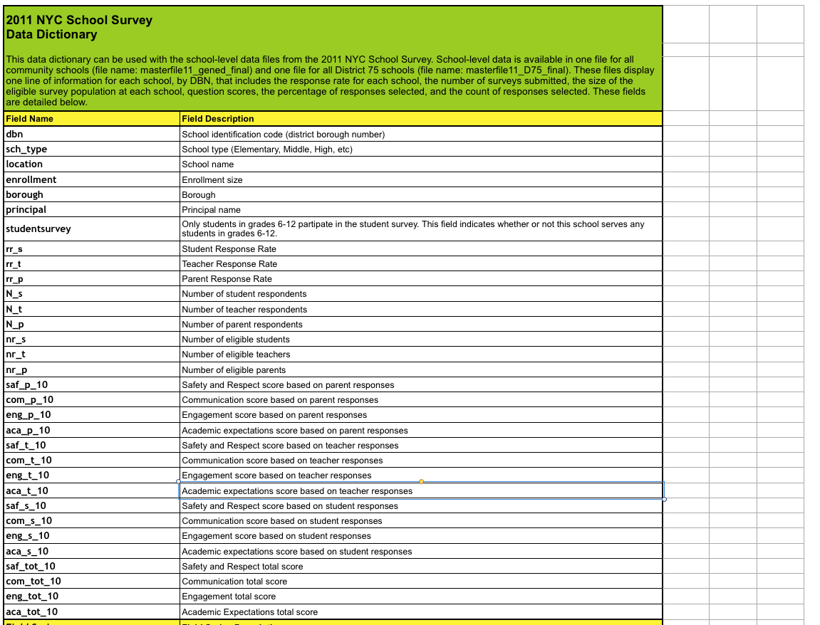
We can then remove any extraneous columns in survey:
survey["DBN"] = survey["dbn"]
survey_fields = ["DBN", "rr_s", "rr_t", "rr_p", "N_s", "N_t", "N_p", "saf_p_11", "com_p_11", "eng_p_11", "aca_p_11", "saf_t_11", "com_t_11", "eng_t_10", "aca_t_11", "saf_s_11", "com_s_11", "eng_s_11", "aca_s_11", "saf_tot_11", "com_tot_11", "eng_tot_11", "aca_tot_11",]
survey = survey.loc[:,survey_fields]
data["survey"] = survey
survey.shape(1702, 23)Making sure you understand what each dataset contains, and what the relevant columns are can save you lots of time and effort later on.
Condensing datasets
If we take a look at some of the datasets, including class_size, we’ll immediately see a problem:
data["class_size"].head()| CSD | BOROUGH | SCHOOL CODE | SCHOOL NAME | GRADE | PROGRAM TYPE | CORE SUBJECT (MS CORE and 9-12 ONLY) | CORE COURSE (MS CORE and 9-12 ONLY) | SERVICE CATEGORY(K-9* ONLY) | NUMBER OF STUDENTS / SEATS FILLED | NUMBER OF SECTIONS | AVERAGE CLASS SIZE | SIZE OF SMALLEST CLASS | SIZE OF LARGEST CLASS | DATA SOURCE | SCHOOLWIDE PUPIL-TEACHER RATIO | DBN | |
|---|---|---|---|---|---|---|---|---|---|---|---|---|---|---|---|---|---|
| 0 | 1 | M | M015 | P.S. 015 Roberto Clemente | 0K | GEN ED | – | – | – | 19.0 | 1.0 | 19.0 | 19.0 | 19.0 | ATS | NaN | 01M015 |
| 1 | 1 | M | M015 | P.S. 015 Roberto Clemente | 0K | CTT | – | – | – | 21.0 | 1.0 | 21.0 | 21.0 | 21.0 | ATS | NaN | 01M015 |
| 2 | 1 | M | M015 | P.S. 015 Roberto Clemente | 01 | GEN ED | – | – | – | 17.0 | 1.0 | 17.0 | 17.0 | 17.0 | ATS | NaN | 01M015 |
| 3 | 1 | M | M015 | P.S. 015 Roberto Clemente | 01 | CTT | – | – | – | 17.0 | 1.0 | 17.0 | 17.0 | 17.0 | ATS | NaN | 01M015 |
| 4 | 1 | M | M015 | P.S. 015 Roberto Clemente | 02 | GEN ED | – | – | – | 15.0 | 1.0 | 15.0 | 15.0 | 15.0 | ATS | NaN | 01M015 |
There are several rows for each high school (as you can see by the repeated DBN and SCHOOL NAME fields). However, if we take a look at the sat_results dataset, it only has one row per high school:
data["sat_results"].head()| DBN | SCHOOL NAME | Num of SAT Test Takers | SAT Critical Reading Avg. Score | SAT Math Avg. Score | SAT Writing Avg. Score | |
|---|---|---|---|---|---|---|
| 0 | 01M292 | HENRY STREET SCHOOL FOR INTERNATIONAL STUDIES | 29 | 355 | 404 | 363 |
| 1 | 01M448 | UNIVERSITY NEIGHBORHOOD HIGH SCHOOL | 91 | 383 | 423 | 366 |
| 2 | 01M450 | EAST SIDE COMMUNITY SCHOOL | 70 | 377 | 402 | 370 |
| 3 | 01M458 | FORSYTH SATELLITE ACADEMY | 7 | 414 | 401 | 359 |
| 4 | 01M509 | MARTA VALLE HIGH SCHOOL | 44 | 390 | 433 | 384 |
In order to combine these datasets, we’ll need to find a way to condense datasets like class_size to the point where there’s only a single row per high school. If not, there won’t be a way to compare SAT scores to class size. We can accomplish this by first understanding the data better, then by doing some aggregation. With the class_size dataset, it looks like GRADE and PROGRAM TYPE have multiple values for each school. By restricting each field to a single value, we can filter most of the duplicate rows. In the below code, we:
- Only select values from
class_sizewhere theGRADEfield is09-12. - Only select values from
class_sizewhere thePROGRAM TYPEfield isGEN ED. - Group the
class_sizedataset byDBN, and take the average of each column. Essentially, we’ll find the averageclass_sizevalues for each school. - Reset the index, so
DBNis added back in as a column.
class_size = data["class_size"]
class_size = class_size[class_size["GRADE "] == "09-12"]
class_size = class_size[class_size["PROGRAM TYPE"] == "GEN ED"]
class_size = class_size.groupby("DBN").agg(np.mean)
class_size.reset_index(inplace=True)
data["class_size"] = class_size
Condensing other datasets
Next, we’ll need to condense the demographics dataset. The data was collected for multiple years for the same schools, so there are duplicate rows for each school. We’ll only pick rows where the schoolyear field is the most recent available:
demographics = data["demographics"]
demographics = demographics[demographics["schoolyear"] == 20112012]
data["demographics"] = demographics
We’ll need to condense the math_test_results dataset. This dataset is segmented by Grade and by Year. We can select only a single grade from a single year:
data["math_test_results"] = data["math_test_results"][data["math_test_results"]["Year"] == 2011]
data["math_test_results"] = data["math_test_results"][data["math_test_results"]["Grade"] == '8']
Finally, graduation needs to be condensed:
data["graduation"] = data["graduation"][data["graduation"]["Cohort"] == "2006"]
data["graduation"] = data["graduation"][data["graduation"]["Demographic"] == "Total Cohort"]
Data cleaning and exploration is critical before working on the meat of the project. Having a good, consistent dataset will help you do your analysis more quickly.
Computing variables
Computing variables can help speed up our analysis by enabling us to make comparisons more quickly, and enable us to make comparisons that we otherwise wouldn’t be able to do. The first thing we can do is compute a total SAT score from the individual columns SAT Math Avg. Score, SAT Critical Reading Avg. Score, and SAT Writing Avg. Score. In the below code, we:
- Convert each of the SAT score columns from a string to a number.
- Add together all of the columns to get the
sat_scorecolumn, which is the total SAT score.
cols = ['SAT Math Avg. Score', 'SAT Critical Reading Avg. Score', 'SAT Writing Avg. Score']
for c in cols:
data["sat_results"][c] = data["sat_results"][c].convert_objects(convert_numeric=True)
data['sat_results']['sat_score'] = data['sat_results'][cols[0]] + data['sat_results'][cols[1]] + data['sat_results'][cols[2]]
Next, we’ll need to parse out the coordinate locations of each school, so we can make maps. This will enable us to plot the location of each school. In the below code, we:
- Parse latitude and longitude columns from the
Location 1column. - Convert
latandlonto be numeric.
data["hs_directory"]['lat'] = data["hs_directory"]['Location 1'].apply(lambda x: x.split("\n")[-1].replace("(", "").replace(")", "").split(", ")[0])
data["hs_directory"]['lon'] = data["hs_directory"]['Location 1'].apply(lambda x: x.split("\n")[-1].replace("(", "").replace(")", "").split(", ")[1])
for c in ['lat', 'lon']:
data["hs_directory"][c] = data["hs_directory"][c].convert_objects(convert_numeric=True)
Now, we can print out each dataset to see what we have:
for k,v in data.items():
print(k)
print(v.head())
math_test_results DBN Grade Year Category Number Tested Mean Scale Score \111 01M034 8 2011 All Students 48 646280 01M140 8 2011 All Students 61 665346 01M184 8 2011 All Students 49 727388 01M188 8 2011 All Students 49 658411 01M292 8 2011 All Students 49 650 Level 1 # Level 1 % Level 2 # Level 2 % Level 3 # Level 3 % Level 4 # \111 15 31.3% 22 45.8% 11 22.9% 0280 1 1.6% 43 70.5% 17 27.9% 0346 0 0% 0 0% 5 10.2% 44388 10 20.4% 26 53.1% 10 20.4% 3411 15 30.6% 25 51% 7 14.3% 2 Level 4 % Level 3+4 # Level 3+4 %111 0% 11 22.9%280 0% 17 27.9%346 89.8% 49 100%388 6.1% 13 26.5%411 4.1% 9 18.4%survey DBN rr_s rr_t rr_p N_s N_t N_p saf_p_11 com_p_11 eng_p_11 \0 01M015 NaN 88 60 NaN 22.0 90.0 8.5 7.6 7.51 01M019 NaN 100 60 NaN 34.0 161.0 8.4 7.6 7.62 01M020 NaN 88 73 NaN 42.0 367.0 8.9 8.3 8.33 01M034 89.0 73 50 145.0 29.0 151.0 8.8 8.2 8.04 01M063 NaN 100 60 NaN 23.0 90.0 8.7 7.9 8.1 ... eng_t_10 aca_t_11 saf_s_11 com_s_11 eng_s_11 aca_s_11 \0 ... NaN 7.9 NaN NaN NaN NaN1 ... NaN 9.1 NaN NaN NaN NaN2 ... NaN 7.5 NaN NaN NaN NaN3 ... NaN 7.8 6.2 5.9 6.5 7.44 ... NaN 8.1 NaN NaN NaN NaN saf_tot_11 com_tot_11 eng_tot_11 aca_tot_110 8.0 7.7 7.5 7.91 8.5 8.1 8.2 8.42 8.2 7.3 7.5 8.03 7.3 6.7 7.1 7.94 8.5 7.6 7.9 8.0[5 rows x 23 columns]ap_2010 DBN SchoolName AP Test Takers \0 01M448 UNIVERSITY NEIGHBORHOOD H.S. 391 01M450 EAST SIDE COMMUNITY HS 192 01M515 LOWER EASTSIDE PREP 243 01M539 NEW EXPLORATIONS SCI,TECH,MATH 2554 02M296 High School of Hospitality Management s Total Exams Taken Number of Exams with scores 3 4 or 50 49 101 21 s2 26 243 377 1914 s ssat_results DBN SCHOOL NAME \0 01M292 HENRY STREET SCHOOL FOR INTERNATIONAL STUDIES1 01M448 UNIVERSITY NEIGHBORHOOD HIGH SCHOOL2 01M450 EAST SIDE COMMUNITY SCHOOL3 01M458 FORSYTH SATELLITE ACADEMY4 01M509 MARTA VALLE HIGH SCHOOL Num of SAT Test Takers SAT Critical Reading Avg. Score \0 29 355.01 91 383.02 70 377.03 7 414.04 44 390.0 SAT Math Avg. Score SAT Writing Avg. Score sat_score0 404.0 363.0 1122.01 423.0 366.0 1172.02 402.0 370.0 1149.03 401.0 359.0 1174.04 433.0 384.0 1207.0class_size DBN CSD NUMBER OF STUDENTS / SEATS FILLED NUMBER OF SECTIONS \0 01M292 1 88.0000 4.0000001 01M332 1 46.0000 2.0000002 01M378 1 33.0000 1.0000003 01M448 1 105.6875 4.7500004 01M450 1 57.6000 2.733333 AVERAGE CLASS SIZE SIZE OF SMALLEST CLASS SIZE OF LARGEST CLASS \0 22.564286 18.50 26.5714291 22.000000 21.00 23.5000002 33.000000 33.00 33.0000003 22.231250 18.25 27.0625004 21.200000 19.40 22.866667 SCHOOLWIDE PUPIL-TEACHER RATIO0 NaN1 NaN2 NaN3 NaN4 NaNdemographics DBN Name schoolyear \6 01M015 P.S. 015 ROBERTO CLEMENTE 2011201213 01M019 P.S. 019 ASHER LEVY 2011201220 01M020 PS 020 ANNA SILVER 2011201227 01M034 PS 034 FRANKLIN D ROOSEVELT 2011201235 01M063 PS 063 WILLIAM MCKINLEY 20112012 fl_percent frl_percent total_enrollment prek k grade1 grade2 \6 NaN 89.4 189 13 31 35 2813 NaN 61.5 328 32 46 52 5420 NaN 92.5 626 52 102 121 8727 NaN 99.7 401 14 34 38 3635 NaN 78.9 176 18 20 30 21 ... black_num black_per hispanic_num hispanic_per white_num \6 ... 63 33.3 109 57.7 413 ... 81 24.7 158 48.2 2820 ... 55 8.8 357 57.0 1627 ... 90 22.4 275 68.6 835 ... 41 23.3 110 62.5 15 white_per male_num male_per female_num female_per6 2.1 97.0 51.3 92.0 48.713 8.5 147.0 44.8 181.0 55.220 2.6 330.0 52.7 296.0 47.327 2.0 204.0 50.9 197.0 49.135 8.5 97.0 55.1 79.0 44.9[5 rows x 38 columns]graduation Demographic DBN School Name Cohort \3 Total Cohort 01M292 HENRY STREET SCHOOL FOR INTERNATIONAL 200610 Total Cohort 01M448 UNIVERSITY NEIGHBORHOOD HIGH SCHOOL 200617 Total Cohort 01M450 EAST SIDE COMMUNITY SCHOOL 200624 Total Cohort 01M509 MARTA VALLE HIGH SCHOOL 200631 Total Cohort 01M515 LOWER EAST SIDE PREPARATORY HIGH SCHO 2006 Total Cohort Total Grads - n Total Grads - % of cohort Total Regents - n \3 78 43 55.1% 3610 124 53 42.7% 4217 90 70 77.8% 6724 84 47 56% 4031 193 105 54.4% 91 Total Regents - % of cohort Total Regents - % of grads \3 46.2% 83.7%10 33.9% 79.2%17 74.400000000000006% 95.7%24 47.6% 85.1%31 47.2% 86.7% ... Regents w/o Advanced - n \3 ... 3610 ... 3417 ... 6724 ... 2331 ... 22 Regents w/o Advanced - % of cohort Regents w/o Advanced - % of grads \3 46.2% 83.7%10 27.4% 64.2%17 74.400000000000006% 95.7%24 27.4% 48.9%31 11.4% 21% Local - n Local - % of cohort Local - % of grads Still Enrolled - n \3 7 9% 16.3% 1610 11 8.9% 20.8% 4617 3 3.3% 4.3% 1524 7 8.300000000000001% 14.9% 2531 14 7.3% 13.3% 53 Still Enrolled - % of cohort Dropped Out - n Dropped Out - % of cohort3 20.5% 11 14.1%10 37.1% 20 16.100000000000001%17 16.7% 5 5.6%24 29.8% 5 6%31 27.5% 35 18.100000000000001%5 rows x 23 columns]hs_directory dbn school_name boro \0 17K548 Brooklyn School for Music & Theatre Brooklyn1 09X543 High School for Violin and Dance Bronx2 09X327 Comprehensive Model School Project M.S. 327 Bronx3 02M280 Manhattan Early College School for Advertising Manhattan4 28Q680 Queens Gateway to Health Sciences Secondary Sc... Queens building_code phone_number fax_number grade_span_min grade_span_max \0 K440 718-230-6250 718-230-6262 9 121 X400 718-842-0687 718-589-9849 9 122 X240 718-294-8111 718-294-8109 6 123 M520 718-935-3477 NaN 9 104 Q695 718-969-3155 718-969-3552 6 12 expgrade_span_min expgrade_span_max ... \0 NaN NaN ...1 NaN NaN ...2 NaN NaN ...3 9 14.0 ...4 NaN NaN ... priority05 priority06 priority07 priority08 \0 NaN NaN NaN NaN1 NaN NaN NaN NaN2 Then to New York City residents NaN NaN NaN3 NaN NaN NaN NaN4 NaN NaN NaN NaN priority09 priority10 Location 1 \0 NaN NaN 883 Classon Avenue\nBrooklyn, NY 11225\n(40.67...1 NaN NaN 1110 Boston Road\nBronx, NY 10456\n(40.8276026...2 NaN NaN 1501 Jerome Avenue\nBronx, NY 10452\n(40.84241...3 NaN NaN 411 Pearl Street\nNew York, NY 10038\n(40.7106...4 NaN NaN 160-20 Goethals Avenue\nJamaica, NY 11432\n(40... DBN lat lon0 17K548 40.670299 -73.9616481 09X543 40.827603 -73.9044752 09X327 40.842414 -73.9161623 02M280 40.710679 -74.0008074 28Q680 40.718810 -73.806500[5 rows x 61 columns]Combining the datasets
Now that we’ve done all the preliminaries, we can combine the datasets together using the DBN column. At the end, we’ll have a dataset with hundreds of columns, from each of the original datasets. When we join them, it’s important to note that some of the datasets are missing high schools that exist in the sat_results dataset. To resolve this, we’ll need to merge the datasets that have missing rows using the outer join strategy, so we don’t lose data. In real-world data analysis, it’s common to have data be missing. Being able to demonstrate the ability to reason about and handle missing data is an important part of building a portfolio.
You can read about different types of joins here.
In the below code, we’ll:
- Loop through each of the items in the
datadictionary. - Print the number of non-unique DBNs in the item.
- Decide on a join strategy —
innerorouter. - Join the item to the DataFrame
fullusing the columnDBN.
flat_data_names = [k for k,v in data.items()]
flat_data = [data[k] for k in flat_data_names]
full = flat_data[0]
for i, f in enumerate(flat_data[1:]):
name = flat_data_names[i+1]
print(name)
print(len(f["DBN"]) - len(f["DBN"].unique()))
join_type = "inner"
if name in ["sat_results", "ap_2010", "graduation"]:
join_type = "outer"
if name not in ["math_test_results"]:
full = full.merge(f, on="DBN", how=join_type)full.shape
survey
0
ap_2010
1
sat_results
0
class_size
0
demographics
0
graduation
0
hs_directory
0(374, 174)Adding in values
Now that we have our full DataFrame, we have almost all the information we’ll need to do our analysis. There are a few missing pieces, though. We may want to correlate the Advanced Placement exam results with SAT scores, but we’ll need to first convert those columns to numbers, then fill in any missing values:
cols = ['AP Test Takers ', 'Total Exams Taken', 'Number of Exams with scores 3 4 or 5']
for col in cols:
full[col] = full[col].convert_objects(convert_numeric=True)
full[cols] = full[cols].fillna(value=0)
Then, we’ll need to calculate a school_dist column that indicates the school district of the school. This will enable us to match up school districts and plot out district-level statistics using the district maps we downloaded earlier:
full["school_dist"] = full["DBN"].apply(lambda x: x[:2])Finally, we’ll need to fill in any missing values in full with the mean of the column, so we can compute correlations:
full = full.fillna(full.mean())Computing correlations
A good way to explore a dataset and see what columns are related to the one you care about is to compute correlations. This will tell you which columns are closely related to the column you’re interested in. We can do this via the corr method on Pandas DataFrames. The closer to 0 the correlation, the weaker the connection. The closer to 1, the stronger the positive correlation, and the closer to -1, the stronger the negative correlation:
full.corr()['sat_score']Year NaN
Number Tested 8.127817e-02
rr_s 8.484298e-02
rr_t -6.604290e-02
rr_p 3.432778e-02
N_s 1.399443e-01
N_t 9.654314e-03
N_p 1.397405e-01
saf_p_11 1.050653e-01
com_p_11 2.107343e-02
eng_p_11 5.094925e-02
aca_p_11 5.822715e-02
saf_t_11 1.206710e-01
com_t_11 3.875666e-02
eng_t_10 NaN
aca_t_11 5.250357e-02
saf_s_11 1.054050e-01
com_s_11 4.576521e-02
eng_s_11 6.303699e-02
aca_s_11 8.015700e-02
saf_tot_11 1.266955e-01
com_tot_11 4.340710e-02
eng_tot_11 5.028588e-02
aca_tot_11 7.229584e-02
AP Test Takers 5.687940e-01
Total Exams Taken 5.585421e-01
Number of Exams with scores 3 4 or 5 5.619043e-01
SAT Critical Reading Avg. Score 9.868201e-01
SAT Math Avg. Score 9.726430e-01
SAT Writing Avg. Score 9.877708e-01
...
SIZE OF SMALLEST CLASS 2.440690e-01
SIZE OF LARGEST CLASS 3.052551e-01
SCHOOLWIDE PUPIL-TEACHER RATIO NaN
schoolyear NaN
frl_percent -7.018217e-01
total_enrollment 3.668201e-01
ell_num -1.535745e-01
ell_percent -3.981643e-01
sped_num 3.486852e-02
sped_percent -4.413665e-01
asian_num 4.748801e-01
asian_per 5.686267e-01
black_num 2.788331e-02
black_per -2.827907e-01
hispanic_num 2.568811e-02
hispanic_per -3.926373e-01
white_num 4.490835e-01
white_per 6.100860e-01
male_num 3.245320e-01
male_per -1.101484e-01
female_num 3.876979e-01
female_per 1.101928e-01
Total Cohort 3.244785e-01
grade_span_max -2.495359e-17
expgrade_span_max NaN
zip -6.312962e-02
total_students 4.066081e-01
number_programs 1.166234e-01
lat -1.198662e-01
lon -1.315241e-01
Name: sat_score, dtype: float64This gives us quite a few insights that we’ll need to explore:
- Total enrollment correlates strongly with
sat_score, which is surprising, because you’d think smaller schools, which focused more on the student, would have higher scores. - The percentage of females at a school (
female_per) correlates positively with SAT score, whereas the percentage of males (male_per) correlates negatively. - None of the survey responses correlate highly with SAT scores.
- There is a significant racial inequality in SAT scores (
white_per,asian_per,black_per,hispanic_per). ell_percentcorrelates strongly negatively with SAT scores.
Each of these items is a potential angle to explore and tell a story about using the data.
Setting the context
Before we dive into exploring the data, we’ll want to set the context, both for ourselves, and anyone else that reads our analysis. One good way to do this is with exploratory charts or maps. In this case, we’ll map out the positions of the schools, which will help readers understand the problem we’re exploring.
In the below code, we:
- Setup a map centered on New York City.
- Add a marker to the map for each high school in the city.
- Display the map.
import folium
from folium import plugins
schools_map = folium.Map(location=[full['lat'].mean(), full['lon'].mean()], zoom_start=10)
marker_cluster = folium.MarkerCluster().add_to(schools_map)
for name, row in full.iterrows():
folium.Marker([row["lat"], row["lon"]], popup="{0}: {1}".format(row["DBN"], row["school_name"])).add_to(marker_cluster)
schools_map.create_map('schools.html')
schools_map
This map is helpful, but it’s hard to see where the most schools are in NYC. Instead, we’ll make a heatmap:
schools_heatmap = folium.Map(location=[full['lat'].mean(), full['lon'].mean()], zoom_start=10)
schools_heatmap.add_children(plugins.HeatMap([[row["lat"], row["lon"]] for name, row in full.iterrows()]))
schools_heatmap.save("heatmap.html")
schools_heatmap
District level mapping
Heatmaps are good for mapping out gradients, but we’ll want something with more structure to plot out differences in SAT score across the city. School districts are a good way to visualize this information, as each district has its own administration. New York City has several dozen school districts, and each district is a small geographic area.
We can compute SAT score by school district, then plot this out on a map. In the below code, we’ll:
- Group
fullby school district. - Compute the average of each column for each school district.
- Convert the
school_distfield to remove leading0s, so we can match our geograpghic district data.
district_data = full.groupby("school_dist").agg(np.mean)
district_data.reset_index(inplace=True)
district_data["school_dist"] = district_data["school_dist"].apply(lambda x: str(int(x)))
We’ll now we able to plot the average SAT score in each school district. In order to do this, we’ll read in data in GeoJSON format to get the shapes of each district, then match each district shape with the SAT score using the school_dist column, then finally create the plot:
def show_district_map(col):
geo_path = 'schools/districts.geojson'
districts = folium.Map(location=[full['lat'].mean(), full['lon'].mean()], zoom_start=10)
districts.geo_json(
geo_path=geo_path,
data=district_data,
columns=['school_dist', col],
key_on='feature.properties.school_dist',
fill_color='YlGn',
fill_opacity=0.7,
line_opacity=0.2,
)
districts.save("districts.html")
return districts
show_district_map("sat_score")
Exploring enrollment and SAT scores
Now that we’ve set the context by plotting out where the schools are, and SAT score by district, people viewing our analysis have a better idea of the context behind the dataset. Now that we’ve set the stage, we can move into exploring the angles we identified earlier, when we were finding correlations. The first angle to explore is the relationship between the number of students enrolled in a school and SAT score.
We can explore this with a scatter plot that compares total enrollment across all schools to SAT scores across all schools.
full.plot.scatter(x='total_enrollment', y='sat_score')<matplotlib.axes._subplots.AxesSubplot at 0x10fe79978>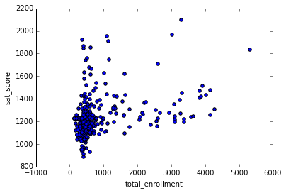
As you can see, there’s a cluster at the bottom left with low total enrollment and low SAT scores. Other than this cluster, there appears to only be a slight positive correlation between SAT scores and total enrollment. Graphing out correlations can reveal unexpected patterns.
We can explore this further by getting the names of the schools with low enrollment and low SAT scores:
34 INTERNATIONAL SCHOOL FOR LIBERAL ARTS
143 NaN
148 KINGSBRIDGE INTERNATIONAL HIGH SCHOOL
203 MULTICULTURAL HIGH SCHOOL
294 INTERNATIONAL COMMUNITY HIGH SCHOOL
304 BRONX INTERNATIONAL HIGH SCHOOL
314 NaN
317 HIGH SCHOOL OF WORLD CULTURES
320 BROOKLYN INTERNATIONAL HIGH SCHOOL
329 INTERNATIONAL HIGH SCHOOL AT PROSPECT
331 IT TAKES A VILLAGE ACADEMY
351 PAN AMERICAN INTERNATIONAL HIGH SCHOO
Name: School Name, dtype: object
Some searching on Google shows that most of these schools are for students who are learning English, and are low enrollment as a result. This exploration showed us that it’s not total enrollment that’s correlated to SAT score — it’s whether or not students in the school are learning English as a second language or not.
Exploring English language learners and SAT scores
Now that we know the percentage of English language learners in a school is correlated with lower SAT scores, we can explore the relationship. The ell_percent column is the percentage of students in each school who are learning English. We can make a scatterplot of this relationship:
full.plot.scatter(x='ell_percent', y='sat_score')<matplotlib.axes._subplots.AxesSubplot at 0x10fe824e0>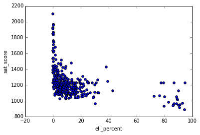
It looks like there are a group of schools with a high ell_percentage that also have low average SAT scores. We can investigate this at the district level, by figuring out the percentage of English language learners in each district, and seeing it if matches our map of SAT scores by district:
show_district_map("ell_percent")As we can see by looking at the two district level maps, districts with a low proportion of ELL learners tend to have high SAT scores, and vice versa.
Correlating survey scores and SAT scores
It would be fair to assume that the results of student, parent, and teacher surveys would have a large correlation with SAT scores. It makes sense that schools with high academic expectations, for instance, would tend to have higher SAT scores. To test this theory, lets plot out SAT scores and the various survey metrics:
full.corr()["sat_score"][["rr_s", "rr_t", "rr_p", "N_s", "N_t", "N_p", "saf_tot_11", "com_tot_11", "aca_tot_11", "eng_tot_11"]].plot.bar()<matplotlib.axes._subplots.AxesSubplot at 0x114652400>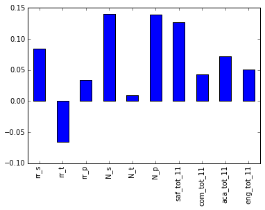
Surprisingly, the two factors that correlate the most are N_p and N_s, which are the counts of parents and students who responded to the surveys. Both strongly correlate with total enrollment, so are likely biased by the ell_learners. The other metric that correlates most is saf_t_11. That is how safe students, parents, and teachers perceived the school to be. It makes sense that the safer the school, the more comfortable students feel learning in the environment. However, none of the other factors, like engagement, communication, and academic expectations, correlated with SAT scores. This may indicate that NYC is asking the wrong questions in surveys, or thinking about the wrong factors (if their goal is to improve SAT scores, it may not be).
Exploring race and SAT scores
One of the other angles to investigate involves race and SAT scores. There was a large correlation differential, and plotting it out will help us understand what’s happening:
full.corr()["sat_score"][["white_per", "asian_per", "black_per", "hispanic_per"]].plot.bar()<matplotlib.axes._subplots.AxesSubplot at 0x108166ba8>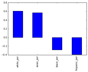
It looks like the higher percentages of white and asian students correlate with higher SAT scores, but higher percentages of black and hispanic students correlate with lower SAT scores. For hispanic students, this may be due to the fact that there are more recent immigrants who are ELL learners. We can map the hispanic percentage by district to eyeball the correlation:
show_district_map("hispanic_per")It looks like there is some correlation with ELL percentage, but it will be necessary to do some more digging into this and other racial differences in SAT scores.
Gender differences in SAT scores
The final angle to explore is the relationship between gender and SAT score. We noted that a higher percentage of females in a school tends to correlate with higher SAT scores. We can visualize this with a bar graph:
full.corr()["sat_score"][["male_per", "female_per"]].plot.bar()<matplotlib.axes._subplots.AxesSubplot at 0x10774d0f0>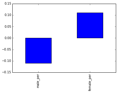
To dig more into the correlation, we can make a scatterplot of female_per and sat_score:
full.plot.scatter(x='female_per', y='sat_score')<matplotlib.axes._subplots.AxesSubplot at 0x104715160>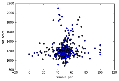
It looks like there’s a cluster of schools with a high percentage of females, and very high SAT scores (in the top right). We can get the names of the schools in this cluster:
full[(full["female_per"] > 65) & (full["sat_score"] > 1400)]["School Name"]3 PROFESSIONAL PERFORMING ARTS HIGH SCH
92 ELEANOR ROOSEVELT HIGH SCHOOL
100 TALENT UNLIMITED HIGH SCHOOL
111 FIORELLO H. LAGUARDIA HIGH SCHOOL OF
229 TOWNSEND HARRIS HIGH SCHOOL
250 FRANK SINATRA SCHOOL OF THE ARTS HIGH SCHOOL
265 BARD HIGH SCHOOL EARLY COLLEGE
Name: School Name, dtype: objectSearching Google reveals that these are elite schools that focus on the performing arts. These schools tend to have higher percentages of females, and higher SAT scores. This likely accounts for the correlation between higher female percentages and SAT scores, and the inverse correlation between higher male percentages and lower SAT scores.
AP scores
So far, we’ve looked at demographic angles. One angle that we have the data to look at is the relationship between more students taking Advanced Placement exams and higher SAT scores. It makes sense that they would be correlated, since students who are high academic achievers tend to do better on the SAT.
full["ap_avg"] = full["AP Test Takers "] / full["total_enrollment"]
full.plot.scatter(x='ap_avg', y='sat_score')<matplotlib.axes._subplots.AxesSubplot at 0x11463a908>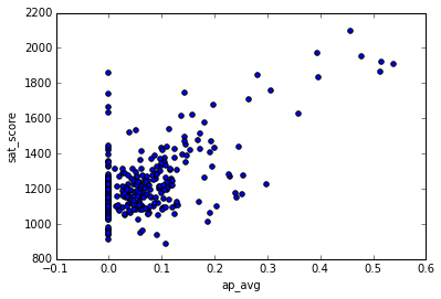
It looks like there is indeed a strong correlation between the two. An interesting cluster of schools is the one at the top right, which has high SAT scores and a high proportion of students that take the AP exams:
full[(full["ap_avg"] > .3) & (full["sat_score"] > 1700)]["School Name"]92 ELEANOR ROOSEVELT HIGH SCHOOL
98 STUYVESANT HIGH SCHOOL
157 BRONX HIGH SCHOOL OF SCIENCE
161 HIGH SCHOOL OF AMERICAN STUDIES AT LE
176 BROOKLYN TECHNICAL HIGH SCHOOL
229 TOWNSEND HARRIS HIGH SCHOOL
243 QUEENS HIGH SCHOOL FOR THE SCIENCES A
260 STATEN ISLAND TECHNICAL HIGH SCHOOL
Name: School Name, dtype: objectSome Google searching reveals that these are mostly highly selective schools where you need to take a test to get in. It makes sense that these schools would have high proportions of AP test takers.
Wrapping up the story
With data science, the story is never truly finished. By releasing analysis to others, you enable them to extend and shape your analysis in whatever direction interests them. For example, in this post, there are quite a few angles that we explored inmcompletely, and could have dived into more.
One of the best ways to get started with telling stories using data is to try to extend or replicate the analysis someone else has done. If you decide to take this route, you’re welcome to extend the analysis in this post and see what you can find. If you do this, make sure to share in the community so we can take a look.
Next steps
If you liked this, you might like to read the other posts in our ‘Build a Data Science Portfolio’ series: