1 tip for effective data visualization in Python
Let's start by talking about some data visualizations in your daily life that may surprise you. Did you know that whenever you see a weather map on TV, check the time on your wall clock, or stop at a traffic light, you're seeing a visual representation of numeric data? Don't believe me? Let's dive a little more into how a wall clock shows time. When the time is
5:05, you don't see the actual time on the clock. Instead, you see a small "hand" pointing to 5, and a big "hand" pointing to 1, like this: 
We've been trained to translate from this visual representation of the data to a time,
5:05. Wall clocks are unfortunately an example of data visualization that makes it harder to understand the underlying data. It takes much more mental effort to parse the time on a wall clock than it does for a digital clock. Wall clocks were created before displaying the time on a digital display was possible, so the only solution was displaying the time via two "hands". Let's look at a visualization that makes it much easier to understand the underlying data, the weather map. Lets look at this map as an example: 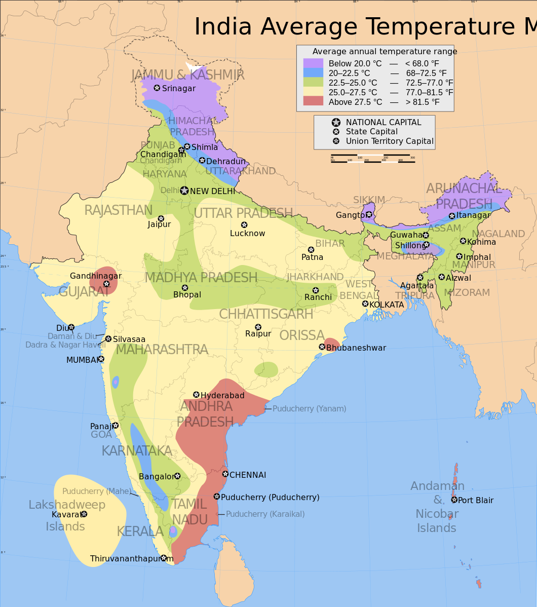
Looking at the map above, you can instantly tell that the coasts of Andhra Pradesh and Tamil Nadu are some of the hottest places in India. Arunachal Pradesh and Jammu and Kashmir are some of the coldest. We can see the "lines" along which higher average temperatures transition to lower average temperatures. The map is great for looking at geographic temperature trends despite display issues with the map — some labels overflow their boxes, or are too light. If we had instead represented this as a table, we would have "lost" a significant amount of data. For example, from the map, we can quickly tell that Hyderabad is colder than the coast of Andhra Pradesh. In order to communicate all of the information in the map, we'd need a table full of temperature data for every place in India, like this but longer:
| City | Average Annual Temperature | |
|---|---|---|
| 0 | Hyderabad | 27.0 |
| 1 | Chennai | 29.5 |
| 2 | Raipur | 26.0 |
| 3 | New Delhi | 23.0 |
This table is hard to think of in geographic terms. Two cities next to each other in the table might be right next to each other geographically, or extremely far apart. It's hard to figure out geographic trends when you're looking at one city at a time, so the table isn't useful for looking at high level geographic temperature changes. However, the table is extremely useful for looking up the average temperature of your city — far more useful than the map. You can instantly tell that the average annual temperature of Hyderabad is
27.0 degrees Celsius. Understanding what representations of the data are useful in which contexts is critical for creating effective data visualizations.
What we've learned so far
- Visualizations aren't always better than numbers for representing data.
- Even a visualization that doesn't look good can be effective if it matches the goals of the audience.
- Effective visualization can enable viewers to discover patterns that they could never find using numeric representations.
In this post, we'll learn how to make effective visualizations by walking through visualizing the performance of our investment portfolio. We'll represent the data a few different ways, and talk about the pros and cons of each approach. Too many tutorials start with making charts, but never discuss
why those charts are being made. At the end of this post, you'll have more insight into what charts are useful in which situations, and be able to more effectively communicate using data. If you want to go more in depth, you should try our courses on exploratory data visualization and storytelling through data visualization. We'll be using Python 3.5 and Jupyter notebook in case you want to follow along.
Tabular representations of the data
Let's say that we own a few shares of stock, and we want to track their performance:
-
AAPL— 500 shares -
GOOG— 450 shares -
BA— 250 shares -
CMG— 200 shares -
NVDA— 100 shares -
RHT— 500 shares
We bought all of the shares on November 7th, 2016, and we want to track their performance to date. We first need to download the daily share price data, which we can do with the
yahoo-finance package. We can install the package using pip install yahoo-finance. In the below code, we:
-
Import the
yahoo-financepackage. - Set a list of symbols to download.
-
Loop through each symbol
-
Download data from
2016-11-07to the previous day. - Extract the closing prices for each day.
-
Download data from
- Create a dataframe with all of the price data.
- Display the dataframe.
from yahoo_finance import Share
import pandas as pd
from datetime import date, timedelta

symbols = ["AAPL", "GOOG", "BA", "CMG", "NVDA", "RHT"]

data = {}
days = []
for symbol in symbols:
    share = Share(symbol)
    yesterday = (date.today() - timedelta(days=1)).strftime("
    prices = share.get_historical('2016-11-7', yesterday)
    close = [float(p["Close"]) for p in prices]
    days = [p["Date"] for p in prices]
    data[symbol] = close

stocks = pd.DataFrame(data, index=days)
stocks.head()
As you can see above, this gives us a table where each column is a stock symbol, each row is a date, and each cell is the price of that stock symbol on that date. The entire dataframe has
62 rows. This is very good if we want to lookup the price of a specific stock on a specific day. For example, I can quickly tell that AAPL shares cost 128.75 at market close on February 1st, 2017. However, we might only care about if we've made or lost money off of each stock symbol. We can find the difference between the price of each share when we bought it, and the current price. In the below code, we subtract the stock prices when we bought them from the current stock prices.
change = stocks.loc["2017-02-06"] - stocks.loc["2016-11-07"]
change
AAPL    19.879989
BA      20.949997
CMG     13.100006
GOOG    18.820007
NVDA    46.040001
RHT      1.550003
dtype: float64
Great! It looks like we made money on every investment. However, we can't tell by what percentage our investments have increased. We can do this with a slightly more complex formula:
pct_change = (stocks.loc["2017-02-06"] - stocks.loc["2016-11-07"]) / stocks.loc["2016-11-07"]
pct_change
AAPL    0.180056
BA      0.146473
CMG     0.034249
GOOG    0.024051
NVDA    0.645994
RHT     0.020217
dtype: float64
It looks like our investments have done extremely well percentage-wise. But it's hard to tell how much money we've made overall. Let's multiply the price change by our share counts to see how much we've made:
import numpy as np
share_counts = np.array([500, 250, 200, 450, 100, 500])
portfolio_change = change * share_counts
portfolio_change
AAPL    9939.99450
BA      5237.49925
CMG     2620.00120
GOOG    8469.00315
NVDA    4604.00010
RHT      775.00150
dtype: float64
Finally, we can add up how much we've made in total:
sum(portfolio_change)31645.49969999996And look at our purchase price to eyeball how much we've made on a percentage basis:
sum(stocks.loc["2016-11-07"] * share_counts)565056.50745000003We've gotten pretty far with numeric data representations. We were able to figure out how much our portfolio value increased. In many cases, data visualization isn't necessary, and a few numbers can express everything you want to share. In this section, we learned that:
- Numeric representations of data can be enough to tell a story.
- It's good to try to simplify tabular data when you can before moving to visualization.
- Understanding the goals of your audience is important to effectively representing data.
Numeric representations stop working well when you want to find patterns or trends in your data. Let's say we wanted to figure out if any stocks were more volatile in December, or if any stocks went down then back up. We could try to use measures like
standard deviation, but they wouldn't give us the whole story:
stocks.std()
AAPL     6.135476
BA       6.228163
CMG     15.352962
GOOG    21.431396
NVDA    11.686528
RHT      3.225995
dtype: float64
The above tells us that
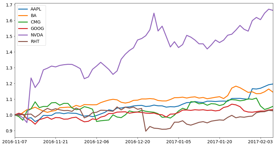
The first thing we can do is make a plot of each stock series. We can do this by using the pandas.DataFrame.plot method. This will create a line plot of the daily closing prices for each stock symbol. We need to first sort the dataframe in reverse order, as currently, it is sorted in descending order of date, and we want it to be in ascending order: The above plot is a good start, and we've come very far in a short amount of time. Unfortunately, the chart is a bit cluttered, and it's hard to tell the overall trends for some of the lower priced symbols. Let's normalize the chart to show each daily closing price as a fraction of the starting price: This plot is much better for seeing relative trends in each stock price. Each line shows us how the value of the stock is changing relative to its purchase price. This shows us which of our stocks are increasing on a percentage basis, and which ones aren't. We can see that the price of In the above plot, it's far easier to separate the lines visually since we have more space, and they're thicker. The labels are also easier to read since they're larger. Let's say that we want to see how much of our total portfolio value is in each stock over time, on a percentage basis. We'd need to first multiply each stock price series by the number of shares we hold, then divide by the total portfolio value, then make an area plot. This would let us see if some stocks are increasing enough to constitute a much larger share of our overall portfolio. In the below code, we: As you can see above, most of our portfolio's value is in When looking at the above plot, we can see that our portfolio lost a good amount of money around the beginning of November, the end of December, and the end of January. When we look at some of our previous plots, we can discover that this is mostly due to drops in the prices of Without understanding all three points, we wouldn't be able to figure out why the price of our portfolio is changing. To tie this all the way back to the tip we started this post with, understanding your audience and the questions they'll ask will help you design visualizations that meet their goals. The key to effective visualization is ensuring that it helps your audience understand complex tabular data more easily. In this post, you've learned: If you want to go into more depth, and learn more about how to explore data and tell stories using data, you should check out our two courses on exploratory data visualization and storytelling through data visualization.68
Plotting all our stock symbols
stocks = stocks.iloc[::-1]
stocks.plot()
<matplotlib.axes._subplots.AxesSubplot at 0x1105cd048>
normalized_stocks = stocks / stocks.loc["2016-11-07"]
normalized_stocks.plot()
<matplotlib.axes._subplots.AxesSubplot at 0x10f81b8d0>
NVDA shares increased very steeply soon after we bought it, and have continued to increase in value. RHT seems to have lost quite a bit of value at the end of December, but the price has been recovering steadily. Unfortunately, there are some visual issues with this plot that make the plot hard to read. The labels are squished together, and it's hard to see what happens to GOOG, CMG, RHT, BA, and AAPL since the lines are bunched together. We'll increase the size of the plot using the figsize keyword argument, and increase the width of the lines to fix these issues. We'll also increase the axis label and axis font sizes to make them easier to read.
import matplotlib.pyplot as plt
normalized_stocks.plot(figsize=(15,8), linewidth=3, fontsize=14)
plt.legend(fontsize=14)<matplotlib.legend.Legend at 0x10eaba160>
0 to 1.
portfolio = stocks * share_counts
portfolio_percentages = portfolio.apply(lambda x: x/sum(x), axis=1)
portfolio_percentages.plot(kind="area", ylim=(0,1), figsize=(15,8), fontsize=14)
plt.yticks([])
plt.legend(fontsize=14)<matplotlib.legend.Legend at 0x10ea8cda0>
GOOG stock. The overall allocation of dollars per stock symbol hasn't changed much since we purchased them. From looking at the data in a different way earlier, we know that the price of NVDA has grown quite quickly in the past few months, but from this view, we can see that its total value isn't that much of our portfolio. This means that although the stock price of NVDA has grown substantially, it hasn't had a huge affect on our overall portfolio value. Note how the chart above is fairly hard to parse and see trends in. This is an example of a chart that's usually better as a series of numbers that show the average percentage of portfolio value each stock comprises. A good way to think about this is "what questions can we answer better with this chart than with any other chart?" If the answer is "no questions", then you're probably better off with something else. To get a better handle on our overall portfolio value over time, we can plot it out:portfolio.sum(axis=1).plot(figsize=(15,8), fontsize=14, linewidth=3)<matplotlib.axes._subplots.AxesSubplot at 0x110dede48>
GOOG, which is most of our portfolio value. Being able to visualize the data from different angles helps us untangle the story of our overall portfolio, and answer questions more intelligently. For instance, making these plots helped us figure out:
Next steps