Adding Axis Labels to Plots With pandas
Pandas plotting methods provide an easy way to plot pandas objects. Often though, you'd like to add axis labels, which involves understanding the intricacies of Matplotlib syntax. Thankfully, there's a way to do this entirely using pandas. Let's start by importing the required libraries:
import pandas as pd
import numpy as np
import matplotlib.pyplot as plt
Next, we'll create a test dataframe, with a column of names and corresponding test scores:
df = pd.DataFrame({
    "name": ["Joe", "Sally", "Ananya"],
    "score": np.random.randint(0,100,size=3)})
df| name | score | |
|---|---|---|
| 0 | Joe | 42 |
| 1 | Sally | 37 |
| 2 | Ananya | 98 |
Plotting this dataframe is simple with the pandas methods. We can just use the DataFrame.plot.bar() method to produce a bar plot in two lines.
df.plot.bar()
plt.show()
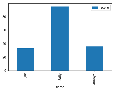
This gives us instant results, but it's not easy to interpret this plot, because we can't see which scores belong to which name. If you look closely, you might notice the currently x-axis labels are 0, 1, and 2. These actually correspond with the dataframe index. By setting the index of the dataframe to our names using the set_index() method, we can easily produce axis labels and improve our plot. We'll use drop=True which will remove the column, and inplace=True instead of having to assign the variable back to itself or to a new variable name.
df.set_index("name",drop=True,inplace=True)
df| score | |
|---|---|
| name | |
| Joe | 33 |
| Sally | 95 |
| Ananya | 36 |
Now, let's plot again and see our results:
df.plot.bar()
plt.show()
Instantly, our plot is better looking, and clearly communicates the data!
If you're interested in learning more about data visualization in Python, you might like to check ourData Visualization with Matplotlib course.