The Dataquest Download
Level up your data and AI skills, one newsletter at a time.
Hi there, Dataquesters!
In our last edition, we talked about how to take your raw data and turn it into insightful visualizations using Python. In this edition, I’d like to share some thoughts on how to build on those visualization skills to create something even more impactful: data stories.
When I started working with complex datasets, I often struggled to convey my findings effectively to non-technical stakeholders. Numbers and statistics, no matter how insightful, often failed to make sense to my audience. Then I discovered the power of telling stories using data visualizations, and it changed everything.
For example, while working on my machine learning weather data project, I applied a FiveThirtyEight style to my visualizations. This style, known for its clean, minimalist approach, uses a specific color palette and typography to create visually appealing charts. The transformation was remarkable. My charts became more informative as well as more polished and professional, engaging non-technical stakeholders and improving how I communicated my findings.
But style is just the beginning. To truly excel at data storytelling, we need to understand how people perceive and process visual information. This is where concepts like Gestalt principles and pre-attentive attributes become invaluable. Case in point, for my climate trends project, I created a series of visualizations using these principles. By carefully considering elements like proximity, similarity, and continuity, I was able to group related weather data points closer together, making seasonal patterns more apparent.
Another valuable lesson I’ve learned is the importance of tailoring visualizations to your audience. I once had to present the same machine learning results to both a team of data scientists and a group of top-level executives. I adjusted the complexity and focus of my visualizations for each group, ensuring that everyone left the meeting with a clear understanding of the insights.
Now, let’s consider how you can apply these techniques to your own work. First, familiarize yourself with advanced features in Matplotlib and seaborn. These full-fledged libraries offer numerous options for creating professional-grade visuals. Experiment with different chart types, color palettes, and annotation techniques. You can try using seaborn’s FacetGrid to create multiple related plots in a single figure, or explore Matplotlib’s 3D plotting capabilities for multidimensional data.
Next, focus on the storytelling aspect of your visualizations. A great data story guides your audience through the information, highlighting key points and leading to a clear conclusion. I once used these storytelling techniques to create a visual presentation for a NASA research project. Instead of simply displaying satellite imaging data, I created a narrative that showed how the data changed over time, highlighting critical patterns and their implications. The visuals didn’t just show the data―they conveyed why the research mattered and how it could make a difference.
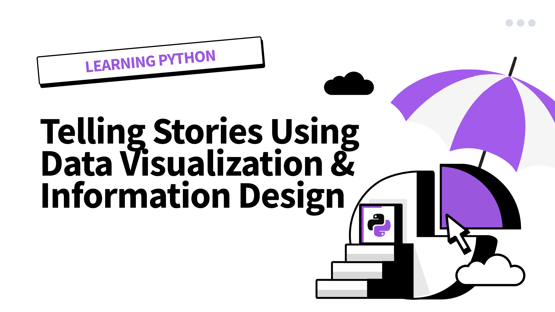
If you’re looking to enhance your data storytelling skills, consider enrolling in our Telling Stories Using Data Visualization and Information Design course, perfect for intermediate Python users who want to build their data storytelling skills using Matplotlib and seaborn. These two powerful libraries allow you to transform complex datasets into compelling narratives. With practice, you’ll be able to craft visualizations that are professional while effectively communicating your data story to any audience.
As you continue your data visualization journey, I encourage you to experiment with different techniques and styles. Try recreating visualizations you admire, or challenge yourself to present familiar data to your non-technical friends and family. Remember, the goal is not just to make pretty charts, but to illuminate the stories hidden within your data.
What complex dataset are you currently working with? How might you apply these advanced visualization techniques to uncover new insights? I’m curious to hear about your experiences and the challenges you’re tackling in your data storytelling journey. Share your findings in the Dataquest community. I look forward to seeing the compelling visual narratives you’ll create with your enhanced skills.
Happy visualizing, Dataquesters!
Mike
|
What We're Reading
|
📖 Build Your Own SQLite: Part 1 A hands-on guide to building a basic SQLite database from scratch, starting with listing tables—perfect for those interested in understanding database internals. Read more 📖 Matplotlib: Pyplot vs. Object-Oriented Interface Compare plotting with Matplotlib using the functional versus object-oriented approach. This side-by-side view helps you understand the limitations of functional plotting and ease into OO plotting. Read more 📖 Amazon’s New Alexa Powered by Claude AI Amazon is launching a revamped Alexa in October, powered by Anthropic’s Claude AI. The new Alexa will support more complex, context-aware conversations and will be offered as a paid subscription service, separate from Prime, with pricing expected between $5 to $10 per month. Read more |
Dataquest Webinars
Don’t miss out on exclusive access to future live webinars—make sure to sign up for our weekly newsletter.
Give 20%, Get $20: Time to Refer a Friend!
Give 20% Get $20
Now is the perfect time to share Dataquest with a friend. Gift a 20% discount, and for every friend who subscribes, earn a $20 bonus. Use your bonuses for digital gift cards, prepaid cards, or donate to charity. Your choice! Click here
Community highlights
Project Spotlight
Sharing and reviewing others’ projects is one of the best things you can do to sharpen your skills. Twice a month we will share a project from the community. The top pick wins a $20 gift card!
In this edition, we spotlight Naveen‘s project on Productivity Prediction of Garment Employees, where he applied a decision tree model to forecast worker productivity. The project shines for its clear mathematical explanations, insightful exploratory data plots, and a detailed thought process that thoroughly justifies Naveen’s decisions throughout the project.
|
Want your project in the spotlight? Share it in the community. |
Ask Our Community
In this edition, we’re spotlighting the question, “Is a Transition from Sales to Data Science the Right Move? Seeking Advice and Resources for a Non-Tech Background” along with the top advice from our community. Do you have insights to share? Join the conversation here!
From Alina Mulenkova:
If you are considering switching to Data Science, you’ve definitely chosen the right online platform to begin! Even though I have some technical background, I have also worked in sales, so I completely understand your hesitation in switching to a new field.
From my side, I can advise you to start the Data Scientist path on Dataquest. It will help you not only learn complicated things step by step but also gain some practical experience. If at some point during the learning process you feel a lack of knowledge, I highly recommend using the community—check older posts to see if other students have had the same difficulties, ask questions, and share your projects.
Once you progress in your studies, try to implement your previous work experience in Data Science. For example, develop a personal project based on your sales background. This will help you progress in your studies and also give you the confidence that is so important when learning a new profession. I am sure you will see that you are not a complete novice and can implement your previous background while switching to a new profession.
Good luck with your studies!
High-fives from Vik, Celeste, Anna P, Anna S, Anishta, Bruno, Elena, Mike, Daniel, and Brayan.