Tutorial: Poisson Regression in R
Poisson Regression can be a really useful tool if you know how and when to use it. In this tutorial we're going to take a long look at Poisson Regression, what it is, and how R programmers can use it in the real world.
Specifically, we're going to cover:
- What Poisson Regression actually is and when we should use it
- Poisson Distribution, and how it differs from Normal Distribution
- Poisson Regression modeling with GLMs
- Modeling Poisson Regression for count data
- Visualizing findings from model using jtools
- Modeling Poisson Regression for rate data
What Are Poisson Regression Models?
Poisson Regression models are best used for modeling events where the outcomes are counts. Or, more specifically, count data: discrete data with non-negative integer values that count something, like the number of times an event occurs during a given timeframe or the number of people in line at the grocery store.
Count data can also be expressed as rate data, since the number of times an event occurs within a timeframe can be expressed as a raw count (i.e. "In a day, we eat three meals") or as a rate ("We eat at a rate of 0.125 meals per hour").
Poisson Regression helps us analyze both count data and rate data by allowing us to determine which explanatory variables (X values) have an effect on a given response variable (Y value, the count or a rate). For example, Poisson regression could be applied by a grocery store to better understand and predict the number of people in a line.
What is Poisson Distribution?
Poisson distribution is a statistical theory named after French mathematician Siméon Denis Poisson. It models the probability of event or events y occurring within a specific timeframe, assuming that y occurrences are not affected by the timing of previous occurrences of y. This can be expressed mathematically using the following formula:

Here, μ (in some textbooks you may see λ instead of μ) is the average number of times an event may occur per unit of exposure. It is also called the parameter of Poisson distribution. The exposure may be time, space, population size, distance, or area, but it is often time, denoted with t. If exposure value is not given it is assumed to be equal to 1.
Let's visualize this by creating a Poisson distribution plot for different values of μ.
First, we'll create a vector of 6 colors:
# vector of colors
colors <- c("Red", "Blue", "Gold", "Black", "Pink", "Green")
Next, we'll create a list for the distribution that will have different values for μ:
# declare a list to hold distribution values
poisson.dist < - list()
</code>
Then, we'll create a vector of values for μ and loop over the values from μ each with quantile range 0-20, storing the results in a list:
a < - c(1, 2, 3, 4, 5, 6) # A vector for values of u
for (i in 1:6) {
    poisson.dist[[i]] <- c(dpois(0:20, i)) # Store distribution vector for each corresponding value of u
}
</code>
Finally, we'll plot the points using plot(). plot() is a base graphics function in R. Another common way to plot data in R would be using the popular ggplot2 package; this is covered in Dataquest's R courses. But for this tutorial, we will stick to base R functions.
# plot each vector in the list using the colors vectors to represent each value for u
plot(unlist(poisson.dist[1]), type = "o", xlab="y", ylab = "P(y)",
col = colors[i])
for (i in 1:6) {
    lines(unlist(poisson.dist[i]), type = "o", col = colors[i])
}
# Adds legend to the graph plotted
legend("topright", legend = a, inset = 0.08, cex = 1.0, fill = colors, title = "Values of u")
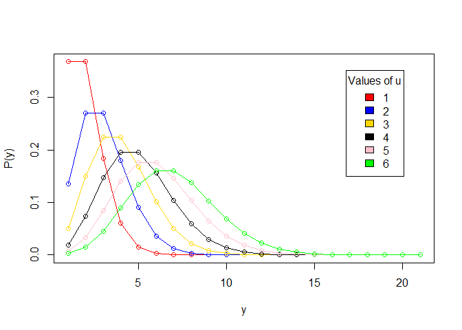
Note that we used dpois(sequence,lambda) to plot the Probability Density Functions (PDF) in our Poisson distribution. In probability theory, a probability density function is a function that describes the relative likelihood that a continuous random variable (a variable whose possible values are continuous outcomes of a random event) will have a given value. (In statistics, a "random" variable is simply a variable whose outcome is result of a random event.)
How Does Poisson Distribution Differ From Normal Distribution?
Poisson Distribution is most commonly used to find the probability of events occurring within a given time interval. Since we're talking about a count, with Poisson distribution, the result must be 0 or higher - it's not possible for an event to happen a negative number of times. On the other hand, Normal distribution is a continuous distribution for a continuous variable and it could result in a positive or negative value:
| Poisson Distribution | Normal Distribution |
|---|---|
| Used for count data or rate data | Used for continuous variables |
| Skewed depending on values of lambda. | Bell shaped curve that is symmetric around the mean. |
| Variance = Mean | Variance and mean are different parameters; mean, median and mode are equal |
We can generate a Normal Distribution in R like this:
# create a sequence -3 to +3 with .05 increments
xseq < - seq(-3, 3, .05)

# generate a Probability Density Function
densities <- dnorm(xseq, 0, 1)

# plot the graph
plot(xseq, densities, col = "blue", xlab = "", ylab = "Density", type = "l", lwd = 2)
# col: changes the color of line
# 'xlab' and 'ylab' are labels for x and y axis respectively
# type: defines the type of plot. 'l' gives a line graph
# lwd: defines line width
</code>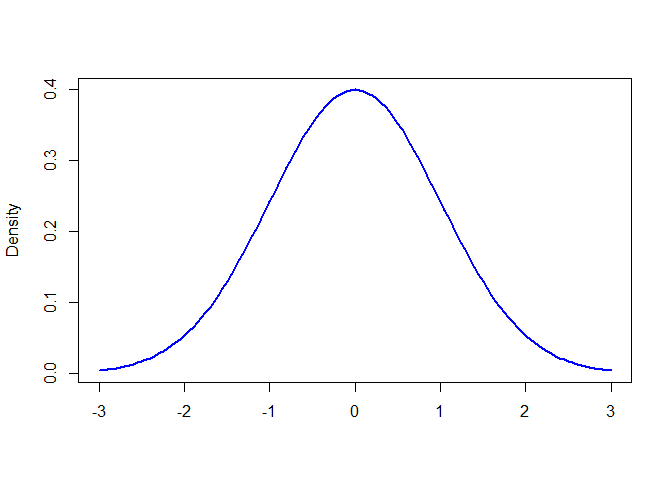
In R, dnorm(sequence, mean, std.dev) is used to plot the Probability Density Function (PDF) of a Normal Distribution.
To understand the Poisson distribution, consider the following problem from Chi Yau's R Tutorial textbook:
If there are 12 cars crossing a bridge per minute on average, what is the probability of having seventeen or more cars crossing the bridge in any given minute?
Here, average number of cars crossing a bridge per minute is μ = 12.
ppois(q, u, lower.tail = TRUE) is an R function that gives the probability that a random variable will be lower than or equal to a value.
We have to find the probability of having seventeen or more cars, so we will use lower.trail = FALSE and set q at 16:
ppois(16, 12, lower.tail = FALSE)
# lower.tail = logical; if TRUE (default) then probabilities are P[X < = x], otherwise, P[X > x].
## [1] 0.101291
To get a percentage, we simply need to multiply this output by 100. Now we have the answer to our question: there is a 10.1
Generalized Linear Models are models in which response variables follow a distribution other than the normal distribution. That's in contrast to Linear regression models, in which response variables follow normal distribution. This is because Generalized Linear Models have response variables that are categorical such as Yes, No; or Group A, Group B and, therefore, do not range from -∞ to +∞. Hence, the relationship between response and predictor variables may not be linear. In GLM: yi = α + β1x1i + β2x2i + ....+βpxpi + ei i = 1, 2....n The response variable yi is modeled by a linear function of predictor variables and some error term. A Poisson Regression model is a Generalized Linear Model (GLM) that is used to model count data and contingency tables. The output Y (count) is a value that follows the Poisson distribution. It assumes the logarithm of expected values (mean) that can be modeled into a linear form by some unknown parameters. Note: In statistics, contingency tables (example) are matrix of frequencies depending on multiple variables. To transform the non-linear relationship to linear form, a link function is used which is the log for Poisson Regression. For that reason, a Poisson Regression model is also called log-linear model. The general mathematical form of Poisson Regression model is: log(y)=α + β1x1 + β2x2 + ....+βpxp Where, The coefficients are calculated using methods such as Maximum Likelihood Estimation(MLE) or maximum quasi-likelihood. Consider an equation with one predictor variables and one response variable: log(y)=α + β(x) This is equivalent to: y = e(α + β(x)) = eα + eβ * x Note: In Poisson Regression models, predictor or explanatory variables can have a mixture of both numeric or categorical values. One of the most important characteristics for Poisson distribution and Poisson Regression is equidispersion, which means that the mean and variance of the distribution are equal. Variance measures the spread of the data. It is the "average of the squared differences from the mean". Variance (Var) is equal to 0 if all values are identical. The greater the difference between the values, the greater the variance. Mean is the average of values of a dataset. Average is the sum of the values divided by the number of values. Let us say that the mean (μ) is denoted by E(X) E(X)=μ For Poisson Regression, mean and variance are related as: var(X)=σ2E(X) Where σ2 is the dispersion parameter. Since var(X)=E(X)(variance=mean) must hold for the Poisson model to be completely fit, σ2 must be equal to 1. When variance is greater than mean, that is called over-dispersion and it is greater than 1. If it is less than 1 than it is known as under-dispersion. In R, the In this tutorial, we'll be using those three parameters. For further details we can consult the R documentation, but let's take a quick look at what each refers to: We're going to model Poisson Regression related to how frequently yarn breaks during weaving. This data is found in the The Let's take a look at the data: Output: This data set looks at how many warp breaks occurred for different types of looms per loom, per fixed length of yarn. We can read more details about this dataset in the documentation here, but here are the three columns we'll be looking at and what each refers to: There are measurements on 9 looms of each of the six types of warp, for a total of 54 entries in the dataset. Let's look at how the data is structured using the Output: From the above, we can see both the types and levels present in the data. Read this to learn a bit more about factors in R. Now we will work with the We can view the dependent variable Clearly, the data is not in the form of a bell curve like in a normal distribution. Let's check out the Output: Output: The variance is much greater than the mean, which suggests that we will have over-dispersion in the model. Let's fit the Poisson model using the Output: We've just been given a lot of information, now we need to interpret it. The first column named If R treats categorical variables as dummy variables. Categorical variables, also called indicator variables, are converted into dummy variables by assigning the levels in the variable some numeric representation.The general rule is that if there are k categories in a factor variable, the output of We can see in above summary that for wool, 'A' has been made the base and is not shown in summary. Similarly, for tension 'L' has been made the base category. To see which explanatory variables have an effect on response variable, we will look at the p values. If the p is less than 0.05 then, the variable has an effect on the response variable. In the summary above, we can see that all p values are less than 0.05, hence, both explanatory variables (wool and tension) have significant effect on breaks. Notice how R output used Before starting to interpret results, let's check whether the model has over-dispersion or under-dispersion. If the Residual Deviance is greater than the degrees of freedom, then over-dispersion exists. This means that the estimates are correct, but the standard errors (standard deviation) are wrong and unaccounted for by the model. The Null deviance shows how well the response variable is predicted by a model that includes only the intercept (grand mean) whereas residual with the inclusion of independent variables. Above, we can see that the addition of 3 (53-50 =3) independent variables decreased the deviance to 210.39 from 297.37. Greater difference in values means a bad fit. So, to have a more correct standard error we can use a quasi-poisson model: Output: Now that we've got two different models, let's compare them to see which is better. First, we'll install the Now we'll use that Output: In above output, we can see the coefficients are the same, but the standard errors are different. Keeping these points in mind, let's see estimate for wool. Its value is -0.2059884, and the exponent of -0.2059884 is 0.8138425. Output: This shows that changing from type A wool to type B wool results in a decrease in breaks 0.8138425 times the intercept, because estimate -0.2059884 is negative. Another way of saying this is if we change wool type from A to B, the number of breaks will fall by 18.6
Once the model is made, we can use Output: Our model is predicting there will be roughly 24 breaks with wool type B and tension level M. When you are sharing your analysis with others, tables are often not the best way to grab people's attention. Plots and graphs help people grasp your findings more quickly. The most popular way to visualize data in R is probably Output: In above code, the You can find more details on We can also visualize the interaction between predictor variables. In the warpbreaks data we have categorical predictor variables, so we'll use Output: We can do the same thing to look at Output: Above, we see how the three different categories of tension (L, M, and H) for each affects breaks with each wool type. For example, breaks tend to be highest with low tension and type A wool. We can also define the type of plot created by Output: We can also to include observations in the plot by adding Output: There are lots of other design options, including line style, color, etc, that will allow us to customize the appearance of these visualizations. For specifics, consult the So far this in this tutorial, we have modeled count data, but we can also model rate data that is predicting the number of counts over a period of time or grouping. Formula for modelling rate data is given by: log(X/n)=β0 + ∑iβiXi This is equivalent to: (applying log formula) log(X)−log(n)=β0 + ∑iβiXi log(X)=log(n)+β0 + ∑iβiXi Thus, rate data can be modeled by including the log(n) term with coefficient of 1. This is called an offset. This offset is modelled with Let's use another a dataset called Now, let's take a look at some details about the data, and print the first ten rows to get a feel for what the dataset includes. Output: To model rate data, we use X/n where X is the event to happen and n is the grouping. In this example, X=cases (the event is a case of cancer) and n=pop (the population is the grouping). As in the formula above, rate data is accounted by log(n) and in this data n is population, so we will find log of population first. We can model for cases/populationas follows: Output: Now, let's model the rate data with Output: In this dataset, we can see that the residual deviance is near to degrees of freedom, and the dispersion parameter is 1.5 (23.447/15) which is small, so the model is a good fit. We use Using this model, we can predict the number of cases per 1000 population for a new data set, using the Output: So, for the city of Kolding among people in the age group 40-54, we could expect roughly 2 or 3 cases of lung cancer per 1000 people. As with the count data, we could also use quasi-poisson to get more correct standard errors with rate data, but we won't repeat that process for the purposes of this tutorial. Poisson regression models have great significance in econometric and real world predictions. In this tutorial, we've learned about Poisson Distribution, Generalized Linear Models, and Poisson Regression models. We also learned how to implement Poisson Regression Models for both count and rate data in R using [thrive_leads id='21203'] If you’d like to learn more about this topic, check out Dataquest's Data Analyst in R that will help you become job-ready in around 6 months. Poisson Regression Models and GLMs
Poisson Regression Modeling Using Count Data
glm() command is used to model Generalized Linear Models. Here is the general structure of glm():
glm(formula, family = familytype(link = ""), data,...)
Parameter
Description
formula
The formula is symbolic representation of how modeled is to fitted
family
Family tells choice of variance and link functions. There are several choices of family, including Poisson and Logistic
data
Data is the dataset to be used
glm() provides eight choices for family with the following default link functions:
Family
Default Link Function
binomial
(link = "logit")
gaussian
(link = "identity")
Gamma
(link = "inverse")
inverse.gaussian
(link = $frac{1}{mu^2}$)
poisson
(link = "log")
quasi
(link = "identity", variance = "constant")
quasibinomial
(link = "logit")
quasipoisson
(link = "log")
Let's Get Modeling!
datasets package in R, so the first thing we need to do is install the package using install.package("datasets") and load the library with library(datasets):
# install.packages("datasets")
library(datasets) # include library datasets after installation
datasets package includes tons of datasets, so we need to specifically select our yarn data. Consulting the package documentation, we can see that it is called warpbreaks, so let's store that as an object.
data < - warpbreaks
</code>
columns < - names(data) # Extract column names from dataframe
columns # show columns
</code>[1] "breaks" "wool" "tension"What's In Our Data?
Column
Type
Description
breaks
numeric
The number of breaks
wool
factor
The type of wool (A or B)
tension
factor
The level of tension (L, M, H)
ls.str() command:
ls.str(warpbreaks)
breaks : num [1:54] 26 30 54 25 70 52 51 26 67 18 ...
tension : Factor w/ 3 levels "L","M","H": 1 1 1 1 1 1 1 1 1 2 ...
wool : Factor w/ 2 levels "A","B": 1 1 1 1 1 1 1 1 1 1 ...
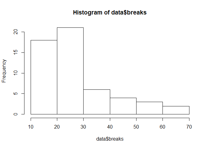
data dataframe. Remember, with a Poisson Distribution model we're trying to figure out how some predictor variables affect a response variable. Here, breaks is the response variable and wool and tension are predictor variables.breaks data continuity by creating a histogram:
hist(data$breaks)
mean() and var() of the dependent variable:
mean(data$breaks) # calculate mean
[1] 28.14815
var(data$breaks) # calculate variance
[1] 174.2041glm() command.
# model poisson regression using glm()
poisson.model < - glm(breaks ~ wool + tension, data, family = poisson(link = "log"))
summary(poisson.model)
</code>
summary() is a generic function used to produce result summaries of the results of various model fitting functions.Call: glm(formula = breaks ~ wool + tension, family = poisson(link = "log"), data = data)
Deviance Residuals:
Min 1Q Median 3Q Max
-3.6871 -1.6503 -0.4269 1.1902 4.2616
Coefficients:
Estimate Std. Error z value Pr(>|z|)
(Intercept) 3.69196 0.04541 81.302 < 2e-16 ***
woolB -0.20599 0.05157 -3.994 6.49e-05 ***
tensionM -0.32132 0.06027 -5.332 9.73e-08 ***
tensionH -0.51849 0.06396 -8.107 5.21e-16 ***
---
Signif. codes: 0 ‘***’ 0.001 ‘**’ 0.01 ‘*’ 0.05 ‘.’ 0.1 ‘ ’ 1
(Dispersion parameter for poisson family taken to be 1)
Null deviance: 297.37 on 53 degrees of freedom
Residual deviance: 210.39 on 50 degrees of freedom
AIC: 493.06Number of Fisher Scoring iterations: 4
</code>
Interpreting the Poisson Model
Estimate is the coefficient values of α (intercept), β1 and so on. Following is the interpretation for the parameter estimates:
family = poisson is kept in glm() then, these parameters are calculated using Maximum Likelihood Estimation MLE.glm() will have k−1 categories with remaining 1 as the base category.*** at the end of each variable. The number of stars signifies significance.
poisson.model2 < - glm(breaks ~ wool + tension, data = data, family = quasipoisson(link = "log"))
summary(poisson.model2)
</code>Call:
glm(formula = breaks ~ wool + tension, family = poisson(link = "log"), data = data)
Deviance Residuals:
Min 1Q Median 3Q Max
-3.6871 -1.6503 -0.4269 1.1902 4.2616
Coefficients:
Estimate Std. Error z value Pr(>|z|)
(Intercept) 3.69196 0.04541 81.302 < 2e-16 ***
woolB -0.20599 0.05157 -3.994 6.49e-05 ***
tensionM -0.32132 0.06027 -5.332 9.73e-08 ***
tensionH -0.51849 0.06396 -8.107 5.21e-16 ***
---
Signif. codes: 0 ‘***’ 0.001 ‘**’ 0.01 ‘*’ 0.05 ‘.’ 0.1 ‘ ’ 1
(Dispersion parameter for poisson family taken to be 1)
Null deviance: 297.37 on 53 degrees of freedom
Residual deviance: 210.39 on 50 degrees of freedom
AIC: 493.06
Number of Fisher Scoring iterations: 4
</code>
Comparing The Models:
arm library because it contains a function we need:
# install.packages("arm")

# load library arm that contains the function se.coef()
library(arm)
se.coef() function to extract the coefficients from each model, and then use cbind() combine those extracted values into a single dataframe so we can compare them.
# extract coefficients from first model using 'coef()'
coef1 = coef(poisson.model)

# extract coefficients from second model
coef2 = coef(poisson.model2)

# extract standard errors from first model using 'se.coef()'
se.coef1 = se.coef(poisson.model)

# extract standard errors from second model
se.coef2 = se.coef(poisson.model2)

# use 'cbind()' to combine values into one dataframe
models.both < - cbind(coef1, se.coef1, coef2, se.coef2, exponent = exp(coef1))

# show dataframe
models.both
</code>coef1 se.coef1 coef2 se.coef2 exponent
(Intercept) 3.6919631 0.04541069 3.6919631 0.09374352 40.1235380
woolB -0.2059884 0.05157117 -0.2059884 0.10646089 0.8138425
tensionM -0.3213204 0.06026580 -0.3213204 0.12440965 0.7251908
tensionH -0.5184885 0.06395944 -0.5184885 0.13203462 0.5954198
1-0.8138425
[1] 0.1861575Predicting From The Model
predict(model, data, type) to predict outcomes using new dataframes containing data other than the training data. Let's look at an example.
# make a dataframe with new data
newdata = data.frame(wool = "B", tension = "M")

# use 'predict()' to run model on new data
predict(poisson.model2, newdata = newdata, type = "response")
[1] 23.68056Visualizing Findings Using jtools
ggplot2 (which is taught in Dataquest's data visualization course), we're also going to use an awesome R package called jtools that includes tools for specifically summarizing and visualizing regression models. Let's use jtools to visualize poisson.model2.
# Install the package jtools if not already installed
install.packages("jtools")

# you may be asked to install 'broom' and 'ggstance' packages as well
install.packages("broom")
install.packages("ggstance")
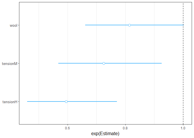
jtools provides plot_summs() and plot_coefs() to visualize the summary of the model and also allows us to compare different models with ggplot2.
# Include jtools library
library(jtools)

# plot regression coefficients for poisson.model2
plot_summs(poisson.model2, scale = TRUE, exp = TRUE)
# plot regression coefficients for poisson.model2 and poisson.model
plot_summs(poisson.model, poisson.model2, scale = TRUE, exp = TRUE)
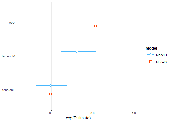
plot_summs(poisson.model2, scale = TRUE, exp = TRUE) plots the second model using the quasi-poisson family in glm.
plot_summs() is the regression model to be used, it may be one or more than one.scale helps with the problem of differing scales of the variables.exp is set to TRUE because for Poisson regression we are more likely to be interested in exponential values of estimates rather than linear.jtools and plot_summs() here in the documentation.jtools provides different functions for different types of variables. For example, if all the variables are categorical, we could use cat_plot() to better understand interactions among them. For continuous variables, interact_plot() is used.cat_plot() to visualize the interaction between them, by giving it arguments specifying which model we'd like to use, the predictor variable we're looking at, and the other predictor variable that it combines with to produce the outcome.
cat_plot(poisson.model2, pred = wool, modx = tension)
# argument 1: regression model
# pred: The categorical variable that will appear on x-axis
# modx: Moderator variable that has an effect in combination to pred on outcome
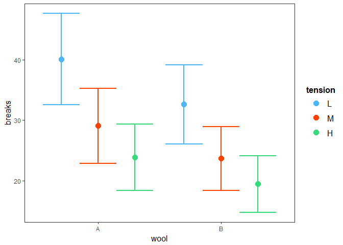
tension:
# using cat_plot. Pass poisson.model2 and we want to see effect of tension type so we set pred=tension
cat_plot(poisson.model2, pred = tension, modx = wool)
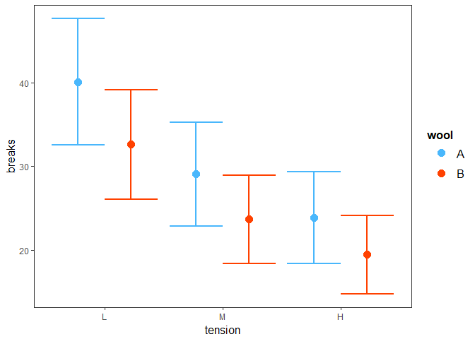
cat_plot() using the geom parameter. This parameter enhances the interpretation of plot. We can use it like so, passing geom as an additional argument to cat_plot:
cat_plot(poisson.model2, pred = tension, modx = wool, geom = "line")
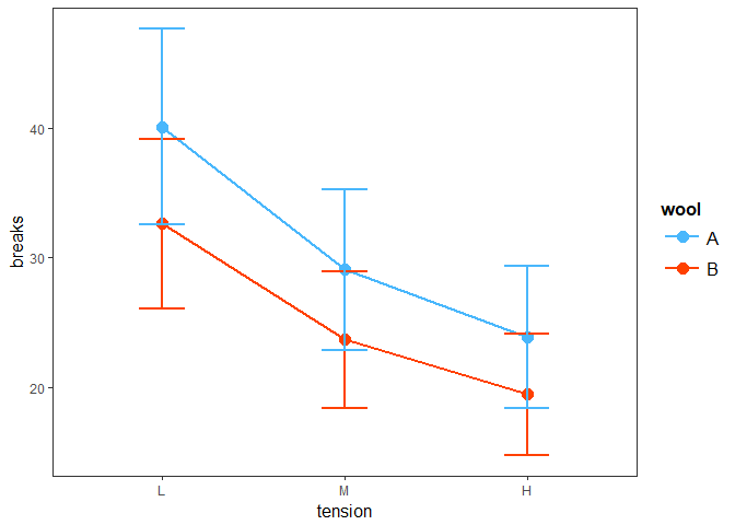
plot.points = TRUE:
cat_plot(poisson.model2, pred = tension, modx = wool, geom = "line", plot.points = TRUE)
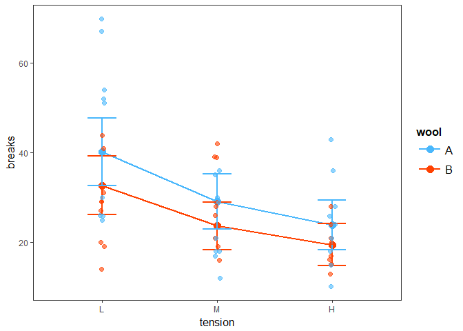
jtools documentation here.Poisson Regression Modeling Using Rate Data
offset() in R.eba1977 from the ISwR package to model Poisson Regression Model for rate data. First, we'll install the package:
# install.packages("ISwR")library(ISwR)
## Warning: package 'ISwR' was built under R version 3.4.4
data(eba1977)
cancer.data = eba1977
cancer.data[1:10, ]
# Description
# Lung cancer incidence in four Danish cities 1968-1971
# Description:
# This data set contains counts of incident lung cancer cases and
# population size in four neighbouring Danish cities by age group.
# Format:
# A data frame with 24 observations on the following 4 variables:
# city a factor with levels Fredericia, Horsens, Kolding, and Vejle.
# age a factor with levels 40-54, 55-59, 60-64, 65-69,70-74, and 75+.
# pop a numeric vector, number of inhabitants.
# cases a numeric vector, number of lung cancer cases.
city age pop cases
1 Fredericia 40-54 3059 11
2 Horsens 40-54 2879 13
3 Kolding 40-54 3142 4
4 Vejle 40-54 2520 5
5 Fredericia 55-59 800 11
6 Horsens 55-59 1083 6
7 Kolding 55-59 1050 8
8 Vejle 55-59 878 7
9 Fredericia 60-64 710 11
10 Horsens 60-64 923 15
# find the log(n) of each value in 'pop' column. It is the third column
logpop = log(cancer.data[ ,3])

# add the log values to the dataframe using 'cbind()'
new.cancer.data = cbind(cancer.data, logpop)

# display new dataframe
new.cancer.data
city age pop cases logpop
1 Fredericia 40-54 3059 11 8.025843
2 Horsens 40-54 2879 13 7.965198
3 Kolding 40-54 3142 4 8.052615
4 Vejle 40-54 2520 5 7.832014
5 Fredericia 55-59 800 11 6.684612
6 Horsens 55-59 1083 6 6.987490
7 Kolding 55-59 1050 8 6.956545
8 Vejle 55-59 878 7 6.777647
9 Fredericia 60-64 710 11 6.565265
10 Horsens 60-64 923 15 6.827629
11 Kolding 60-64 895 7 6.796824
12 Vejle 60-64 839 10 6.732211
13 Fredericia 65-69 581 10 6.364751
14 Horsens 65-69 834 10 6.726233
15 Kolding 65-69 702 11 6.553933
16 Vejle 65-69 631 14 6.447306
17 Fredericia 70-74 509 11 6.232448
18 Horsens 70-74 634 12 6.452049
19 Kolding 70-74 535 9 6.282267
20 Vejle 70-74 539 8 6.289716
21 Fredericia 75+ 605 10 6.405228
22 Horsens 75+ 782 2 6.661855
23 Kolding 75+ 659 12 6.490724
24 Vejle 75+ 619 7 6.428105
offset().
poisson.model.rate < - glm(cases ~ city + age+ offset(logpop), family = poisson(link = "log"), data = cancer.data)

#display summary
summary(poisson.model.rate)
</code>Call:
glm(formula = cases ~ city + age + offset(logpop), family = poisson(link = "log"), data = cancer.data)
Deviance Residuals:
Min 1Q Median 3Q Max
-2.63573 -0.67296 -0.03436 0.37258 1.85267
Coefficients:
Estimate Std. Error z value Pr(>|z|)
(Intercept) -5.6321 0.2003 -28.125 < 2e-16 ***
cityHorsens -0.3301 0.1815 -1.818 0.0690 .
cityKolding -0.3715 0.1878 -1.978 0.0479 *
cityVejle -0.2723 0.1879 -1.450 0.1472
age55-59 1.1010 0.2483 4.434 9.23e-06 ***
age60-64 1.5186 0.2316 6.556 5.53e-11 ***
age65-69 1.7677 0.2294 7.704 1.31e-14 ***
age70-74 1.8569 0.2353 7.891 3.00e-15 ***
age75+ 1.4197 0.2503 5.672 1.41e-08 ***
---
Signif. codes: 0 ‘***’ 0.001 ‘**’ 0.01 ‘*’ 0.05 ‘.’ 0.1 ‘ ’ 1
(Dispersion parameter for poisson family taken to be 1)Null deviance: 129.908 on 23 degrees of freedom
Residual deviance: 23.447 on 15 degrees of freedom
AIC: 137.84
Number of Fisher Scoring iterations: 5
</code>
fitted(model) to return values fitted by the model. It returns outcomes using the training data on which the model is built. Let's give it a try:
fitted(poisson.model.rate)
1 2 3 4 5 6 7 8
10.954812 7.411803 7.760169 6.873215 8.615485 8.384458 7.798635 7.201421
9 10 11 12 13 14 15 16
11.609373 10.849479 10.092831 10.448316 12.187276 12.576313 10.155638 10.080773
17 18 19 20 21 22 23 24
11.672630 10.451942 8.461440 9.413988 8.960422 8.326004 6.731286 6.982287
predict() function, much like we did for our model of count data previously:
# create a test dataframe containing new values of variables
test.data = data.frame(city = "Kolding", age = "40-54", pop = 1000, logpop = log(1000))

# predict outcomes (responses) using 'predict()'
predicted.value < - predict(poisson.model.rate, test.data, type = "response")

# show predicted value
predicted.value
</code>[1] 2.469818Conclusion
glm(), and how to fit the data to the model to predict for a new dataset. Additionally, we looked at how to get more accurate standard errors in glm() using quasipoisson and saw some of the possibilities available for visualization with jtools.References