Tutorial: Find Dominant Colors in an Image through Clustering
Analyzing images with code can be difficult. How do you make your code "understand" the context of an image?
In general, the first step of analyzing images with AI is finding the dominant colors. In this tutorial, we're going to find dominant colors in images using matplotlib's imageclass. Finding dominant colors is also something you can do with third-party APIs, but we're going to build our own system for doing this so that we have total control over the process.
We will first look at converting an image into its component colors in the form of a matrix, and then perform k-means clustering on it to find the dominant colors.
Prerequisites
This tutorial assumes that you know basics of Python, but you don't need to have worked with images in Python before.
This tutorial is based on the following:
- Python version 3.6.5
- matplotlib version 2.2.3: to decode images and visualize dominant colors
- scipy version 1.1.0: to perform clustering that determines dominant colors
The packages matplotlib and scipy can be installed through a package manager — pip. You may want to install specific versions of packages in a virtual environment to make sure there are no clashes with dependencies of other projects you are working on.
pip install matplotlib==2.2.3
pip install scipy==1.1.0
Further, we analyze JPG images in this tutorial, the support for which is available only when you install an additional package, pillow.
pip install pillow==5.2.0Alternatively, you can just use a Jupyter notebook. The code for this tutorial was run on a Jupyter notebook in Anaconda version 1.8.7. These above packages are pre-installed in Anaconda.
import matplotlib
matplotlib.__version__'3.0.2'import PIL
PIL.__version__'5.3.0'import scipy
scipy.__version__'1.1.0'Decoding images
Images may have various extensions — JPG, PNG, TIFF are common. This post focuses on JPG images only, but the process for other image formats should not be very different. The first step in the process is to read the image.
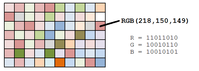
An image with a JPG extension is stored in memory as a list of dots, known as pixels. A pixel, or a picture element, represents a single dot in an image. The color of the dot is determined by a combination of three values — its three component colors (Red, Blue and Green). The color of the pixel is essentially a combination of these three component colors.

Image source: Datagenetics
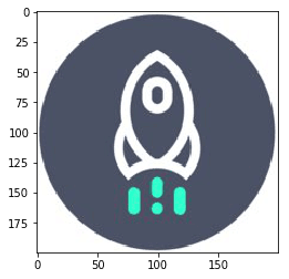
Let us use Dataquest's logo for the purpose of finding dominant colors in the image. You can download the image here.
To read an image in Python, you need to import the image class of matplotlib(documentation). The imread() method of the image class decodes an image into its RGB values. The output of the imread() method is an array with the dimensions M x N x 3, where M and N are the dimensions of the image.
from matplotlib import image as imgimage = img.imread('./dataquest.jpg')

image.shape(200, 200, 3)
You can use the imshow() method of matplotlib's pyplot class to display an image, which is in the form of a matrix of RGB values.
plt.show()
The matrix we get from the imread() method depends on the type of the image being read. For instance, PNG images would also include an element measuring a pixel's level of transparency. This post will only cover JPG images.
Before moving on to clustering the images, we need to perform an additional step. In the process of finding out the dominant colors of an image, we are not concerned about the position of the pixel. Hence, we need to convert the M x N x 3 matrix to three individual lists, which contain the respective red, blue and green values. The following snippet converts the matrix stored in image into three individual lists, each of length 40,000 (200 x 200).
r = []
g = []
b = []for line in image:
for pixel in line:
temp_r, temp_g, temp_b = pixel
r.append(temp_r)
g.append(temp_g)
b.append(temp_b)
The snippet above creates three empty lists, and then loops through each pixel of our image, appending the RGB values to our r, g, and b lists, respectively. If done correctly, each list wiill have a length of 40,000 (200 x 200).
Clustering Basics
Now that we have stored all of the component colors of our image, it is time to find the dominant colors. Let us now take a moment to understand the basics of clustering and how it is going to help us find the dominant colors in an image.
Clustering is a technique that helps in grouping similar items together based on particular attributes. We are going to apply k-means clustering to the list of three colors that we have just created above.
The colors at each cluster center will reflect the average of the attributes of all members of a cluster, and that will help us determine the dominant colors in the image.
How Many Dominant Colors?
Before we perform k-means clustering on the pixel data points, it might be good for us to figure out how many clusters are ideal for a given image, since not all images will have the same number of dominant colors.
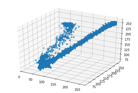
Since we are dealing with three variables for clustering — the Red, Blue and Green values of pixels — we can visualize these variables on three dimensions to understand how many dominant colors may exist.
To make a 3D plot in matplotlib, we will use the Axes3D() class (documentation). After initializing the axes using the Axes3D() class, we use the scatter method and use the three lists of color values as arguments.
from mpl_toolkits.mplot3d import Axes3Dfig = plt.figure()
ax = Axes3D(fig)
ax.scatter(r, g, b)
plt.show()
In the resultant plot, we can see that the distribution of points forms two elongated clusters. This is also supported by the fact that by looking at it, we can see that the image is primarily composed of two colors. Therefore, we will focus on creating two clusters in the next section.
First, though, we can probably guess that it's possible that a 3D plot may not yield distinct clusters for some images. Additionally, if we were using a PNG image, we would have a fourth agrument (each pixel's transparency value), which would make plotting in three dimensions impossible. In such cases, you may need to use the elbow method to determine the ideal number of clusters.
Perform Clustering in SciPy
In the previous step, we've determined that we'd like two clusters, and now we are ready to perform k-means clustering on the data. Let's create a Pandas data frame to easily manage the variables.
import pandas as pddf = pd.DataFrame({'red': r,
'blue': b,
'green': g})
There are essentially three steps involved in the process of k-means clustering with SciPy:
- Standardize the variables by dividing each data point by its standard deviation. We will use the
whiten()method of thevqclass. - Generate cluster centers using the
kmeans()method. - Generate cluster labels for each data point using the
vq()method of thevqclass.
The first step above ensures that the variations in each variable affects the clusters equally. Imagine two variables with largely different scales. If we ignore the first step above, the variable with the larger scale and variation would have a larger impact on the formation of clusters, thus making the process biased. We therefore standardize the variable using the whiten() function. The whiten() function takes one argument, a list or array of the values of a variable, and returns the standardized values. After standardization, we print a sample of the data frame. Notice that the variations in the columns has reduced considerably in the standardized columns.
from scipy.cluster.vq import whitendf['scaled_red'] = whiten(df['red'])
df['scaled_blue'] = whiten(df['blue'])
df['scaled_green'] = whiten(df['green'])
df.sample(n = 10)|
|
red
|
blue | green | scaled_red | scaled_blue | scaled_green |
|---|---|---|---|---|---|---|
| 24888 | 255 | 255 | 255 | 3.068012 | 3.590282 | 3.170015 |
| 38583 | 255 | 255 | 255 | 3.068012 | 3.590282 | 3.170015 |
| 2659 | 67 | 91 | 72 | 0.806105 | 1.281238 | 0.895063 |
| 36954 | 255 | 255 | 255 | 3.068012 | 3.590282 | 3.170015 |
| 39967 | 255 | 255 | 255 | 3.068012 | 3.590282 | 3.170015 |
| 13851 | 75 | 101 | 82 | 0.902357 | 1.422033 | 1.019377 |
| 14354 | 75 | 101 | 82 | 0.902357 | 1.422033 | 1.019377 |
| 18613 | 75 | 100 | 82 | 0.902357 | 1.407954 | 1.019377 |
| 6719 | 75 | 100 | 82 | 0.902357 | 1.407954 | 1.019377 |
| 14299 | 71 | 104 | 82 | 0.854231 | 1.464272 | 1.019377 |
The next step is to perform k-means clustering with the standardized columns. We will use the kmeans() function of perform clustering. The kmeans() function (documentation) has two required arguments — the observations and the number of clusters. It returns two values — the cluster centers and the distortion. Distortion is the sum of squared distances between each point and its nearest cluster center. We will not be using distortion in this tutorial.
from scipy.cluster.vq import kmeanscluster_centers, distortion = kmeans(df[['scaled_red', 'scaled_green', 'scaled_blue']], 2)The final step in k-means clustering is generating cluster labels. However, in this exercise, we won't need to do that. We are only looking for the dominant colors, which are represented by the cluster centers.
Display Dominant Colors
We have performed k-means clustering and generated our cluster centers, so let's see what values they contain.
print(cluster_centers)[[2.94579782 3.1243935 3.52525635]
[0.91860119 1.05099931 1.4465091 ]]As you can see, the results we get are standardized versions of RGB values. To get the original color values we need to multiply them with their standard deviations.
We will display the colors in the form of a palette using the imshow() method of matplotlib's pyplot class. However, to display colors, imshow() needs the values of RGB in the range of 0 to 1, where 1 signifies 255 in our original scale of RGB values. We therefore must divide each RGB component of our cluster centers with 255 in order to get to a value between 0 to 1, and display them through the imshow() method.
Finally, we have one more consideration before we plot the colors using the imshow() function (documentation). The dimensions of the cluster centers are N x 3, where N is the number of clusters. imshow() is originally intended to display an A X B matrix of colors, so it expects a 3D array of dimentions A x B x 3 (three color elements for each block in the palette). Hence, we need to convert our N x 3 matrix to 1 x N x 3 matrix by passing the colors of the cluster centers as a list with a single element. For instance, if we stored our colors in colors we need to pass [colors] as an argument to imshow().
Let's explore the dominant colors in our image.
colors = []r_std, g_std, b_std = df[['red', 'green', 'blue']].std()for cluster_center in cluster_centers:
scaled_r, scaled_g, scaled_b = cluster_center
colors.append((
scaled_r * r_std / 255,
scaled_g * g_std / 255,
scaled_b * b_std / 255
))
plt.imshow([colors])
plt.show()
As expected, the colors seen in the image are quite similar to the prominent colors in the image that we started with. That said, you've probably noticed that the light blue color above doesn't actually appear in our source image. Remember, the cluster centers are the means all of of the RGB values of all pixels in each cluster. So, the resultant cluster center may not actually be a color in the original image, it is just the RBG value that's at the center of the cluster all similar looking pixels from our image.
Conclusion
In this post, we looked at a step by step implementation for finding the dominant colors of an image in Python using matplotlib and scipy. We started with a JPG image and converted it to its RGB values using the imread() method of the image class in matplotlib. We then performed k-means clustering with scipy to find the dominant colors. Finally, we displayed the dominant colors using the imshow() method of the pyplot class in matplotlib.
Want to learn more Python skills? Dataquest offers a full sequence of courses that can take you from zero to data scientist in Python. Sign up and start learning for free!