Project Tutorial: Predicting Indian IPO Listing Gains with TensorFlow
Speculation runs high when a company goes public and its shares hit the market. The company sets a price, investors subscribe, and on listing day the market decides whether that price was justified. For an investment firm trying to allocate capital across dozens of listings per year, guessing wrong repeatedly is expensive. Getting it right more often than a coin flip, consistently, is genuinely valuable.
In this project, we'll step into the role of a data scientist at an investment firm and build a deep learning classification model using TensorFlow to predict whether an Indian IPO will generate positive listing gains. Along the way, we'll explore the data, handle some stubborn outliers, scale our features, and evaluate how well the model generalizes to listings it's never seen.
What You'll Learn
By the end of this tutorial, you'll know how to:
- Explore and visualize a real-world financial dataset
- Identify and treat outliers using the IQR clipping method
- Scale features using MinMaxScaler before feeding them to a neural network
- Build and train a sequential deep learning model with TensorFlow and Keras
- Evaluate model performance and recognize the signs of overfitting
Before You Start
This project works best if you have some familiarity with Python, pandas, and basic machine learning concepts. If you're new to building models with TensorFlow, reviewing the Introduction to Deep Learning in TensorFlow course first will help.
You'll need pandas, matplotlib, seaborn, and TensorFlow installed. You can access the full project in the Dataquest app, and the solution notebook is available on GitHub Gist.
The Dataset
We're working with historical IPO data from the Indian market, originally sourced from MoneyControl. Each row represents a single IPO listing from 2010 to 2022, with the following features:
Issue_Size: The size of the IPO offeringSubscription_QIB: Subscription rate from Qualified Institutional Buyers (banks and large institutions)Subscription_HNI: Subscription rate from High Net Worth Individuals (larger retail investments, typically over $2,000)Subscription_RII: Subscription rate from Retail Individual Investors (smaller individual contributions)Subscription_Total: Total subscription rate across all investor typesIssue_Price: The IPO's listing priceListing_Gains_Percent: The percentage gain or loss on listing day (our source for the target variable)
Let's load everything up and take a look.
import numpy as np
import pandas as pd
import seaborn as sns
import matplotlib.pyplot as plt
import tensorflow as tf
from tensorflow import keras
from tensorflow.keras import layers
from sklearn.model_selection import train_test_split

df = pd.read_csv('Indian_IPO_Market_Data.csv')
display(df.head())
display(df.info())
display(df.describe())
Date IPOName Issue_Size Subscription_QIB Subscription_HNI \
0 03/02/10 Infinite Comp 189.80 48.44 106.02
1 08/02/10 Jubilant Food 328.70 59.39 51.95
2 15/02/10 Syncom Health 56.25 0.99 16.60
3 15/02/10 Vascon Engineer 199.80 1.12 3.65
4 19/02/10 Thangamayil 0.00 0.52 1.52
Subscription_RII Subscription_Total Issue_Price Listing_Gains_Percent
0 11.08 43.22 165 11.82
1 3.79 31.11 145 -84.21
2 6.25 5.17 75 17.13
3 0.62 1.22 165 -11.28
4 2.26 1.12 75 -5.20<class 'pandas.core.frame.DataFrame'>
RangeIndex: 319 entries, 0 to 318
Data columns (total 9 columns):
# Column Non-Null Count Dtype
--- ------ -------------- -----
0 Date 319 non-null object
1 IPOName 319 non-null object
2 Issue_Size 319 non-null float64
3 Subscription_QIB 319 non-null float64
4 Subscription_HNI 319 non-null float64
5 Subscription_RII 319 non-null float64
6 Subscription_Total 319 non-null float64
7 Issue_Price 319 non-null int64
8 Listing_Gains_Percent 319 non-null float64
dtypes: float64(6), int64(1), object(2)319 rows, 9 columns, no null values. Two columns are non-numeric (Date and IPOName) and everything else is already a number. That's a clean starting point, though 319 rows is a fairly small dataset for deep learning, and that's something we'll keep coming back to throughout the project.
Now let's look at the descriptive statistics.
       Issue_Size  Subscription_QIB  Subscription_HNI  Subscription_RII  \
count  319.000000        319.000000        319.000000        319.000000
mean  1192.859969         25.684138         70.091379          8.561599
std   2384.643786         40.716782        142.454416         14.508670
min      0.000000          0.000000          0.000000          0.000000
25%    169.005000          1.150000          1.255000          1.275000
50%    496.250000          4.940000          5.070000          3.420000
75%   1100.000000         34.635000         62.095000          8.605000
max  21000.000000        215.450000        958.070000        119.440000
The gap between mean and median for almost every column is large. Issue_Size has a mean of about 1,193 but a median of 496. Subscription_HNI has a mean of 70 but a median of just 5. That kind of divergence is an early signal that we have significant outliers pulling the means upward, and those outliers are going to need attention before we build the model.
Step 1: Creating the Classification Target Variable
Our raw target column, Listing_Gains_Percent, is continuous. We're going to convert it into a binary classification variable: 1 if the IPO listed with a gain (positive percentage), 0 if it didn't.
df['Listing_Gains_Profit'] = np.where(df['Listing_Gains_Percent'] > 0, 1, 0)
df['Listing_Gains_Profit'].value_counts(normalize=True)
1 0.545455
0 0.454545
Name: Listing_Gains_Profit, dtype: float64About 55% of IPOs in our dataset had positive listing gains and 45% didn't. That's a reasonably balanced split, which matters for classification. If one class dominated (say, 90% profitable), the model could just predict "profitable" every time and look accurate without learning anything meaningful about what actually predicts gains.
Now let's drop the columns we don't need.
df = df.drop(['Date', 'IPOName', 'Listing_Gains_Percent'], axis=1)
df.info()
<class 'pandas.core.frame.DataFrame'>
RangeIndex: 319 entries, 0 to 318
Data columns (total 7 columns):
# Column Non-Null Count Dtype
--- ------ -------------- -----
0 Issue_Size 319 non-null float64
1 Subscription_QIB 319 non-null float64
2 Subscription_HNI 319 non-null float64
3 Subscription_RII 319 non-null float64
4 Subscription_Total 319 non-null float64
5 Issue_Price 319 non-null int64
6 Listing_Gains_Profit 319 non-null int64
dtypes: float64(5), int64(2)Date and IPOName don't carry predictive signal for our purposes, and Listing_Gains_Percent has been replaced by our binary Listing_Gains_Profit column. We're left with 7 columns, all numeric.
Step 2: Exploratory Visualization
With our features defined, let's visualize the data before doing any cleaning.
# Target variable distribution
sns.countplot(x='Listing_Gains_Profit', data=df)
plt.title('Distribution of IPO Listing Profit Category')
plt.xlabel('Listing Profit (No=0, Yes=1)')
plt.ylabel('Frequency')
plt.show()

# Histograms for all features
df.hist(bins=30, figsize=(12, 10))
plt.show()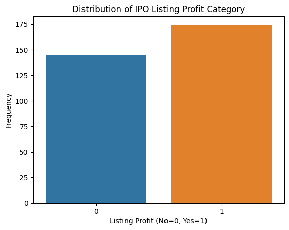
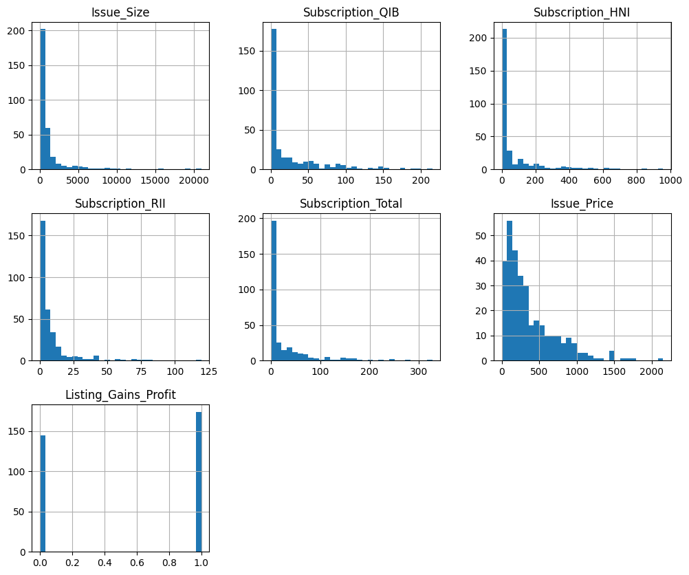
The count plot confirms our target variable is roughly balanced. The histograms tell a different story. Every numeric feature shows a right-skewed distribution with long tails, meaning there are a small number of very large values pulling the distribution rightward. Those are our outliers.
Box plots give us a clearer look at the problem.
for col in ['Issue_Size', 'Subscription_QIB', 'Subscription_HNI',
            'Subscription_RII', 'Subscription_Total', 'Issue_Price']:
    sns.boxplot(data=df, y=col)
    plt.title(f'Boxplot of {col}')
    plt.show()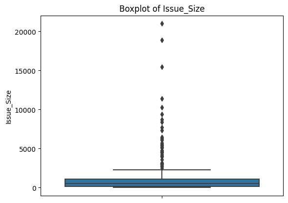
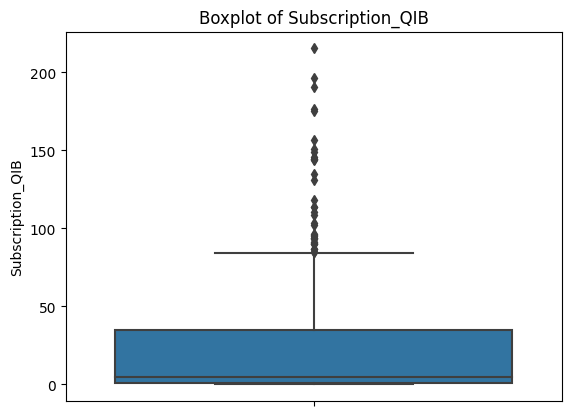
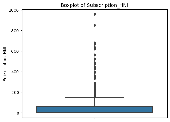
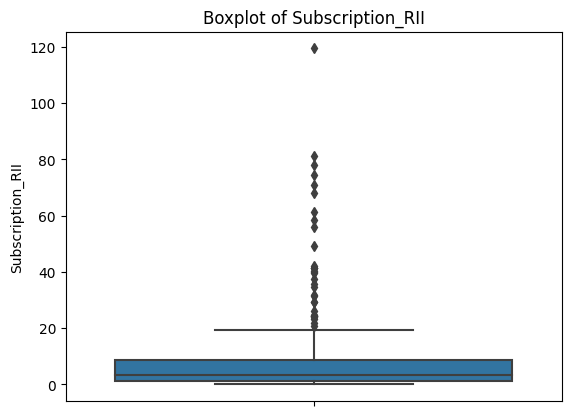
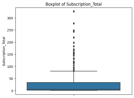
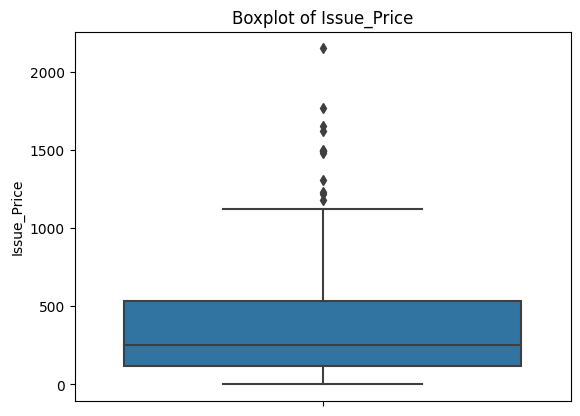
Each plot shows a compact box (where most of the data lives) with a dense cluster of dots above it. Those dots are all flagged as outliers by the IQR definition. This is consistent across every feature.
Before deciding how to handle them, it's worth checking whether the outliers are concentrated in one class of our target variable, since that could bias the model.
for col in ['Issue_Size', 'Subscription_QIB', 'Subscription_HNI',
            'Subscription_RII', 'Subscription_Total', 'Issue_Price']:
    sns.boxplot(data=df, x='Listing_Gains_Profit', y=col)
    plt.title(f'Boxplot of {col} with respect to Listing Gains Type')
    plt.xlabel('Listing Profit (No=0, Yes=1)')
    plt.show()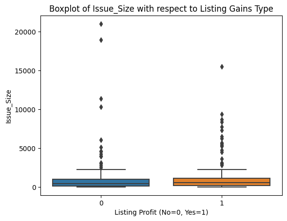
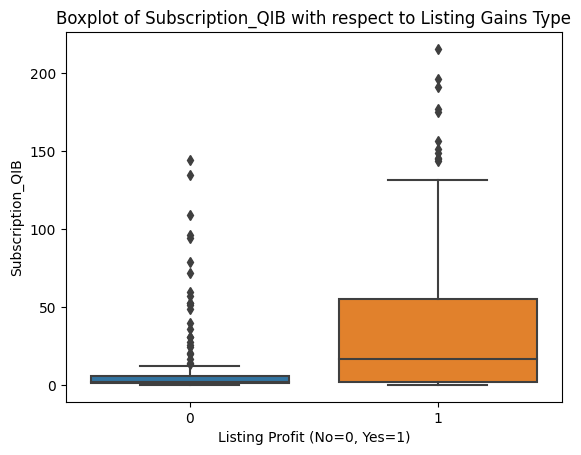
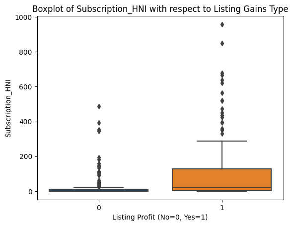
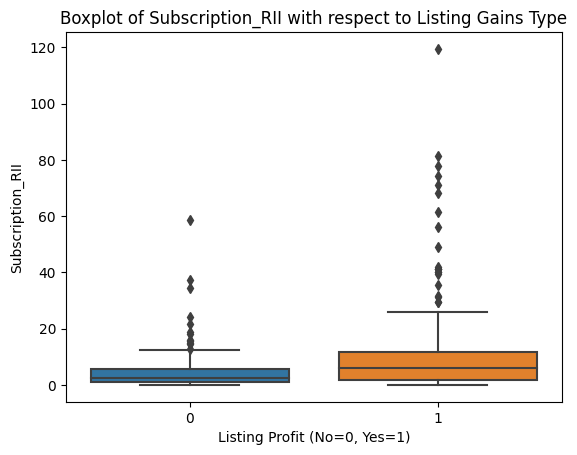
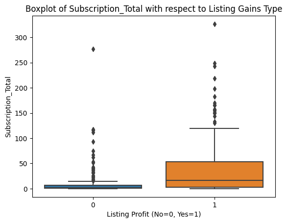
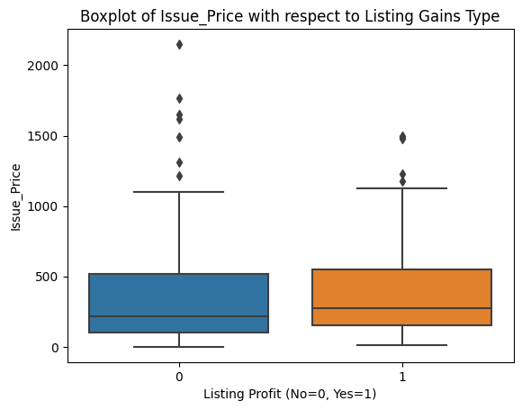
Outliers appear roughly evenly distributed across profitable and non-profitable listings for all features. That gives us confidence that a uniform outlier treatment won't inadvertently skew our model toward one class.
Let's also look at skewness and correlation.
print(df.skew())Issue_Size 4.853402
Subscription_QIB 2.143705
Subscription_HNI 3.078445
Subscription_RII 3.708274
Subscription_Total 2.911907
Issue_Price 1.696881
Listing_Gains_Profit -0.183438
dtype: float64Values well above 1.0 across the board. We'll revisit these numbers after cleaning.
correlations = df.corr()
sns.heatmap(correlations, cmap='Blues', annot=True)
plt.show()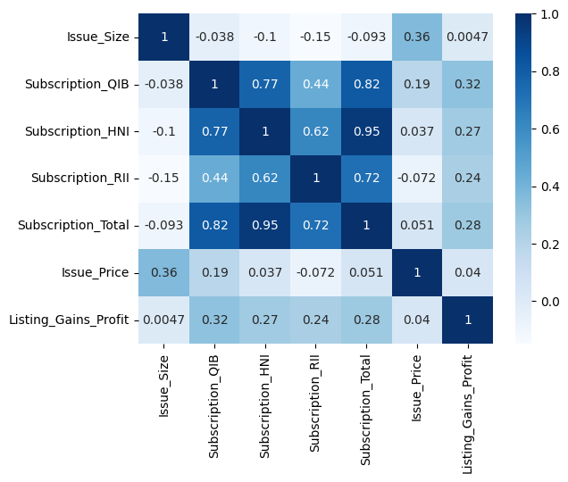
The correlation heatmap reveals two things worth noting. First, the subscription variables are strongly correlated with each other, especially Subscription_HNI and Subscription_Total (0.95). This makes intuitive sense: when high net worth investors are piling into an IPO, total subscription rates go up too. Second, Issue_Size shows near-zero correlation with our target variable. We're keeping it for now given how few features we have, but it's a candidate to experiment with removing.
independent_vars = df[['Issue_Size', 'Subscription_QIB', 'Subscription_HNI',
                        'Subscription_RII', 'Subscription_Total', 'Issue_Price']]
sns.pairplot(independent_vars, kind='scatter', plot_kws={'alpha': 0.4})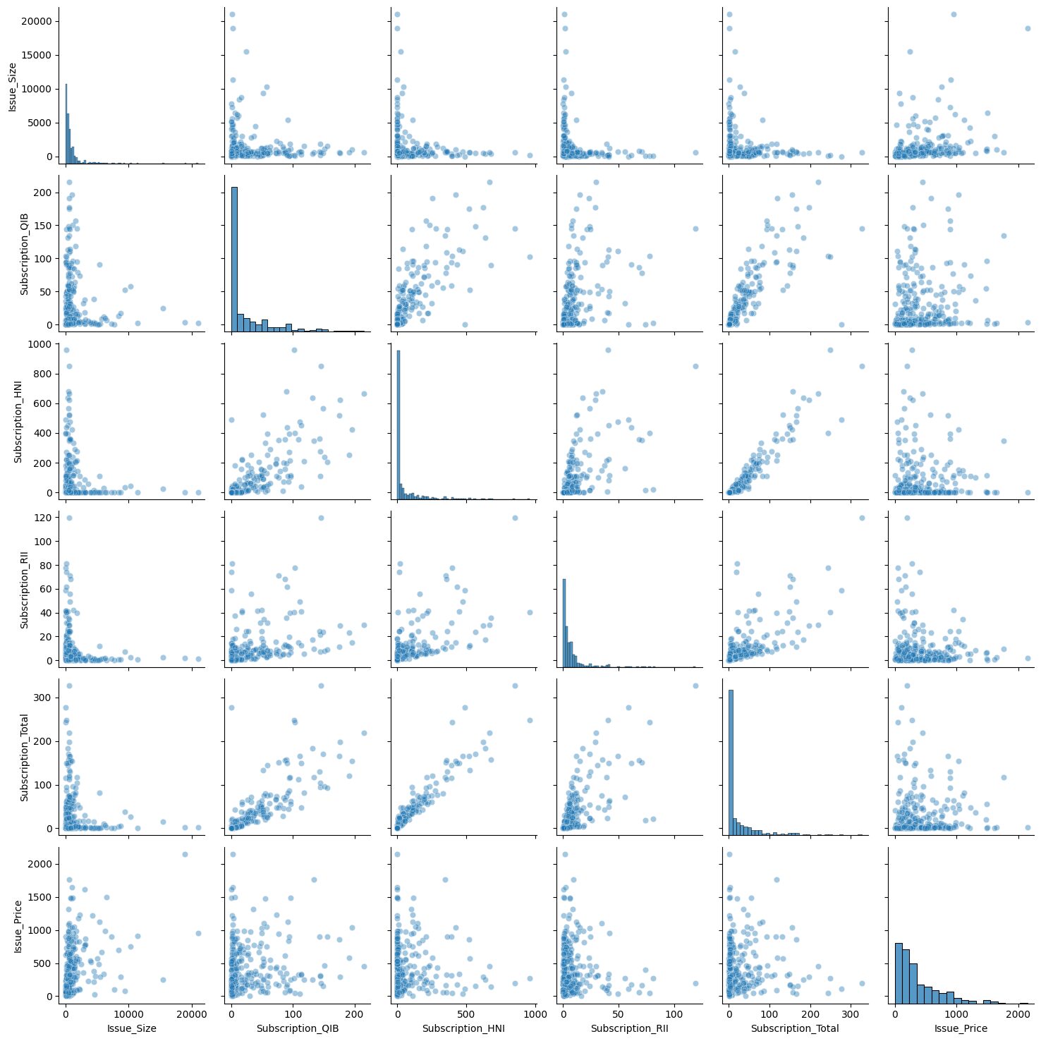
The pair plot visually confirms what the heatmap told us: the strongest pairwise relationship is between Subscription_HNI and Subscription_Total, which looks nearly linear in the scatter plot.
Learning Insight: The pair plot is one of those visualizations that takes a while to run but pays off. Running it on all variables at once gives you a bird's-eye view of pairwise relationships that you'd otherwise have to check manually. Just be careful with large datasets since the compute time scales quickly with the number of columns.
Step 3: Handling Outliers with IQR Clipping
We have a lot of outliers and only 319 rows. Removing them entirely would leave us with too little data to train on meaningfully. Instead, we'll use clipping: we calculate lower and upper IQR bounds, and any value outside those bounds gets replaced by the bound value. This acknowledges that extreme values exist without letting them dominate the model's calculations.
q1 = df['Issue_Size'].quantile(q=0.25)
q3 = df['Issue_Size'].quantile(q=0.75)
iqr = q3 - q1
lower = (q1 - 1.5 * iqr)
upper = (q3 + 1.5 * iqr)
print('IQR = ', iqr, '\nlower = ', lower, '\nupper = ', upper, sep='')

df['Issue_Size'] = df['Issue_Size'].clip(lower, upper)
df['Issue_Size'].describe()
IQR = 930.995
lower = -1227.4875000000002
upper = 2496.4925000000003
count 319.000000
mean 763.561238
std 769.689122
min 0.000000
25% 169.005000
50% 496.250000
75% 1100.000000
max 2496.492500The maximum value of Issue_Size is now exactly the upper bound we calculated (2,496.49), meaning all the extreme values above that threshold were clipped to it. We repeat this process for each of the other numeric features.
for col in ['Subscription_QIB', 'Subscription_HNI', 'Subscription_RII',
            'Subscription_Total']:
    q1 = df[col].quantile(q=0.25)
    q3 = df[col].quantile(q=0.75)
    iqr = q3 - q1
    lower = q1 - 1.5 * iqr
    upper = q3 + 1.5 * iqr
    df[col] = df[col].clip(lower, upper)
After clipping all features, let's check our skewness values again.
print(df.skew())Issue_Size 1.224620
Subscription_QIB 1.262734
Subscription_HNI 1.181636
Subscription_RII 1.129171
Subscription_Total 1.293880
Issue_Price 1.696881
Listing_Gains_Profit -0.183438
dtype: float64Before clipping, most features had skew values between 2 and 5. Now they're all in the 1.1 to 1.3 range. We still have some right skew, which is expected for financial data, but it's no longer extreme enough to seriously distort our model's calculations.
Step 4: Scaling and Splitting the Data
Deep learning models are built on matrix calculations, and those calculations can get unbalanced when features live on very different scales. A feature ranging from 0 to 21,000 will dominate gradient updates compared to one ranging from 0 to 5. MinMaxScaler solves this by compressing each feature to a 0-1 range.
from sklearn.preprocessing import MinMaxScaler

target = 'Listing_Gains_Profit'
predictors = df.drop(columns=[target]).columns

scaler = MinMaxScaler()
X_scaled = scaler.fit_transform(df[predictors])

X_scaled_df = pd.DataFrame(X_scaled, columns=predictors)
X_scaled_df.describe()
Issue_Size Subscription_QIB Subscription_HNI Subscription_RII \
count 319.000000 319.000000 319.000000 319.000000
mean 0.305854 0.253601 0.263157 0.309232
min 0.000000 0.000000 0.000000 0.000000
max 1.000000 1.000000 1.000000 1.000000Every feature now has a minimum of 0.0 and maximum of 1.0. Notice that we only scale the predictor variables, not the target. The target is already 0 or 1, so scaling it is unnecessary and would just make the output harder to interpret.
Now let's split into training and test sets.
X = X_scaled_df.values
y = df[target].values

X_train, X_test, y_train, y_test = train_test_split(X, y, test_size=0.30, random_state=42)

print(X_train.shape)
print(X_test.shape)
(223, 6)
(96, 6)We train on 223 rows and test on 96. With only 319 total examples, this is a lean dataset for deep learning. That's something to keep in mind when we interpret the results.
Step 5: Building the Deep Learning Model
With our data ready, we can build the model. We're using TensorFlow's Sequential API, which lets us stack layers one at a time in a straightforward pipeline: input goes in, passes through one or more hidden layers, and arrives at an output layer that makes the classification.
tf.random.set_seed(42)

model = tf.keras.Sequential()
model.add(tf.keras.layers.Dense(32, input_shape=(X_train.shape[1],), activation='relu'))
model.add(tf.keras.layers.Dense(1, activation='sigmoid'))

model.compile(
    optimizer=tf.keras.optimizers.Adam(0.001),
    loss=tf.keras.losses.BinaryCrossentropy(),
    metrics=['accuracy']
)

print(model.summary())
Model: "sequential"
_________________________________________________________________
Layer (type) Output Shape Param #
=================================================================
dense (Dense) (None, 32) 224
dense_1 (Dense) (None, 1) 33
=================================================================
Total params: 257
Trainable params: 257
Non-trainable params: 0
_________________________________________________________________A few things worth understanding about this architecture:
The first layer has 32 nodes and uses the ReLU activation function. ReLU converts any negative input to zero and passes positive values through unchanged. This introduces the non-linearity that lets the network learn patterns that a simple linear model can't.
The output layer has a single node with a sigmoid activation function. Sigmoid outputs a value between 0 and 1, which we interpret as the probability that the IPO will be profitable. Values closer to 1 indicate a predicted gain; values closer to 0 indicate a predicted loss.
Binary cross-entropy is the appropriate loss function for binary classification. It penalizes the model more heavily when it's confidently wrong than when it's uncertain.
The Adam optimizer handles how the model updates its weights after each pass through the data. The learning rate of 0.001 controls how large those updates are.
Learning Insight: None of this code has touched our data yet. The
Sequential()call creates the model architecture, andcompile()specifies the training process. The actual learning happens in the next step when we callmodel.fit(). Keeping these stages conceptually separate, define, compile, fit, evaluate, makes it much easier to debug when something goes wrong.
Step 6: Training the Model
model.fit(X_train, y_train, epochs=250)Epoch 1/250
7/7 [==============================] - 0s 8ms/step - loss: 0.6687 - accuracy: 0.5695
Epoch 2/250
7/7 [==============================] - 0s 1ms/step - loss: 0.6626 - accuracy: 0.5740
...
Epoch 250/250
7/7 [==============================] - 0s 1ms/step - loss: 0.5968 - accuracy: 0.6861Setting epochs=250 tells the model to pass through the training data 250 times, adjusting its weights after each pass to reduce the loss. At epoch 1, accuracy is around 57%, barely better than a coin flip. By epoch 250, training accuracy has climbed to about 69%.
You'll notice accuracy doesn't improve in a perfectly smooth line. It fluctuates, sometimes stalling for many epochs, occasionally dipping. This is normal. The model is exploring the weight space, and not every adjustment is an improvement. The overall trend is what matters.
Step 7: Evaluating the Model
Let's see how the model performs on data it was trained on versus data it's never seen.
model.evaluate(X_train, y_train)7/7 [==============================] - 0s 2ms/step - loss: 0.5966 - accuracy: 0.6906
[0.5965526103973389, 0.6905829310417175]model.evaluate(X_test, y_test)3/3 [==============================] - 0s 2ms/step - loss: 0.6285 - accuracy: 0.6458
[0.628541886806488, 0.6458333134651184]Training accuracy: 69%. Test accuracy: 64.6%. The gap between those two numbers is the story here.
A model that performs similarly on training and test data is generalizing well. The ~5 percentage point drop we see is modest and within an acceptable range. For context, if training accuracy were 90%+ but test accuracy were 64%, that would signal severe overfitting: the model memorized the training examples rather than learning generalizable patterns.
Learning Insight: With only 319 rows of training data, deep learning is working at a disadvantage. Neural networks typically shine with larger datasets because more examples expose the model to more patterns, making it harder to overfit. The relatively modest accuracy we see here is largely a reflection of data constraints, not a flaw in the approach. This is a good case study in understanding when deep learning is and isn't the right tool for the job.
Step 8: Comparing with Simpler Models
It's useful to benchmark against simpler classifiers to put our neural network's performance in context.
from sklearn.linear_model import LogisticRegression
from sklearn.ensemble import RandomForestClassifier
from sklearn.metrics import accuracy_score

# Logistic Regression
clf = LogisticRegression()
clf.fit(X_train, y_train)
y_pred = clf.predict(X_test)
print(f"Logistic Regression: {accuracy_score(y_test, y_pred):.4f}")

# Random Forest
rf = RandomForestClassifier(n_estimators=100, random_state=42)
rf.fit(X_train, y_train)
y_pred = rf.predict(X_test)
print(f"Random Forest: {accuracy_score(y_test, y_pred):.4f}")
Logistic Regression: 0.6875
Random Forest: 0.6354Logistic regression actually edges out our neural network at 68.75% compared to 64.58%. Random forest lands at 63.5%. All three models are in a similar range.
This is a healthy reminder that deep learning isn't automatically better. On small, structured datasets, simpler models like logistic regression often perform comparably, and sometimes better, because they have fewer parameters to overfit. Deep learning's advantages tend to emerge at scale and with unstructured data like images, text, and audio.
Next Steps
There's a lot of room to extend this project:
Hyperparameter tuning. Experiment with the number of layers and nodes in your network, the learning rate, and the number of epochs. Even small changes to training length can affect whether the model overfits.
Feature engineering. The correlation heatmap showed that Issue_Size has nearly zero correlation with the target. Try removing it and see whether the model improves. You could also try creating interaction features, for example, multiplying Subscription_HNI by Subscription_Total to capture combined subscription pressure.
Different optimizers and loss functions. The Adam optimizer with binary cross-entropy is a sensible default, but other optimizers like RMSprop or SGD behave differently. Worth experimenting with, especially on a small dataset where default choices may not be optimal.
More data. If you can source a larger IPO dataset, the neural network is likely to show more of its potential. The data size limitation here is real, and a bigger training set is the most reliable path to better generalization.
Resources
- Project in the Dataquest app
- Solution notebook on GitHub Gist
- Introduction to Deep Learning in TensorFlow course
- Dataquest Community Forum
Share your extensions in the community forum and tag @Anna_strahl. There are many directions this project can go, and experimenting with the architecture and features is exactly what makes a deep learning project worth putting in a portfolio.