Explore Happiness Data Using Python Pivot Tables
One of the biggest challenges when facing a new data set is knowing where to start and what to focus on. Being able to quickly summarize hundreds of rows and columns can save you a lot of time and frustration. A simple tool you can use to achieve this is a pivot table, which helps you slice, filter, and group data at the speed of inquiry and represent the information in a visually appealing way.
Pivot table, what is it good for?
You may already be familiar with the concept of pivot tables from Excel, where they were introduced in 1994 by the trademarked name PivotTable. This tool enabled users to automatically sort, count, total, or average the data stored in one table. In the image below we used the PivotTable functionality to quickly summarize the Titanic data set. The larger table below displays the first ~30 rows of the data set, and the smaller tables are the PivotTables we created.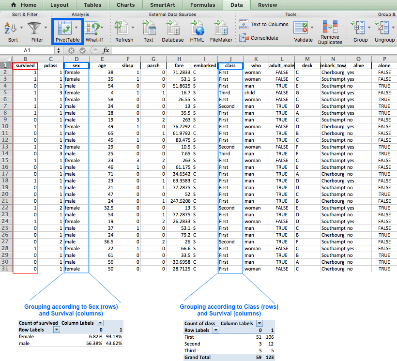
The pivot table on the left grouped the data according to the Sex and Survived column. As a result, this table displays the percentage of each gender among the different survival status (0: Didn’t survive, 1: Survived). This allows us to quickly see that women had better chances of survival than men. The table on the right also uses the Survived column, but this time the data is grouped by Class.
Introducing our data set: World Happiness Report
We used Excel for the above examples, but this post will demonstrate the advantages of the built-in pandas function pivot_table built in function in Pandas. We'll use the World Happiness Report, which is a survey about the state of global happiness. The report ranks more than 150 countries by their happiness levels, and has been published almost every year since 2012. We'll use data collected in the years 2015, 2016, and 2017, which is available for download if you'd like to follow along. We're running python 3.6 and pandas 0.19.Some interesting questions we might like to answer are:
- Which are the happiest and least happy countries and regions in the world?
- Is happiness affected by region?
- Did the happiness score change significantly over the past three years?
import pandas as pd
import numpy as np
# reading the data
data = pd.read_csv('data.csv', index_col=0)
# sort the df by ascending years and descending happiness scores
data.sort_values(['Year', "Happiness Score"], ascending=[True, False], inplace=True)
#diplay first 10 rows
data.head(10)Happiness Score is calculated by summing the seven other variables in the table. Each of these variables reveals a population-weighted average score on a scale running from 0 to 10, that is tracked over time and compared against other countries.
These variables are:
Economy: real GDP per capitaFamily: social supportHealth: healthy life expectancyFreedom: freedom to make life choicesTrust: perceptions of corruptionGenerosity: perceptions of generosityDystopia: each country is compared against a hypothetical nation that represents the lowest national averages for each key variable and is, along with residual error, used as a regression benchmark
Happiness Score determines its Happiness Rank - which is its relative position among other countries in that specific year. For example, the first row indicates that Switzerland was ranked the happiest country in 2015 with a happiness score of 7.587. Switzerland was ranked first just before Iceland, which scored 7.561. Denmark was ranked third in 2015, and so on. It's interesting to note that Western Europe took seven of the top eight rankings in 2015.
We’ll concentrate on the final Happiness Score to demonstrate the technical aspects of pivot table.
# getting an overview of our data
print("Our data has {0} rows and {1} columns".format(data.shape[0], data.shape[1]))
# checking for missing values
print("Are there missing values? {}".format(data.isnull().any().any()))
data.describe()
Our data has 495 rows and 12 columns
Are there missing values? TrueHappiness Rank ranges from 1 to 158, which means that the largest number of surveyed countries for a given year was 158. It's worth noting that Happiness Rank was originally of type int. The fact it's displayed as a float here implies we have NaN values in this column (we can also determine this by the count row which only amounts to 470 as opposed to the 495 rows in our data set).
The Year column doesn’t have any missing values. Firstly, because it’s displayed in the data set as int, but also - the count for Year amounts to 495 which is the number of rows in our data set. By comparing the count value for Year to the other columns, it seems we can expect 25 missing values in each column (495 in Year VS. 470 in all other columns).
Categorizing the data by Year and Region
The fun thing about pandas pivot_table is you can get another point of view on your data with only one line of code. Most of the pivot_table parameters use default values, so the only mandatory parameters you must add are data and index. Though it isn't mandatory, we'll also use the value parameter in the next example.
datais self explanatory - it's the DataFrame you'd like to useindexis the column, grouper, array (or list of the previous) you'd like to group your data by. It will be displayed in the index column (or columns, if you're passing in a list)values(optional) is the column you'd like to aggregate. If you do not specify this then the function will aggregate all numeric columns.
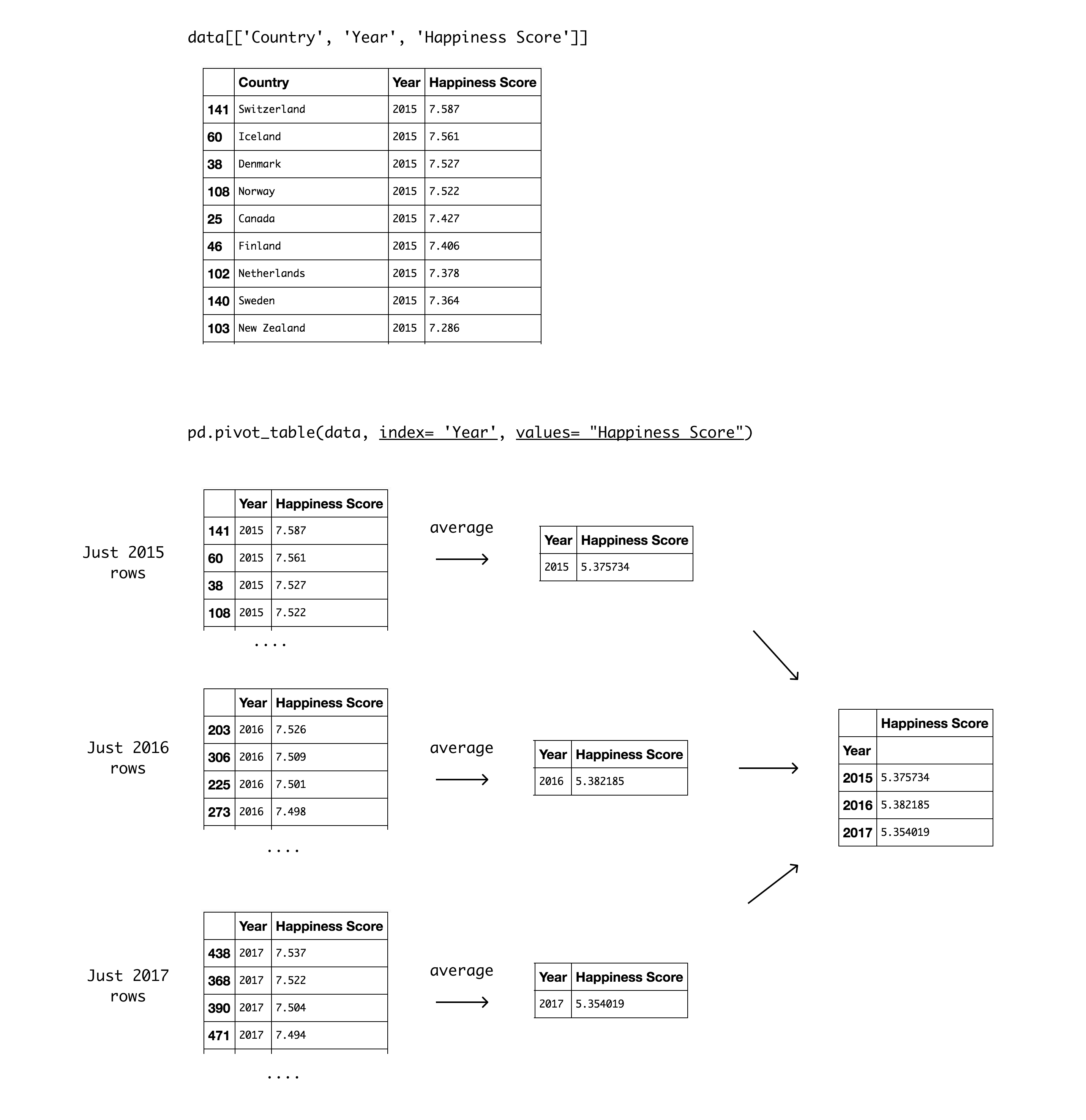
pd.pivot_table(data, index= 'Year', values= "Happiness Score")Year as the index parameter, we chose to group our data by Year. The output is a pivot table that displays the three different values for Year as index, and the Happiness Score as values. It's worth noting that the aggregation default value is mean (or average), so the values displayed in the Happiness Score column are the yearly average for all countries. The table shows the average for all countries was highest in 2016, and is currently the lowest in the past three years.
Here’s a detailed diagram of how this pivot table was created:
Next, let’s use the Region column as index:
pd.pivot_table(data, index = 'Region', values="Happiness Score")Happiness Score column in the pivot table above are the mean, just as before - but this time it's each region's mean for all years documented (2015, 2016, 2017). This display makes it easier to see Australia and New Zealand have the highest average score, while North America is ranked close behind. It's interesting that despite the initial impression we got from reading the data, which showed Western Europe in most of the top places, Western Europe is actually ranked third when calculating the average for the past three years. The lowest ranked region is Sub-Saharan Africa, and close behind is Southern Asia.
Creating a multi-index pivot table
You may have usedgroupby() to achieve some of the pivot table functionality (we've previously demonstrated how to use groupby() to analyze your data). However, the pivot_table() built-in function offers straightforward parameter names and default values that can help simplify complex procedures like multi-indexing.
In order to group the data by more than one column, all we have to do is pass in a list of column names. Let’s categorize the data by Region and Year.
pd.pivot_table(data, index = ['Region', 'Year'], values="Happiness Score")This is one way to look at the data, but we can use the columns parameter to get a better display:
columnsis the column, grouper, array, or list of the previous you'd like to group your data by. Using it will spread the different values horizontally.
Year as the Columns argument will display the different values for year, and will make for a much better display, like so:
pd.pivot_table(data, index= 'Region', columns='Year', values="Happiness Score")Visualizing the pivot table using plot()
If you want to look at the visual representation of the previous pivot table we created, all you need to do is add plot() at the end of the pivot_table function call (you'll also need to import the relevant plotting libraries).
%matplotlib inline
import matplotlib.pyplot as plt
import seaborn as sns
# use Seaborn styles
sns.set()
pd.pivot_table(data, index= 'Region', columns= 'Year', values= "Happiness Score").plot(kind= 'bar')
plt.ylabel("Happiness Rank")<matplotlib.text.Text at 0x11b885630>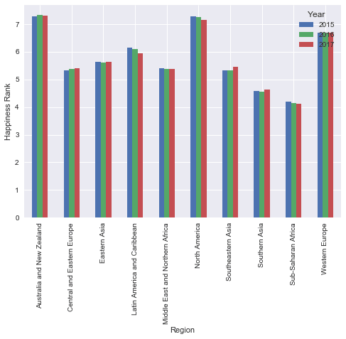
The visual representation helps reveal that the differences are minor. Having said that, this also shows that there’s a permanent decrease in the Happiness rank of both of the regions located in America.
Manipulating the data using aggfunc
Up until now we've used the average to get insights about the data, but there are other important values to consider. Time to experiment with the aggfunc parameter:
aggfunc(optional) accepts a function or list of functions you'd like to use on your group (default:numpy.mean). If a list of functions is passed, the resulting pivot table will have hierarchical columns whose top level are the function names.
pd.pivot_table(data, index= 'Region', values= "Happiness Score", aggfunc= [np.mean, np.median, min, max, np.std])Middle East and Northern Africa region have a high standard deviation, so we might want to remove extreme values. Let's see how many values we're calculating for each region. This might affect the representation we're seeing. For example, Australia and new Zealand have a very low standard deviation and are ranked happiest for all three years, but we can also assume they only account for two countries.
Applying a custom function to remove outliers
pivot_table allows you to pass your own custom aggregation functions as arguments. You can either use a lambda function, or create a function. Let's calculate the average number of countries in each region in a given year. We can do this easily using a lambda function, like so:
pd.pivot_table(data, index = 'Region', values="Happiness Score", aggfunc= [np.mean, min, max, np.std, lambda x: x.count()/3])Sub-Saharan Africa, on the other hand, has the lowest Happiness score, but it accounts for 43 countries. An interesting next step would be to remove extreme values from the calculation to see if the ranking changes significantly. Let's create a function that only calculates the values that are between the 0.25th and 0.75th quantiles. We'll use this function as a way to calculate the average for each region and check if the ranking stays the same or not.
def remove_outliers(values):
    mid_quantiles = values.quantile([.25, .75])
return np.mean(mid_quantiles)
pd.pivot_table(data, index = 'Region', values="Happiness Score", aggfunc= [np.mean, remove_outliers, lambda x: x.count()/3])Western Europe (average of 21 countries surveyed per year) improved its ranking. Unfortunately, Sub-Saharan Africa (average of 39 countries surveyed per year) received an even lower ranking when we removed the outliers.
Categorizing using string manipulation
Up until now we've grouped our data according to the categories in the original table. However, we can search the strings in the categories to create our own groups. For example, it would be interesting to look at the results by continents. We can do this by looking for region names that containsAsia, Europe, etc. To do this, we can first assign our pivot table to a variable, and then add our filter:
table = pd.pivot_table(data, index = 'Region', values="Happiness Score", aggfunc= [np.mean, remove_outliers])
table[table.index.str.contains('Asia')]Europe:
table[table.index.str.contains('Europe')]If you’d like to extract specific values from more than one column, then it’s better to use df.query because the previous method won’t work for conditioning multi-indexes. For example, we can choose to view specific years, and specific regions in the Africa area.
table = pd.pivot_table(data, index = ['Region', 'Year'], values='Happiness Score',aggfunc= [np.mean, remove_outliers])
table.query('Year == [2015, 2017] and Region == ["Sub-Saharan Africa", "Middle East and Northern Africa"]')Handling missing data
We've covered the most powerful parameters ofpivot_table thus far, so you can already get a lot out of it if you go experiment using this method on your own project. Having said that, it's useful to quickly go through the remaining parameters (which are all optional and have default values). The first thing to talk about is missing values.
dropnais type boolean, and used to indicate you do not want to include columns whose entries are allNaN(default: True)fill_valueis type scalar, and used to choose a value to replace missing values (default: None).
NaN, but it's worth knowing that if we did pivot_table would drop them by default according to dropna definition.
We have been letting pivot_table treat our NaN’s according to the default settings. The fill_value default value is None so this means we didn’t replace missing values in our Data set. To demonstrate this we’ll need to produce a pivot table with NaN values. We can split the Happiness Score of each region into three quantiles, and check how many countries fall into each of the three quantiles (hoping at least one of the quantiles will have missing values in it).
To do this, we’ll use qcut(), which is a built-in pandas function that allows you to split your data into any number of quantiles you choose. For example, specifying pd.qcut(data[“Happiness Score”], 4) will result in four quantiles:
- 0-25%
- 25%-50%
- 50%-75%
- 75%-100%
# splitting the happiness score into 3 quantiles
score = pd.qcut(data["Happiness Score"], 4)
pd.pivot_table(data, index= ['Region', score], values= "Happiness Score", aggfunc= 'count').head(9)NaN. This isn't ideal because a count that equals NaN doesn't give us any useful information. It's less confusing to display 0, so let's substitute NaN by zeros using fill_value:
# splitting the happiness score into 3 quantiles
score = pd.qcut(data["Happiness Score"], 3)
pd.pivot_table(data, index= ['Region', score], values= "Happiness Score", aggfunc= 'count', fill_value= 0)Adding total rows/columns
The last two parameters are both optional and mostly useful to improve display:marginsis type boolean and allows you to add anallrow / columns, e.g. for subtotal / grand totals (Default False)margins_namewhich is type string and accepts the name of the row / column that will contain the totals when margins is True (default ‘All’)
# splitting the happiness score into 3 quantiles
score = pd.qcut(data['Happiness Score'], 3)
# creating a pivot table and only displaying the first 9 values
pd.pivot_table(data, index= ['Region', score], values= "Happiness Score", aggfunc= 'count', fill_value= 0, margins = True, margins_name= 'Total count')Let's summarize
If you're looking for a way to inspect your data from a different perspective thenpivot_table is the answer. It's easy to use, it's useful for both numeric and categorical values, and it can get you results in one line of code.
If you enjoyed digging into this data and you’re interested in investigating this further then we suggest adding survey results from previous years, and/or combining additional columns with countries information like: poverty, terror, unemployment, etc. Feel free to share your notebook, and enjoy your learning!
