Tutorial: Concatenation (Combining Data Tables) with Pandas and Python
You'd be hard pressed to find a data science project which doesn't require concatenation (combining multiple data sources together). Often times, data analysis calls for appending new rows to a table, pulling additional columns in, or in more complex cases, merging distinct tables on a common key. All of these tricks are handy to keep in your back pocket so disparate data sources don't get in the way of your analysis!
In this concatenation tutorial, we will walk through several methods of combining data using pandas. It's geared towards beginner to intermediate levels and will require knowledge on the fundamentals of the pandas DataFrame. Some prior understanding of SQL and relational databases will also come in handy, but is not required. We will walk through four different techniques (concatenate, append, merge, and join) while analyzing average annual labor hours for a handful of countries. We will also create a plot after every step so we visually understand the different results each data combination technique produces. As a bonus, you will leave this tutorial with insights about labor trends around the globe and a sweet looking set of graphs you can add to your portfolio!
We will play the role of a macroeconomic analyst at the Organization for Economic Cooperation and Development (OECD). The question we are trying to answer is simple but interesting: which countries have citizens putting in the longest work hours and how have these trends been changing over time? Unfortunately, the OECD has been collecting data for different continents and time periods separately. Our job is to first get all of the data into one place so we can run the necessary analysis.
Accessing the data set
Download tutorial data files here
We will use data from the OECD Employment and Labour Market Statistics database, which provides data on average annual labor hours for most developed countries dating back to 1950. Throughout the tutorial, I will refer to DataFrames and tables interchangeably. We will use a Jupyter Notebook in Python 3 (you are welcome to use any IDE (integrated development environment) you wish, but this tutorial will be easiest to follow along with in Jupyter). Once that's launched, let's import the pandas and matplotlib libraries, then use %matplotlb inline so Jupyter knows to display plots within the notebook cells. If any of the tools I mentioned sound unfamiliar, I'd recommend looking at Dataquest's getting started guide.
import pandas as pd
import matplotlib.pyplot as plt
%matplotlib inline
Next, we will use the pd.read_csv() function to open our first two data files. We will specify that the first column should be used as the row index by passing the argument index_col=0. Finally, we'll display what our initial tables look like.
north_america = pd.read_csv('./north_america_2000_2010.csv', index_col=0)
south_america = pd.read_csv('./south_america_2000_2010.csv', index_col=0)north_america| 2000 | 2001 | 2002 | 2003 | 2004 | 2005 | 2006 | 2007 | 2008 | 2009 | 2010 | |
|---|---|---|---|---|---|---|---|---|---|---|---|
| Country | |||||||||||
| Canada | 1779.0 | 1771.0 | 1754.0 | 1740.0 | 1760.0 | 1747 | 1745.0 | 1741.0 | 1735 | 1701.0 | 1703.0 |
| Mexico | 2311.2 | 2285.2 | 2271.2 | 2276.5 | 2270.6 | 2281 | 2280.6 | 2261.4 | 2258 | 2250.2 | 2242.4 |
| USA | 1836.0 | 1814.0 | 1810.0 | 1800.0 | 1802.0 | 1799 | 1800.0 | 1798.0 | 1792 | 1767.0 | 1778.0 |
| 2000 | 2001 | 2002 | 2003 | 2004 | 2005 | 2006 | 2007 | 2008 | 2009 | 2010 | |
|---|---|---|---|---|---|---|---|---|---|---|---|
| Country | |||||||||||
| Chile | 2263 | 2242 | 2250 | 2235 | 2232 | 2157 | 2165 | 2128 | 2095 | 2074 | 2069.6 |
After some observation, we find that rows are countries, columns are years, and cell values are the average annual hours worked per employee. As glorious as DataFrames are, they are still pretty hard to understand at a glance, so we're going to do some plotting using matplotlib's DataFrame.plot() method to create line graphs for our yearly labor trends.
north_america.plot()<matplotlib.axes._subplots.AxesSubplot at 0x2fc51a80f0>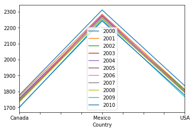
Woah, that's not what we wanted! By default, the DataFrame.plot() method treats rows as x axis labels, cell values as y axis labels, and columns as lines. The quick fix here is to pivot the axes on our DataFrame using the DataFrame.transpose() method. To make our visualizations compelte, we'll add a title using the title='string' parameter in the plot method. We can chain these methods together and then use plt.show() to neatly display our line graphs without the line of matplotlib text above the plot.
north_america.transpose().plot(title='Average Labor Hours Per Year')
plt.show()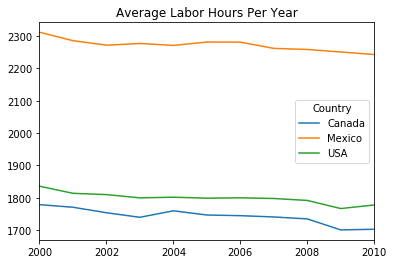
south_america.transpose().plot(title='Average Labor Hours Per Year')
plt.show()
Concatenating Americas data
It looks like we have three countries in the north_america DataFrame and one country in our south_america DataFrame. Since these are in two separate plots, it's hard to compare the average labor hours in South America versus North America. If we were able to get all the countries into the same data frame, it would be much easier to do this camparison.
For simple operations where we need to add rows or columns of the same length, the pd.concat() function is perfect. All we have to do is pass in a list of DataFrame objects in the order we would like them concatenated.
result = pd.concat([list of DataFrames], axis=0, join='outer', ignore_index=False)- axis: whether we will concatenate along rows (0) or columns (1)
- join: can be set to inner, outer, left, or right; explained in more detail later in this tutorial
- ignore_index: whether or not the original row labels from should be retained
In our case, we can leave all the default parameters how they are and just pass in our north_america and south_america DataFrames.
americas = pd.concat([north_america, south_america])
americas| 2000 | 2001 | 2002 | 2003 | 2004 | 2005 | 2006 | 2007 | 2008 | 2009 | 2010 | |
|---|---|---|---|---|---|---|---|---|---|---|---|
| Country | |||||||||||
| Canada | 1779.0 | 1771.0 | 1754.0 | 1740.0 | 1760.0 | 1747 | 1745.0 | 1741.0 | 1735 | 1701.0 | 1703.0 |
| Mexico | 2311.2 | 2285.2 | 2271.2 | 2276.5 | 2270.6 | 2281 | 2280.6 | 2261.4 | 2258 | 2250.2 | 2242.4 |
| USA | 1836.0 | 1814.0 | 1810.0 | 1800.0 | 1802.0 | 1799 | 1800.0 | 1798.0 | 1792 | 1767.0 | 1778.0 |
| Chile | 2263.0 | 2242.0 | 2250.0 | 2235.0 | 2232.0 | 2157 | 2165.0 | 2128.0 | 2095 | 2074.0 | 2069.6 |
This is looking like a good start, but we want our data to be as recent as possible. After requesting data on these four countries from later years, the data collection team sent us each year from 2011 to 2015 in separate CSV files as follows:[americas_2011.csv , americas_2012.csv, americas_2014.csv, americas_2015.csv]
Let's load in the new data using a for loop along with the string.format() method to automate the process a bit. We'll be putting our americas DataFrame from earlier in to a list named americas_dfs and appending each of these new DataFrames to that list. Finally, we will display the americas_2011 DataFrame using list indexing.
americas_dfs = [americas]
for year in range(2011, 2016):
    filename = "./americas_{}.csv".format(year)
    df = pd.read_csv(filename, index_col=0)
americas_dfs.append(df)
americas_dfs[1]| 2011 | |
|---|---|
| Country | |
| Canada | 1700.0 |
| Chile | 2047.4 |
| Mexico | 2250.2 |
| USA | 1786.0 |
One thing you might notice is the rows in the americas_2011 DataFrame we just printed are not in the same sequence as the americas DataFrame (pandas automatically alphabetized them). Luckily, the pd.concat() function joins data on index labels (countries, in our case), not sequence, so this won't pose an issue during concatenation. If we wanted to instead concatenate the rows in the order they are currently in, we could pass the argument ignore_index=True. This would result in the indexes being assigned a sequence of integers. It's also important to keep in mind we have to create the list of DataFrames in the order we would like them concatenated, otherwise our years will be out of chronological order.
We can't use the pd.concat() function exactly the same way we did last time, because now we are adding columns instead of rows. This is where axis comes into play. By default, the argument is set to axis=0, which means we are concatenating rows. This time, we will need to pass in axis=1 to indicate we want to concatenate columns. Remember, this will only work if all the tables have the same height (number of rows).
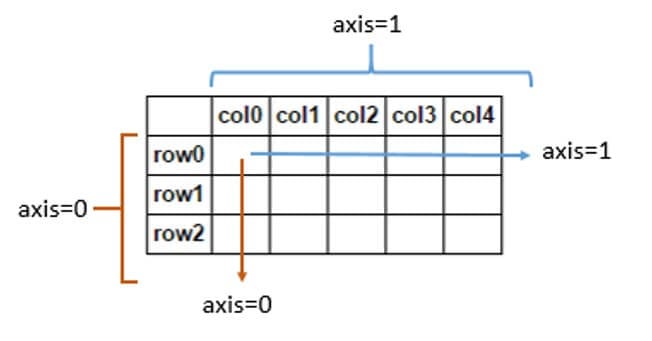
Source: Stack Overflow
One caveat to keep in mind when concatenating along axis 1 is the title for the row indexes, 'Country', will be dropped. This is because pandas isn't sure whether that title applies to the new row labels that have been added. We can easily fix this by assigning the DataFrame.index.names attribute. Afterwards, let's make another plot to see where we're at.
americas = pd.concat(americas_dfs, axis=1)
americas.index.names = ['Country']
americas| 2000 | 2001 | 2002 | 2003 | 2004 | 2005 | 2006 | 2007 | 2008 | 2009 | 2010 | 2011 | 2012 | 2013 | 2014 | 2015 | |
|---|---|---|---|---|---|---|---|---|---|---|---|---|---|---|---|---|
| Country | ||||||||||||||||
| Canada | 1779.0 | 1771.0 | 1754.0 | 1740.0 | 1760.0 | 1747 | 1745.0 | 1741.0 | 1735 | 1701.0 | 1703.0 | 1700.0 | 1713.0 | 1707.0 | 1703.0 | 1706.0 |
| Chile | 2263.0 | 2242.0 | 2250.0 | 2235.0 | 2232.0 | 2157 | 2165.0 | 2128.0 | 2095 | 2074.0 | 2069.6 | 2047.4 | 2024.0 | 2015.3 | 1990.1 | 1987.5 |
| Mexico | 2311.2 | 2285.2 | 2271.2 | 2276.5 | 2270.6 | 2281 | 2280.6 | 2261.4 | 2258 | 2250.2 | 2242.4 | 2250.2 | 2225.8 | 2236.6 | 2228.4 | 2246.4 |
| USA | 1836.0 | 1814.0 | 1810.0 | 1800.0 | 1802.0 | 1799 | 1800.0 | 1798.0 | 1792 | 1767.0 | 1778.0 | 1786.0 | 1789.0 | 1787.0 | 1789.0 | 1790.0 |
americas.transpose().plot(title='Average Labor Hours Per Year')
plt.show()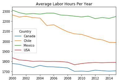
Appending data from other continents
Now that we've got a full view of the Americas, we we'd like to see how this compares to the rest of the world. The data collection team has provided CSV files for Asia, Europe, and the South Pacific for 2000 through 2015. Let's load these files in and have a preview. Since europe is a much taller table, we will utilize the DataFrame.head() method to save space by showing only the first 5 rows.
asia = pd.read_csv('./asia_2000_2015.csv', index_col=0)
asia| 2000 | 2001 | 2002 | 2003 | 2004 | 2005 | 2006 | 2007 | 2008 | 2009 | 2010 | 2011 | 2012 | 2013 | 2014 | 2015 | |
|---|---|---|---|---|---|---|---|---|---|---|---|---|---|---|---|---|
| Country | ||||||||||||||||
| Israel | 2017 | 1979 | 1993 | 1974 | 1942 | 1931 | 1919 | 1931 | 1929 | 1927 | 1918 | 1920 | 1910 | 1867 | 1853 | 1858 |
| Japan | 1821 | 1809 | 1798 | 1799 | 1787 | 1775 | 1784 | 1785 | 1771 | 1714 | 1733 | 1728 | 1745 | 1734 | 1729 | 1719 |
| Korea | 2512 | 2499 | 2464 | 2424 | 2392 | 2351 | 2346 | 2306 | 2246 | 2232 | 2187 | 2090 | 2163 | 2079 | 2124 | 2113 |
| Russia | 1982 | 1980 | 1982 | 1993 | 1993 | 1989 | 1998 | 1999 | 1997 | 1974 | 1976 | 1979 | 1982 | 1980 | 1985 | 1978 |
europe = pd.read_csv('./europe_2000_2015.csv', index_col=0)
europe.head()| 2000 | 2001 | 2002 | 2003 | 2004 | 2005 | 2006 | 2007 | 2008 | 2009 | 2010 | 2011 | 2012 | 2013 | 2014 | 2015 | |
|---|---|---|---|---|---|---|---|---|---|---|---|---|---|---|---|---|
| Country | ||||||||||||||||
| Austria | 1807.4 | 1794.6 | 1792.2 | 1783.8 | 1786.8 | 1764.0 | 1746.2 | 1736.0 | 1728.5 | 1673.0 | 1668.6 | 1675.9 | 1652.9 | 1636.7 | 1629.4 | 1624.9 |
| Belgium | 1595.0 | 1588.0 | 1583.0 | 1578.0 | 1573.0 | 1565.0 | 1572.0 | 1577.0 | 1570.0 | 1548.0 | 1546.0 | 1560.0 | 1560.0 | 1558.0 | 1560.0 | 1541.0 |
| Switzerland | 1673.6 | 1635.0 | 1614.0 | 1626.8 | 1656.5 | 1651.7 | 1643.2 | 1632.7 | 1623.1 | 1614.9 | 1612.4 | 1605.4 | 1590.9 | 1572.9 | 1568.3 | 1589.7 |
| Czech Republic | 1896.0 | 1818.0 | 1816.0 | 1806.0 | 1817.0 | 1817.0 | 1799.0 | 1784.0 | 1790.0 | 1779.0 | 1800.0 | 1806.0 | 1776.0 | 1763.0 | 1771.0 | 1779.0 |
| Germany | 1452.0 | 1441.9 | 1430.9 | 1424.8 | 1422.2 | 1411.3 | 1424.7 | 1424.4 | 1418.4 | 1372.7 | 1389.9 | 1392.8 | 1375.3 | 1361.7 | 1366.4 | 1371.0 |
south_pacific = pd.read_csv('./south_pacific_2000_2015.csv', index_col=0)
south_pacific| 2000 | 2001 | 2002 | 2003 | 2004 | 2005 | 2006 | 2007 | 2008 | 2009 | 2010 | 2011 | 2012 | 2013 | 2014 | 2015 | |
|---|---|---|---|---|---|---|---|---|---|---|---|---|---|---|---|---|
| Country | ||||||||||||||||
| Australia | 1778.7 | 1736.7 | 1731.7 | 1735.8 | 1734.5 | 1729.2 | 1720.5 | 1712.5 | 1717.2 | 1690 | 1691.5 | 1699.5 | 1678.6 | 1662.7 | 1663.6 | 1665 |
| New Zealand | 1836.0 | 1825.0 | 1826.0 | 1823.0 | 1830.0 | 1815.0 | 1795.0 | 1774.0 | 1761.0 | 1740 | 1755.0 | 1746.0 | 1734.0 | 1752.0 | 1762.0 | 1757 |
Pandas has a shortcut when you only want to add new rows called the DataFrame.append() method. The syntax is a little different - since it's a DataFrame method, we will use dot notation to call it on our americas object and then pass in the new objects as arguments.
result = DataFrame.append([DataFrame or list of DataFrames])It looks like these new DataFrames have all 16 years as their columns. If any columns were missing from the data we are trying to append, they would result in those rows having NaN values in the cells falling under the missing year columns. Let's run the append method and verify that all the countries have been sucesfully appended by printing DataFrame.index. Then we can plot a line graph to see what the new appended data looks like.
world = americas.append([asia, europe, south_pacific])
world.indexIndex(['Canada', 'Chile', 'Mexico', 'USA', 'Israel', 'Japan', 'Korea', 'Russia', 'Austria', 'Belgium', 'Switzerland', 'Czech Republic', 'Germany', 'Denmark', 'Spain', 'Estonia', 'Finland', 'France', 'United Kingdom', 'Greece', 'Hungary', 'Ireland', 'Iceland', 'Italy', 'Lithuania', 'Luxembourg', 'Latvia', 'Netherlands', 'Norway', 'Poland', 'Portugal', 'Slovak Republic', 'Slovenia', 'Sweden', 'Australia', 'New Zealand'], dtype='object', name='Country')world.transpose().plot(title='Average Labor Hours Per Year')
plt.show()
Customizing the visualization
The new DataFrame with all 36 countries is great but holy moly did it mess up our plot! Before moving on, see if you can spot the three things that are wrong with our visualization.
First, we will want to make our plot much larger so we can see all these new data points with higher fidelity. This is a pretty easy fix if we pass the figsize=(10,10) argument, the tuple specifies the dimensions of the plot figure. You might also have noticed there are 36 lines representing all our different countries, but the colors are repeating themselves. This is because the default colormap only contains 10 distinct colors, but we will need much more than that. I looked in the matplotlib colormaps documentation and decided to use the rainbow map, this can be passed in as colormap='rainbow'. Since we're making the graph bigger, I'd also like thicker lines so I'm setting linewidth=2.
Finally, we will tackle the legend overlapping onto our plot. This can be done with the plt.legend() function. We will pass in loc='right' to indicate we want the legend box to the right of the plot. You can test this out and see that it doesn't exactly line it up with the borders of the plot. We can do some fine tuning with the bbox_to_anchor=(1.3,0.5) argument; the tuple we pass in are coordinates of the legend box's position relative to the plot. I played around with the values until I found one that lines up, but feel free to modify any of these four arguments if you prefer a different aesthetic.
world.transpose().plot(figsize=(10,10), colormap='rainbow', linewidth=2, title='Average Labor Hours Per Year')
plt.legend(loc='right', bbox_to_anchor=(1.3, 0.5))
plt.show()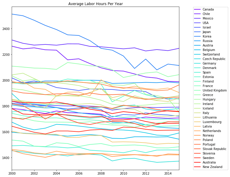
A primer on joins
For those with experience doing joins in relational databases like SQL, here's some good news: pandas has options for high performance in-memory merging and joining. When we need to combine very large DataFrames, joins serve as a powerful way to perform these operations swiftly.
A couple important things to keep in mind: joins can only be done on two DataFrames at a time, denoted as left and right tables. The key is the common column that the two DataFrames will be joined on. It's a good practice to use keys which have unique values throughout the column to avoid unintended duplication of row values.
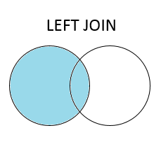
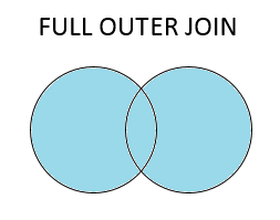
There are four basic ways to handle the join (inner, left, right, and outer), depending on which rows must retain their data. The venn diagrams below will help you visually understand these joins; think about the blue area as the portion of the key column which will be retained in the final table.
An inner join is the simplest join, this will only retain rows in which both tables share a key value.

A left join keeps all rows that occur in the primary (left) table, and the right table will only concatenate on rows where it shares a key value with the left. NaN values will be filled in for cells where the there's no matching key value.
A right join is the same concept as a left join, but keeps all rows occurring in the right table. The resulting DataFrame will have any potential NaN values on the left side.

Finally, a full outer join retains all rows occuring in both tables and NaN values can show up on either side of your resulting DataFrame.
Merging historical labor data
It's nice being able to see how the labor hours have shifted since 2000, but in order to see real trends emerge, we want to be able to see as much historical data as possible. The data collection team was kind enough to send data from 1950 to 2000, let's load it in and take a look.
historical = pd.read_csv('./historical.csv', index_col=0)
historical.head()| 1950 | 1951 | 1952 | 1953 | 1954 | 1955 | 1956 | 1957 | 1958 | 1959 | ... | 1990 | 1991 | 1992 | 1993 | 1994 | 1995 | 1996 | 1997 | 1998 | 1999 | |
|---|---|---|---|---|---|---|---|---|---|---|---|---|---|---|---|---|---|---|---|---|---|
| Country | |||||||||||||||||||||
| Australia | NaN | NaN | NaN | NaN | NaN | NaN | NaN | NaN | NaN | NaN | ... | 1779.5 | 1774.90 | 1773.70 | 1786.50 | 1797.60 | 1793.400 | 1782.700 | 1783.600 | 1768.40 | 1778.8 |
| Austria | NaN | NaN | NaN | NaN | NaN | NaN | NaN | NaN | NaN | NaN | ... | NaN | NaN | NaN | NaN | NaN | 1619.200 | 1637.150 | 1648.500 | 1641.65 | 1654.0 |
| Belgium | NaN | NaN | NaN | NaN | NaN | NaN | NaN | NaN | NaN | NaN | ... | 1662.9 | 1625.79 | 1602.72 | 1558.59 | 1558.59 | 1515.835 | 1500.295 | 1510.315 | 1513.33 | 1514.5 |
| Canada | NaN | NaN | NaN | NaN | NaN | NaN | NaN | NaN | NaN | NaN | ... | 1789.5 | 1767.50 | 1766.00 | 1764.50 | 1773.00 | 1771.500 | 1786.500 | 1782.500 | 1778.50 | 1778.5 |
| Switzerland | NaN | NaN | NaN | NaN | NaN | NaN | NaN | NaN | NaN | NaN | ... | NaN | 1673.10 | 1684.80 | 1685.80 | 1706.20 | 1685.500 | 1658.900 | 1648.600 | 1656.60 | 1678.4 |
5 rows × 50 columns
You'll notice there are a lot of NaN values, especially in the earlier years. This simply means that there was no data collected for those countries in the earlier years. Putting a 0 in those cells would be misleading, as it would imply that no one spent any hours working that year! Instead, NaN represents a null value, meaning "not a number". Having null values will not affect our DataFrame merging since we will use the row labels (index) as our key.
When merging, it's important to keep in mind which rows will be retained from each table. I'm not sure what the full dimensions of my tables are, so instead of displaying the whole thing, we can just look at facts we're interested in. Let's print the DataFrame.shape() attribute to see a tuple containing (total rows, total columns) for both tables.
print("World rows & columns: ", world.shape)
print("Historical rows & columns: ", historical.shape)
World rows & columns: (36, 16)Historical rows & columns: (39, 50)Note that the historical table has 39 rows, even though we are only analyzing 36 countries in our world table. Dropping the three extra rows can be automatically taken care of with some proper DataFrame merging. We will treat world as our primary table and want this to be on the right side of the resulting DataFrame and historical on the left, so the years (columns) stay in chronological order. The columns in these two tables are all distinct, that means we will have to find a key to join on. In this case, the key will be the row indexes (countries).
We will want to do a right join using the pd.merge() function and use the indexes as keys to join on.
result = pd.merge(left DataFrame, right DataFrame, left_index=False, right_index=False, how='inner')When using this function, the first two arguments will always be the left and right DataFrames, respectively. Then, we want to set left_index=True and right_index=True to specify that the indexes will be our key values and so we can retain the countries as row labels (pandas would otherwise change the row indexes to a sequence of integers.) Finally, we pass in how='right' to indicate a right join.
The right join will ensure we only keep the 36 rows from the right table and discard the extra 3 from the historical table. Let's print the shape of the resulting DataFrame and display the head to make sure everything turned out correct.
world_historical = pd.merge(historical, world, left_index=True, right_index=True, how='right')
print(world_historical.shape)
world_historical.head()(36, 66)| 1950 | 1951 | 1952 | 1953 | 1954 | 1955 | 1956 | 1957 | 1958 | 1959 | ... | 2006 | 2007 | 2008 | 2009 | 2010 | 2011 | 2012 | 2013 | 2014 | 2015 | |
|---|---|---|---|---|---|---|---|---|---|---|---|---|---|---|---|---|---|---|---|---|---|
| Country | |||||||||||||||||||||
| Canada | NaN | NaN | NaN | NaN | NaN | NaN | NaN | NaN | NaN | NaN | ... | 1745.0 | 1741.0 | 1735.0 | 1701.0 | 1703.0 | 1700.0 | 1713.0 | 1707.0 | 1703.0 | 1706.0 |
| Chile | NaN | NaN | NaN | NaN | NaN | NaN | NaN | NaN | NaN | NaN | ... | 2165.0 | 2128.0 | 2095.0 | 2074.0 | 2069.6 | 2047.4 | 2024.0 | 2015.3 | 1990.1 | 1987.5 |
| Mexico | NaN | NaN | NaN | NaN | NaN | NaN | NaN | NaN | NaN | NaN | ... | 2280.6 | 2261.4 | 2258.0 | 2250.2 | 2242.4 | 2250.2 | 2225.8 | 2236.6 | 2228.4 | 2246.4 |
| USA | 1960.0 | 1975.5 | 1978.0 | 1980.0 | 1970.5 | 1992.5 | 1990.0 | 1962.0 | 1936.5 | 1947.0 | ... | 1800.0 | 1798.0 | 1792.0 | 1767.0 | 1778.0 | 1786.0 | 1789.0 | 1787.0 | 1789.0 | 1790.0 |
| Israel | NaN | NaN | NaN | NaN | NaN | NaN | NaN | NaN | NaN | NaN | ... | 1919.0 | 1931.0 | 1929.0 | 1927.0 | 1918.0 | 1920.0 | 1910.0 | 1867.0 | 1853.0 | 1858.0 |
5 rows × 66 columns
A quicker way to join
Now that we've done it the hard way and understand table merging conceptually, let's try a more elegant technique. Pandas has a clean method to join on indexes which is perfect for our situation.
result = DataFrame.join([other DataFrame], how='inner', on=None)The DataFrame.join() method lets us use dot notation on our left table, then pass in the right table and how as an argument. This eliminates the need to specify the right and left index arguments like we did in the previous function. If on=None, the join key will be the row index. Let's observe how the nulls are affecting our analysis by taking a look at the DataFrame head.
world_historical = historical.join(world, how='right')world_historical.head()| 1950 | 1951 | 1952 | 1953 | 1954 | 1955 | 1956 | 1957 | 1958 | 1959 | ... | 2006 | 2007 | 2008 | 2009 | 2010 | 2011 | 2012 | 2013 | 2014 | 2015 | |
|---|---|---|---|---|---|---|---|---|---|---|---|---|---|---|---|---|---|---|---|---|---|
| Country | |||||||||||||||||||||
| Canada | NaN | NaN | NaN | NaN | NaN | NaN | NaN | NaN | NaN | NaN | ... | 1745.0 | 1741.0 | 1735.0 | 1701.0 | 1703.0 | 1700.0 | 1713.0 | 1707.0 | 1703.0 | 1706.0 |
| Chile | NaN | NaN | NaN | NaN | NaN | NaN | NaN | NaN | NaN | NaN | ... | 2165.0 | 2128.0 | 2095.0 | 2074.0 | 2069.6 | 2047.4 | 2024.0 | 2015.3 | 1990.1 | 1987.5 |
| Mexico | NaN | NaN | NaN | NaN | NaN | NaN | NaN | NaN | NaN | NaN | ... | 2280.6 | 2261.4 | 2258.0 | 2250.2 | 2242.4 | 2250.2 | 2225.8 | 2236.6 | 2228.4 | 2246.4 |
| USA | 1960.0 | 1975.5 | 1978.0 | 1980.0 | 1970.5 | 1992.5 | 1990.0 | 1962.0 | 1936.5 | 1947.0 | ... | 1800.0 | 1798.0 | 1792.0 | 1767.0 | 1778.0 | 1786.0 | 1789.0 | 1787.0 | 1789.0 | 1790.0 |
| Israel | NaN | NaN | NaN | NaN | NaN | NaN | NaN | NaN | NaN | NaN | ... | 1919.0 | 1931.0 | 1929.0 | 1927.0 | 1918.0 | 1920.0 | 1910.0 | 1867.0 | 1853.0 | 1858.0 |
5 rows × 66 columns
It looks like a lot of the rows have null values on the left side of the DataFrame, as we'd expect with a right join. Before plotting the final line graph, it's a good idea to sort our rows alphabetically to make the legend more easy to read for our viewers. This can be executed with the DataFrame.sort_index() method. We can pass in the parameter inplace=True to avoid having to reassign our world_historical variable. Then simply reuse the matplotlib code from our most recent vizualization to display our final sorted DataFrame.
world_historical.sort_index(inplace=True)
world_historical.transpose().plot(figsize=(15,10), colormap='rainbow', linewidth=2, title='Average Labor Hours Per Year')
plt.legend(loc='right', bbox_to_anchor=(1.15, 0.5))
plt.show()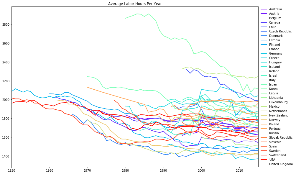
Putting it all together (pun intended)
Wow, our visualization is looking pretty impressive now that we've got a big colorful view of labor trends spanning more than half a century. It sure would be exhausting to be a Korean worker in the '80s!
To summarize:
pd.concat()function: the most multi-purpose and can be used to combine multiple DataFrames along either axis.DataFrame.append()method: a quick way to add rows to your DataFrame, but not applicable for adding columns.pd.merge()function: great for joining two DataFrames together when we have one column (key) containing common values.DataFrame.join()method: a quicker way to join two DataFrames, but works only off index labels rather than columns.
For a deeper dive on the techniques we worked with, take a look at the pandas merge, join, and concatenate guide.
Panda photo by Todorov.petar.p (Own work)
[CC BY-SA 4.0 (https://creativecommons.org/licenses/by-sa/4.0)]
via Wikimedia Commons
