How to Generate FiveThirtyEight Graphs in Python
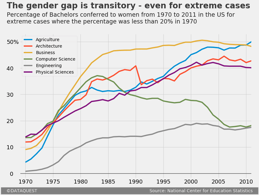
If you read data science articles, you may have already stumbled upon FiveThirtyEight's content. Naturally, you were impressed by their awesome visualizations. You wanted to make your own awesome visualizations and so asked Quora and Reddit how to do it. You received some answers, but they were rather vague. You still can't get the graphs done yourself. In this post, we'll help you. Using Python's matplotlib and pandas, we'll see that it's rather easy to replicate the core parts of any FiveThirtyEight (FTE) visualization. We'll start here: 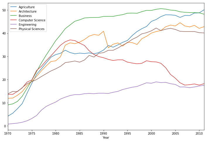
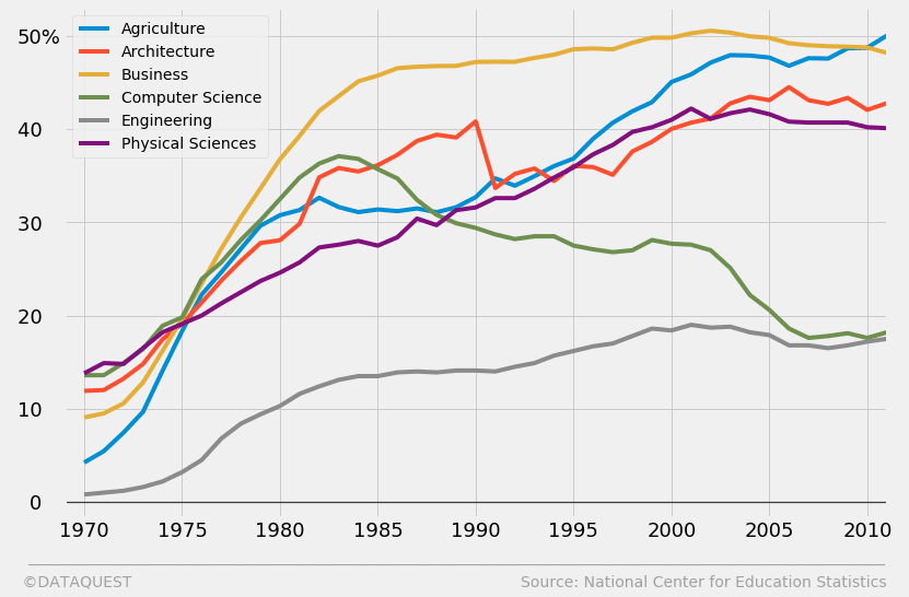
And, at the end of the tutorial, arrive here:
 To follow along, you'll need at least some basic knowledge of Python. If you know what's the difference between methods and attributes, then you're good to go.
Introducing the dataset
We'll work with data describing the percentages of Bachelors conferred to women in the US from 1970 to 2011. We'll use a dataset compiled by data scientist
Randal Olson, who collected the data from the National Center for Education Statistics. If you want to follow along by writing code yourself, you can download the data from Randal's blog. To save yourself some time, you can skip downloading the file, and just pass in the direct link to pandas' read_csv() function. In the following code cell, we:
- Import the pandas module.
- Assign the direct link toward the dataset as a
stringto a variable nameddirect_link. - Read in the data by using
read_csv(), and assign the content towomen_majors. - Print information about the dataset by using the
info()method. We're looking for the number of rows and columns, and checking for null values at the same time. - Show the first five rows to understand better the structure of the dataset by using the
head()method.
import pandas as pd
direct_link = 'https://www.randalolson.com/wp-content/uploads/percent-bachelors-degrees-women-usa.csv'
women_majors = pd.read_csv(direct_link)
print(women_majors.info())
women_majors.head()
RangeIndex: 42 entries, 0 to 41
Data columns (total 18 columns):
Year                             42 non-null int64
Agriculture                      42 non-null float64
Architecture                     42 non-null float64
Art and Performance              42 non-null float64
Biology                          42 non-null float64
Business                         42 non-null float64
Communications and Journalism    42 non-null float64
Computer Science                 42 non-null float64
Education                        42 non-null float64
Engineering                      42 non-null float64
English                          42 non-null float64
Foreign Languages                42 non-null float64
Health Professions               42 non-null float64
Math and Statistics              42 non-null float64
Physical Sciences                42 non-null float64
Psychology                       42 non-null float64
Public Administration            42 non-null float64
Social Sciences and History      42 non-null float64
dtypes: float64(17), int64(1)
memory usage: 6.0 KB
None
Besides the
Year column, every other column name indicates the subject of a Bachelor degree. Every datapoint in the Bachelor columns represents the percentage of Bachelor degrees conferred to women. Thus, every row describes the percentage for various Bachelors conferred to women in a given year. As mentioned before, we have data from 1970 to 2011. To confirm the latter limit, let's print the last five rows of the dataset by using the tail() method:
women_majors.tail()The context of our FiveThirtyEight graph
Almost every FTE graph is part of an article. The graphs complement the text by illustrating a little story, or an interesting idea. We'll need to be mindful of this while replicating our FTE graph. To avoid digressing from our main task in this tutorial, let's just pretend we've already written most of an article about the evolution of gender disparity in US education. We now need to create a graph to help readers visualize the evolution of gender disparity for Bachelors where the situation was really bad for women in 1970. We've already set a threshold of 20%, and now we want to graph the evolution for every Bachelor where the percentage of women graduates was less than 20% in 1970. Let's first identify those specific Bachelors. In the following code cell, we will:
- Use
.loc, a label-based indexer, to:- select the first row (the one that corresponds to 1970);
- select the items in the first row only where the values are less than 20; the
Yearfield will be checked as well, but will obviously not be included because 1970 is much greater than 20.
- Assign the resulting content to
under_20.
under_20 = women_majors.loc[0, women_majors.loc[0] < 20]
under_20
Agriculture           4.229798
Architecture         11.921005
Business              9.064439
Computer Science     13.600000
Engineering           0.800000
Physical Sciences    13.800000
Name: 0, dtype: float64
Using matplotlib's default style
Let's begin working on our graph. We'll first take a peek at what we can build by default. In the following code block, we will:
- Run the Jupyter magic
%matplotlibto enable Jupyter and matplotlib work together effectively, and addinlineto have our graphs displayed inside the notebook. - Plot the graph by using the
plot()method onwomen_majors. We pass in toplot()the following parameters:x- specifies the column fromwomen_majorsto use for the x-axis;y- specifies the columns fromwomen_majorsto use for the y-axis; we'll use the index labels ofunder_20which are stored in the.indexattribute of this object;figsize- sets the size of the figure as atuplewith the format(width, height)in inches.
- Assign the plot object to a variable named
under_20_graph, and print its type to show that pandas usesmatplotlibobjects under the hood.
%matplotlib inline
under_20_graph = women_majors.plot(x = 'Year', y = under_20.index, figsize = (12,8))
print('Type:', type(under_20_graph))
Type: <class 'matplotlib.axes._subplots.AxesSubplot'>
Using matplotlib's fivethirtyeight style
The graph above has certain characteristics, like the width and color of the spines, the font size of the y-axis label, the absence of a grid, etc. All of these characteristics make up matplotlib's default style. As a short parenthesis, it's worth mentioning that we'll use a few technical terms about the parts of a graph throughout this post. If you feel lost at any point, you can refer to the legend below.
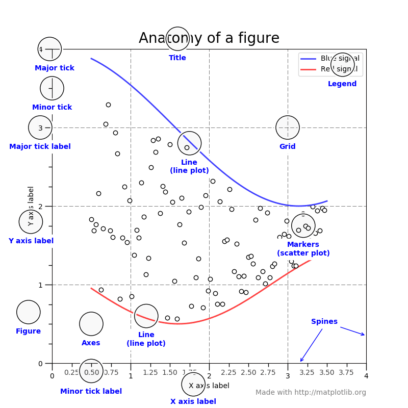
Source: Matplotlib.org
Besides the default style, matplotlib comes with several built-in styles that we can use readily. To see a list of the available styles, we will:
- Import the
matplotlib.stylemodule under the namestyle. - Explore the content of
matplotlib.style.available(a predefined variable of this module), which contains a list of all the available in-built styles.
import matplotlib.style as style
style.available
['seaborn-deep',
'seaborn-muted',
'bmh',
'seaborn-white',
'dark_background',
'seaborn-notebook',
'seaborn-darkgrid',
'grayscale',
'seaborn-paper',
'seaborn-talk',
'seaborn-bright',
'classic',
'seaborn-colorblind',
'seaborn-ticks',
'ggplot',
'seaborn',
'_classic_test',
'fivethirtyeight',
'seaborn-dark-palette',
'seaborn-dark',
'seaborn-whitegrid',
'seaborn-pastel',
'seaborn-poster']
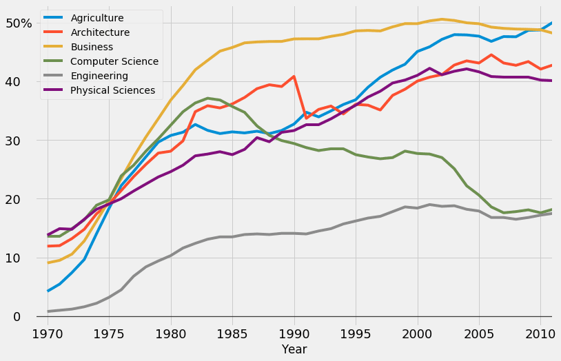
You might have already observed that there's a built-in style called fivethirtyeight. Let's use this style, and see where that leads. For that, we'll use the aptly named use() function from the same matplotlib.style module (which we imported under the name style). Then we'll generate our graph using the same code as earlier.
style.use('fivethirtyeight')
women_majors.plot(x = 'Year', y = under_20.index, figsize = (12,8))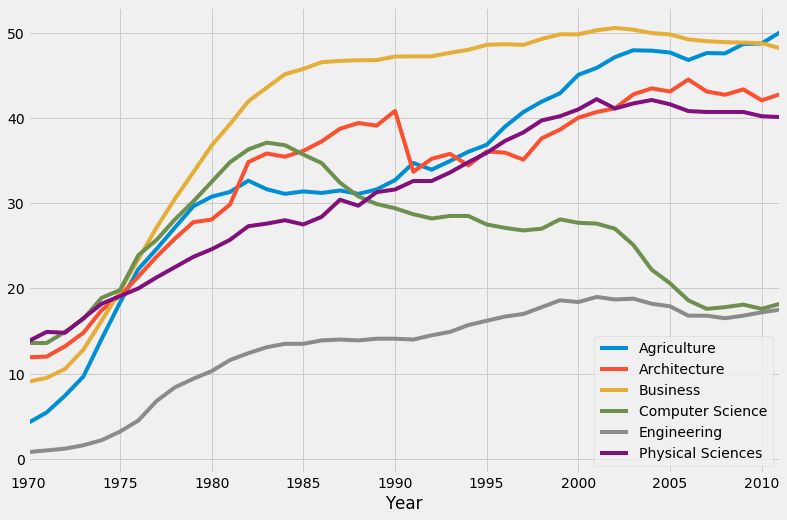 Wow, that's a major change! With respect to our first graph, we can see that this one has a different background color, it has grid lines, there are no spines whatsoever, the weight and the font size of the major tick labels are different, etc. You can read a technical description of the
 fivethirtyeight style here - it should also give you a good idea about what code runs under the hood when we use this style. The author of the style sheet, Cameron David-Pilon, discusses some of the characteristics here.
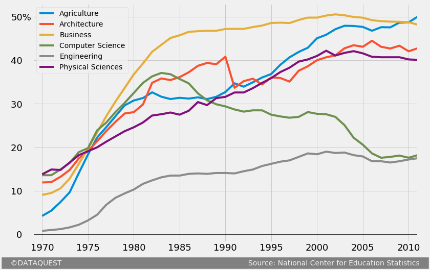
The limitations of matplotlib's fivethirtyeight style
All in all, using the
fivethirtyeight style clearly brings us much closer to our goal. Nonetheless, there's still a lot left to do. Let's examine a simple FTE graph, and see what else we need to add to our graph. 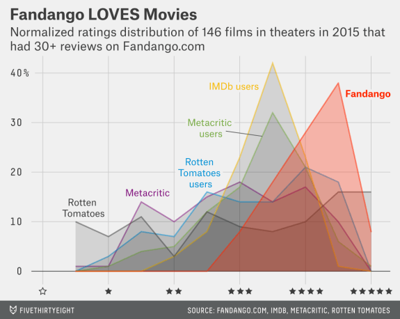
Source: FiveThirtyEight
By comparing the above graph with what we've made so far, we can see that we still need to:
- Add a title and a subtitle.
- Remove the block-style legend, and add labels near the relevant plot lines. We'll also have to make the grid lines transparent around these labels.
- Add a signature bottom bar which mentions the author of the graph and the source of the data.
- Add a couple of other small adjustments:
- increase the font size of the tick labels;
- add a "%" symbol to one of the major tick labels of the y-axis;
- remove the x-axis label;
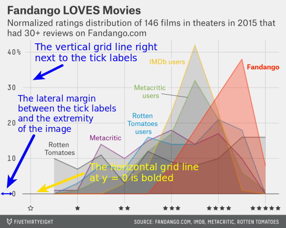
- bold the horizontal grid line at y = 0;
- add an extra grid line next to the tick labels of the y-axis;
- increase the lateral margins of the figure.
Source: FiveThirtyEight
To minimize the time spent with generating the graph, it's important to avoid beginning adding the title, the subtitle, or any other text snippet. In matplotlib, a text snippet is positioned by specifying the x and y coordinates, as we'll see in some of the sections below. To replicate in detail the FTE graph above, notice that we'll have to align vertically the tick labels of the y-axis with the title and the subtitle. We want to avoid a situation where we have the vertical alignment we want, lost it by increasing the font size of the tick labels, and then have to change the position of the title and subtitle again.

Source: FiveThirtyEight
For teaching purposes, we're now going to proceed incrementally with adjusting our FTE graph. Consequently, our code will span over multiple code cells. In practice, however, no more than one code cell will be required.
If you'd like to learn more about the Fandango movie rating controversy, check out this full project walkthrough.
Customizing the tick labels
We'll start by increasing the font size of the tick labels. In the following code cell, we:
- Plot the graph using the same code as earlier, and assign the resulting object to
fte_graph. Assigning to a variable allows us to repeatedly and easily apply methods on the object, or access its attributes. - Increase the font size of all the major tick labels using the
tick_params()method with the following parameters:axis- specifies the axis that the tick labels we want to modify belong to; here we want to modify the tick labels of both axes;which- indicates what tick labels to be affected (the major or the minor ones; see the legend shown earlier if you don't know the difference);labelsize- sets the font size of the tick labels.
fte_graph = women_majors.plot(x = 'Year', y = under_20.index, figsize = (12,8))
fte_graph.tick_params(axis = 'both', which = 'major', labelsize = 18)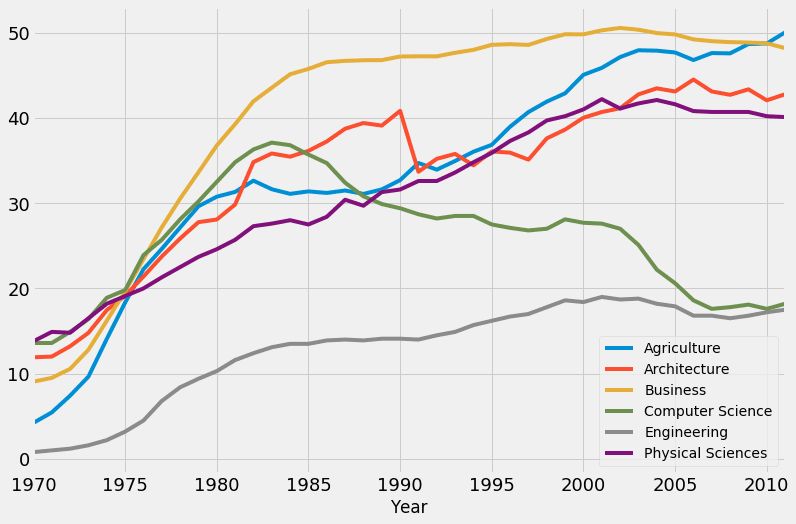 You may have noticed that we didn't use
 style.use('fivethirtyeight') this time. That's because the preference for any matplotlib style becomes global once it's first declared in our code. We've set the style earlier as fivethirtyeight, and from there on all subsequent graphs inherit this style. If for some reason you want to return to the default state, just run style.use('default'). We'll now build upon our previous changes by making a few adjustments to the tick labels of the y-axis:
- We add a "%" symbol to 50, the highest visible tick label of the y-axis.
- We also add a few whitespace characters after the other visible labels to align them elegantly with the new "50%" label.
To make these changes to the tick labels of the y-axis, we'll use the
set_yticklabels() method along with the label parameter. As you can deduce from the code below, this parameter can take in a list of mixed data types, and doesn't require any fixed number of labels to be passed in.
# The previous code
fte_graph = women_majors.plot(x = 'Year', y = under_20.index, figsize = (12,8))
fte_graph.tick_params(axis = 'both', which = 'major', labelsize = 18)

# Customizing the tick labels of the y-axis fte_graph.set_yticklabels(labels = [-10, '0   ', '10   ', '20   ', '30   ', '40   ', '50%'])
print('The tick labels of the y-axis:', fte_graph.get_yticks()) # -10 and 60 are not visible on the graph
The tick labels of the y-axis: [-10. 0. 10. 20. 30. 40. 50. 60.]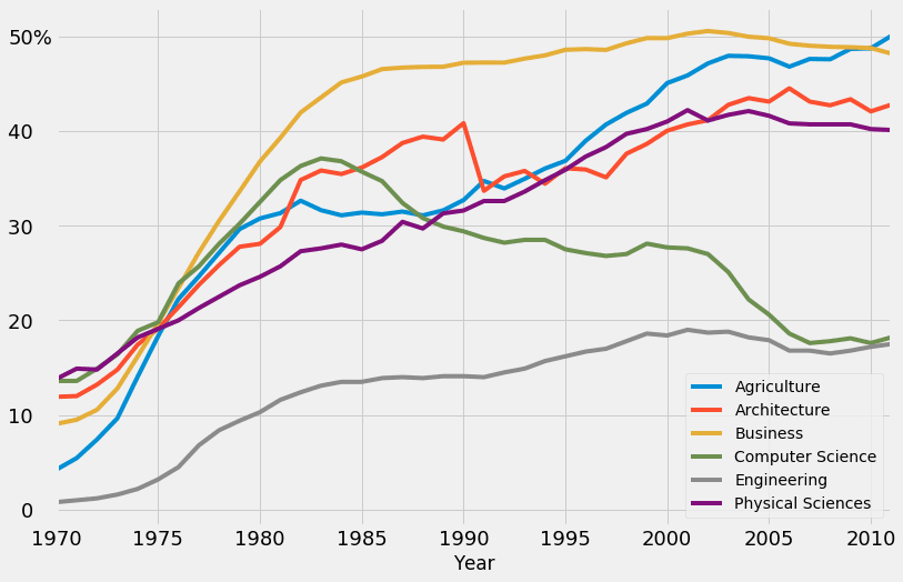
Bolding the horizontal line at y = 0
We will now bold the horizontal line where the y-coordinate is 0. For that, we'll use the
axhline() method to add a new horizontal grid line, and cover the existing one. The parameters we use for axhline() are:
y- specifies the y-coordinate of the horizontal line;color- indicates the color of the line;linewidth- sets the width of the line;alpha- regulates the transparency of the line, but we use it here to regulate the intensity of the black color; the values foralpharange from 0 (completely transparent) to 1 (completely opaque).
#
# The previous code
fte_graph = women_majors.plot(x = 'Year', y = under_20.index, figsize = (12,8))
fte_graph.tick_params(axis = 'both', which = 'major', labelsize = 18)
fte_graph.set_yticklabels(labels = [-10, '0   ', '10   ', '20   ', '30   ', '40   ', '50%'])

# Generate a bolded horizontal line at y = 0
fte_graph.axhline(y = 0, color = 'black', linewidth = 1.3, alpha = .7)

Add an extra vertical line
As we mentioned earlier, we have to add another vertical grid line in the immediate vicinity of the tick labels of the y-axis. For that, we simply tweak the range of the values of the x-axis. Increasing the range's left limit will result in the extra vertical grid line we want. Below, we use the
set_xlim() method with the self-explanatory parameters left and right.
# The previous code
fte_graph = women_majors.plot(x = 'Year', y = under_20.index, figsize = (12,8))
fte_graph.tick_params(axis = 'both', which = 'major', labelsize = 18)
fte_graph.set_yticklabels(labels = [-10, '0   ', '10   ', '20   ', '30   ', '40   ', '50%'])
fte_graph.axhline(y = 0, color = 'black', linewidth = 1.3, alpha = .7)

# Add an extra vertical line by tweaking the range of the x-axis
fte_graph.set_xlim(left = 1969, right = 2011)
Generating a signature bar
The signature bar of the example FTE graph presented above has a few obvious characteristics:
- It's positioned at the bottom of the graph.
- The author's name is located on the left side of the signature bar.
- The source of the data is mentioned on the right side of the signature bar.
- The text has a light grey color (the same as the background color of the graph), and a dark grey background.
- The area in-between the author's name and the source name has a dark grey background as well.

The image is posted again so you don't have to scroll back. Source: FiveThirtyEight
It may seem difficult to add such a signature bar, but with a little ingenuity we can get it done quite easily. We'll add a single snippet of text, give it a light grey color, and a background color of dark grey. We'll write both the author's name and the source in a single text snippet, but we'll space out these two such that one ends up on the far left side, and the other on the far right. The nice thing is that the whitespace characters will get a dark grey background as well, which will create the effect of a signature bar. We'll also use some white space characters to align the author's name and the name of the source, as you'll be able to see in the next code block. This is also a good moment to remove the label of the x-axis. This way, we can get a better visual sense of how the signature bar fits in the overall scheme of the graph. In the next code cell, we'll build up on what we've done so far, and we will:
- Remove the label of the x-axis by passing in a
Falsevalue to theset_visible()method we apply to the objectfte_graph.xaxis.label. Think of it this way: we access thexaxisattribute offte_graph, and then we access thelabelattribute offte_graph.xaxis. Then we finally applyset_visible()tofte_graph.xaxis.label. - Add a snippet of text on the graph in the way discussed above. We'll use the
text()method with the following parameters:x- specifies the x-coordinate of the text;y- specifies the y-coordinate of the text;s- indicates the text to be added;fontsize- sets the size of the text;color- specifies the color of the text; the format of the value we use below is hexadecimal; we use this format to match exactly the background color of the entire graph (as specified in the code of thefivethirtyeightstyle);backgroundcolor- sets the background color of the text snippet.
# The previous code
fte_graph = women_majors.plot(x = 'Year', y = under_20.index, figsize = (12,8))
fte_graph.tick_params(axis = 'both', which = 'major', labelsize = 18)
fte_graph.set_yticklabels(labels = [-10, '0   ', '10   ', '20   ', '30   ', '40   ', '50%'])
fte_graph.axhline(y = 0, color = 'black', linewidth = 1.3, alpha = .7)
fte_graph.set_xlim(left = 1969, right = 2011)

# Remove the label of the x-axis
fte_graph.xaxis.label.set_visible(False)

# The signature bar
fte_graph.text(x = 1965.8, y = -7,
    s = ' ©DATAQUEST Source: National Center for Education Statistics',fontsize = 14, color = '#f0f0f0', backgroundcolor = 'grey')
 The x and y coordinates of the text snippet added were found through a process of trial and error. You can pass in
 floats to the x and y parameters, so you'll be able to control the position of the text with a high level of precision. It's also worth mentioning that we tweaked the positioning of the signature bar in such a way that we added some visually refreshing lateral margins (we discussed this adjustment earlier). To increase the left margin, we simply lowered the value of the x-coordinate. To increase the right one, we added more whitespace characters between the author's name and the source's name - this pushes the source's name to the right, which results in adding the desired margin.
A different kind of signature bar
You'll also meet a slightly different kind of signature bar:
 Source: FiveThirtyEight This kind of signature bar can be replicated quite easily as well. We'll just add some grey colored text, and a line right above it. We'll create the visual effect of a line by adding a snippet of text of multiple underscore characters ("_"). You might wonder why we're not using
 axhline() to simply draw a horizontal line at the y-coordinate we want. We don't do that because the new line will drag down the entire grid of the graph, and this won't create the desired effect. We could also try adding an arrow, and then remove the pointer so we end up with a line. However, the "underscore" solution is much simpler. In the next code block, we implement what we've just discussed. The methods and parameters we use here should already be familiar from earlier sections.
# The previous code
fte_graph = women_majors.plot(x = 'Year', y = under_20.index, figsize = (12,8))
fte_graph.tick_params(axis = 'both', which = 'major', labelsize = 18)
fte_graph.set_yticklabels(labels = [-10, '0   ', '10   ', '20   ', '30   ', '40   ', '50%'])
fte_graph.axhline(y = 0, color = 'black', linewidth = 1.3, alpha = .7)
fte_graph.xaxis.label.set_visible(False)
fte_graph.set_xlim(left = 1969, right = 2011)

# The other signature bar
fte_graph.text(x = 1967.1, y = -6.5,
    s = '________________________________________________________________________________________________________________',
    color = 'grey', alpha = .7)

fte_graph.text(x = 1966.1, y = -9,
    s = '   ©DATAQUEST                                                                               Source: National Center for Education Statistics   ',
    fontsize = 14, color = 'grey', alpha = .7)
Adding a title and subtitle
If you examine
a couple of FTE graphs, you may notice these patterns with regard to the title and the subtitle:
- The title is almost invariably complemented by a subtitle.
- The title gives a contextual angle to look from at a particular graph. The title is almost never technical, and it usually expresses a single, simple idea. It's also almost never emotionally-neutral. In the Fandango graph above, we can see a simple, "emotionally-active" title ("Fandango LOVES Movies"), and not a bland "The distribution of various movie rating types".
- The subtitle offers technical information about the graph. This information is what makes axis labels redundant oftentimes. We should be careful to customize our subtitle accordingly since we've already dropped the x-axis label.
- Visually, the title and the subtitle have different font weights, and they are left-aligned (unlike most titles, which are centered). Also, they are aligned vertically with the major tick labels of the y-axis, as we showed earlier.
Let's now add a title and a subtitle to our graph while being mindful of the above observations. In the code block below, we'll build upon what we've coded so far, and we will:
- Add a title and a subtitle by using the same
text()method we used to add text in the signature bar. If you already have some experience with matplotlib, you might wonder why we don't use thetitle()andsuptitle()methods. This is because these two methods have an awful functionality with regard to moving text with precision. The only new parameter fortext()isweight. We use it to bold the title.
# The previous code
fte_graph = women_majors.plot(x = 'Year', y = under_20.index, figsize = (12,8))
fte_graph.tick_params(axis = 'both', which = 'major', labelsize = 18)
fte_graph.set_yticklabels(labels = [-10, '0   ', '10   ', '20   ', '30   ', '40   ', '50%'])
fte_graph.axhline(y = 0, color = 'black', linewidth = 1.3, alpha = .7)
fte_graph.xaxis.label.set_visible(False)
fte_graph.set_xlim(left = 1969, right = 2011)
fte_graph.text(x = 1965.8, y = -7,
    s = '   ©DATAQUEST                                                                                 Source: National Center for Education Statistics   ',
    fontsize = 14, color = '#f0f0f0', backgroundcolor = 'grey')

# Adding a title and a subtitle
fte_graph.text(x = 1966.65, y = 62.7, s = "The gender gap is transitory - even for extreme cases",
               fontsize = 26, weight = 'bold', alpha = .75)
fte_graph.text(x = 1966.65, y = 57,
               s = 'Percentage of Bachelors conferred to women from 1970 to 2011 in the US for\nextreme cases where the percentage was less than 20% in 1970',
              fontsize = 19, alpha = .85)
 In case you were wondering, the font used in the original FTE graphs is Decima Mono, a paywalled font. For this reason, we'll stick with Matplotlib's default font, which looks pretty similar anyway.
Adding colorblind-friendly colors
Right now, we have that clunky, rectangular legend. We'll get rid of it, and add colored labels near each plot line. Each line will have a certain color, and a word of an identical color will name the Bachelor which that line corresponds to. First, however, we'll modify the default colors of the plot lines, and add colorblind-friendly colors:
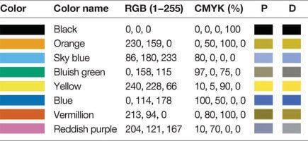
Source: Points of View: Color blindness by Bang Wong
We'll compile a list of RGB parameters for colorblind-friendly colors by using values from the above image. As a side note, we avoid using yellow because text snippets with that color are not easily readable on the graph's dark grey background color. After compiling this list of RGB parameters, we'll then pass it to the
color parameter of the plot() method we used in our previous code. Note that matplotlib will require the RGB parameters to be within a 0-1 range, so we'll divide every value by 255, the maximum RGB value. We won't bother dividing the zeros because 0/255 = 0.
# Colorblind-friendly colors
colors = [[0,0,0], [230/255,159/255,0], [86/255,180/255,233/255], [0,158/255,115/255],
          [213/255,94/255,0], [0,114/255,178/255]]

# The previous code we modify
fte_graph = women_majors.plot(x = 'Year', y = under_20.index, figsize = (12,8), color = colors)

# The previous code that remains the same
fte_graph.tick_params(axis = 'both', which = 'major', labelsize = 18)
fte_graph.set_yticklabels(labels = [-10, '0   ', '10   ', '20   ', '30   ', '40   ', '50%'])
fte_graph.axhline(y = 0, color = 'black', linewidth = 1.3, alpha = .7)
fte_graph.xaxis.label.set_visible(False)
fte_graph.set_xlim(left = 1969, right = 2011)
fte_graph.text(x = 1965.8, y = -7,
    s = '   ©DATAQUEST                                                                                 Source: National Center for Education Statistics   ',
    fontsize = 14, color = '#f0f0f0', backgroundcolor = 'grey')
fte_graph.text(x = 1966.65, y = 62.7, s = "The gender gap is transitory - even for extreme cases",
               fontsize = 26, weight = 'bold', alpha = .75)
fte_graph.text(x = 1966.65, y = 57,
               s = 'Percentage of Bachelors conferred to women from 1970 to 2011 in the US for\nextreme cases where the percentage was less than 20% in 1970',
              fontsize = 19, alpha = .85)
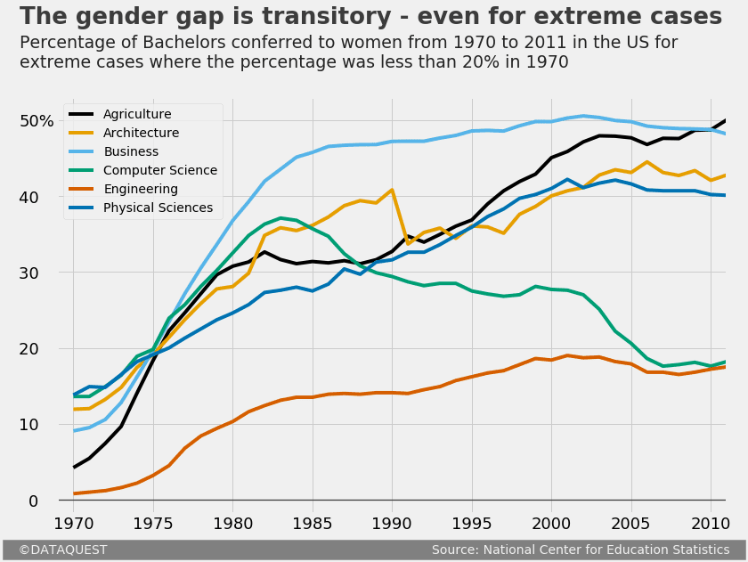
Changing the legend style by adding colored labels
Finally, we add colored labels to each plot line by using the
text() method used earlier. The only new parameter is rotation, which we use to rotate each label so that it fits elegantly on the graph. We'll also do a little trick here, and make the grid lines transparent around labels by simply modifying their background color to match that of the graph. In our previous code we only modify the plot() method by setting the legend parameter to False. This will get us rid of the default legend. We also skip redeclaring the colors list since it's already stored in memory from the previous cell.
# The previous code we modify
fte_graph = women_majors.plot(x = 'Year', y = under_20.index, figsize = (12,8), color = colors, legend = False)

# The previous code that remains unchanged
fte_graph.tick_params(axis = 'both', which = 'major', labelsize = 18)
fte_graph.set_yticklabels(labels = [-10, '0   ', '10   ', '20   ', '30   ', '40   ', '50%'])
fte_graph.axhline(y = 0, color = 'black', linewidth = 1.3, alpha = .7)
fte_graph.xaxis.label.set_visible(False)
fte_graph.set_xlim(left = 1969, right = 2011)
fte_graph.text(x = 1965.8, y = -7,
    s = '   ©DATAQUEST                                                                                 Source: National Center for Education Statistics   ',
    fontsize = 14, color = '#f0f0f0', backgroundcolor = 'grey')
fte_graph.text(x = 1966.65, y = 62.7, s = "The gender gap is transitory - even for extreme cases",
               fontsize = 26, weight = 'bold', alpha = .75)
fte_graph.text(x = 1966.65, y = 57,
               s = 'Percentage of Bachelors conferred to women from 1970 to 2011 in the US for\nextreme cases where the percentage was less than 20% in 1970',
              fontsize = 19, alpha = .85)

# Add colored labels
fte_graph.text(x = 1994, y = 44, s = 'Agriculture', color = colors[0], weight = 'bold', rotation = 33,
              backgroundcolor = '#f0f0f0')
fte_graph.text(x = 1985, y = 42.2, s = 'Architecture', color = colors[1], weight = 'bold', rotation = 18,
              backgroundcolor = '#f0f0f0')
fte_graph.text(x = 2004, y = 51, s = 'Business', color = colors[2], weight = 'bold', rotation = -5,
               backgroundcolor = '#f0f0f0')
fte_graph.text(x = 2001, y = 30, s = 'Computer Science', color = colors[3], weight = 'bold', rotation = -42.5,
              backgroundcolor = '#f0f0f0')
fte_graph.text(x = 1987, y = 11.5, s = 'Engineering', color = colors[4], weight = 'bold',
              backgroundcolor = '#f0f0f0')
fte_graph.text(x = 1976, y = 25, s = 'Physical Sciences', color = colors[5], weight = 'bold', rotation = 27,
              backgroundcolor = '#f0f0f0')
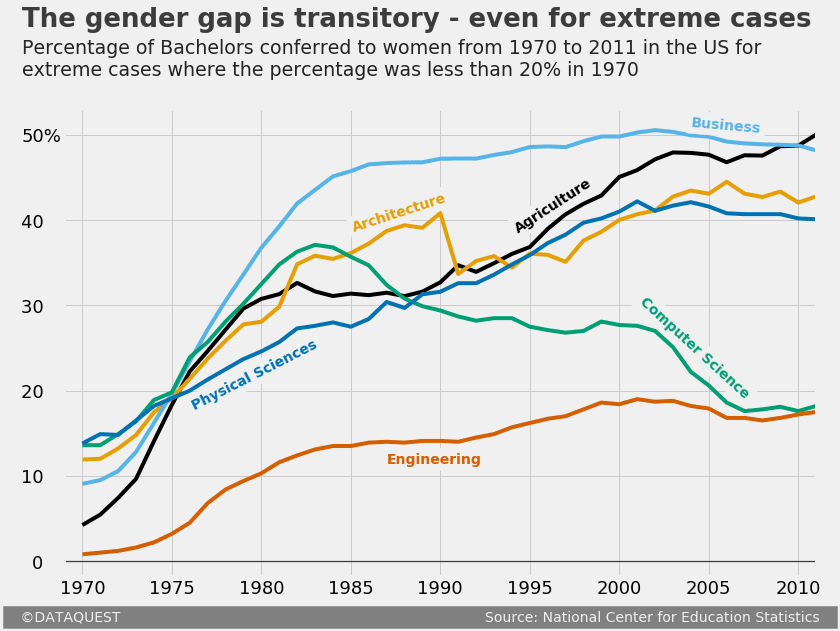
Next steps
That's it, our graph is now ready for publication! To do a short recap, we've started with generating a graph with matplotlib's default style. We then brought that graph to "FTE-level" through a series of steps:
- We used matplotlib's in-built
fivethirtyeightstyle. - We added a title and a subtitle, and customized each.
- We added a signature bar.
- We removed the default legend, and added colored labels.
- We made a series of other small adjustments: customizing the tick labels, bolding the horizontal line at y = 0, adding a vertical grid line near the tick labels, removing the label of the x-axis, and increasing the lateral margins of the y-axis.
To build upon what you've learned, here are a few next steps to consider:
- Generate a similar graph for other Bachelors.
- Generate different kinds of FTE graphs: a histogram, a scatter plot etc.
- Explore matplotlib's gallery to search for potential elements to enrich your FTE graphs (like inserting images, or adding arrows etc.). Adding images can take your FTE graphs to a whole new level:
Source: FiveThirtyEight