Project Tutorial: Investigating Fandango Movie Ratings
In this guide, I'll walk you through analyzing movie rating data to determine if Fandango's rating system changed after being exposed for potential bias. This guided project, Investigating Fandango Movie Ratings, will help you develop hands-on skills in data cleaning, exploratory analysis, and statistical comparison using Python.
We'll assume the role of a data journalist investigating whether Fandango—a movie ticket sales and ratings website—adjusted its rating system following a high-profile analysis in 2015 that suggested it was inflating movie ratings.
What You'll Learn:
- How to clean and prepare datasets for statistical comparison
- How to visualize and interpret rating distributions
- How to use frequency tables and summary statistics to reveal data patterns
- How to draw conclusions from data and understand its limitations
- How to organize your analysis workflow in a Jupyter Notebook
Before diving into this project, ensure you're comfortable with Python basics, NumPy and pandas library fundamentals, and data visualization with matplotlib. If you're new to these concepts, these foundational skills are covered in Dataquest's Python Basics for Data Analysis course.
Now, let's begin our investigation!
Step 1: Setting Up the Environment
If you're working on this project within the Dataquest platform, you can skip this step as everything is already set up for you. However, if you'd like to work locally, ensure you have the following set up:
- Jupyter Notebook: Install Jupyter Notebook or JupyterLab to easily combine code, visualize results, and clearly document your analysis using markdown cells as you work through this project. Alternatively, use Google Colab for a cloud-based option that requires no installation.
- Required Libraries: We'll be using pandas and NumPy for data manipulation and matplotlib for visualization.
- Dataset Files: Download the two dataset files from the links below:
Now, let's dive into our analysis!
Step 2: Understanding the Project Background
In October 2015, Walt Hickey, a data journalist at FiveThirtyEight, published a compelling analysis showing that Fandango's movie rating system appeared to be biased and dishonest. His evidence suggested that Fandango was inflating ratings, potentially to encourage ticket sales on their platform (since they sell movie tickets in addition to hosting reviews).
After Hickey's analysis went public, Fandango responded by claiming the inflated ratings were caused by a "bug" in their system that rounded ratings up to the nearest half-star. They promised to fix this issue.
Our goal is to determine whether Fandango actually changed their rating system following this controversy by comparing movie ratings before and after Hickey's analysis.
Step 3: Opening and Exploring the Data
Let's start by importing pandas, loading our two datasets, and looking at the first few rows. We'll be comparing movie ratings from before and after the 2015 analysis.
import pandas as pd

prior = pd.read_csv('fandango_score_comparison.csv')
after = pd.read_csv('movie_ratings_16_17.csv')

prior.head()| FILM | RottenTomatoes | RottenTomatoes_User | Metacritic | Metacritic_User | IMDB | Fandango_Stars | Fandango_Ratingvalue | RT_norm | RT_user_norm | ... | IMDB_norm | RT_norm_round | RT_user_norm_round | Metacritic_norm_round | Metacritic_user_norm_round | IMDB_norm_round | Metacritic_user_vote_count | IMDB_user_vote_count | Fandango_votes | Fandango_Difference | |
|---|---|---|---|---|---|---|---|---|---|---|---|---|---|---|---|---|---|---|---|---|---|
| 0 | Avengers: Age of Ultron (2015) | 74 | 86 | 66 | 7.1 | 7.8 | 5.0 | 4.5 | 3.70 | 4.3 | ... | 3.90 | 3.5 | 4.5 | 3.5 | 3.5 | 4.0 | 1330 | 271107 | 14846 | 0.5 |
| 1 | Cinderella (2015) | 85 | 80 | 67 | 7.5 | 7.1 | 5.0 | 4.5 | 4.25 | 4.0 | ... | 3.55 | 4.5 | 4.0 | 3.5 | 4.0 | 3.5 | 249 | 65709 | 12640 | 0.5 |
| 2 | Ant-Man (2015) | 80 | 90 | 64 | 8.1 | 7.8 | 5.0 | 4.5 | 4.00 | 4.5 | ... | 3.90 | 4.0 | 4.5 | 3.0 | 4.0 | 4.0 | 627 | 103660 | 12055 | 0.5 |
| 3 | Do You Believe? (2015) | 18 | 84 | 22 | 4.7 | 5.4 | 5.0 | 4.5 | 0.90 | 4.2 | ... | 2.70 | 1.0 | 4.0 | 1.0 | 2.5 | 2.5 | 31 | 3136 | 1793 | 0.5 |
| 4 | Hot Tub Time Machine 2 (2015) | 14 | 28 | 29 | 3.4 | 5.1 | 3.5 | 3.0 | 0.70 | 1.4 | ... | 2.55 | 0.5 | 1.5 | 1.5 | 1.5 | 2.5 | 88 | 19560 | 1021 | 0.5 |
| 5 rows × 22 columns | |||||||||||||||||||||
When you run the code above, you'll see that the prior dataset contains multiple movie rating sources, including Rotten Tomatoes, Metacritic, IMDB, and Fandango. Before we get to our analysis, we’ll make sure we filter this down to only columns related to Fandango.
Now let’s take a peek at the after dataset to see how it compares:
after.head()| movie | year | metascore | imdb | tmeter | audience | fandango | n_metascore | n_imdb | n_tmeter | n_audience | nr_metascore | nr_imdb | nr_tmeter | nr_audience | |
|---|---|---|---|---|---|---|---|---|---|---|---|---|---|---|---|
| 0 | 10 Cloverfield Lane | 2016 | 76 | 7.2 | 90 | 79 | 3.5 | 3.80 | 3.60 | 4.50 | 3.95 | 4.0 | 3.5 | 4.5 | 4.0 |
| 1 | 13 Hours | 2016 | 48 | 7.3 | 50 | 83 | 4.5 | 2.40 | 3.65 | 2.50 | 4.15 | 2.5 | 3.5 | 2.5 | 4.0 |
| 2 | A Cure for Wellness | 2016 | 47 | 6.6 | 40 | 47 | 3.0 | 2.35 | 3.30 | 2.00 | 2.35 | 2.5 | 3.5 | 2.0 | 2.5 |
| 3 | A Dog's Purpose | 2017 | 43 | 5.2 | 33 | 76 | 4.5 | 2.15 | 2.60 | 1.65 | 3.80 | 2.0 | 2.5 | 1.5 | 4.0 |
| 4 | A Hologram for the King | 2016 | 58 | 6.1 | 70 | 57 | 3.0 | 2.90 | 3.05 | 3.50 | 2.85 | 3.0 | 3.0 | 3.5 | 3.0 |
The after dataset also contains ratings from various sources, but its structure is slightly different. The column names and organization don't exactly match the prior dataset, which is something we'll need to address.
Let's examine the information about each dataset using the DataFrame info() method to better understand what we're working with:
    prior.info()

<class 'pandas.core.frame.DataFrame'>
RangeIndex: 146 entries, 0 to 145
Data columns (total 22 columns):
 #   Column                       Non-Null Count  Dtype
---  ------                       --------------  -----
 0   FILM                         146 non-null    object
 1   RottenTomatoes               146 non-null    int64
 2   RottenTomatoes_User          146 non-null    int64
 3   Metacritic                   146 non-null    int64
 4   Metacritic_User              146 non-null    float64
 5   IMDB                         146 non-null    float64
 6   Fandango_Stars               146 non-null    float64
 7   Fandango_Ratingvalue         146 non-null    float64
 8   RT_norm                      146 non-null    float64
 9   RT_user_norm                 146 non-null    float64
 10  Metacritic_norm              146 non-null    float64
 11  Metacritic_user_nom          146 non-null    float64
 12  IMDB_norm                    146 non-null    float64
 13  RT_norm_round                146 non-null    float64
 14  RT_user_norm_round           146 non-null    float64
 15  Metacritic_norm_round        146 non-null    float64
 16  Metacritic_user_norm_round   146 non-null    float64
 17  IMDB_norm_round              146 non-null    float64
 18  Metacritic_user_vote_count   146 non-null    int64
 19  IMDB_user_vote_count         146 non-null    int64
 20  Fandango_votes               146 non-null    int64
 21  Fandango_Difference          146 non-null    float64
dtypes: float64(15), int64(6), object(1)
memory usage: 25.2+ KB
    after.info()

<class 'pandas.core.frame.DataFrame'>
RangeIndex: 214 entries, 0 to 213
Data columns (total 15 columns):
 #   Column         Non-Null Count  Dtype
---  ------         --------------  -----
 0   movie          214 non-null    object
 1   year           214 non-null    int64
 2   metascore      214 non-null    int64
 3   imdb           214 non-null    float64
 4   tmeter         214 non-null    int64
 5   audience       214 non-null    int64
 6   fandango       214 non-null    float64
 7   n_metascore    214 non-null    float64
 8   n_imdb         214 non-null    float64
 9   n_tmeter       214 non-null    float64
 10  n_audience     214 non-null    float64
 11  nr_metascore   214 non-null    float64
 12  nr_imdb        214 non-null    float64
 13  nr_tmeter      214 non-null    float64
 14  nr_audience    214 non-null    float64
dtypes: float64(10), int64(4), object(1)
memory usage: 25.2+ KB
As we can see, the datasets have different column names, structures, and even different numbers of entries—the prior dataset has 146 movies, while the after dataset contains 214 movies. Before we can make a meaningful comparison, we need to clean and prepare our data by focusing only on the relevant Fandango ratings.
Step 4: Data Cleaning
Since we're only interested in Fandango's ratings, let's create new dataframes using copy() by selecting just the columns we need for our analysis:
prior = prior[['FILM',
               'Fandango_Stars',
               'Fandango_Ratingvalue',
               'Fandango_votes',
               'Fandango_Difference']].copy()
after = after[['movie',
               'year',
               'fandango']].copy()

prior.head()
after.head()| FILM | Fandango_Stars | Fandango_Ratingvalue | Fandango_votes | Fandango_Difference | |
|---|---|---|---|---|---|
| 0 | Avengers: Age of Ultron (2015) | 5.0 | 4.5 | 14846 | 0.5 |
| 1 | Cinderella (2015) | 5.0 | 4.5 | 12640 | 0.5 |
| 2 | Ant-Man (2015) | 5.0 | 4.5 | 12055 | 0.5 |
| 3 | Do You Believe? (2015) | 5.0 | 4.5 | 1793 | 0.5 |
| 4 | Hot Tub Time Machine 2 (2015) | 3.5 | 3.0 | 1021 | 0.5 |
| movie | year | fandango | |
|---|---|---|---|
| 0 | 10 Cloverfield Lane | 2016 | 3.5 |
| 1 | 13 Hours | 2016 | 4.5 |
| 2 | A Cure for Wellness | 2016 | 3.0 |
| 3 | A Dog's Purpose | 2017 | 4.5 |
| 4 | A Hologram for the King | 2016 | 3.0 |
One key difference is that our prior dataset doesn't have a dedicated ‘year’ column, but we can see the year is included at the end of each movie title (in parentheses). Let's extract that information and place it in a new ‘year’ column:
prior['year'] = prior['FILM'].str[-5:-1]
prior.head()| FILM | Fandango_Stars | Fandango_Ratingvalue | Fandango_votes | Fandango_Difference | Year | |
|---|---|---|---|---|---|---|
| 0 | Avengers: Age of Ultron (2015) | 5.0 | 4.5 | 14846 | 0.5 | 2015 |
| 1 | Cinderella (2015) | 5.0 | 4.5 | 12640 | 0.5 | 2015 |
| 2 | Ant-Man (2015) | 5.0 | 4.5 | 12055 | 0.5 | 2015 |
| 3 | Do You Believe? (2015) | 5.0 | 4.5 | 1793 | 0.5 | 2015 |
| 4 | Hot Tub Time Machine 2 (2015) | 3.5 | 3.0 | 1021 | 0.5 | 2015 |
The code above uses string slicing to extract the year from the film title. By using negative indexing ([-5:-1]), we're taking characters starting from the fifth-to-last (-5) up to (but not including) the last character (-1). This neatly captures the year while avoiding the closing parenthesis. When you run this code, you'll see that each movie now has a corresponding year value extracted from its title.
Now that we have the year information for both datasets, let's check which years are included in the prior dataset using the Series value_counts() method:
prior['year'].value_counts()year
2015 129
2014 17
Name: count, dtype: int64From the output above, we can see that the prior dataset includes movies from both 2014 and 2015―129 movies from 2015 and 17 from 2014. Since we want to compare 2015 (before the analysis) with 2016 (after the analysis), we need to filter out movies from 2014:
fandango_2015 = prior[prior['year'] == '2015'].copy()
fandango_2015['year'].value_counts()
year
2015 129
Name: count, dtype: int64This confirms we now have only the 129 movies from 2015 in our analysis-ready fandango_2015 dataset.
Now let's do the same for the after dataset in order to create the comparable fandango_2016 dataset:
after['year'].value_counts()year
2016 191
2017 23
Name: count, dtype: int64The output shows that the after dataset includes movies from both 2016 and 2017―191 movies from 2016 and 23 from 2017. Let's filter to include only 2016 movies:
fandango_2016 = after[after['year'] == 2016].copy()
fandango_2016['year'].value_counts()
year
2016 191
Name: count, dtype: int64This is what we wanted to see, and now our 2016 data is ready for analysis. Notice that we're using different filtering methods for each dataset. For the 2015 data, we're filtering for '2015' as a string, while for the 2016 data, we're filtering for 2016 as an integer. This is because the year was extracted as a string in the first dataset, but was already stored as an integer in the second dataset.
This is a common "gotcha" when working with real datasets—the same type of information might be stored differently across different sources, and you need to be careful to handle these inconsistencies.
Step 5: Visualizing Rating Distributions
Now that we have our cleaned datasets, let's visualize and compare the distributions of movie ratings for 2015 and 2016. We'll use kernel density estimation (KDE) plots to visualize the shape of the distributions:
import matplotlib.pyplot as plt
from numpy import arange
%matplotlib inline

plt.style.use('tableau-colorblind10')

fandango_2015['Fandango_Stars'].plot.kde(label='2015', legend=True, figsize=(8, 5.5))
fandango_2016['fandango'].plot.kde(label='2016', legend=True)

plt.title("Comparing distribution shapes for Fandango's ratings\n(2015 vs 2016)", y=1.07)  # y parameter adds padding above the title
plt.xlabel('Stars')
plt.xlim(0, 5)  # ratings range from 0 to 5 stars
plt.xticks(arange(0, 5.1, .5))  # set tick marks at every half star
plt.show()
When you run this code, you'll see the plot below showing two curve distributions:
- The 2015 distribution (in blue) shows a strong left skew with a peak around 4.5 stars
- The 2016 distribution (in orange) is also left-skewed with a peak around 4.0 stars
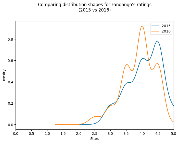
When we analyze this visualization, we notice two interesting patterns:
- Both distributions are left-skewed, meaning most ratings are clustered toward the higher end of the scale. This could suggest that Fandango generally gives favorable ratings to movies.
- The 2016 distribution appears to be slightly shifted to the left compared to the 2015 distribution, indicating that ratings might have been slightly lower in 2016.
Instructor Insight: I find KDE plots a bit controversial for this kind of data because ratings aren't truly continuous—they're discrete values (whole or half stars). The dips you see in the KDE plot don't actually exist in the data; they're artifacts of the KDE algorithm trying to bridge the gaps between discrete rating values. However, KDE plots are excellent for quickly visualizing the overall shape and skew of distributions, which is why I'm showing them here.
Let's look at the actual frequency of each rating to get a more accurate picture.
Step 6: Comparing Relative Frequencies
To get a more precise understanding of how the ratings changed, let's calculate the percentage of movies that received each star rating in both years:
print('2015 Ratings Distribution')
print('-' * 25)
print(fandango_2015['Fandango_Stars'].value_counts(normalize=True).sort_index() * 100)

print('\n2016 Ratings Distribution')
print('-' * 25)
print(fandango_2016['fandango'].value_counts(normalize=True).sort_index() * 100)
The output shows us the percentage breakdown of ratings for each year:
2015 Ratings Distribution
-------------------------
3.0     8.527132
3.5    17.829457
4.0    28.682171
4.5    37.984496
5.0     6.976744
Name: Fandango_Stars, dtype: float64

2016 Ratings Distribution
-------------------------
2.5     3.141361
3.0     7.329843
3.5    24.083770
4.0    40.314136
4.5    24.607330
5.0     0.523560
Name: fandango, dtype: float64
Now, let's transform this into a more visually appealing bar chart of percentages to make the comparison easier:
norm_2015 = fandango_2015['Fandango_Stars'].value_counts(normalize=True).sort_index() * 100
norm_2016 = fandango_2016['fandango'].value_counts(normalize=True).sort_index() * 100

df_freq = pd.DataFrame({
    '2015': norm_2015,
    '2016': norm_2016
})

df_freq.plot(kind='bar', figsize=(10, 6))
plt.title('Comparison of Fandango Rating Distributions (2015 vs 2016)')
plt.xlabel('Star Rating')
plt.ylabel('Percentage of Movies')
plt.xticks(rotation=0)
plt.show()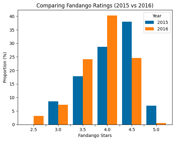
This visualization makes several patterns immediately clear:
- Perfect 5-star ratings dropped dramatically: In 2015, nearly 7% of movies received a perfect 5-star rating, but in 2016 this plummeted to just 0.5%—a 93% decrease!
- Very high 4.5-star ratings also decreased: The percentage of movies with 4.5 stars fell from about 38% in 2015 to just under 25% in 2016.
- Middle-high ratings increased: The percentage of movies with 3.5 and 4.0 stars increased significantly in 2016 compared to 2015.
- Lower minimum rating: The minimum rating in 2016 was 2.5 stars, while in 2015 it was 3.0 stars.
These trends suggest that Fandango's rating system did indeed change between 2015 and 2016, with a shift toward slightly lower ratings overall.
Step 7: Calculating Summary Statistics
To quantify the overall change in ratings, let's calculate summary statistics (mean, median, and mode) for both years:
mean_2015 = fandango_2015['Fandango_Stars'].mean()
mean_2016 = fandango_2016['fandango'].mean()

median_2015 = fandango_2015['Fandango_Stars'].median()
median_2016 = fandango_2016['fandango'].median()

mode_2015 = fandango_2015['Fandango_Stars'].mode()[0]
mode_2016 = fandango_2016['fandango'].mode()[0]

summary = pd.DataFrame()
summary['2015'] = [mean_2015, median_2015, mode_2015]
summary['2016'] = [mean_2016, median_2016, mode_2016]
summary.index = ['mean', 'median', 'mode']

summary
This gives us:
       2015     2016
mean   4.085271 3.887435
median 4.000000 4.000000
mode   4.500000 4.000000
Let's visualize these statistics to make the comparison clearer:
plt.style.use('fivethirtyeight')

summary['2015'].plot.bar(color='#0066FF', align='center', label='2015', width=.25)
summary['2016'].plot.bar(color='#CC0000', align='edge', label='2016', width=.25, rot=0, figsize=(8, 5))

plt.title('Comparing summary statistics: 2015 vs 2016', y=1.07)
plt.ylim(0, 5.5)
plt.yticks(arange(0, 5.1, .5))
plt.ylabel('Stars')
plt.legend(framealpha=0, loc='upper center')
plt.show()
When you run this code, you'll produce the bar chart below comparing the mean, median and mode for 2015 and 2016:
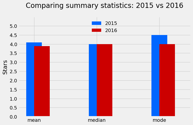
This visualization makes it immediately clear that ratings were generally lower in 2016. It also confirms what we observed in the distributions plot earlier:
- The mean rating decreased from about 4.1 stars in 2015 to 3.9 stars in 2016—a drop of about 5%.
- The median remained the same at 4.0 stars for both years.
- The mode (most common rating) decreased from 4.5 stars in 2015 to 4.0 stars in 2016.
Instructor Insight: When presenting these findings to stakeholders, I'd recommend the bar chart over the KDE plot. While the KDE is great for quickly understanding distribution shapes, the bar chart provides more accurate representation of the actual data without introducing misleading artifacts. The
framealpha=0parameter I used in the legend makes the legend background transparent—it's a small styling detail but makes the chart look more professional.
Step 8: Drawing Conclusions
Based on our analysis, we can confidently say that there was definitely a change in Fandango's rating system between 2015 and 2016. The key findings include:
- Overall ratings declined: The average movie rating dropped by about 0.2 stars (a 5% decrease).
- Perfect ratings nearly disappeared: 5-star ratings went from fairly common (7% of movies) to extremely rare (0.5% of movies).
- Rating inflation decreased: The evidence suggests that Fandango's tendency to inflate ratings was reduced, with the distribution shifting toward more moderate (though still positive) ratings.
While we can't definitively prove that these changes were a direct response to Walt Hickey's analysis, the timing strongly suggests that Fandango did adjust their rating system after being called out for inflated ratings. It appears that they addressed the issues Hickey identified, particularly by eliminating the upward rounding that artificially boosted many ratings.
Step 9: Limitations and Next Steps
Our analysis has several limitations to keep in mind:
- Movie quality variation: We're comparing different sets of movies from different years. It's possible (though unlikely) that 2016 movies were genuinely lower quality than 2015 movies.
- Sample representativeness: Both datasets were collected using non-random sampling methods, which limits how confidently we can generalize our findings.
- External factors: Changes in Fandango's user base, reviewing policies, or other external factors could have influenced the ratings.
For further analysis, you might try answering these questions:
- Comparing with other rating platforms: Did similar changes occur on IMDB, Rotten Tomatoes, or Metacritic during the same period?
- Analyzing by genre: Were certain types of movies affected more than others by the rating system change?
- Extending the time frame: How have Fandango's ratings evolved in subsequent years?
- Investigating other rating providers: Do other platforms that sell movie tickets also show inflated ratings?
We have some other project walkthrough tutorials you may also enjoy:
- Project Tutorial: Build Your First Data Project
- Project Tutorial: Profitable App Profiles for the App Store and Google Play Markets
- Project Tutorial: Analyzing New York City High School Data
- Project Tutorial: Analyzing Helicopter Prison Escapes Using Python
- Project Tutorial: Build A Python Word Guessing Game
- Project Tutorial: Predicting Heart Disease with Machine Learning
- Project Tutorial: Customer Segmentation Using K-Means Clustering
- Project Tutorial: Predicting Insurance Costs with Linear Regression
- Project Tutorial: Answering Business Questions Using SQL
- Project Tutorial: Analyzing Startup Fundraising Deals from Crunchbase
- Project Tutorial: Finding Heavy Traffic Indicators on I-94
- Project Tutorial: Star Wars Survey Analysis Using Python and Pandas
- Project Tutorial: Build an AI Chatbot with Python and the OpenAI API
- Project Tutorial: Build a Web Interface for Your Chatbot with Streamlit (Step-by-Step)
Step 10: Sharing Your Project
Now that you've completed this analysis, you might want to share it with others! Here are a few ways to do that:
- GitHub Gist: For a quick and easy way to share your Jupyter Notebook, you can use GitHub Gist:
- Go to GitHub Gist
- Log in to your GitHub account (or create one if you don't have one)
- Click on "New Gist"
- Copy and paste your Jupyter Notebook code or upload your .ipynb file
- Add a description and select "Create secret Gist" (private) or "Create public Gist" (visible to everyone)
- Portfolio website: Add this project to your data analysis portfolio to showcase your skills to potential employers.
- Dataquest Community: Share your analysis in the Dataquest Community to get feedback and engage with fellow learners.
Instructor Insight: GitHub Gists are significantly easier to use than full Git repositories when you're just starting out, and they render Jupyter Notebooks beautifully. I still use them today for quick sharing of notebooks with colleagues. If you tag me in the Dataquest community (@Anna_Strahl), I'd love to see your projects and provide feedback!
Final Thoughts
This project demonstrates the power of data analysis for investigating real-world questions about data integrity and bias. By using relatively simple tools—data cleaning, visualization, and summary statistics—we were able to uncover meaningful changes in Fandango's rating system.
The investigation also shows how public accountability through data journalism can drive companies to address issues in their systems. After being exposed for rating inflation, Fandango appears to have made concrete changes to provide more honest ratings to its users.
If you enjoyed this project and want to strengthen your data analysis skills further, check out other guided projects on Dataquest or try extending this analysis with some of the suggestions in the "Next Steps" section!