How to Plot a Bar Graph in Matplotlib: The Easy Way

A bar graph or bar chart is one of the most common visualization types and is very easy to create in Matplotlib. All we need to do is write one short line of Python code.
However, if we want to create an informative, easily readable bar plot that efficiently reveals the story behind the data, we have to keep several important things in mind. That’s what we’re going to discuss in this article.
Some of these suggestions are only specific to bar plots; the others apply to any kind of data visualizations.
To practice our bar chart, we’ll use a very bar-related dataset from Kaggle — Alcohol Consumption around the World

import pandas as pd
import numpy as np
import matplotlib
import matplotlib.pyplot as plt
import seaborn as sns

df = pd.read_csv('drinks.csv')
print('Number of all the countries:', len(df), '\n')

# Removing the countries with 0 alcohol consumption
df = df[df['total_litres_of_pure_alcohol'] > 0]\
       .reset_index(drop=True)
print(df.head(3), '\n')
print('Number of all the drinking countries:', len(df))
Output:
Number of all the countries: 193

   country  beer_servings  spirit_servings  wine_servings  \
0  Albania             89              132             54
1  Algeria             25                0             14
2  Andorra            245              138            312

   total_litres_of_pure_alcohol
0                           4.9
1                           0.7
2                          12.4

Number of all the drinking countries: 180
Decluttering
As a general rule, we should maximize the data-ink ratio of the graph and, hence, exclude everything that doesn’t provide any additional information for our storytelling through the data.
Removing Redundant Features
To start with, we should avoid any features on the plot that could potentially distract the reader’s attention:
- Unnecessary spines and ticks
- The grid, if it’s redundant
- Decimal numbers where possible, especially those with many decimal points
- Putting the exact numbers (decimal or not) on top of each bar: if we really need them, we can supplement our graph with a corresponding table. Alternatively, we can use only these direct labels on top of the bars and remove the numeric axis, to avoid duplicating the same information.
Labeling and Sizing
A seemingly obvious but sometimes neglected or misused aspect of storytelling when creating bar charts relates to labeling and sizing:
- Sufficient width and height of the figure
- An easily readable font size of the graph title, axes labels, ticks, and annotations (if present)
- The title as laconic as possible while still exhaustively descriptive, divided into no more than 2–3 rows (if long)
- Clear axes labels
- Rotating tick labels (if necessary)
- The units for the measured value (
- If the values of the categorical axis are self-explanatory, we can omit this axis label
Things to Always Avoid
Always avoid the following features when creating bar charts:
- 3D bar plots: they severely deform reality, creating an optical illusion and making it more difficult to identify the real height (length) of each bar. Moreover, the bars in the front can completely cover the bars in the back, rendering them invisible to the reader.
- Interactivity (except for very rare cases).
- Decorations or color effects.
Let’s compare the two bar plots below, which are identical in terms of the data but different in style. Also, we’ll find out which countries consumed the most alcohol in 2010:
top5_alcohol = df.sort_values('total_litres_of_pure_alcohol',
                  ascending=False)[:5]\\
     .reset_index(drop=True)

ss="token punctuation">, ax = plt.subplots(figsize=(16,7))
ss="token punctuation">.tight_layout(pad=2)

ss="token punctuation">.subplot(1,2,1)
ss="token punctuation">.set_style('whitegrid')
ss="token operator">= sns.barplot(x='country', y='total_litres_of_pure_alcohol',
     data=top5_alcohol)
"token keyword">for p in ax.patches:
class="token punctuation">.annotate(format(p.get_height(), '.1f'),
    (p.get_x() + p.get_width() / 2., p.get_height()),
    ha='center', va='center',
    xytext=(0, 7), textcoords='offset points')
ss="token punctuation">.title('TOP5 countries by pure alcohol consumption')
ss="token punctuation">.xlabel('Countries')
ss="token punctuation">.ylabel('Litres per person')
s="token punctuation">.grid(True)

ss="token punctuation">.subplot(1,2,2)
ss="token punctuation">.set_style('ticks')
ss="token operator">= sns.barplot(x='country', y='total_litres_of_pure_alcohol',
     data=top5_alcohol)
ss="token punctuation">.title('TOP5 countries by pure alcohol consumption', fontsize=30)
ss="token punctuation">.xlabel(None)
ss="token punctuation">.xticks(fontsize=22, rotation=30)
ss="token punctuation">.ylabel('Litres per person', fontsize=25)
ss="token punctuation">.yticks(fontsize=22)
ss="token punctuation">.despine(bottom=True)
s="token punctuation">.grid(False)
s="token punctuation">.tick_params(bottom=False, left=True)
"token keyword">for _,s in ax.spines.items():
lass="token punctuation">.set_color('black')
ss="token punctuation">.show()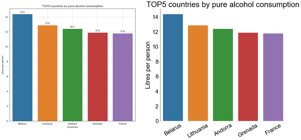
The second bar chart, even if it’s still not ideal, is definitely much cleaner and more readable than the first one. We removed unnecessary spines, the ticks from the categorical axis, the grid, the bar values denotations, increased font size, rotated x-tick labels, and omitted the categorical axis label.
And yes, we clearly see what countries drank more alcohol in 2010. Most likely, though, they were consuming different kinds of drinks. We’ll investigate this question soon.
Coloring
We’ve already mentioned that using additional color effects, like background or font color, isn’t a good practice. There are a couple of other things to consider when selecting colors for a bar plot.
Highlighting Some Bars
When applying different colors doesn’t communicate anything about the data, we should avoid it. By default, each bar in a seaborn barplot is colored differently, as we saw earlier. We can override it by introducing the color parameter and assigning the same color to all the bars.
However, we still can emphasize some bars in particular and display the other ones in grey. For example, of our TOP5 countries above, let’s highlight the leader in drinking specifically spirits. Besides color emphasizing, we’ll add also a corresponding annotation:
spirit_top = top5_alcohol['spirit_servings']
colors = ['grey' if (s < max(spirit_top)) else 'red' for s in spirit_top]

fig, ax = plt.subplots(figsize=(10,5))
sns.set_style('white')
ax=sns.barplot(x='country', y='total_litres_of_pure_alcohol',
               data=top5_alcohol, palette=colors)
plt.title('TOP5 countries by pure alcohol consumption', fontsize=25)
plt.xlabel(None)
plt.xticks(fontsize=16)
plt.ylabel('Litres per person', fontsize=20)
plt.yticks(fontsize=15)
ax.text(x=2.5, y=12.3, s='the highest \\nspirit servings',
        color='red', size=17, weight='bold')
sns.despine(bottom=True)
ax.grid(False)
ax.tick_params(bottom=False, left=True)
plt.show()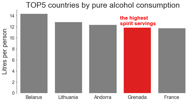
A small island Caribbean country, Grenada, is in fourth place of pure alcohol consumption, and among the TOP5 countries, it’s the one with the highest number of strong spirit servings.
Using Colorblind Palette
For our bar charts to reach a wider audience, we should consider using colorblind-friendly colors. There are various online tools (e.g., Stark or Colblindor) for testing how an image looks for different types of color blindness. However, the most common form of it involves differentiating between red and green, so a good approach would be to avoid palettes with both of them. Another way is to use the Color Blind 10 palette of Tableau. The drawback is that it offers quite a limited choice of colors.
Avoiding Counterintuitive Colors
Some colors have strong associations with certain categories of phenomena or qualities for the majority of people.
For example, fuchsia is widely considered to be a feminine color. The traffic light palette is commonly used to distinguish between dangerous, neutral, and safe zones. And the red-blue palette is related to the temperature, etc. Even if you are a convinced nonconformist, who is always against any stereotypes, it’s a good idea to follow these unwritten conventions when creating a grouped bar chart to avoid misleading the reader.
If there are no particular conventions for our groups in question, a good practice is to try to come up (if possible) with some contextual but still easy-to-understand decisions. Say, we’re going to create a grouped bar chart of the worldwide population of koalas and foxes in the last 10 years. In this case, we can think of using orange color for foxes and grey for koalas, and not vice versa.
Let’s return to our TOP5 countries by pure alcohol consumption and check the proportions of drinking beer and wine in each of them. Of course, some types of beer have dark red color (e.g., the cherry’s one), and some wines have golden color (white or plum wine). Despite that, the most intuitively comprehensible color associations for these drink types are dark red for wine and golden for beer:
fig, ax = plt.subplots(figsize=(10,5))
x = np.arrange(len(top5_alcohol))
width = 0.4
plt.bar(x-0.2, top5_alcohol['wine_servings'],
        width, color='tab:red', label='wine')
plt.bar(x+0.2, top5_alcohol['beer_servings'],
        width, color='gold', label='beer')
plt.title('TOP5 countries by pure alcohol consumption', fontsize=25)
plt.xlabel(None)
plt.xticks(top5_alcohol.index, top5_alcohol['country'], fontsize=17)
plt.ylabel('Servings per person', fontsize=20)
plt.yticks(fontsize=17)
sns.despine(bottom=True)
ax.grid(False)
ax.tick_params(bottom=False, left=True)
plt.legend(frameon=False, fontsize=15)
plt.show()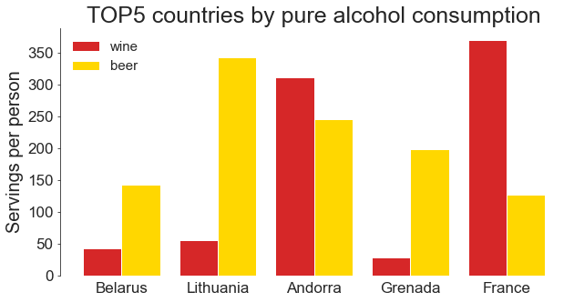
Now we can easily capture that in France people drink much more wine than beer, while in Lithuania and Grenada, the opposite is true. In Andorra, both drinks are rather popular, with wine slightly dominating.
Positioning
Vertical vs. Horizontal Bar Graph
Even though a vertical bar graph is usually a default one, sometimes a horizontal version is preferred:
- For plotting nominal variables
- When x-tick labels are too long, and rotating them would help to avoid overlapping but would decrease readability
- When we have a large number of categories (bars)
In the last case, horizontal bar graphs are especially advantageous for viewing the graph on a narrow mobile phone screen.
A vertical bar graph is more suitable for plotting ordinal variables or time series. For example, we can use it to plot the overall biomass on Earth by geological period, or the number of UFO sightings by month, etc.
Since the country column represents a nominal variable, and the names of some countries are rather long, let's select many categories (the TOP20 countries by beer consumption per person) and see the horizontal bar graph in action:
top20_beer = df.sort_values('beer_servings', ascending=False)[:20]

fig, ax = plt.subplots(figsize=(40,18))
fig.tight_layout(pad=5)

# Creating a case-specific function to avoid code repetition
def plot_hor_vs_vert(subplot, x, y, xlabel, ylabel, rotation,
                     tick_bottom, tick_left):
    ax=plt.subplot(1,2,subplot)
    sns.barplot(x, y, data=top20_beer, color='slateblue')
    plt.title('TOP20 countries \\nby beer consumption', fontsize=85)
    plt.xlabel(xlabel, fontsize=60)
    plt.xticks(fontsize=45, rotation=rotation)
    plt.ylabel(ylabel, fontsize=60)
    plt.yticks(fontsize=45)
    sns.despine(bottom=False, left=True)
    ax.grid(False)
    ax.tick_params(bottom=tick_bottom, left=tick_left)
    return None

plot_hor_vs_vert(1, x='country', y='beer_servings',
                 xlabel=None, ylabel='Servings per person',
                 rotation=90, tick_bottom=False, tick_left=True)
plot_hor_vs_vert(2, x='beer_servings', y='country',
                 xlabel='Servings per person', ylabel=None,
                 rotation=None, tick_bottom=True, tick_left=False)
plt.show()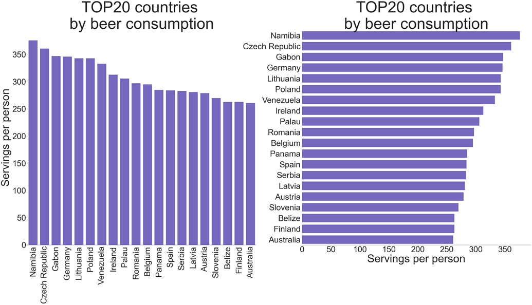
Flipping all the words horizontally (including the label of the measured value axis) makes the second graph significantly more readable.
Namibia opens this list, followed by the Czech Republic. We no longer see the countries with the highest alcohol consumption except for Lithuania, which has dropped to 5th place. It seems that their high positions in the previous rating were explained by drinking spirit and wine rather than beer.
Ordering
If we extract all the countries where people drink wine more than average and then visualize this data as a bar plot, the resulting bars will be ordered by the underlying categories (countries) in alphabetical order. Most probably, though, in this case, we’re more interested in seeing this data ordered by the number of wine servings per person. Let’s compare both approaches:
wine_more_than_mean = (df[df['wine_servings'] > df['wine_servings']\\
                         .mean()])
sort_wine_more_than_mean = wine_more_than_mean\\
                           .sort_values('wine_servings',
                                        ascending=False)

fig, ax = plt.subplots(figsize=(30,30))
fig.tight_layout(pad=5)

# Creating a case-specific function to avoid code repetition
def plot_hor_bar(subplot, data):
    plt.subplot(1,2,subplot)
    ax = sns.barplot(y='country', x='wine_servings', data=data,
                     color='slateblue')
    plt.title('Countries drinking wine \\nmore than average',
              fontsize=70)
    plt.xlabel('Servings per person', fontsize=50)
    plt.xticks(fontsize=40)
    plt.ylabel(None)
    plt.yticks(fontsize=40)
    sns.despine(left=True)
    ax.grid(False)
    ax.tick_params(bottom=True, left=False)
    return None

plot_hor_bar(1, wine_more_than_mean)
plot_hor_bar(2, sort_wine_more_than_mean)
plt.show()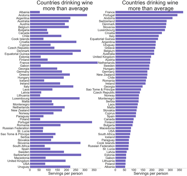
In the first plot, we can somehow distinguish the first and the last three countries by wine servings per person (referring only to those where people drink wine more than average), then things become excessively complicated. In the second plot, we can easily trace the whole country rating. For a more realistic picture, we should take into account the population of each country (certainly, it’s not exactly correct to compare Russian Federation with the Cook Islands and St. Lucia) and, probably, exclude abstainers. However, the point here is that we should always consider ordering the data before plotting it if we want to get the maximum information from our visualization. It doesn’t have to be an ordering by values: instead, we can decide to rank the data by categories themselves (if they are ordinal, like age ranges), or there could be whatever other logic behind it, if necessary.
Starting at 0
While other types of plots don’t have to start at zero, bar plots always do. The reason is that a bar plot is supposed to show the magnitude of each data point and the proportions between all the data points, instead of just a change in a variable, as it happens in line plots.
If we truncate the y-axis (or the x-axis, in case of a horizontal bar plot) starting it at a value other than 0, we also cut the length of each bar, so our graph doesn’t display correctly — neither individual values for each category nor the ratios between them:
usa = df[df['country']=='USA'].transpose()[1:4].reset_index()
usa.columns = ['drinks', 'servings']

fig = plt.figure(figsize=(16,6))
fig.tight_layout(pad=5)

# Creating a case-specific function to avoid code repetition
def plot_vert_bar(subplot, y_min):
    plt.subplot(1,2,subplot)
    ax = sns.barplot(x='drinks', y='servings',
                     data=usa, color='slateblue')
    plt.title('Drink consumption in the USA', fontsize=30)
    plt.xlabel(None)
    plt.xticks(usa.index, ['Beer', 'Spirit', 'Wine'], fontsize=25)
    plt.ylabel('Servings per person', fontsize=25)
    plt.yticks(fontsize=17)
    plt.ylim(y_min, None)
    sns.despine(bottom=True)
    ax.grid(False)
    ax.tick_params(bottom=False, left=True)
    return None

plot_vert_bar(1, y_min=80)
plot_vert_bar(2, y_min=None)
plt.show()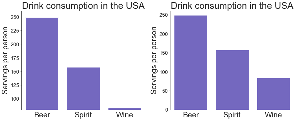
The plot on the left gives us a misleading impression that the consumption of wine in the USA is around 15 times lower than that of spirit, which, in turn, is less than half that of beer. On the right plot, we see completely different proportions, which are the correct ones.
Grouping and Stacking
Visually Evident Grouping
When creating a grouped bar plot, it’s important to mind the distances between the bars, which we consider grouped properly when the gaps between bars inside each group are smaller (up to 0) than those between the bars of adjacent groups.
Back to the TOP5 countries by pure alcohol consumption, let’s now check the proportions of drinking spirit and wine in each of them:
top5_alcohol_rev = top5_alcohol\\
                       .sort_values('total_litres_of_pure_alcohol')\\
                       .reset_index(drop=True)

fig, ax = plt.subplots(figsize=(20,9))
fig.tight_layout(pad=5)

# Creating a case-specific function to avoid code repetition
def plot_grouped_bar(subplot, width, gap):
    plt.subplot(1,2,subplot)
    x = np.arange(len(top5_alcohol_rev['wine_servings']))
    plt.barh(x, top5_alcohol_rev['wine_servings'],
             width, color='tab:red', label='wine')
    plt.barh(x+width+gap, top5_alcohol_rev['spirit_servings'],
             width, color='aqua', label='spirit')
    plt.yticks(x+width/2, top5_alcohol_rev['country'], fontsize=28)
    plt.title('TOP5 countries \\nby pure alcohol consumption',
              fontsize=40)
    plt.xlabel('Servings per person', fontsize=30)
    plt.xticks(fontsize=22)
    sns.despine(left=True)
    plt.tick_params(bottom=True, left=False)
    ax.grid(False)
    plt.legend(loc='right', frameon=False, fontsize=23)
    return None

plot_grouped_bar(1, width=0.4, gap=0.1)
plot_grouped_bar(2, width=0.3, gap=0)
plt.show()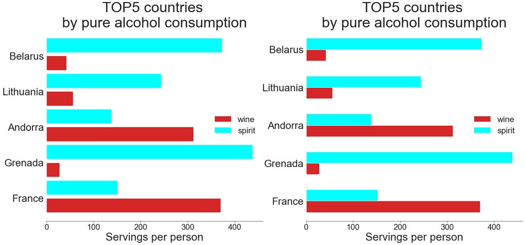
In the graph on the left, it’s difficult to immediately distinguish the boundaries between adjacent groups, since the distances between the bars inside each group and between the groups are equal. The graph on the right, however, clearly displays to which country each bar relates. We see now that people in Grenada, Belarus, and Lithuania prefer much more spirit than wine, while in France and Andorra it’s just the opposite.
Stacked vs. Grouped Bar Plots
Choosing between a stacked and a grouped bar plot, we should consider the main message of our visualization:
- If we’re mostly interested in the overall values across several categories, and, as a secondary goal, we’d like to estimate which of the components contributes most of all in the biggest or smallest total values, the best choice would be a stacked bar plot. However, the issue here is that it can be rather difficult to figure out the trends of its individual elements apart from the first one (i.e., the lowermost in a vertically stacked bar plot or the leftmost in a horizontal). It especially counts in a situation when we have a lot of bars, and sometimes, we can even get a deceptive impression and come to an incorrect conclusion.
- If we want to trace the trends of each individual component across the categories, we’d better use a grouped bar plot. Evidently, in this case, we can say nothing about the total values by category.
Let’s apply stacked and grouped bar plots to the Baltic countries to determine their drinking preferences:
baltics = df[(df['country']=='Latvia')|(df['country']=='Lithuania')\\
            |(df['country']=='Estonia')].iloc[:,:4]
baltics.columns = ['country', 'beer', 'spirit', 'wine']
baltics.reset_index(drop=True, inplace=True)

labels = baltics['country'].tolist()
beer = np.array(baltics['beer'])
spirit = np.array(baltics['spirit'])
wine = np.array(baltics['wine'])

fig, ax = plt.subplots(figsize=(16,7))
fig.tight_layout(pad=5)

# Creating a case-specific function to avoid code repetition
def plot_stacked_grouped(subplot, shift, width, bot1, bot2):
    x = np.arrange(len(baltics))
    plt.subplot(1,2,subplot)
    plt.bar(x-shift, beer, width,
            label='beer', color='gold')
    plt.bar(x, spirit, width, bottom=bot1,
            label='spirit', color='aqua')
    plt.bar(x+shift, wine, width, bottom=bot2,
            label='wine', color='tab:red')
    plt.title('Drink consumption \\nin Baltic countries',
              fontsize=35)
    plt.xlabel(None)
    plt.xticks(baltics.index, labels, fontsize=25)
    plt.ylabel('Servings per person', fontsize=27)
    plt.yticks(fontsize=20)
    sns.despine(bottom=True)
    plt.tick_params(bottom=False, left=True)
    plt.legend(frameon=False, fontsize=17)
    return None

plot_stacked_grouped(1, shift=0, width=0.35,
                     bot1=beer, bot2=beer+spirit)
plot_stacked_grouped(2, shift=0.2, width=0.2,
                     bot1=0, bot2=0)
plt.show()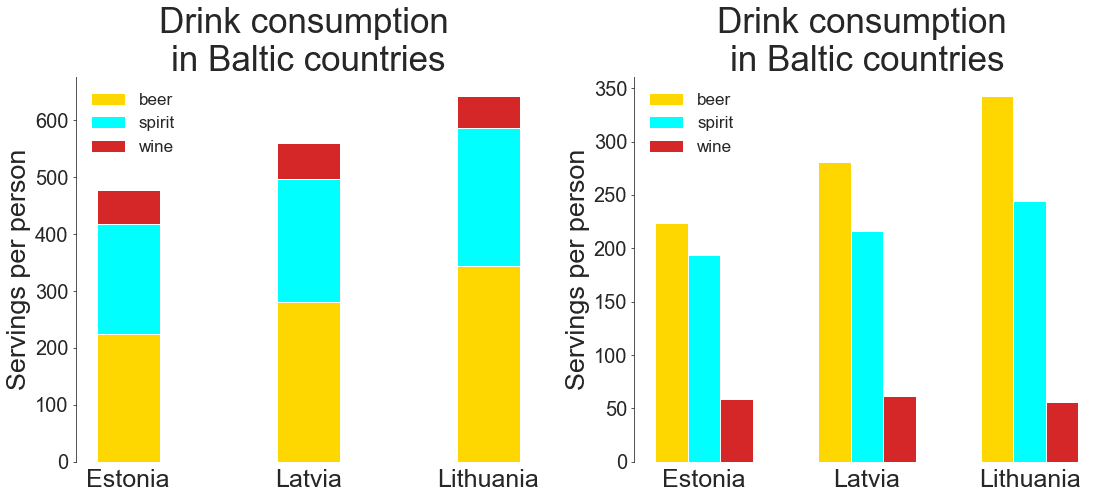
In the stacked plot above, we see that of all the three Baltic countries, Lithuania shows the highest level of alcohol consumption, while Estonia shows the lowest. The main contribution in both cases comes from beer. About the consumption of spirit and wine in these countries, we can say nothing precise from this plot. Indeed, the amounts seem equal.
The grouped plot clearly shows that Lithuania also leads in drinking spirit, while Estonia again shows the lowest level. The difference for this type of drink is not so evident, though, as it was for the beer. As for the wine, the difference is even less noticeable, but it seems that in Latvia the wine consumption is the highest, while in Lithuania, it’s the lowest. From this plot, however, it’s already more difficult to guess the overall alcohol consumption in these countries. We’d have to do some mental arithmetic, and in the case of more than three bar groups, this task would become impracticable.
Conclusion
Before creating a meaningful visualization and obtaining the correct insights from it, we have to consider the following details:
- Our goal
- Our target audience
- The important takeaway from our graph and how to emphasize it while displaying additional helpful information
- How to exclude the features that are useless for our storytelling
Thanks for reading, and za zdorovie!
Want to Learn More About Improving Your Bar Chart Visualizations?
- Learn how to create bar plots using Python in this lesson
- Learn how Seaborn can make your plots stand out in this lesson
- Learn about visualizing grouped frequency tables in this lesson


