How to Make Your Plots Appealing in Python
Data visualization is arguably the most important step in a data science project because it’s how you communicate your findings to the audience. You may do this for multiple reasons: to convince investors to finance your project, to highlight the importance of changes at your company, or just to present the results in the annual report and emphasize the most valuable achievements.
Whatever your final goal, it’s critical to present the data clearly. In this article, I will talk about the technical aspects of improving data visualizations in Python. However, depending on your audience, some of these aspects may be more relevant than others, so choose wisely when determining what to present.
We’ll be using a dataset that contains data on Netflix movies and TV shows (https://www.kaggle.com/shivamb/netflix-shows).
Let’s get started!
Basic Plot
First of all, let’s look at the dataset.
# Imports
import pandas as pd
import matplotlib.pyplot as plt
import seaborn as sns

netflix_movies = pd.read_csv("./data/netflix_titles.csv") # From
netflix_movies.head()
We have plenty of columns we can easily visualize. One of our questions could be What is the number of movies and TV series on Netflix?
netflix_movies["type"].value_counts()We have roughly 2.5 times more movies than TV series. However, it’s not a good idea to present your results simply as numbers (unless it’s something like “we have grown by 30% this year!”, then this number can be very effective). Plain numbers are more abstract than visualizations.
Ok, let’s start plotting. A nice way to represent categorical data is to use simple bar plots.
netflix_movies["type"].value_counts().plot.bar()
This is the most basic plot we can make using pandas. We now can easily see the difference in the number of movies and TV shows.
First Improvements
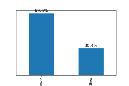
I already see the first problem: we still have pure numbers. I believe that the best way to show something interesting in this data is to show relative percentages.
netflix_movies["type"].value_counts(normalize=True).mul(100).plot.bar()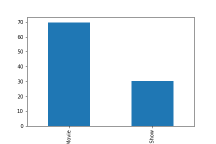
This is much better. But what if we want to determine the exact proportion of movies and shows? We can go back and forth from each bar to the y axis and make a guess, but it’s not an easy task. We should plot the numbers directly above the bars!
# Label bars with percentages
ax = netflix_movies["type"].value_counts(normalize=True).mul(100).plot.bar()
for p in ax.patches:
    y = p.get_height()
    x = p.get_x() + p.get_width() / 2

    # Label of bar height
    label = "{:.1f}%".format(y)

    # Annotate plot
    ax.annotate(
        label,
        xy=(x, y),
        xytext=(0, 5),
        textcoords="offset points",
        ha="center",
        fontsize=14,
    )

# Remove y axis
ax.get_yaxis().set_visible(False)
The code above is pretty advanced, so spend some time in the documentation to understand how it works. You can start from this page.
Now it looks much cleaner: we increased the signal-to-noise ratio by removing useless clutter.
The next step is to increase the size of the plot using figsize parameter. Let’s also remove the spines.
# Increase the size of the plot
ax = netflix_movies["type"].value_counts(normalize=True).mul(100).plot.bar(figsize=(12, 7))

# Remove spines
sns.despine()

# Label bars with percentages
for p in ax.patches:
    y = p.get_height()
    x = p.get_x() + p.get_width() / 2

    # Label of bar height
    label = "{:.1f}%".format(y)

    # Annotate plot
    ax.annotate(
        label,
        xy=(x, y),
        xytext=(0, 5),
        textcoords="offset points",
        ha="center",
        fontsize=14,
    )

# Remove y axis
ax.get_yaxis().set_visible(False)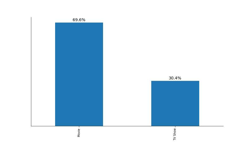
The plot starts to look better. However, we can barely see the x tick labels (“Movie” and “TV Show”). Additionally, we also need to rotate them by 90 degrees to improve readability.
I also believe that we need to increase the transparency of x tick labels because these labels shouldn’t be the focus of attention. In other words, the audience should, first of all, see the difference between the heights of the two bars and only then pay attention to the surrounding information.
However, I’m leaving the transparency level of the percentages at 100% because this is the information we want to convey (that there is a big difference between the two bars).
Add the following lines of code to the previous code:
# Increase x ticks label size, rotate them by 90 degrees, and remove tick lines
plt.tick_params(axis="x", labelsize=18, rotation=0, length=0)
# Increase x ticks transparency
plt.xticks(alpha=0.75)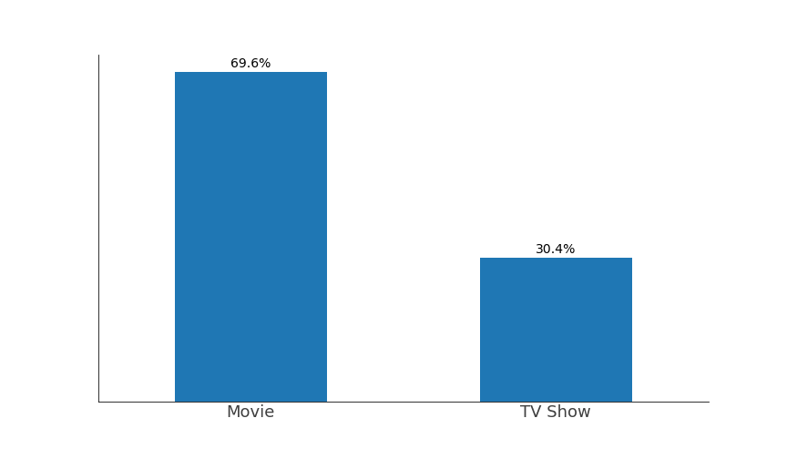 Stop for a moment, and look back at the original plot. Note the differences. Now think about all the decisions that you have made. At every step of the plotting, you should consider what you are doing, or the final plot will become incomprehensible and inaccurate.
Adding a Title and a Subtitle
Now let’s continue. We’re missing two key pieces of information: a title and a subtitle. The title should tell us what we’re looking at, while the subtitle should direct the audience’s attention to what we consider important.
The natural instinct is to just use plt.title(). However, centrally aligned texts make our plot look clumsy because our eyes like straight lines. Thus, we will align the title and subtitle to the left to make a perfectly straight line with the first bar.
I have also decided to remove the bottom and the left spines (by using parameters left=True, and bottom=True in the sns.despine()) because they would not align with the other elements. You can see that I’m making decisions iteratively, so don’t be discouraged if you can’t create a perfect plot the first time you approach a dataset. Experiment!
As before, add the following lines of code to the previous code:
# Font for title
title_font = {
"size": 22,
"alpha": 0.75
}
# Font for subtitle
subtitle_font = {
"size": 16,
"alpha": 0.80
}
# Title
plt.text(
x=-0.25,
y=80,
s="Proportions of Movies and TV Shows on Netflix",
ha="left",
fontdict=title_font,
)
# Subtitle
plt.text(
x=-0.25,
y=75,
s="Movies are more than two times more frequent on Netflix",
ha="left",
fontdict=subtitle_font,
)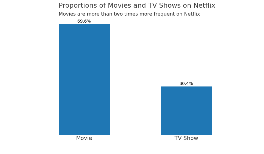 Colors
What about the colors? First of all, the default blue color seems nice! However, we can choose other colors that can complement our brand or convey an emotion. Don’t use very intense default colors (“red,” “green,” etc.). These are not the colors we’re used to seeing in nature. Instead, look at some photos of nature on Google, and pick the color you like most. I’m using the ColorZilla extension to pick colors’ hex codes. In this instance, I will choose another shade of blue
## Complete code to generate the plot below. Note that the only difference is the color parameter in the first line

# Increase the size of the plot
ax = netflix_movies["type"].value_counts(normalize=True).mul(100).plot.bar(figsize=(12, 7), color="#3B97B6")

# Remove spines
sns.despine(left=True, bottom=True)

# Label bars with percentages
for p in ax.patches:
    y = p.get_height()
    x = p.get_x() + p.get_width() / 2

    # Label of bar height
    label = "{:.1f}%".format(y)

    # Annotate plot
    ax.annotate(
        label,
        xy=(x, y),
        xytext=(0, 5),
        textcoords="offset points",
        ha="center",
        fontsize=14,
    )

# Remove y axis
ax.get_yaxis().set_visible(False)

# Increase x ticks label size, rotate them by 90 degrees, and remove tick lines
plt.tick_params(axis="x", labelsize=18, rotation=0, length=0)

# Increase x ticks transparency
plt.xticks(alpha=0.75)

# Font for title
title_font = {
    "size": 22,
    "alpha": 0.75
}

# Font for subtitle
subtitle_font = {
    "size": 16,
    "alpha": 0.80
}

# Title
plt.text(
    x=-0.25,
    y=80,
    s="Proportions of Movies and TV Shows on Netflix",
    ha="left",
    fontdict=title_font,
)

# Subtitle
plt.text(
    x=-0.25,
    y=75,
    s="Movies are more than two times more frequent on Netflix",
    ha="left",
    fontdict=subtitle_font,
)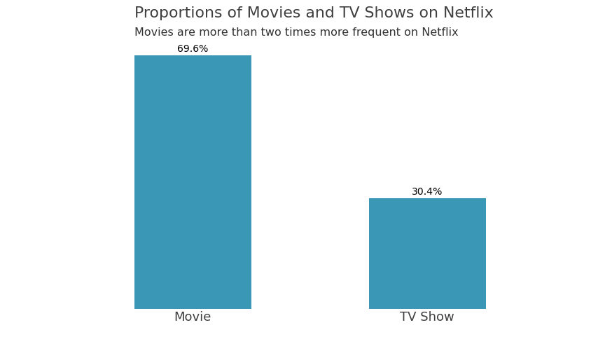
The plot looks really nice now! But can we improve it? Of course, we can.
Horizontal Bar Plot!
We may create a horizontal bar plot and align all text data! Let’s have a look.
# Increase the size of the plot
ax = netflix_movies["type"].value_counts(normalize=True).mul(100).plot.barh(figsize=(12, 7), color="#0C476E")

# Remove spines
sns.despine(left=True)

# Label bars with percentages
ax.bar_label(
    ax.containers[0],
    labels=["69.6%", "30.4%"],
    label_type="edge",
    size=13,
    padding=-50,
    color="white",
    weight="bold"
)

# Increase y ticks label size, rotate them by 90 degrees, and remove tick lines
plt.tick_params(axis="y", labelsize=18, rotation=0, length=0)

# Increase x ticks transparency
plt.yticks(alpha=0.75)

# Remove x axis
ax.get_xaxis().set_visible(False)

# Font for titles
title_font = {
    "size": 22,
    "alpha": 0.75
}

# Font for subtitles
subtitle_font = {
    "size": 16,
    "alpha": 0.80
}

# Title
plt.text(
    x=-9,
    y=1.55,
    s="Proportions of Movies and TV Shows on Netflix",
    ha="left",
    fontdict=title_font,
)

# Subtitle
plt.text(
    x=-9,
    y=1.4,
    s="Movies are more than two times more frequent on Netflix",
    ha="left",
    fontdict=subtitle_font,
)

# Extend bottom spine to align it with titles and labels
ax.spines.bottom.set_bounds((-9, 69.6))

# Add total
plt.text(
    x=63,
    y=-0.6,
    s="Total",
    fontdict={"alpha": 0.75},
)

# Add 100%
plt.text(
    x=67,
    y=-0.6,
    s="100%",
    fontdict={"alpha": 0.75},
)
Compared to the previous plots, apart from aligning the title and subtitle to labels, I also included tick labels directly inside the bars to reduce clutter, changed the color to improve contrast, and restored the bottom spine that I aligned with the rest of the figure. You can also see that I added “Total 100%” to indicate that the percentages add up to 100.
Looking at this plot, we immediately notice the difference between the bar plots, and our eyes naturally move from left to the right and from top to bottom; thus, we put all the information we need in strategic positions to communicate clearly with the audience.
Conclusions
After finishing the plot, I noticed that I could increase the size of the fonts for the percentages to make them even more visible, I could also invert the y axis to move the “Movies” bar above the “TV Shows” bar because higher values should naturally be on top.
But I think it’s just not worth the effort. At some point, you should stop improving a plot and just say that it is “good enough.” While you’re learning, try to make the best plots you can, browse the documentation, and learn new techniques! However, when you have to deliver data visualizations, just stop at some point — when the plot quality is acceptable.
To summarize, here’s what we’ve covered:
- Increasing the plot’s size
- Despining the plot
- Enlarging axes’ labels
- Including a title and a subtitle
- Making secondary information more transparent
- Aligning all the elements of the plot
- Using natural colors
By applying these seven rules, you’ll make your plots much more appealing and informative for your audience.
Feel free to ask me any questions on LinkedIn or GitHub. Happy coding, and happy plotting!