Designing Clear and Impactful Visuals
In a previous tutorial, we explored how to choose the right chart type based on the question we're trying to answer. But selecting the appropriate chart is just the first step. Even the perfect chart can fail to communicate if poorly designed.
Let's consider a scenario to exemplify this:
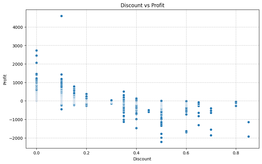
Following our previous tutorial's guidance, we analyzed the relationship between discounts and profits for "Superstore." We correctly chose a scatter plot to answer our question: "How do discount rates affect profitability across product categories?" Yet when we present it to the executive team, they struggle to identify the key insights. Why? Because the design of our visualization isn't directing their attention to what matters most:
Design isn't about making charts pretty. Instead, it's about making them communicate effectively. Throughout this tutorial, we'll explore a three-level framework that transforms basic visualizations into powerful communication tools. By the end, you'll be able to:
- Reduce chart clutter
- Highlight key data insights using color, labels, and annotations
- Contextualize numbers by providing comparisons and benchmarks
- Make visuals readable for all audiences by addressing accessibility considerations:
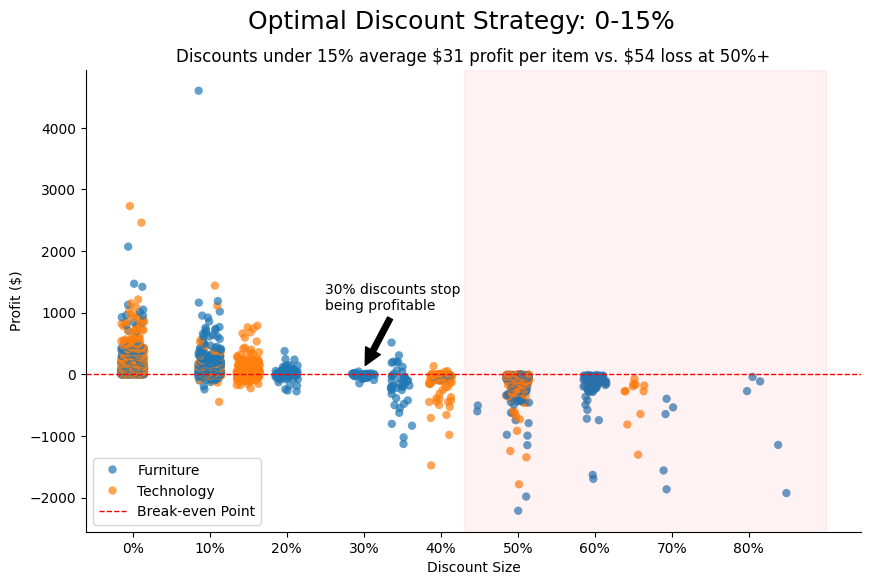
As we go, we’ll convert the chart above into the following:
Let’s get started!
The Three-Level Framework for Effective Data Visualization
Creating truly effective visualizations requires moving beyond basic chart creation to thoughtful design. Our three-level framework helps structure this process, ensuring our visuals aren't just accurate but genuinely insightful.
Level 1: Clarify Your Purpose
Before making a single design decision, we need to be crystal clear on what we want our audience to understand. This mirrors what we discussed in our previous tutorials: our visual should answer a specific question.
Many analysts make the mistake of addressing this step too late in their process. They create a visualization first, then retroactively try to determine what message to emphasize. This approach often leads to unfocused or ineffective visuals. Instead, start by asking: "What specific insight should viewers take away from this visualization?" This question transforms vague intentions like "show sales performance" into focused goals like "demonstrate how the West region's furniture sales outperformed all other categories and regions in Q4."
For instance, at Superstore, we might initially want to "visualize profit and discounts." That's too broad. Without a clear purpose, we might create visualizations that don't address our actual analytical needs. Consider the two charts below—they use the same data but answer entirely different questions:
Violin plot versus scatterplot for profit/discount relationship:
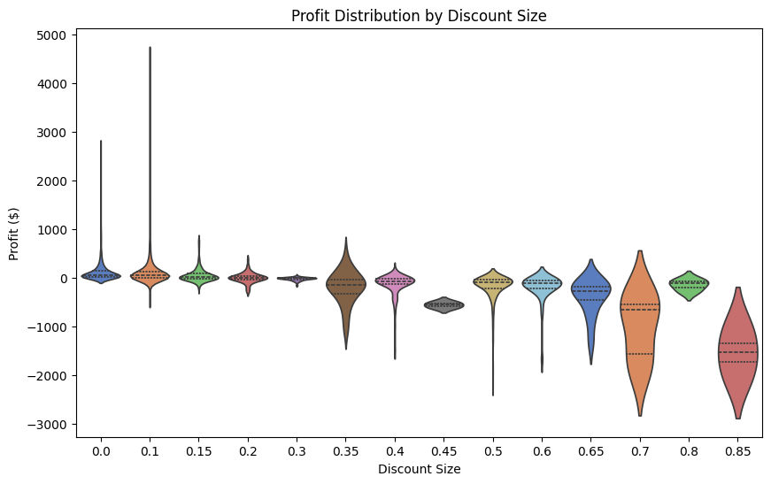

The scatterplot shows the direct relationship between individual discount and profit values, while the violin plot reveals the distribution patterns at different discount levels. If our goal is to show overall correlation, but we present a violin plot, our audience will waste time analyzing distribution shapes that don't address our intended point. The key is defining why we need a visualization before choosing its type.
A clearer purpose would be: "Show how increased discount amounts negatively affect profit for both major product categories, suggesting which discount values are unprofitable for the company."
This clarity of purpose should guide every subsequent design decision. Just ask yourself: does this element help convey my core message? If it doesn’t, it likely doesn’t belong in your visualization.
Level 2: Direct Attention to What Matters
Once our purpose is clear, the next challenge is directing our audience's attention to the most important elements. Our brains process visual information rapidly but can easily get overwhelmed by complexity. Effective design controls where our audience looks first and what stands out.
1. Reducing Clutter and Avoiding Chartjunk
Data visualization pioneer Edward Tufte introduced the concept of data-ink ratio—the proportion of a graphic's ink devoted to actual data representation rather than decorative elements. The goal is to maximize this ratio by eliminating what Tufte calls "chartjunk," unnecessary elements that distract from the data. We want the audience's attention is on the data, not on structure or decorations.
Common chartjunk culprits include:
- Excessive gridlines and tick marks makes that create visual noise
- 3D effects that distort data perception
- Decorative backgrounds or images
- Redundant labels or information
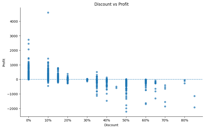
In our initial “Discount vs. Profit” scatterplot for Superstore, we included detailed gridlines and an unnecessary chart border. By removing these elements and replacing them with a single horizontal line representing zero profit, the actual relationships become the visual focus rather than the grid structure or excessive text
The best visualizations often have significant white space (areas without data or decoration). This isn't wasted space; it's breathing room that helps important elements stand out. Simplicity isn't about making visuals boring; it's about making them clear.
2. Revealing True Data Patterns
Before we can direct attention to what matters, we must ensure the underlying patterns in our data are actually visible. So far, our Superstore scatterplot has the points aligned in perfect vertical columns at specific discount values (0.0, 0.1, 0.15, etc.). This creates several problems:
- The true density at each discount level is hidden
- Points overlap, obscuring potentially hundreds of data points
- Patterns within specific discount levels become invisible
This vertical alignment occurs because discounts are typically offered at standardized percentages. To reveal the actual distribution, we can apply jitter, which is a small random horizontal offset that separates overlapping points:
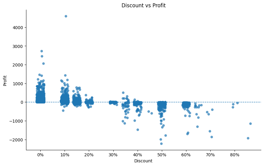
The jittered version preserves the fundamental relationship between discount and profit while revealing:
- The actual concentration of data points at each discount level
- The full range of profit outcomes at each discount
- Clearer patterns in how profit distribution changes as discounts increase
This technique doesn't alter the data relationship—all points maintain their exact y-values and their approximate x-values—but dramatically improves readability. Consider applying jitter whenever categorical or discrete values create artificial alignment in your scatterplots.
With the true data pattern now visible, we can move on to actively directing attention through strategic design choices.
3. Strategic Use of Visual Elements
Beyond removing distractions, we can actively direct attention through strategic design choices:
Color as a Focus Tool:
Color is perhaps our most powerful attention-directing tool, but it's frequently misused as decoration instead of communication. Rather than using multiple colors to make a chart "interesting," use color sparingly to highlight what matters most.
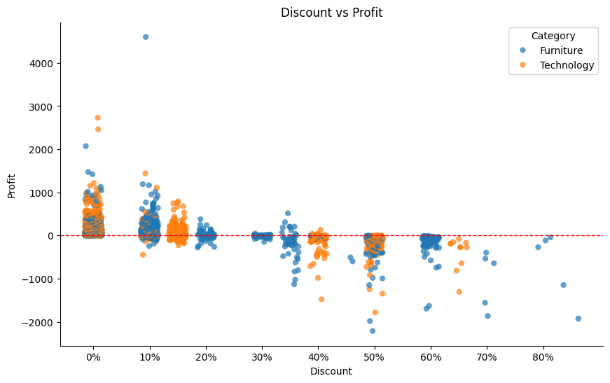
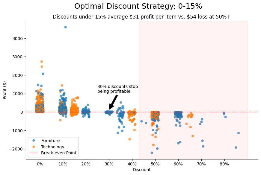
For instance, in our Superstore scatterplot, we can color code the two product categories (Technology and Furniture) and make our zero-profit horizontal line red to emphasize it as a cutoff point for profitability. This strategic use of color effectively increases the data-ink ratio by adding a new layer of information (product categories) without adding additional visual elements. We're getting more data communication value from essentially the same amount of "ink.” This color coding also begins revealing some interesting trends in category discounts. For example, only Technology appears to use 65\% discounts, and almost all items discounted 70\% or more are Furniture, suggesting different discount strategies by product category.
Effective Labels and Annotations:
Text elements should help the audience interpret the data. Instead of labeling every data point, consider using annotations that explain the significance of key patterns or outliers.
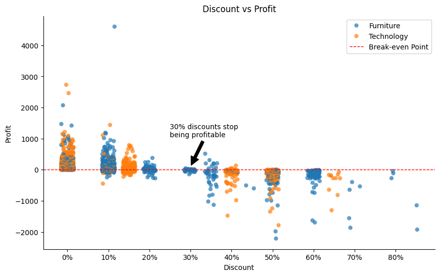
For our Superstore example, we’ve added a few labels and annotations:
- Unit label on the y-axis (
Profit) as “$” so readers don’t have to make assumptions about currency type - A callout at the 30\%
Discountmark to clarify that this represents the percentage that stops being consistently profitable for the company - “Break-even Point” in the legend box to further clarify the horizontal line at zero profit
Contrast and Emphasis:
Size, position, and visual weight naturally guide the viewer's attention. Important elements should be larger, positioned prominently (typically top or left given Western reading patterns), or visually distinctive.
Let's see how this applies to our Superstore example:

Before we add any emphasis, all regions and categories in the chart carry equal visual weight, which means the viewer has to work harder to spot key differences. But if we subtly highlight discounts of 45\% or more in red, we instantly draw attention to how unprofitable those cases are.
This transformation didn't require sophisticated tools, just thoughtful decisions about what deserves emphasis and what should recede into the background.
Level 3: Remove Barriers to Understanding
The final level of our framework focuses on ensuring viewers can accurately interpret our visualization without struggle. Even well-structured charts with clear emphasis can fail if viewers lack context or face accessibility barriers.
Contextualizing Numbers Through Comparison
Raw numbers rarely communicate effectively on their own. A $5,000 profit value means little without context—is that good or bad? Better or worse than expected? To make numbers meaningful, provide reference points.
Effective contextual elements to include:
Benchmarks and Targets
Adding a target line to a sales chart or a profit cutoff instantly transforms it from descriptive to evaluative. Viewers can immediately see whether performance meets expectations rather than just observing the pattern.
For our Superstore example, we’ve included numerical context directly in the title and subtitle. By adding in the average profit value for discounts under 15\% (average profit of $31 per item) versus discounts 50\% or higher ($54 loss per item), viewers can see the value difference between profitable discounts and unprofitable discounts.
A few other ways you can contextualize charts for your audience are:
-
Historical Comparison
Current performance gains versus past results. Instead of showing just this year's sales, include last year's or the three-year average as a reference line.
-
Industry Standards
External benchmarks help contextualize performance within the broader market. A 5\% growth rate might seem disappointing until shown alongside the industry average of 2\%.
Accessibility Considerations
Design choices that improve accessibility ensure that your visualizations are not limited to certain audiences. A common pitfall for chart design is not accounting for color vision when selecting chart colors.
Approximately 8\% of men and 0.5\% of women have some form of color vision deficiency. When color is used to convey important information, select palettes that remain distinguishable to these viewers. Avoid red-green combinations, which pose particular challenges.
For our Superstore visualization, we might choose a blue-orange contrast rather than red-green, ensuring all viewers can distinguish between positive and negative values. In the image demonstration below, we can see that a red-green color palette is indistinguishable to a red-green colorblind viewer, whereas an orange-blue color palette still shows a high-contrast distinction between product types.
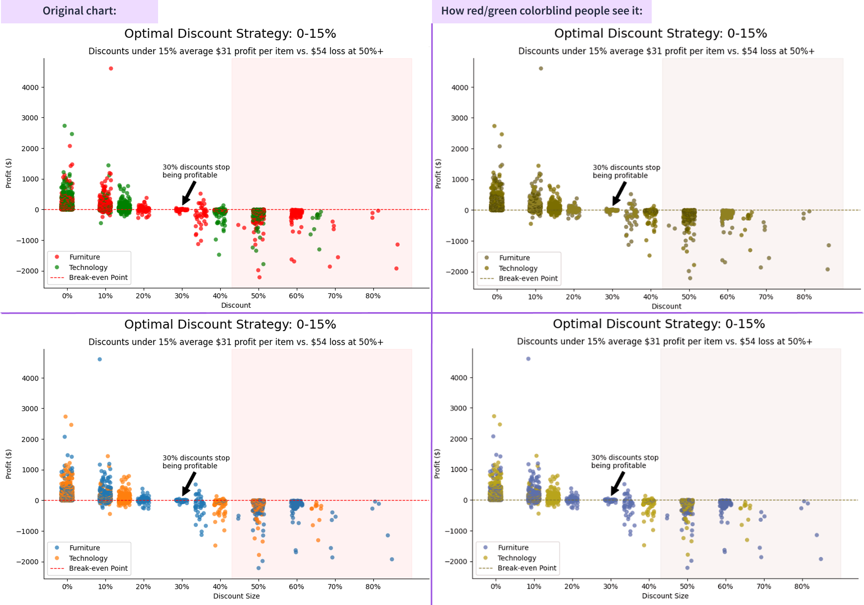
To help you navigate colorblindness accessibility, tools like David Nichols’ Coloring for Colorblindness provide colorblind-friendly palettes for various visualization needs.
Evaluating Your Visualizations
Once you have taken your chart through the framework to create a better visualization, how do you know if your design is effective? Here are practical methods to evaluate your work before sharing it with stakeholders.
The 5-Second Test
Show your visualization to a colleague for just five seconds, then ask:
- What was the main point?
- What stood out to you first?
- What do you think this is telling us about the business?
If their answers align with your intended message, your design is working. If not, you may need to strengthen your visual hierarchy or clarify your purpose.
For our Superstore plot, after five seconds, viewers should recognize that discounts stop being consistently profitable at 30\%, regardless of product category.
Quick Assessment Rubric
Ask these five questions about any visualization you create:
- Purpose Check: Can you express in one sentence what insight this visualization communicates?
- Focus Assessment: If you squint at the visualization (blurring the details), does the most important information still stand out?
- Necessity Test: If you removed any element (a color, line, label, etc.), would the message become unclear? If not, consider removing it.
- Context Evaluation: Would someone unfamiliar with this data understand its significance without additional explanation?
- Action Prompt: Does the visualization suggest a clear next step or decision to the viewer?
Common red flags include charts with multiple competing focal points, elements that require detailed explanation, or visualizations where the key insight emerges only after careful study.
Review & Next Steps
Thoughtful design transforms visualizations from mere data displays into powerful communication tools. By following the three-level framework (clarifying purpose, directing attention, and removing barriers) you can create visuals that instantly convey meaningful insights.
Remember that design is about communication, not decoration. Each color choice, label placement, and formatting decision should serve your core message. Even simple charts can deliver profound insights when designed with purpose and clarity.
As you apply these principles to your own work, start with the most important visualizations you share regularly. Apply the framework level by level, and use the assessment methods to gauge effectiveness. You'll likely find that small design changes can dramatically improve understanding and impact.
Effective data visualization sits at the intersection of analytics and communication—bringing together the technical accuracy of data science with the clarity and persuasiveness of good design. By mastering both aspects, you'll ensure that your insights don't just reach your audience but genuinely influence their decisions.
