Using Box Plots to Explore Women’s Height Data
I’ve recently been working on the Digital Panopticon, a digital history project that has brought together (and created) massive amounts of data about British prisoners and convicts in the long 19th century, including several datasets which include heights for women. Adult height is strongly influenced by environmental factors in childhood, one of the most important being nutrition. So,
The height of past populations can thus tell historians much about the conditions that individuals encountered in their formative years. Given sufficient data it is possible to glimpse inside households in order to piece together a history of the impact that declining wages, rising prices, improvements in sanitation and diminishing family size had on mean adult stature.
However, many studies of height and nutrition in 18th- and 19th-century Britain focused on military records and therefore had little to say about women. The turn to using the rich records of heights for men and women (and children) in 19th-century penal records has been more recent.
Today’s post is going to look at height patterns in four Digital Panopticon datasets, mainly using a kind of visualisation that many historians aren’t familiar with: box plots. If you’ve seen them and not really understood them, it’s OK – I didn’t have a clue until quite recently either! And so, I’ll start by attempting to explain what I learned before I move on to the actual data.
A box plot, or box and whisker plot, is a really concentrated way of visualising what statisticians call the “five figure summary” of a dataset:
- the median average;
- upper quartile (halfway between the median and the maximum value);
- lower quartile (halfway between the median and minimum value);
- minimum value; and
- maximum value.
Here’s a diagram:
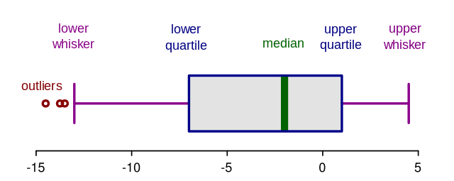
The thick green middle bar marks the median value. The two blue lines parallel to that (aka “hinges”) show the upper and lower quartiles. The pink horizontal lines extending from the box are the whiskers. In this version of a box plot, the whiskers don’t necessarily extend right to the minimum and maximum values. Instead, they’re calculated to exclude outliers which are then plotted as individual dots beyond the end of the whiskers.
So what’s the point of all this? Imagine two datasets: one contains the values 4,4,4,4,4,4,4,4 and the other 1,3,3,4,4,4,6,7. The two datasets have the same averages, but the distribution of the values is very different. A boxplot is useful for looking more closely at such variations within a dataset, or for comparing different datasets, which might look pretty much the same if you only considered averages.
These are the four datasets:
- HCR, Home Office Criminal Registers 1790-1801, prisoners held in Newgate awaiting trial (1226 heights total, 1061 aged over 19)
- CIN, Convict Indents 1820-1853, convicts transported to Australia (17183 heights, 14181 over 19)
- PLF, Female prison licences 1853-1884, female convicts sentenced to penal servitude (571 heights, 535 over 19)
- RHC, Registers of Habitual Criminals 1881-1925, recidivists who were under police supervision following release from prison (12599 heights, 12118 over 19)
For each dataset, I only included women who had a year of birth, or whose year of birth could be calculated using an age and date, as well as a height. (I say “heights” above because I can’t guarantee that they are all unique individuals; but nearly all of them should be.) In all the following charts I’m including only adult women aged over 19.
Here’s what happens when you plot the heights for each birth decade in RHC.
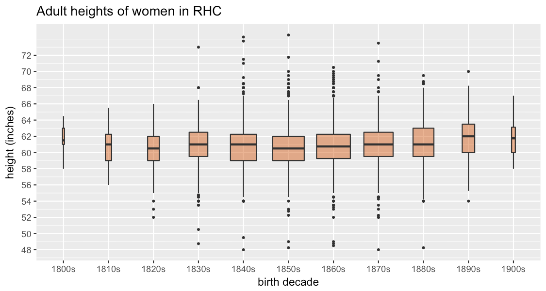
(This is generated using the R package ggplot2, and it looks a little bit different from many examples you’ll see online because ggplot has a nice feature to vary the width of the boxes according to the size of the data group.)
The first thing I look for is incongruities that might suggest problems with the data, and on the whole it looks good – the boxes are mostly quite symmetrical and none of the outliers is outside the realms of possibility (the tallest woman is 74.5 inches, or 6 foot 2 1/2, and the shortest is 48 inches), though I’m slightly doubtful that there were women born in the 1800s in this dataset, which gets going in the 1880s; still, they’re a very small number so unlikely to skew things much overall. Since the data seems to be OK on first sight, the interesting thing to note here is that from the 1850s onwards, the women are getting taller, and those born in the 1890s are quite a lot taller than the 1880s cohort. This is fairly consistent with Deb Oxley’s (more fine-grained) observations of the same data.
Here’s CIN:
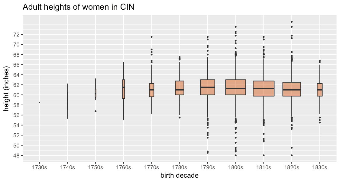
Again, we have a reasonable spread of heights and fortunately very small number of slightly questionable early births. (It happens to be the case that this data was manually transcribed, whereas RHC was created using Optical Character Recognition – but on the other hand, the source for RHC was printed and much more legible than the handwritten indents.) Ignoring for now the very small groups before the 1770s, the tallest decade cohort of women in this data is those born in the 1790s and thereafter they get consistently shorter.
Let’s put all four datasets together! (Click on the image for a larger version.)

I’ve filtered out women born before 1750 and after 1899, because the numbers were very small, and some extreme outliers (more about those later…). Then I added a guideline at the median for the 1820s (the mid-point), as I think it helps in seeing the trends.
It might seem surprising at first that the late 18th-century women of HCR are taller than any subsequent cohorts until the 1890s. Yet the trends here are broadly consistent with the pioneering research by Roderick Floud et al on British men and boys between 1740 and 1914. They argued “that the average heights of successive birth cohorts of British males increased between 1740 and 1840, fell back between 1840 and 1850, and increased once again from the 1850s onwards” (Harris, ‘Health, Height and History’). The British population was less well-fed for much of the 19th century (as food resources struggled to keep up with rapid population growth), and it got smaller as a result. Our women’s growth after 1850 may be slower than for the men (until the 1890s) though; perhaps it took longer for women than men to start growing again.
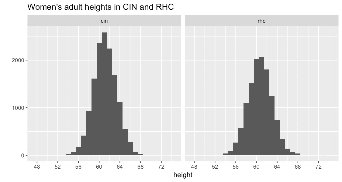
Finally, though, I have to put in a big caveat about the HCR data. I mentioned that I excluded some extreme outliers from the chart above. HCR was by far the worst offender, and if you look closely at the 18th-century cohorts covered by HCR, the boxes aren’t quite as symmetrical as the 19th-century ones. If we visualise it using a histogram (another handy one for examining the distribution of values in a dataset), we can see more clearly that there’s something up. A ‘normal’ height distribution in a population should look like a “bell curve” – quite tightly and symmetrically clustered around the average. CIN and RHC are close:
But this is what HCR looks like. This is not good.

If we’re lucky, much of the problem could turn out to be errors in the data which can be fixed. After all, it’s at least roughly the right kind of shape! The big spike at 60 inches (5 feet) rings plenty of alarm bells though. It looks reminiscent of a problem we have with much of the age data in the Digital Panopticon, known as "heaping", a tendency to round ages to the nearest 0 or 5 (people often didn’t know their exact dates of birth). The age heaping is very mild in comparison to this spike, so I think it could well be another issue with either the transcription or the method used to extract heights. But if it turns out that’s not the case, this could be pretty problematic. We’re assuming the prisoners were properly measured, but we don’t know anything about the equipment used. For all we know, it might often have been largely guess work. In the end, we might find that HCR simply isn’t reliable enough to use for demographic analysis. There’s very little height data for women born in the 18th century, so this is a potentially really important source. But what if it’s not up to the job?
Further reading
- John Canning, Statistics for the Humanities (2014), especially chapter 3.
- Introduction to Statistics: Box plots
- The Normal Distribution
- H Maxwell-Stewart, K Inwood and M Cracknell, ‘Height, Crime and Colonial History’, Law, Crime and History (2015).
- Deborah Oxley, David Meredith, and Sara Horrell, ‘Anthropometric measures of living standards and gender inequality in nineteenth-century Britain’, Local Population Studies, 2007.
- Deborah Oxley, Biometrics, https://www.digitalpanopticon.org (2017).
- Bernard Harris, ‘Health, Height, and History: An Overview of Recent Developments in Anthropometric History’, Social History of Medicine (1994).
- Jessica M. Perkins et al, ‘Adult height, nutrition, and population health’, Nutrition Reviews (2016).
Editor's note: This was originally posted on Early Modern Notes, and has been reposted with permission as part of our focus on Women's History Month. Author Sharon Howard works at the University of Sheffield as Project Manager for digital history projects.