How to Plot a DataFrame Using Pandas (21 Code Examples)
Pandas is a data analysis tool that also offers great options for data visualization. Here's how to get started plotting in Pandas.
Data visualization is an essential step in making data science projects successful — an effective plot tells a thousand words.
Data visualization is a powerful way to capture trends and share the insights gained from data. There are plenty of data visualization tools on the shelf with a lot of outstanding features, but in this tutorial, we're going to learn plotting with the Pandas package.
As you may already know, Pandas is a data analysis tool, but it provides some great options for data visualization. At the end of this tutorial, you'll see how easy and straightforward plotting with Pandas can be.
We assume that you know the fundamentals of Pandas DataFrames. If you're not familiar with the Pandas library, you might like to try our Pandas and NumPy Fundamentals course.
Let's dive in.
The Pandas plot() Method
Pandas comes with a couple of plotting functionalities applicable on DataFrame- or series objects that use the Matplotlib library under the hood, which means any plot created by the Pandas library is a Matplotlib object.
Technically, the Pandas plot() method provides a set of plot styles through the kind keyword argument to create decent-looking plots. The default value of the kind argument is the line string value. However, there are eleven different string values that can be assigned to the kind argument, which determines what kind of plot we'll create.
The .plot is also an attribute of Pandas DataFrame and series objects, providing a small subset of plots available with Matplotlib. In fact, Pandas makes plotting as simple as just writing a single line of code by automating much of the data visualization procedure for us.
Importing the Libraries and the Dataset
In this tutorial, we're going to work on the weekly closing price of the Facebook, Microsoft, and Apple stocks over the last previous months. The following code imports the necessary libraries and the dataset required for visualization and then displays the content of the DataFrame on the output. The We're now ready to explore and visualize the data with Pandas. The default plot is the line plot that plots the index on the x-axis and the other numeric columns in the DataFrame on the y-axis. Let's plot a line plot and see how Microsoft performed over the previous 12 months: NOTE The We can plot multiple lines from the data by providing a list of column names and assigning it to the y-axis. For example, let's see how the three companies performed over the previous year: We can use the other parameters provided by the As we see in the figure, the A bar chart is a basic visualization for comparing values between data groups and representing categorical data with rectangular bars. This plot may include the count of a specific category or any defined value, and the lengths of the bars correspond to the values they represent. In the following example, we'll create a bar chart based on the average monthly stock price to compare the average stock price of each company to others in a particular month. To do so, first, we need to resample data by month-end and then use the Now, we're ready to create a bar chart based on the aggregated data by assigning the We can create horizontal bar charts by assigning the We can also plot the data on the stacked vertical or horizontal bar charts, which represent different groups on top of each other. The height of the resulting bar shows the combined result of the groups. To create a stacked bar chart we need to assign A histogram is a type of bar chart that represents the distribution of numerical data where the x-axis represents the bin ranges while the y-axis represents the data frequency within a certain interval. In the example above, the A histogram can also be stacked. Let's try it out: A box plot consists of three quartiles and two whiskers that summarize the data in a set of indicators: minimum, first quartile, median, third quartile, and maximum values. A box plot conveys useful information, such as the interquartile range (IQR), the median, and the outliers of each data group. Let's see how it works: We can create horizontal box plots, like horizontal bar charts, by assigning An area plot is an extension of a line chart that fills the region between the line chart and the x-axis with a color. If more than one area chart displays in the same plot, different colors distinguish different area charts. Let's try it out: The Pandas If we're interested in ratios, a pie plot is a great proportional representation of numerical data in a column. The following example shows the average Apple stock price distribution over the previous three months: A legend will display on pie plots by default, so we assigned The new keyword argument in the code above is If we want to represent the data of all the columns in multiple pie charts as subplots, we can assign Scatter plots plot data points on the x and y axes to show the correlation between two variables. Like this: As we see in the plot above, the scatter plot shows the relationship between Microsoft and Apple stock prices. When the data is very dense, a hexagon bin plot, also known as a hexbin plot, can be an alternative to a scatter plot. In other words, when the number of data points is enormous, and each data point can't be plotted separately, it's better to use this kind of plot that represents data in the form of a honeycomb. Also, the color of each hexbin defines the density of data points in that range. The The last plot we want to discuss in this tutorial is the Kernel Density Estimate, also known as KDE, which visualizes the probability density of a continuous and non-parametric data variable. This plot uses Gaussian kernels to estimate the probability density function (PDF) internally. Let's try it out: We're can also specify the bandwidth that affects the plot smoothness in the KDE plot, like this: As we can see, selecting a small bandwidth leads to under-smoothing, which means the density plot appears as a combination of individual peaks. On the contrary, a huge bandwidth leads to over-smoothing, which means the density plot appears as unimodal distribution. In this tutorial, we discussed the capabilities of the Pandas library as an easy-to-learn and straightforward data visualization tool. Then, we covered all the plots provided in Pandas by implementing some examples with very few lines of code.import pandas as pd
import numpy as np
import matplotlib.pyplot as plt
dataset_url = ('https://raw.githubusercontent.com/m-mehdi/pandas_tutorials/main/weekly_stocks.csv')
df = pd.read_csv(dataset_url, parse_dates=['Date'], index_col='Date')
pd.set_option('display.max.columns', None)
print(df.head())
MSFT FB AAPL
Date
2021-05-24 249.679993 328.730011 124.610001
2021-05-31 250.789993 330.350006 125.889999
2021-06-07 257.890015 331.260010 127.349998
2021-06-14 259.429993 329.660004 130.460007
2021-06-21 265.019989 341.369995 133.110001Line Plot
df.plot(y='MSFT', figsize=(9,6))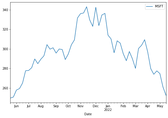
figsize argument takes two arguments, width and height in inches, and allows us to change the size of the output figure. The default values of the width and height are 6.4 and 4.8, respectively.
df.plot.line(y=['FB', 'AAPL', 'MSFT'], figsize=(10,6))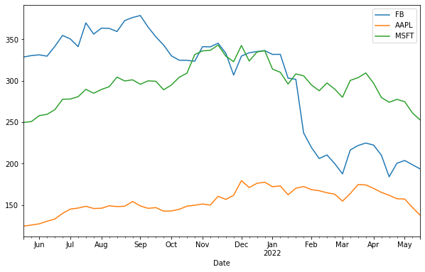
plot() method to add more details to a plot, like this:df.plot(y='FB', figsize=(10,6), title='Facebook Stock', ylabel='USD')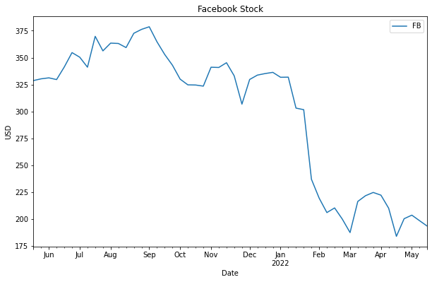
title argument adds a title to the plot, and the ylabel sets a label for the y-axis of the plot. The plot's legend display by default, however, we may set the legend argument to false to hide the legend.Bar Plot
mean() method to calculate the average stock price in each month. We also select the last three months of data, like this:df_3Months = df.resample(rule='M').mean()[-3:]
print(df_3Months) MSFT FB AAPL
Date
2022-03-31 298.400002 212.692505 166.934998
2022-04-30 282.087494 204.272499 163.704994
2022-05-31 262.803335 198.643331 147.326665bar string value to the kind argument:df_3Months.plot(kind='bar', figsize=(10,6), ylabel='Price')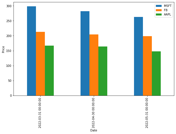
barh string value to the kind argument. Let's do it:df_3Months.plot(kind='barh', figsize=(9,6))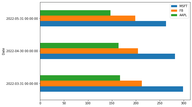
True to the stacked argument, like this:df_3Months.plot(kind='bar', stacked=True, figsize=(9,6))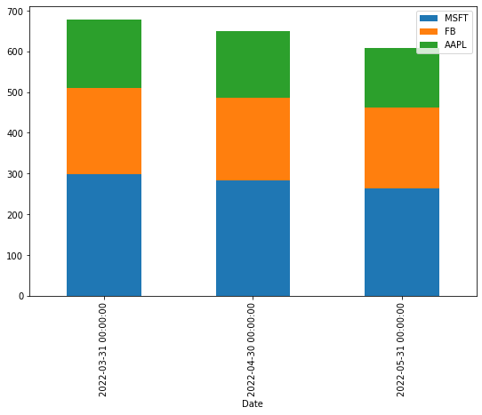
Histogram
df[['MSFT', 'FB']].plot(kind='hist', bins=25, alpha=0.6, figsize=(9,6))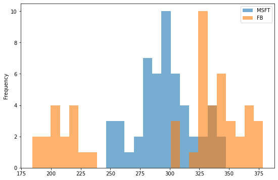
bins argument specifies the number of bin intervals, and the alpha argument specifies the degree of transparency.df[['MSFT', 'FB']].plot(kind='hist', bins=25, alpha=0.6, stacked=True, figsize=(9,6))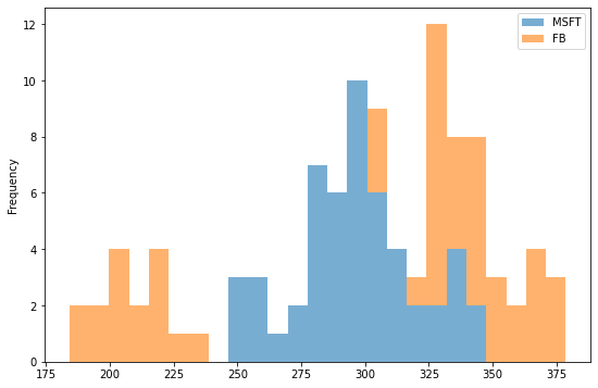
Box Plot
df.plot(kind='box', figsize=(9,6))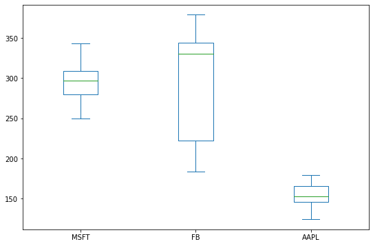
False to the vert argument. Like this:df.plot(kind='box', vert=False, figsize=(9,6))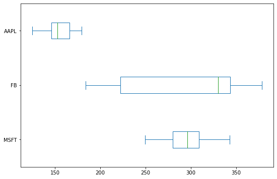
Area Plot
df.plot(kind='area', figsize=(9,6))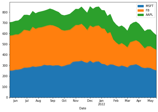
plot() method creates a stacked area plot by default. It's a common task to unstack the area chart by assigning False to the stacked argument:df.plot(kind='area', stacked=False, figsize=(9,6))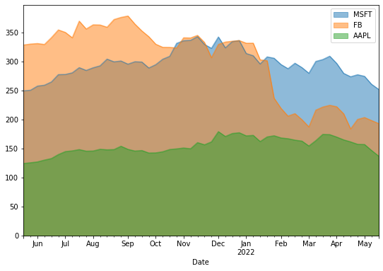
Pie Plot
df_3Months.index=['March', 'April', 'May']
df_3Months.plot(kind='pie', y='AAPL', legend=False, autopct='
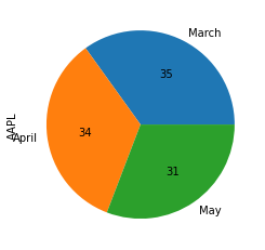
False to the legend keyword to hide the legend.autopct, which shows the percent value on the pie chart slices.True to the subplots argument, like this:df_3Months.plot(kind='pie', legend=False, autopct='
array([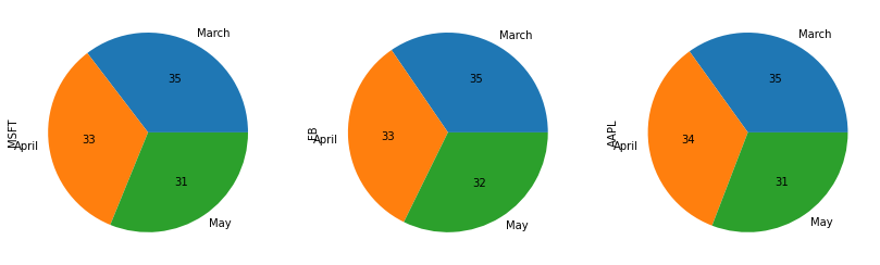
Scatter Plot
df.plot(kind='scatter', x='MSFT', y='AAPL', figsize=(9,6), color='Green')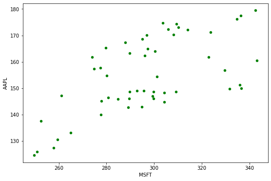
Hexbin Plot
df.plot(kind='hexbin', x='MSFT', y='AAPL', gridsize=10, figsize=(10,6))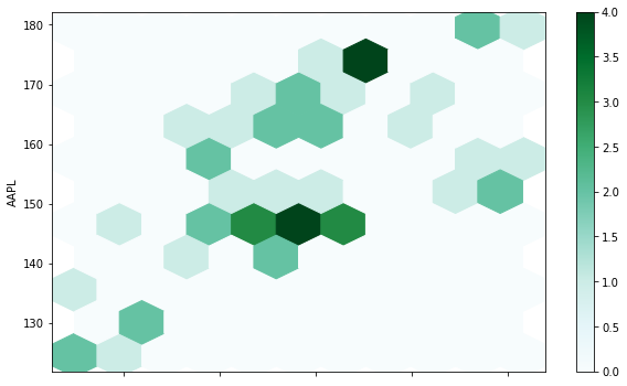
gridsize argument specifies the number of hexagons in the x-direction. A larger grid size means more and smaller bins. The default value of the gridsize argument is 100.KDE Plot
df.plot(kind='kde')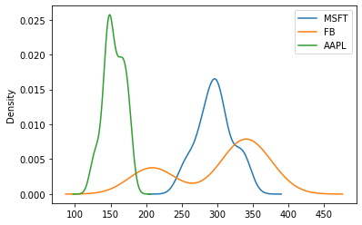
df.plot(kind='kde', bw_method=0.1)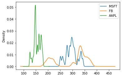
df.plot(kind='kde', bw_method=1)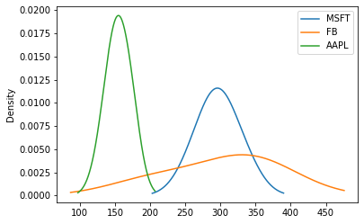
Summary